Congratulations on reaching the momentous occasion of your organization’s 25th anniversary! As you prepare to commemorate this significant milestone, one crucial element to consider is a visually appealing and memorable logo that represents your brand’s journey and achievements. In this article, we will explore various 25th anniversary logo ideas that can help you capture the essence of your organization’s history, values, and aspirations. Whether you are looking for a nostalgic design or a contemporary twist, we’ve got you covered.
1. Reflections of the Past

1.1 Retro Revival
Take a trip down memory lane by incorporating elements from your organization’s early years into your 25th anniversary logo. Consider using vintage fonts, retro color schemes, or iconic symbols that were associated with your brand in its inception. By evoking nostalgia, you can create a sense of connection with your long-standing supporters while also reflecting on the journey you have taken together.
1.2 Timeless Elegance
If your organization has maintained a classic and sophisticated image throughout its history, consider a logo design that embodies timeless elegance. Clean lines, serif fonts, and a refined color palette can convey a sense of longevity and trust. Incorporating the number “25” subtly into the design can further reinforce the significance of your anniversary.
2. Embracing the Present

2.1 Modern Minimalism
For organizations with a contemporary and minimalist brand aesthetic, a clean and sleek logo design can be the perfect choice for your 25th anniversary. Focus on simplicity and precision, using sans-serif fonts and minimalist shapes. By incorporating subtle references to your anniversary, such as the number “25” as negative space, you can create a visually striking logo that resonates with a modern audience.
2.2 Vibrant Celebration
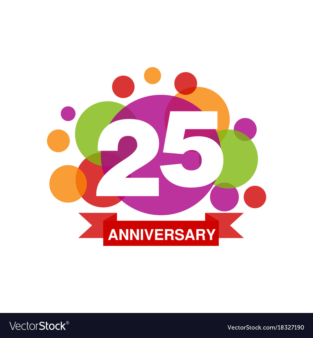
If your organization has a vibrant and dynamic brand personality, consider incorporating bold colors and playful elements into your 25th anniversary logo. This approach can convey a sense of celebration and excitement, attracting attention and engaging both existing and potential supporters. Experiment with energetic typography and lively illustrations to capture the spirit of your anniversary milestone.
3. Looking Towards the Future
3.1 Forward Motion
As you celebrate 25 years, it is important to convey a sense of progress and innovation in your logo design. Consider incorporating elements that symbolize growth, such as arrows, upward trajectories, or futuristic shapes. A contemporary font choice, combined with a color palette that reflects your brand’s future aspirations, can create a logo that inspires confidence and demonstrates your organization’s commitment to evolving with the times.
3.2 Sustainability and Social Responsibility
In today’s world, many organizations are prioritizing sustainability and social responsibility. If this aligns with your brand values, consider incorporating eco-friendly elements into your logo design. Symbolic representations of nature, the use of earthy color palettes, or the integration of sustainability icons can demonstrate your commitment to a better future while celebrating your 25th anniversary.
4. Combining Elements
4.1 A Journey Through Time
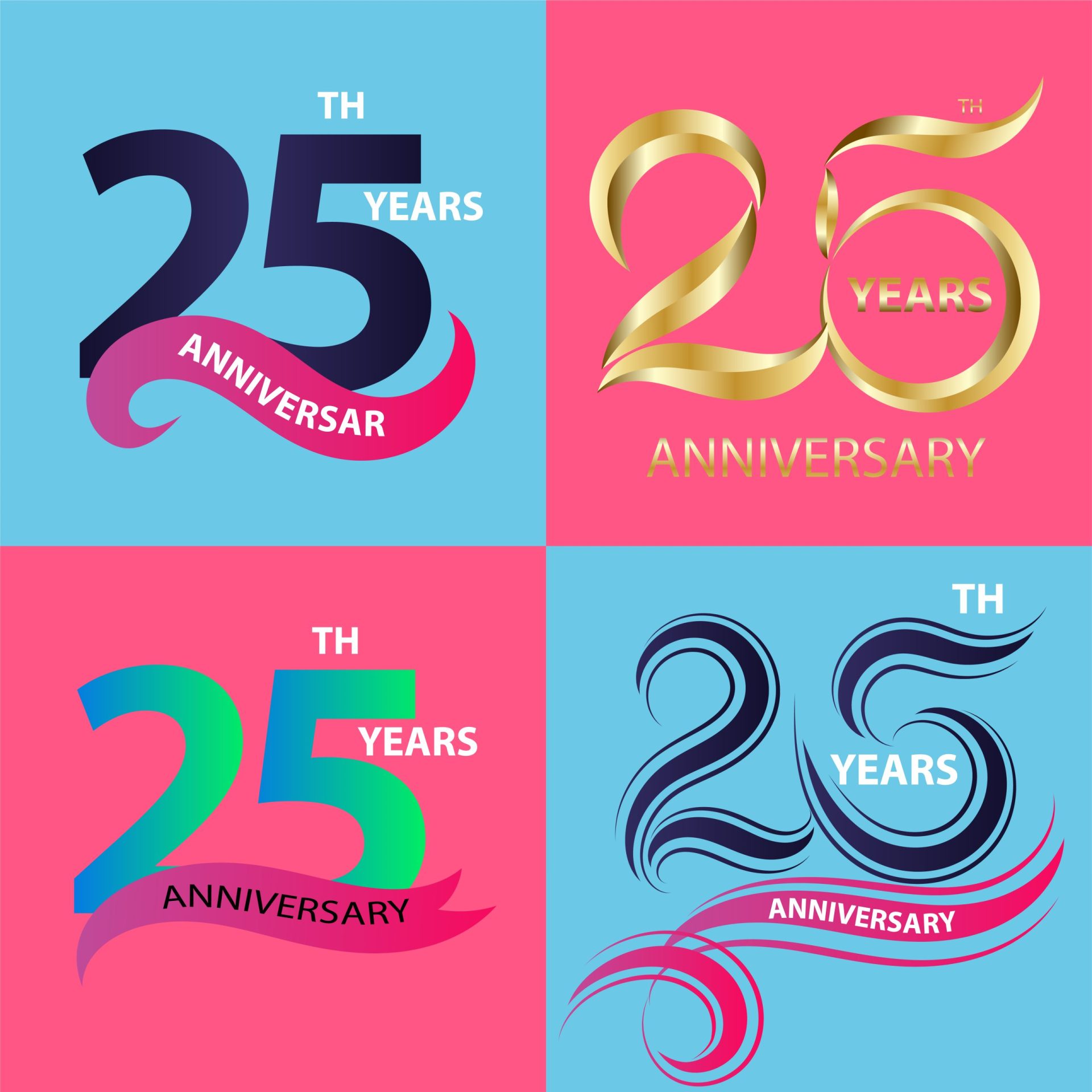
Incorporating multiple elements into your 25th anniversary logo can create a rich visual narrative of your organization’s journey. Consider blending retro and modern design elements to illustrate the evolution of your brand over the past 25 years. This approach can be particularly effective if your organization has undergone significant transformations or if you want to highlight the continuity of your core values.
4.2 Balanced Fusion
For organizations that have successfully maintained a balance between tradition and innovation, a logo design that combines elements from different eras can be a powerful representation of your brand’s identity. By seamlessly merging classic and contemporary design elements, you can create a logo that reflects your organization’s ability to adapt while staying true to its roots.
5. Seeking Professional Guidance
Designing a logo for your organization’s 25th anniversary is a significant undertaking that requires careful consideration and creativity. While exploring these logo ideas can provide inspiration, it is essential to seek the expertise of a professional graphic designer or design agency. Their skills and experience can help you translate your vision into a visually appealing and meaningful logo that truly captures the essence of your organization’s journey and achievements.
Conclusion
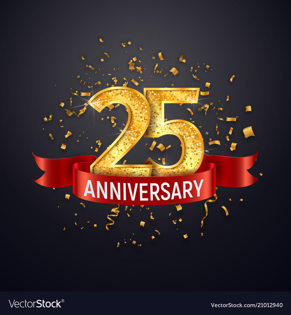
Your organization’s 25th anniversary is a remarkable milestone that deserves to be celebrated in style. By choosing an anniversary logo that aligns with your brand’s history, values, and aspirations, you can create a visual representation that resonates with your target audience. Whether you opt for a retro design, a modern twist, or a fusion of elements, remember to seek professional guidance to ensure your logo accurately reflects the significance of this milestone. Embrace this opportunity to showcase your organization’s accomplishments and set the stage for a future filled with continued success.
Barry Edwards is a digital marketing expert with a deep understanding of content strategy, logo, and branding principles. Holding a Bachelor’s degree in Marketing from Beaconhill College, he offers valuable insights on digital marketing trends and strategies through his writing. Follow Barry’s work to stay updated on the latest in online marketing and branding.
