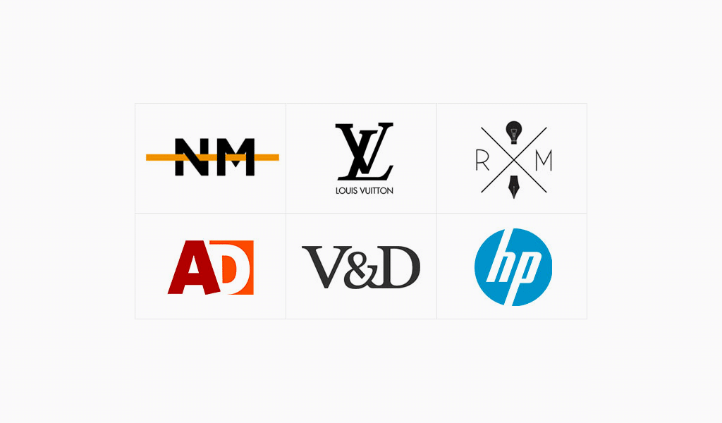
Are you looking to create a unique and memorable logo for your brand? Acronym logo ideas can be a great way to achieve just that. Acronyms are short abbreviations formed from the initial letters of a longer name or phrase. When used effectively, acronym logos can convey a brand’s identity succinctly, making them instantly recognizable and memorable.
In this article, we will explore the power of acronym logos and provide you with some creative ideas to inspire your own logo design. Whether you are starting a new business or rebranding an existing one, these suggestions will help you create a logo that stands out in a crowded marketplace.
Understanding the Power of Acronym Logos

Acronym logos have become increasingly popular in recent years due to their simplicity and ability to create a strong brand identity. They condense a brand’s name or message into a concise and memorable format, making it easier for customers to remember and recognize.
By utilizing an acronym logo, you can effectively communicate your brand’s essence, values, or key offerings without overwhelming your audience with lengthy text. This simplicity can be particularly advantageous in the digital age, where attention spans are shorter and visual impact is crucial.
Guidelines for Designing Acronym Logos

Creating an effective and memorable acronym logo requires careful consideration and strategic design choices. Here are some guidelines to keep in mind during the logo design process:
1. Reflect your brand’s identity
Your acronym logo should reflect your brand’s identity and purpose. Consider the values and personality of your brand and how you want to be perceived by your target audience. Whether you aim to convey professionalism, creativity, or playfulness, make sure your logo aligns with your brand’s overall image.
2. Choose a legible typeface
The choice of typeface is crucial in acronym logos. Opt for a clean, legible font that complements your brand’s personality and is easily recognizable. Avoid overly decorative or complex fonts that may hinder readability, especially when scaled down for smaller applications. Remember, a clear and readable logo is essential for making a lasting impression.
3. Create a balanced composition
Achieving visual balance is essential in logo design. Ensure that the elements of your acronym logo are well-proportioned and visually harmonious. A balanced composition enhances the overall aesthetic appeal and makes your logo more memorable.
4. Use meaningful symbolism
Consider incorporating symbolism or visual elements that connect with your brand’s industry or target audience. These additional elements can enhance the meaning and impact of your acronym logo, making it more memorable and resonating with your customers on a deeper level.
5. Experiment with colors
Colors play a significant role in logo design, evoking emotions and associations. Experiment with different color combinations to find the ones that best represent your brand’s personality and values. Consider the psychological impact of colors and ensure that they align with your brand’s message.
6. Test for scalability
An effective logo should be versatile and adaptable to various applications. Test your acronym logo across different sizes, from small social media icons to large signage, to ensure legibility and visual appeal. A logo that looks great on a website might not necessarily translate well onto a billboard.
Now that we have outlined the guidelines for designing acronym logos, let’s dive into some creative ideas to inspire your own logo design process.
Creative Acronym Logo Ideas
1. Nike: Just Do It
One of the most iconic acronym logos is that of Nike. The simple yet powerful “swoosh” symbolizes motion and speed while representing the brand’s tagline, “Just Do It.” This logo has become synonymous with Nike’s brand identity and is instantly recognizable worldwide.
2. NASA: National Aeronautics and Space Administration
NASA’s acronym logo combines simplicity and symbolism to represent its purpose. The blue circular shape represents Earth, while the red arrow passing through it signifies aeronautics and space exploration. This logo effectively communicates NASA’s mission and has stood the test of time.
3. IBM: International Business Machines
IBM’s logo is a perfect example of a sleek and modern acronym design. The blue horizontal lines forming the letters “IBM” convey a sense of stability, professionalism, and technological advancement. This logo reflects IBM’s brand identity as a leading global technology company.
4. WWF: World Wide Fund for Nature
The World Wide Fund for Nature (WWF) logo cleverly integrates the acronym into the visual representation of a panda. The black and white design not only represents the endangered species but also symbolizes the organization’s commitment to conservation. This logo is a memorable example of how symbolism can enhance the impact of an acronym logo.
5. ESPN: Entertainment and Sports Programming Network
ESPN’s acronym logo incorporates a vibrant, angular design that represents the excitement and energy of sports and entertainment. The stylized letters “ESPN” create a dynamic visual impact, making this logo instantly recognizable among sports enthusiasts.
6. LG: Life’s Good
LG’s acronym logo combines simplicity and elegance. The stylized letters “LG” form a smiling face, representing the brand’s tagline, “Life’s Good.” This logo effectively conveys a positive and optimistic message, leaving a lasting impression on customers.
Conclusion

Acronym logos have the power to condense a brand’s identity into a concise and memorable format, making them instantly recognizable and memorable. By following the guidelines and drawing inspiration from successful examples, you can create an acronym logo that effectively communicates your brand’s essence and resonates with your target audience.
Remember, a well-designed acronym logo reflects your brand’s identity, uses legible typefaces, creates a balanced composition, incorporates meaningful symbolism, explores appropriate colors, and tests for scalability. By carefully considering these factors, you can create an acronym logo that becomes an enduring symbol of your brand’s success.
Angela Irwin is a branding and design enthusiast with a Bachelor of Fine Arts in Graphic Design from Meadowbrook College. As a writer at Logocreator.io, she shares her expertise on logo design, graphic trends, and effective branding strategies, helping businesses create impactful visual identities.


