When you think of fast food, one of the first brands that likely comes to mind is Burger King. With its flame-grilled burgers and iconic “Have it Your Way” slogan, Burger King has become a staple in the fast food industry. But have you ever stopped to think about the history and evolution of the Burger King logo?
The Burger King logo has undergone several changes throughout the years. The original logo, which was introduced in 1957, featured a cartoonish king with a chef’s hat and a burger in his hand. Over the years, the logo has been updated to reflect changing design trends and the company’s evolving brand identity. In early 2021, Burger King unveiled its latest logo redesign, which features a more minimalist and modern look.
The Burger King logo is more than just a visual representation of the brand. It’s a symbol of the company’s values and identity. The logo plays a crucial role in creating brand recognition and establishing a connection with customers. By understanding the history and evolution of the Burger King logo, you can gain a deeper appreciation for the brand and its place in the fast food industry.
History of Burger King Logo
Burger King has been a popular fast-food chain serving some of America’s iconic burgers for over 60 years. But as well as its delicious menu, Burger King is known for its iconic logo design, which has evolved over the years. In this section, we will take a look at the history of the Burger King logo.
Insta-Burger King Era
Burger King started as Insta-Burger King in 1953 in Jacksonville, Florida. The original logo featured a man in chef’s hat and apron holding a large hamburger. However, the company went through financial difficulties and was eventually bought by James McLamore and David R. Edgerton in 1954. They changed the name to Burger King and redesigned the logo to a minimalist design that featured only the restaurant’s name in a custom sans-serif typeface.
Logo Evolution Through The Decades
In the 1970s, Burger King introduced a new logo that featured a stylized bun with the restaurant’s name in the center. This logo was used until 1994, when the company introduced the “blue crescent” logo, which featured a blue crescent shape with the restaurant’s name in the center.
In 1999, Burger King introduced a new logo that featured a more modern design with a blue swoosh and a stylized burger bun. This logo was used until 2011, when the company introduced a new logo that featured a more classic design with a red circle and a stylized burger bun.
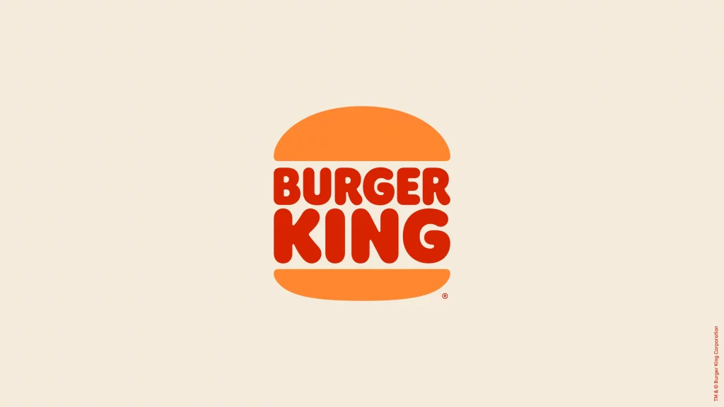
In 2021, Burger King announced a new logo that features a more minimalist design with a simplified burger bun and a new custom font. This new logo is meant to reflect the company’s commitment to simplicity and quality.
Despite its many logo changes over the years, Burger King has remained a popular fast-food chain and a major competitor to McDonald’s. Its logos have evolved to reflect changing design trends and the company’s commitment to quality and simplicity.
Design Elements of Burger King Logo
Burger King’s logo has undergone several modifications since the restaurant chain was first launched in 1953. The current logo features a minimalist design that is easily recognizable. In this section, we will discuss the design elements of the Burger King logo, including the color palette, typography, and iconography.
Color Palette
The Burger King logo uses a color palette that includes red, orange, and blue. The color red is associated with passion, energy, and excitement, while orange is often linked to warmth, enthusiasm, and friendliness. The color blue is often associated with trust, loyalty, and dependability. The combination of these colors creates a vibrant and energetic logo that stands out.
Typography
The Burger King logo uses a custom sans-serif typeface that is bold and modern. The font is designed to be easily readable and recognizable, making it an ideal choice for a logo. The Burger King logo features the company name in all caps, which gives it an authoritative and commanding presence. The font’s heavy weight and clean lines make it easy to read from a distance.
Iconography
The Burger King logo features an icon that consists of a crescent-shaped flame. The flame is designed to represent the grill used to cook the restaurant’s burgers. The flame is also a nod to the company’s name, which includes the word “king.” The crescent shape of the flame is meant to resemble a burger patty, further emphasizing the restaurant’s focus on food.
The Burger King logo also features a blue swoosh that runs through the center of the flame. The swoosh is designed to represent speed and movement, highlighting the fast-food nature of the restaurant. The combination of the flame and the swoosh creates a dynamic and memorable logo that is easily recognizable.
Conclusion
In conclusion, the Burger King logo is a well-designed and recognizable logo that features a bold color palette, a modern typography, and a dynamic iconography. The logo has undergone several modifications over the years, but the current design is a perfect representation of the brand’s focus on fast food and quality burgers.
The Role of Logo in Branding
Logos play a crucial role in branding. A well-designed logo can help a brand stand out from its competitors and create a lasting impression on customers. In the case of Burger King, the logo has been a key part of the brand’s visual identity since its inception in 1953. Let’s take a closer look at the role of the Burger King logo in branding.
Brand Recognition
One of the primary functions of the Burger King logo is to create brand recognition. The logo’s classic look, with the words “Burger King” in a bold, sans-serif font, has become synonymous with the brand. The logo’s visual identity has remained consistent over the years, even as the company has undergone rebrands and changes in ownership. This consistency has helped to build a strong brand identity that customers can easily recognize.
Marketing Strategy
The Burger King logo is also an essential component of the company’s marketing strategy. The logo’s bright colors and bold design help to attract attention and create a sense of excitement around the brand. The logo is featured prominently on product packaging, in-store signage, and advertising campaigns. The company has also used the logo to promote its signature product, the Whopper, which has become a cultural icon in its own right.
Burger King’s parent company, Restaurant Brands International, has also used the logo to promote the brand globally. Since acquiring the company in 2014, Restaurant Brands International has expanded the Burger King franchise to over 18,000 locations in more than 100 countries. The company’s marketing strategy has focused on creating a consistent brand image across all locations, with the logo playing a central role in this effort.
In conclusion, the Burger King logo has played a vital role in building the brand’s identity and marketing strategy. Its classic look and consistent visual identity have helped to create brand recognition and attract customers. As Burger King continues to expand globally, the logo will undoubtedly remain a key part of the company’s visual identity and marketing efforts.
Logo Redesign Process
If you’re a fan of Burger King, you may have noticed that the fast-food giant has recently undergone a significant logo redesign. In this section, we’ll take a closer look at the logo redesign process, including the role of design agencies and the launch and reception of the new logo.
Role of Design Agencies
Redesigning a logo for a major brand like Burger King is no small task, and it’s not something that the company’s in-house design team can handle alone. Instead, Burger King enlisted the help of two design agencies: Sterling Brands and Jones Knowles Ritchie.
Sterling Brands was responsible for the brand strategy and design, while Jones Knowles Ritchie handled the actual logo design. Both agencies worked closely with Fernando Machado, the CMO of Burger King, to ensure that the new logo would be a perfect fit for the brand.
Launch and Reception
The new Burger King logo was officially unveiled in January 2021, and it was met with mixed reviews. Some people loved the new design, which features a more minimalist and modern look, while others felt that it lacked the character and personality of the old logo.
One thing that everyone could agree on, however, was that the new logo was a significant departure from the old one. The new design features a more streamlined look, with a simplified burger icon and a custom font called “Flame.”
Overall, the new Burger King logo is a bold and modern take on the classic design. Whether you love it or hate it, there’s no denying that it’s a significant change for the brand. And with the help of design agencies like Sterling Brands and Jones Knowles Ritchie, Burger King was able to create a logo that perfectly captures the essence of the brand in a fresh and exciting way.
That’s it for our look at the logo redesign process for Burger King. Stay tuned for more insights into the world of branding and logo design.
Impact of Logo on Other Brand Elements
When a company changes its logo, it can have a significant impact on other elements of its brand. Burger King’s recent logo change is no exception. Let’s take a look at how the new logo has impacted other brand elements.
Uniform
Burger King’s new logo has had a direct impact on employee uniforms. The new uniforms are designed to match the new logo with a minimalist design and a focus on the color red. The uniforms are meant to project a modern and sophisticated image, while still maintaining the brand’s fun and playful personality.
Packaging
The new logo has also influenced the packaging design. The packaging now features a bold, minimalist design that is meant to be eye-catching and memorable. The focus is on the color red, which is used to highlight the brand’s signature flame-grilled burgers. The new packaging is designed to be more sustainable, with a focus on reducing waste and using eco-friendly materials.
Restaurant Signage
The new logo has also had an impact on restaurant signage. The new signage is designed to be more modern and eye-catching, with a focus on the color red. The new signage is meant to project a more sophisticated and upscale image, while still maintaining the brand’s fun and playful personality.
In conclusion, Burger King’s new logo has had a significant impact on other brand elements such as employee uniforms, packaging, and restaurant signage. The new logo is designed to project a more modern and sophisticated image, while still maintaining the brand’s fun and playful personality.
Burger King Logo in Digital Space
Burger King’s new minimalist logo and packaging redesign pays homage to its brand heritage, but it also reflects the fast-food chain’s transition to a more modern, digital-friendly design language. In this section, we’ll explore how Burger King’s logo looks in the digital space, specifically on its mobile app and website.
Mobile App
Burger King’s mobile app features its new minimalist logo prominently on the home screen. The logo is displayed in the center of the screen, with the words “Burger King” in bold letters underneath. The background is white, which makes the logo stand out even more.
When you navigate to the menu section of the app, you’ll notice that the logo is displayed in the top left corner of the screen. It’s smaller than the logo on the home screen, but it’s still visible and recognizable. The menu items are displayed in a list format, with pictures and prices next to each item. The font is easy to read, and the colors are consistent with the new minimalist design.
Website
Burger King’s website features its new minimalist logo prominently on the top left corner of the screen. The logo is displayed in white against a red background, which makes it stand out. The words “Burger King” are displayed in bold letters underneath the logo. The font is easy to read, and the colors are consistent with the new minimalist design.
When you navigate to the menu section of the website, you’ll notice that the logo is displayed in the top left corner of the screen, just like on the mobile app. The menu items are displayed in a grid format, with pictures and prices next to each item. The font is easy to read, and the colors are consistent with the new minimalist design.
In conclusion, Burger King’s new minimalist logo looks great in the digital space. Whether you’re using the mobile app or browsing the website, the logo is prominently displayed and easy to recognize. The font is easy to read, and the colors are consistent with the new minimalist design. If you’re a fan of Burger King, you’ll appreciate the new logo and packaging redesign.
Burger King Logo Around The World
Burger King is a global chain of fast-food restaurants with a recognizable logo that is instantly recognizable. The Burger King logo has undergone several changes over the years, but it remains one of the most iconic logos in the fast-food industry.
The logo is recognized worldwide and is used in all Burger King locations, whether they are owned by the corporation or franchisees. The logo is so well-known that it is often used as a symbol of American culture.
The Burger King logo has also been used in various marketing campaigns and promotions, both in the United States and internationally. The logo has been featured on billboards, television commercials, and print ads, and is often used in conjunction with the company’s slogan, “Have it Your Way.”
Burger King has locations all over the world, and the logo is used in all of them. The company has franchisees in many countries, and the logo is used by all of them. The logo is also used by Restaurant Brands International, the parent company of Burger King.
The Burger King logo is a symbol of the company’s commitment to quality and consistency. It is a recognizable symbol of the company’s brand, and it is used to promote the company’s products and services.
In conclusion, the Burger King logo is a recognizable symbol of the company’s brand, and it is used to promote the company’s products and services. The logo is recognized worldwide and is used in all Burger King locations, whether they are owned by the corporation or franchisees. The logo is a symbol of the company’s commitment to quality and consistency and is used in various marketing campaigns and promotions, both in the United States and internationally.
Angela Irwin is a branding and design enthusiast with a Bachelor of Fine Arts in Graphic Design from Meadowbrook College. As a writer at Logocreator.io, she shares her expertise on logo design, graphic trends, and effective branding strategies, helping businesses create impactful visual identities.


