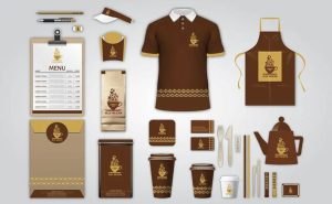
Are you a passionate chef looking to establish a strong brand identity? One of the most crucial elements of branding is a well-designed logo that effectively represents your culinary expertise and unique style. A chef logo not only serves as a visual representation of your brand but also helps to establish trust and recognition among your target audience.
In this comprehensive guide, we will explore various chef logo ideas that can help you create an impressive brand identity. From exploring different design elements to understanding color psychology, we will provide you with valuable insights to guide you in the logo creation process.
Understanding the Importance of a Chef Logo
Before diving into the realm of chef logo ideas, it’s essential to understand why a logo holds such significance for a culinary professional. Here are a few key reasons:
- Brand Recognition: A well-designed chef logo helps your target audience recognize your brand instantly. It becomes a visual representation of your culinary skills and serves as a memorable symbol of your expertise.
- Differentiation: In a competitive industry, a unique chef logo sets you apart from your competitors. It helps establish a distinct identity that reflects your culinary style, values, and overall brand personality.
- Professionalism: A professionally designed logo lends credibility to your culinary business. It conveys a sense of professionalism and expertise, which can be instrumental in attracting potential customers and business opportunities.
Now, let’s explore some creative chef logo ideas that can inspire you to create a logo that truly represents your culinary prowess.
1. Incorporating Culinary Utensils

One of the most common and effective ways to design a chef logo is by incorporating culinary utensils. Utensils such as knives, spoons, forks, or even a combination of them, can instantly convey your profession and culinary expertise. Here are a few ways to utilize culinary utensils in your chef logo:
a. Knife Silhouette
Consider incorporating a knife silhouette as a central element in your logo. A well-designed knife can symbolize precision, expertise, and the artistry involved in crafting delectable dishes. Experiment with different styles, such as a realistic knife illustration or a simplified and abstract representation.
b. Utensil Combination
Another approach is to combine various culinary utensils to create a unique logo design. For example, you can merge a chef’s hat, knife, and fork to create a visually appealing and meaningful logo that directly represents your profession.
2. Showcasing Culinary Ingredients
As a chef, your expertise lies in transforming raw ingredients into delectable dishes. Incorporating culinary ingredients in your logo design can effectively communicate your culinary expertise and create an instant connection with your target audience. Here are a few ways to showcase culinary ingredients in your chef logo:
a. Illustrative Ingredients
Consider incorporating illustrative elements of popular ingredients that are synonymous with your cuisine. For example, if you specialize in Italian cuisine, you might include a tomato, basil leaves, or a garlic bulb in your logo design. These illustrations can be abstract, minimalist, or even realistic, based on your brand’s aesthetic.
b. Abstract Ingredient Shapes
Instead of detailed illustrations, explore the idea of using abstract shapes and forms to represent culinary ingredients. For example, you could use a series of simple geometric shapes to create a visual representation of common ingredients like vegetables, fruits, or spices. This approach adds a modern and artistic touch to your chef logo design.
3. Emphasizing Culinary Elements
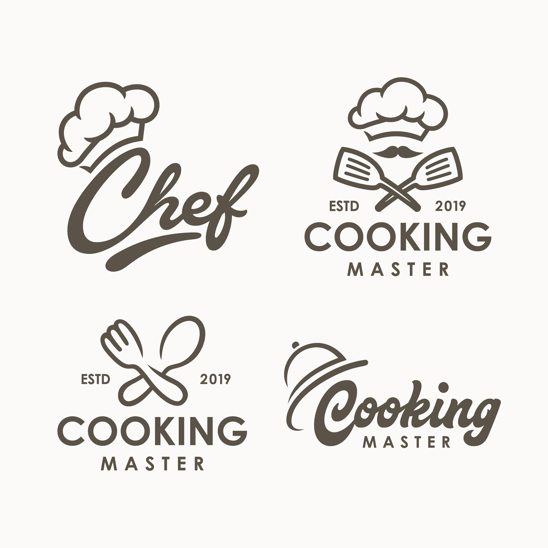
Beyond utensils and ingredients, there are other culinary elements that you can incorporate into your logo design. These elements can help communicate your unique culinary style and create a visual representation of your brand. Here are a few ideas to consider:
a. Flames and Fire
Fire is closely associated with the culinary world, symbolizing passion, heat, and the transformative power of cooking. Incorporating flames or fire in your logo design can capture the essence of your profession and create an impactful visual representation. Experiment with different flame styles, from realistic illustrations to abstract flame shapes.
b. Plate or Platter
Consider incorporating a plate or platter as a central element in your chef logo. This symbolizes the end result of your culinary skills – a beautifully presented dish. A plate or platter can be stylized to match your brand’s aesthetic, whether it’s a classic round plate or a modern and minimalist rectangular platter.
4. Typography and Lettering Styles

Typography plays a crucial role in logo design as it sets the tone and personality of your brand. When selecting a typography style for your chef logo, consider these options:
a. Classic and Elegant
Choose a classic and elegant typography style to portray a sophisticated and refined culinary experience. Serif fonts like Baskerville, Bodoni, or Didot can evoke a sense of tradition and professionalism. This style works well for fine dining establishments or chefs specializing in classic cuisine.
b. Modern and Minimalist
If your culinary style is contemporary and innovative, a modern and minimalist typography style might be more suitable. Sans-serif fonts like Helvetica, Gotham, or Futura can convey a clean, streamlined, and cutting-edge aesthetic. This style works well for chefs focusing on fusion cuisine or experimental culinary techniques.
5. Color Psychology and Palette Selection

Colors play a significant role in creating a visually appealing and meaningful chef logo. Different colors evoke different emotions and can influence how your brand is perceived. Here are a few color palettes and their associated emotions that you can consider for your chef logo:
a. Earthy and Natural
An earthy color palette with shades of brown, green, and beige can convey a sense of naturalness, authenticity, and sustainability. This palette works well for chefs who prioritize locally sourced ingredients or have a farm-to-table philosophy.
b. Bold and Vibrant
If you want to create a logo that exudes energy, passion, and excitement, consider a bold and vibrant color palette. Reds, oranges, and yellows can evoke a sense of warmth, while blues and greens can symbolize freshness and calmness. This palette works well for chefs who specialize in spicy or exotic cuisines.
Conclusion
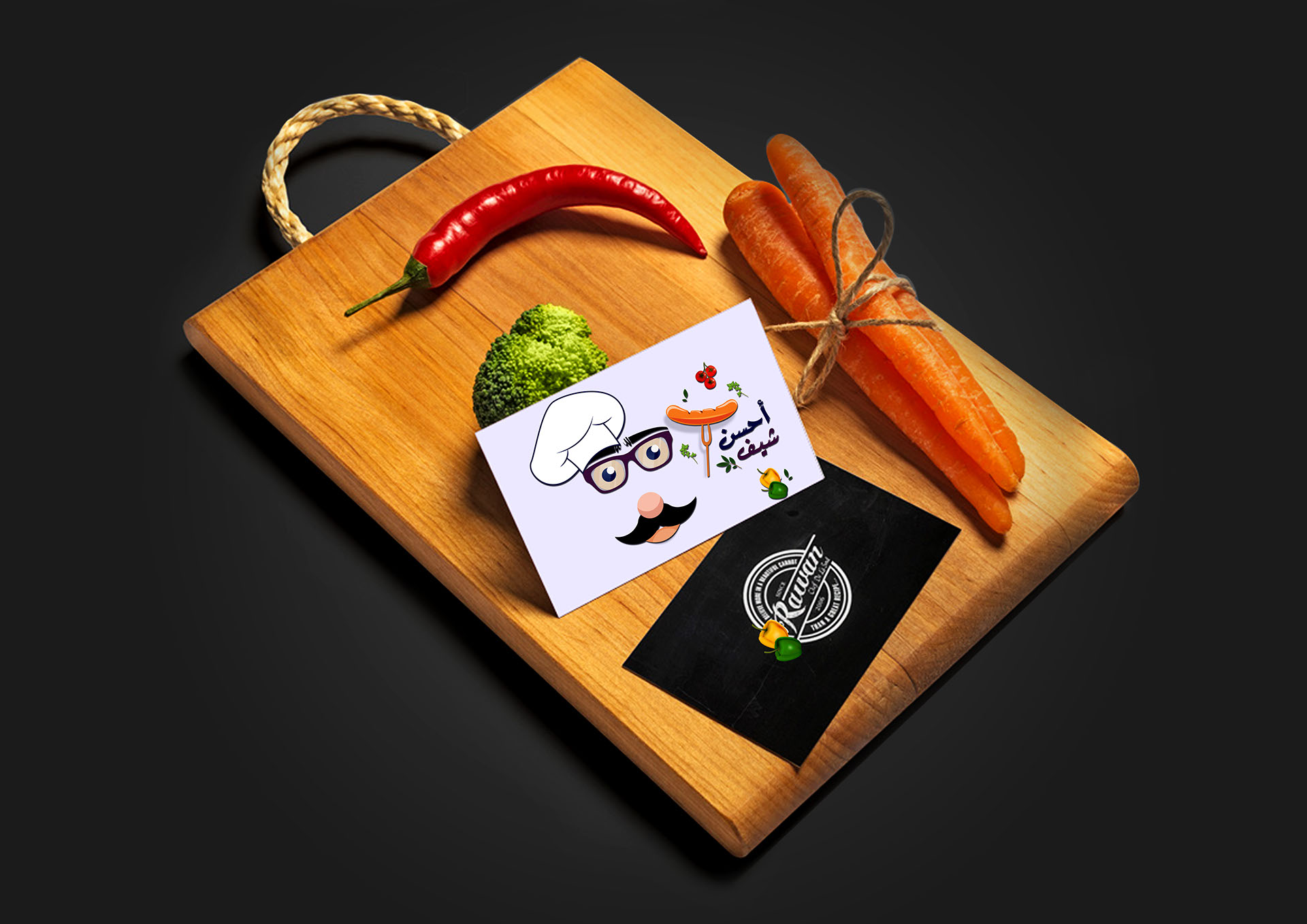
Designing a chef logo that effectively represents your culinary expertise and unique style is essential for establishing a strong brand identity. By incorporating culinary utensils, showcasing ingredients, emphasizing culinary elements, selecting appropriate typography, and utilizing color psychology, you can create a logo that captures the essence of your brand and resonates with your target audience.
Remember, your chef logo should be unique, memorable, and reflective of your brand’s personality. Take inspiration from the chef logo ideas discussed in this comprehensive guide, but don’t hesitate to infuse your creativity and personal touch to create a logo that truly represents your culinary prowess. Happy logo designing!
Marietta Arnold is a branding and design enthusiast who draws inspiration from hobbies like hiking, photography, and art exploration. With a background in graphic design, she shares insights on branding strategies and logo design trends. Stay updated with Marietta’s work for the latest in branding and design.


