Are you looking to create a logo that stands out from the crowd? A circle logo might just be the perfect choice for your brand. Circular logos have a timeless and versatile appeal that can make your company memorable and recognizable. In this article, we will explore various circle logo ideas and provide you with some tips on how to design a logo that truly represents your brand identity.
Why Choose Circle Logos?
Versatility and Timelessness
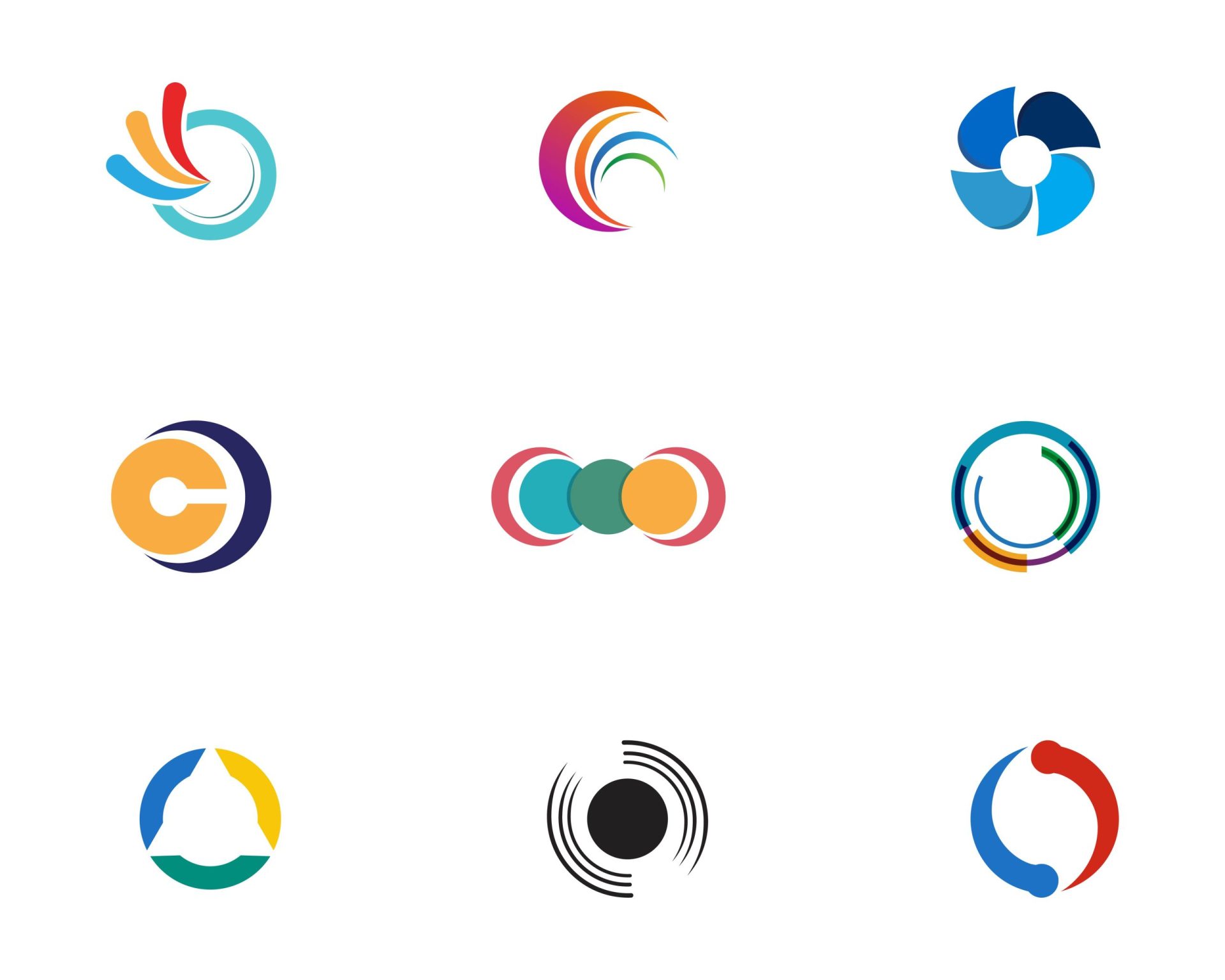
Circle logos have been used for centuries to represent various concepts and organizations. The circular shape is universal and can be adapted to fit any industry or brand. Whether you are a tech startup, a fashion brand, or a nonprofit organization, a circle logo can be tailored to suit your unique needs. The timeless appeal of circular designs ensures that your logo will remain relevant and impactful for years to come.
Symbolic Meaning
The circle is a powerful symbol that represents unity, wholeness, and perfection. It has no beginning or end, suggesting continuity and endless possibilities. By incorporating a circle into your logo design, you can tap into these symbolic meanings and convey a sense of trust, harmony, and balance to your audience.
Circle Logo Design Ideas

Now that we understand the benefits of using a circle logo, let’s explore some creative ideas to inspire your design process.
Minimalistic Circle Logos
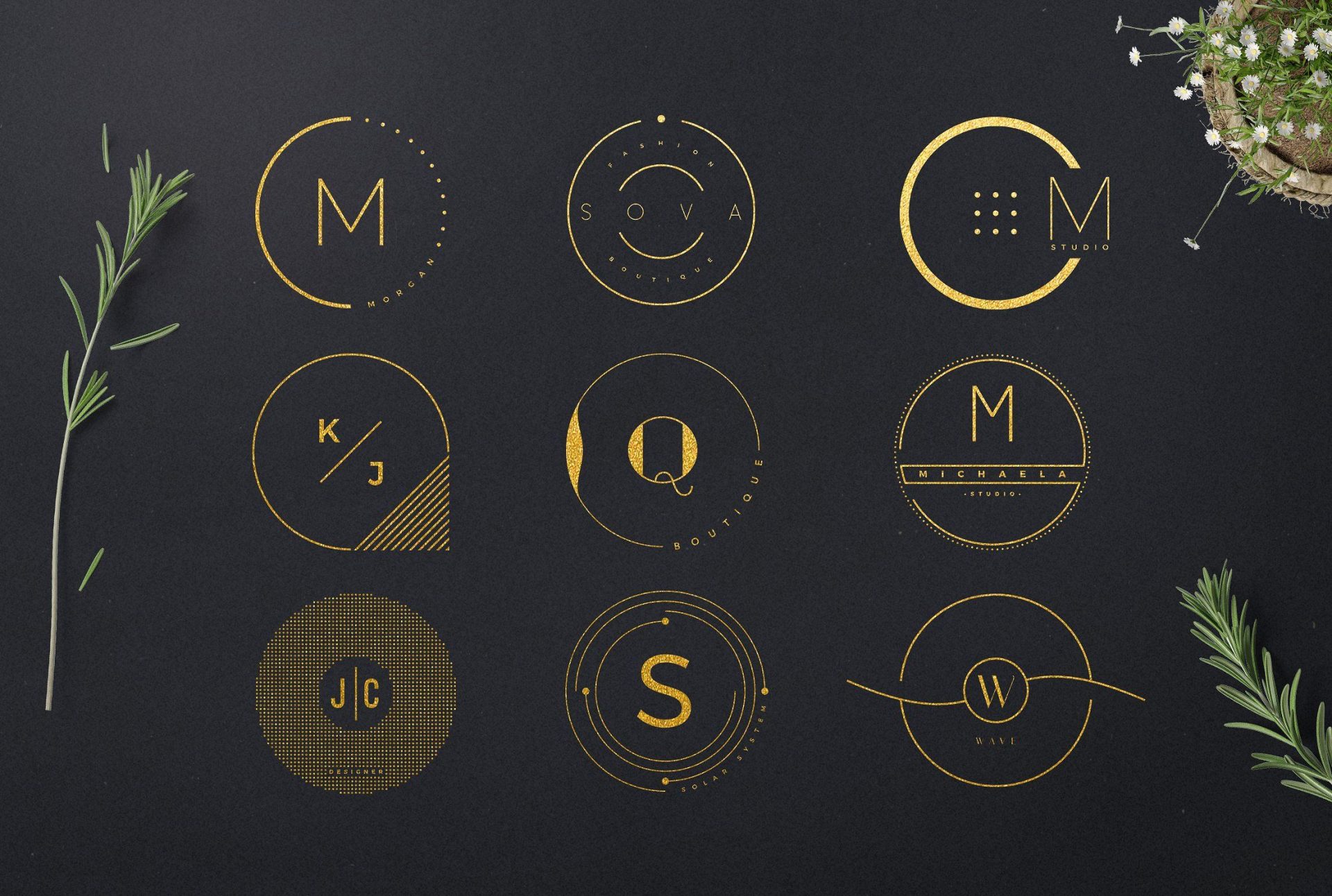
Minimalistic designs have gained popularity in recent years due to their clean and modern aesthetics. A minimalistic circle logo can communicate simplicity, elegance, and sophistication. Consider using bold lines, geometric shapes, and limited color palettes to create a sleek and minimalist logo that instantly catches the eye.
Abstract Circle Logos
If you want to convey a sense of creativity and innovation, consider using abstract circle logos. Abstract designs allow you to experiment with shapes, lines, and colors to create a logo that is unique and visually captivating. By using abstract elements within a circular frame, you can create a logo that sparks curiosity and leaves a lasting impression.
Circle Logos with Typography
Typography can play a crucial role in logo design, and incorporating it into a circle logo can result in a visually striking and memorable brand identity. Experiment with different font styles, sizes, and placements to find the perfect balance between text and visuals. Whether you choose to place the typography inside the circle or around it, make sure it complements the overall design and is easily legible.
Circle Logos with Illustrations
Adding illustrations to your circle logo can help tell a story and evoke emotions. Consider incorporating elements that represent your industry or brand values. For example, if you are a coffee shop, you could include a coffee cup or coffee bean illustration within the circular frame. The key is to choose illustrations that are relevant, recognizable, and visually appealing.
Circle Logos with Negative Space
Negative space is a design technique that uses the empty spaces within a logo to create hidden or secondary visuals. Incorporating negative space into a circle logo can add depth, complexity, and intrigue to your design. This technique can be particularly effective when used to represent dualities or hidden meanings associated with your brand.
Circle Logos with Geometric Patterns
Geometric patterns can add visual interest and a sense of structure to your circle logo. Experiment with different geometric shapes, such as triangles, squares, or hexagons, to create intricate patterns within the circular frame. This approach is well-suited for brands that want to convey precision, reliability, and a sense of order.
Tips for Designing a Circle Logo
Now that you have some inspiration for your circle logo design, it’s time to put those ideas into action. Here are some tips to help you create a logo that effectively represents your brand identity:
1. Research Your Industry and Competitors
Before diving into the design process, it’s essential to research your industry and competitors. This will help you understand the visual language commonly used in your field and ensure your logo stands out from the competition. Look for common design elements, color palettes, and typography choices within your industry, and use that knowledge to create a unique and distinctive logo.
2. Keep It Simple
When designing a circle logo, it’s crucial to keep it simple and avoid clutter. Remember, your logo will often appear in various sizes and formats, so it needs to be easily recognizable and legible at any scale. Avoid using too many details or complex illustrations that may get lost when scaled down. Focus on creating a clean and straightforward design that can be easily understood at a glance.
3. Choose Colors Wisely
Colors play a significant role in logo design, as they can evoke emotions and convey specific brand messages. When selecting colors for your circle logo, consider your brand personality and the emotions you want to evoke in your audience. Use color psychology principles to guide your choices and ensure they align with your brand values.
4. Test Your Logo
Once you have designed your circle logo, it’s essential to test it in various formats and applications. Consider how it will appear on different backgrounds, in different sizes, and in both digital and print formats. Ensure that your logo remains visually appealing and legible across these different platforms.
5. Be Consistent
Consistency is key when it comes to building brand identity. Once you have finalized your circle logo, make sure to use it consistently across all your marketing materials, including your website, social media profiles, business cards, and advertisements. Consistency will help reinforce your brand message and make your logo easily recognizable to your audience.
Conclusion
Circle logos offer a versatile and timeless option for creating a unique and memorable brand identity. By experimenting with different design techniques, such as minimalism, abstract concepts, typography, illustrations, negative space, and geometric patterns, you can create a logo that truly represents your brand values. Remember to research your industry, keep it simple, choose colors wisely, test your logo, and be consistent in its usage. With these tips in mind, you are well on your way to creating a circle logo that sets your brand apart from the competition and leaves a lasting impression on your audience.
Marietta Arnold is a branding and design enthusiast who draws inspiration from hobbies like hiking, photography, and art exploration. With a background in graphic design, she shares insights on branding strategies and logo design trends. Stay updated with Marietta’s work for the latest in branding and design.
