Are you a bakery owner, a cupcake enthusiast, or a graphic designer looking for inspiration to create a captivating cupcake logo? Look no further! In this comprehensive guide, we will explore various cupcake logo ideas that will help you design a sweet and memorable brand identity. From color schemes to typography and iconography, we will cover all the essential elements that will make your cupcake logo stand out from the crowd. So, let’s dive right in!
Importance of a Cupcake Logo

Before we delve into the creative process, let’s understand why a cupcake logo is crucial for your bakery business. A logo serves as the visual representation of your brand and is often the first point of contact for potential customers. A well-designed logo can instantly communicate your bakery’s personality, values, and quality of products. It helps create a lasting impression and sets you apart from competitors. A cupcake logo should be visually appealing, easily recognizable, and evoke a sense of delight and indulgence.
Understanding Your Brand Identity

Before you start brainstorming cupcake logo ideas, it is vital to have a clear understanding of your brand identity. Your logo should align with your bakery’s overall theme, ambiance, and target audience. Ask yourself some key questions:
- What is the unique selling point of your bakery?
- Is your bakery modern and trendy or classic and traditional?
- Who is your target audience? Are you catering to children, adults, or both?
- What emotions or feelings do you want your cupcake logo to evoke?
By answering these questions, you will have a solid foundation to build upon and create a logo that accurately represents your brand.
Color Schemes for Cupcake Logos
Colors play a significant role in logo design, as they have the power to evoke specific emotions and associations. When it comes to cupcake logos, it’s essential to choose colors that are visually appealing, appetizing, and align with your brand identity. Here are some color scheme ideas for cupcake logos:
Pastel Delights
Pastel colors are often associated with sweetness, delicacy, and a whimsical feel. Soft hues like pink, mint green, lavender, and baby blue can create a gentle and inviting atmosphere. Pastel color schemes work well for bakeries that cater to children or have a playful and nostalgic vibe.
Bold and Vibrant
If your bakery has a modern and trendy aesthetic, consider using bold and vibrant colors for your cupcake logo. Bright shades of red, orange, yellow, or electric blue can create a visually striking and energetic impression. These colors are perfect for attracting attention and conveying a sense of excitement.
Elegant Neutrals
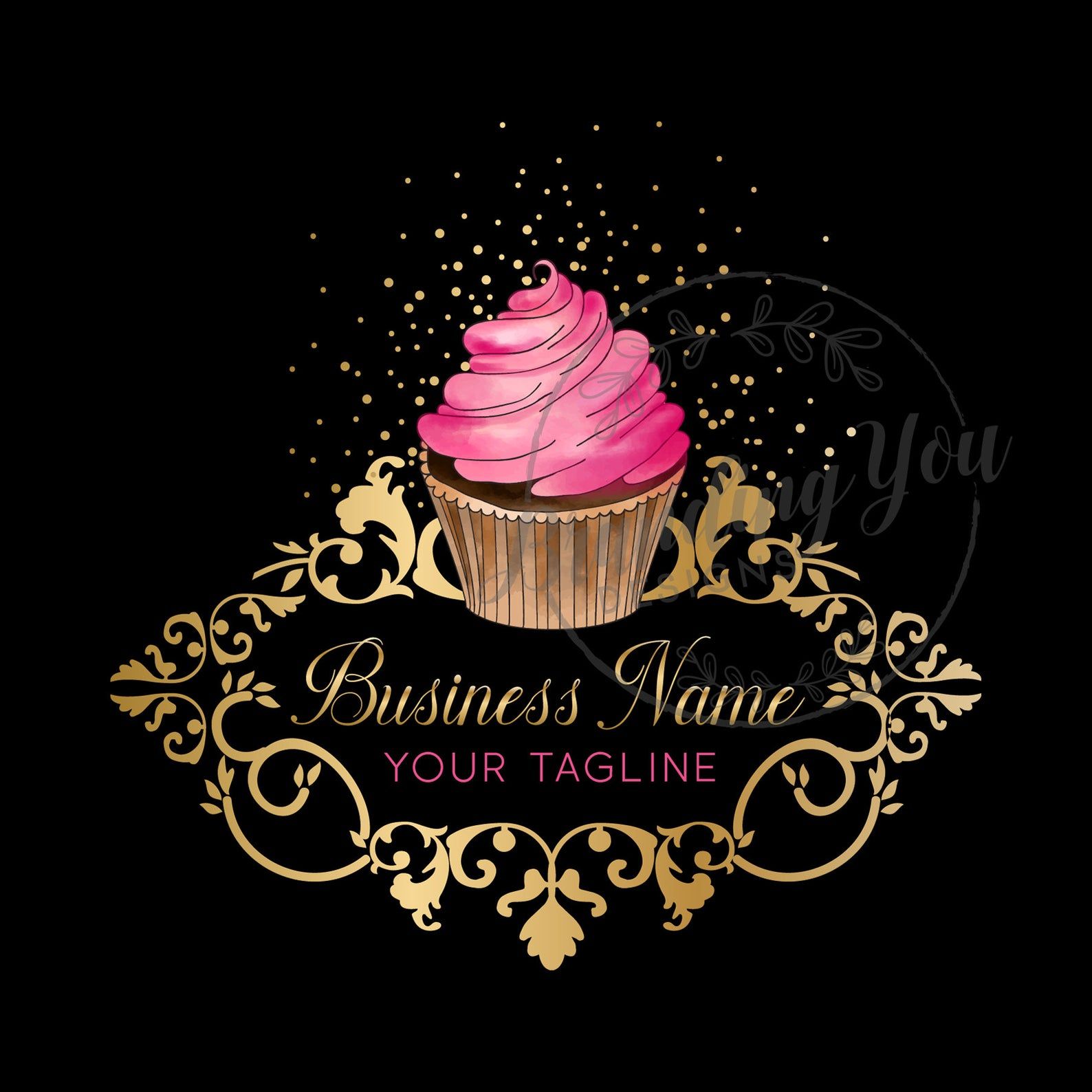
For a more sophisticated and upscale bakery, opt for an elegant neutral color scheme. Shades of beige, ivory, taupe, or metallic tones like gold or silver can create a luxurious and refined look. Neutrals are versatile and can work well with various design styles, allowing your logo to exude elegance and glamour.
Typography Choices for Cupcake Logos
Choosing the right typography is crucial when designing a cupcake logo as it sets the tone and personality of your brand. Here are some typography choices to consider:
Handwritten Fonts
Handwritten fonts can add a personal and artisanal touch to your cupcake logo. They can evoke a sense of warmth, creativity, and homemade goodness. Consider using calligraphy or script fonts that mimic the fluid strokes of a pastry chef’s pen. They can be combined with other font styles to create a harmonious and unique logo.
Playful and Whimsical Fonts
If your bakery caters to children or has a playful theme, consider using whimsical fonts for your cupcake logo. These fonts often have exaggerated or irregular letterforms that convey a sense of fun and imagination. Comic Sans, Chalkduster, or KG Happy can all be great choices to capture the attention of young customers.
Elegant and Serif Fonts
Serif fonts are known for their timeless elegance and sophistication. They can be a great choice for bakeries that aim to convey a classic and refined image. Fonts like Times New Roman, Baskerville, or Garamond can add a touch of sophistication to your cupcake logo while maintaining readability.
Iconography: Adding Sweet Elements to Your Logo

Incorporating relevant iconography in your cupcake logo can give it a distinctive touch and make it instantly recognizable. Here are some sweet elements you can consider:
Cupcake Illustrations
Including a cupcake illustration in your logo is a straightforward and effective way to communicate your bakery’s main offering. You can choose to depict a realistic cupcake, a stylized version, or an abstract representation. Experiment with different shapes, colors, and toppings to find the perfect cupcake illustration that matches your brand identity.
Baking Utensils
Another option is to incorporate baking utensils like a whisk, rolling pin, or spatula into your cupcake logo. These elements can signify the expertise and craftsmanship that goes into creating your delicious cupcakes. They also add a touch of authenticity and professionalism to your brand.
Nature-Inspired Elements
If your bakery focuses on using natural and organic ingredients, consider incorporating nature-inspired elements in your logo. Leaves, flowers, fruits, or grains can add a fresh and wholesome feel to your cupcake logo. These elements can also convey a sense of sustainability and eco-friendliness.
Keeping It Simple: Minimalist Cupcake Logos
In logo design, simplicity often reigns supreme. A minimalist cupcake logo can be just as impactful and memorable as a more intricate design. The key is to distill the essence of a cupcake into its simplest form. Consider using geometric shapes, negative space, or monoline illustrations to create a minimalist cupcake logo that leaves a lasting impression.
Test and Refine Your Cupcake Logo
Once you have designed your cupcake logo, it’s essential to test its effectiveness before finalizing it. Show your logo to friends, family, or target customers and gather their feedback. Does it accurately represent your brand? Does it evoke the desired emotions? Is it memorable and easily recognizable?
Based on the feedback received, make necessary adjustments and refinements to ensure your cupcake logo truly reflects your bakery’s identity. Remember, a logo is not set in stone, and it can evolve over time as your business grows and changes.
Conclusion
Designing a cupcake logo that stands out requires careful consideration of various elements, including color schemes, typography, and iconography. By understanding your brand identity and target audience, you can create a visually appealing and memorable logo that represents your bakery’s unique personality. Experiment with different cupcake logo ideas, seek feedback, and refine your design until you achieve a logo that leaves a sweet and lasting impression. So, grab your sketchbook or fire up your design software and let your creativity flow!
Marietta Arnold is a branding and design enthusiast who draws inspiration from hobbies like hiking, photography, and art exploration. With a background in graphic design, she shares insights on branding strategies and logo design trends. Stay updated with Marietta’s work for the latest in branding and design.
