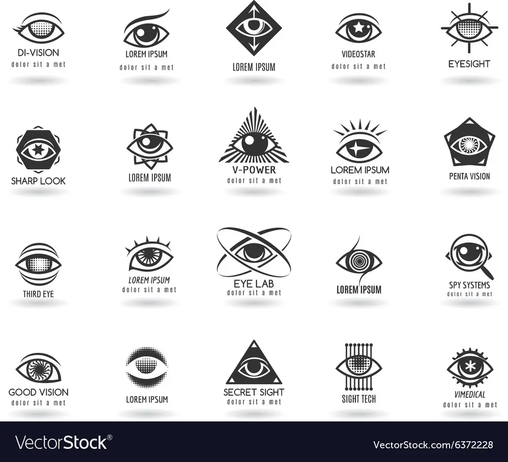
Are you looking for eye-catching logo design ideas that will captivate your audience? Look no further! In this article, we will explore a variety of innovative and visually appealing eye logo designs to inspire your creativity. Whether you are designing a logo for an optometry clinic, an eyewear brand, or any other business related to vision, these ideas will help you create a compelling visual identity that stands out from the competition. So, let’s dive in and explore the world of eye logo design!
1. The Classic Eye

The classic eye logo design is timeless and instantly recognizable. It features a simple and elegant representation of an eye, often using basic geometric shapes such as circles or ovals. This design approach is versatile and can be adapted to suit various industries. Consider using a sleek and minimalistic style for a modern and sophisticated look, or opt for a more playful and colorful design for a youthful and vibrant brand image.
2. Abstract Eye

If you want to add a touch of creativity and intrigue to your logo, consider exploring abstract eye designs. These designs aim to capture the essence of the eye while using unconventional shapes, lines, and patterns. Abstract eye logos can convey a sense of mystery and artistic flair, making them an excellent choice for creative industries such as art galleries or design studios.
3. Eye and Nature
Combining the eye symbol with elements of nature can create a visually striking logo design. The incorporation of leaves, flowers, or other natural elements around the eye can evoke a sense of freshness, growth, and harmony. This type of design is particularly suitable for eco-friendly brands, organic food stores, or businesses focused on wellness and natural products.
4. Eye and Technology

For tech-related businesses, integrating the eye symbol with technology-inspired elements can result in a logo that reflects innovation and progress. Consider incorporating circuit board patterns, pixels, or futuristic lines and shapes to create a visually captivating logo that resonates with your target audience.
5. Eye and Animals
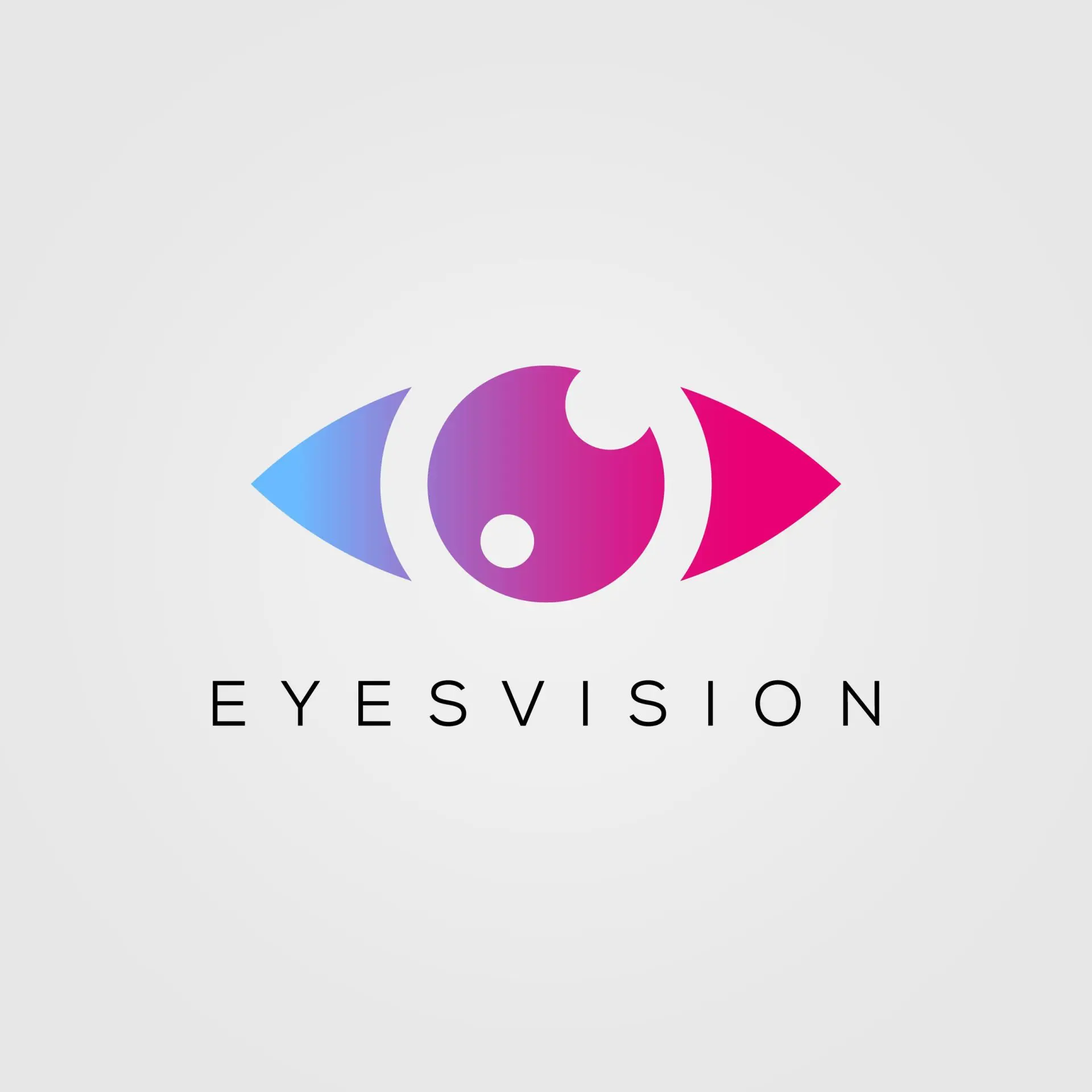
Integrating the eye symbol with animal imagery can be a powerful way to communicate specific brand attributes. Different animals can evoke different emotions and associations. For example, incorporating a lion’s eye in your logo can symbolize strength and leadership, while a bird’s eye may represent freedom and vision. Choose an animal that aligns with your brand values and resonates with your target audience.
6. Eye and Typography
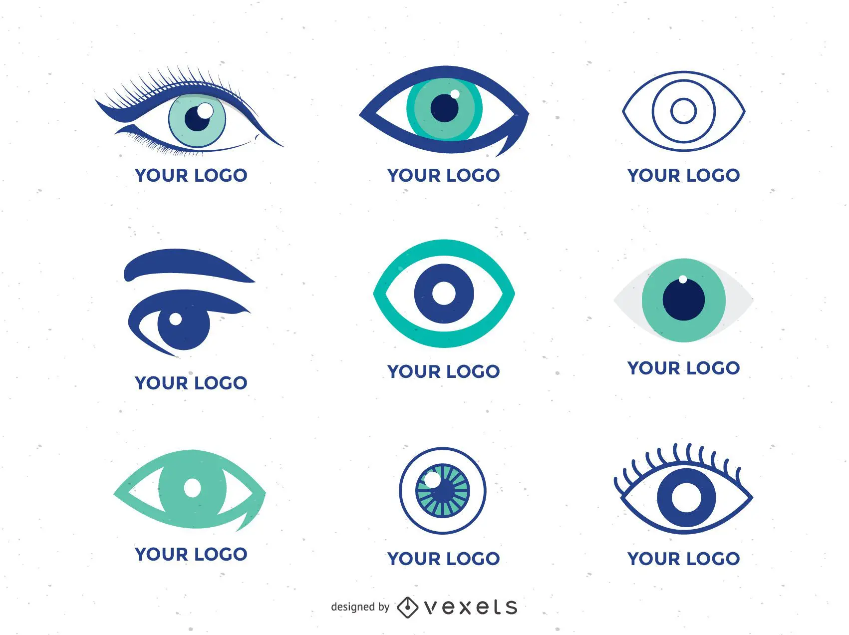
Combining the eye symbol with creative typography can result in a logo that stands out and leaves a lasting impression. Experiment with different fonts, letter spacing, and alignments to create a unique and visually appealing design. This approach works well for businesses in the fashion industry, beauty salons, or any brand that wants to convey elegance and style.
7. Eye and Geometric Shapes

Geometric shapes are a popular trend in logo design due to their simplicity and visual impact. By combining the eye symbol with geometric shapes such as triangles, squares, or hexagons, you can create a logo that is both modern and visually appealing. This approach works well for businesses in the tech industry, architecture firms, or any brand that wants to convey a sense of precision and structure.
8. Eye and Negative Space
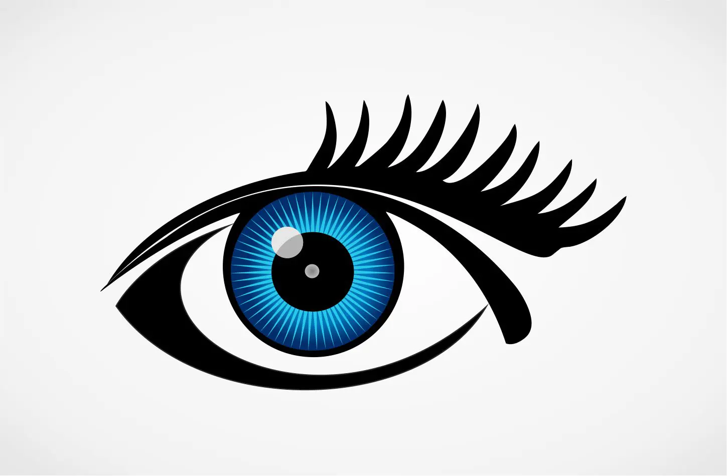
Utilizing negative space in logo design can create a clever and visually intriguing effect. Experiment with incorporating the eye symbol using negative space techniques, where the eye is formed by the absence of shapes or lines within the logo. This approach can add an element of surprise and make your logo more memorable. It works particularly well for brands in the creative industry or those seeking a unique and artistic look.
9. Eye and Color Psychology
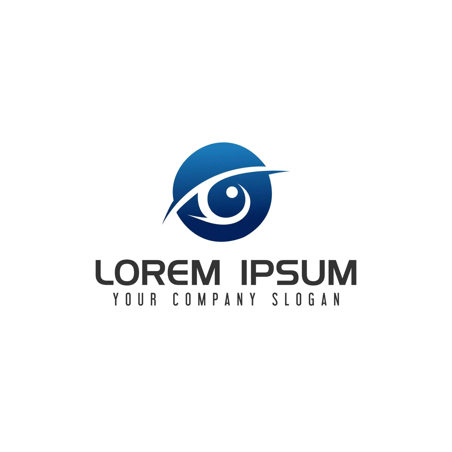
Colors play a crucial role in logo design as they evoke emotions and convey brand messaging. When designing an eye logo, consider the psychological impact of different colors and choose hues that align with your brand identity. For example, blue evokes trust and reliability, while green represents growth and nature. Use color strategically to enhance the impact and effectiveness of your eye logo design.
10. Eye and Symbolism
Incorporating symbolic elements in your eye logo design can add depth and meaning to your brand identity. Symbols such as arrows, keys, or stars can convey specific messages or values associated with your business. Take the time to research and choose symbols that resonate with your target audience and align with your brand’s philosophy.
Conclusion
Designing an eye-catching logo that effectively represents your business can be an exciting and creative process. By exploring different ideas and design approaches, you can create a logo that captures the attention of your target audience and leaves a lasting impression. Whether you opt for a classic eye design, an abstract interpretation, or a combination of elements, remember to keep your brand values and target audience in mind. So, let your creativity soar and design an eye logo that truly reflects your brand’s vision!
Angela Irwin is a branding and design enthusiast with a Bachelor of Fine Arts in Graphic Design from Meadowbrook College. As a writer at Logocreator.io, she shares her expertise on logo design, graphic trends, and effective branding strategies, helping businesses create impactful visual identities.
