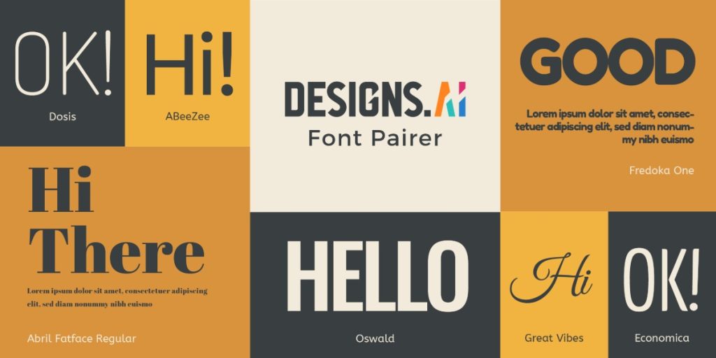
Are you looking for a way to make your logo stand out? Choosing the right font pairing can make all the difference. With so many font options available, it can be overwhelming to know where to start. That’s where Fontpair comes in.
Fontpair is a website that offers free, curated font pairings to use for your next design project. With categories such as Sans-Serif, Serif, Slab, Monospace, Display, and Handwriting, you can easily find the perfect combination to fit your brand’s personality. By using Fontpair’s suggested pairings, you can create a cohesive and professional look for your logo design.
Font pairing is an essential tool in logo design. The right pairing can create a visual hierarchy, convey a particular mood or idea, and create a sense of contrast that lends a certain personality to your brand’s design. But with so many font options available, it can be challenging to know which ones to use. In this article, we’ll explore how Fontpair can help you find the perfect font pairing for your logo design and provide some of our favorite pairings to inspire you.
Basics of Font Pairing
Font pairing is the process of selecting two or more fonts that complement each other and work well together in a design. The right font pairing can enhance the overall visual appeal of a logo and make it more memorable. Here are some basic tips to keep in mind when pairing fonts for your logo design:
1. Contrast is Key
When pairing fonts, it’s important to choose fonts that have contrasting styles. For example, pairing a bold, sans-serif font with a delicate, script font can create a visually appealing contrast that draws the eye. Similarly, pairing a serif font with a sans-serif font can create a nice balance between the two styles.
2. Stick to a Maximum of Three Fonts
While it can be tempting to experiment with multiple fonts, it’s generally best to stick to a maximum of three fonts in your logo design. Using too many fonts can make your design look cluttered and unprofessional. Instead, focus on selecting two or three fonts that work well together and use them consistently throughout your design.
3. Consider Legibility
While it’s important to choose fonts that look visually appealing together, it’s equally important to choose fonts that are easy to read. Make sure that the fonts you choose are legible at different sizes and on different backgrounds. Avoid using overly decorative or complex fonts that may be difficult to read, especially at smaller sizes.
4. Use Font Pairing Tools
If you’re struggling to find the right font pairing for your logo design, there are several online tools that can help. Font pairing tools like Fontjoy and Canva’s Font Combinations Generator can suggest font pairings based on the style and mood you’re trying to convey. These tools can be a great starting point for your font pairing journey.
By keeping these basic tips in mind, you can create a visually appealing and memorable logo design with complementary font pairings.
Logo Design Essentials
When designing a logo, there are certain key elements that you need to keep in mind to ensure that your logo is effective and memorable. Here are some essential logo design tips to help you create a logo that stands out:
1. Simplicity is Key
One of the most important aspects of logo design is simplicity. A simple logo is easier to recognize and remember than a complex one. Keep your logo design clean and uncluttered, and use simple shapes and typography to create a memorable logo.
2. Use Appropriate Typography
Typography is a crucial element of logo design, and it’s important to choose the right font to convey the right message. Serif fonts are more traditional and formal, while sans-serif fonts are more modern and informal. Choose a font that matches the personality of your brand.
3. Consider Color Psychology
Colors have a powerful impact on our emotions and perceptions, and it’s important to choose the right colors for your logo. Red is associated with passion and excitement, while blue is associated with trust and reliability. Consider the emotions you want your logo to evoke when choosing your colors.
4. Make it Scalable
Your logo will be used in a variety of different sizes and formats, so it’s important to design it in a way that is scalable. Make sure your logo looks just as good in a small size as it does in a large size.
5. Ensure it’s Memorable
Finally, your logo should be memorable and easily recognizable. Use unique and distinctive elements in your design to make your logo stand out from the crowd. A memorable logo will help your brand stick in people’s minds and increase brand recognition.
By keeping these logo design essentials in mind, you can create a logo that effectively represents your brand and helps you stand out from the competition.
The Role of Font Pair in Logo Design
When it comes to logo design, choosing the right font pair can make all the difference. Fonts are a crucial element in creating a brand’s identity, and pairing them correctly can help convey the right message to your audience.
Here are some reasons why font pairing is important in logo design:
1. Establishes Visual Hierarchy
One of the main reasons to use font pairing in logo design is to establish a visual hierarchy. By using two different fonts, you can create contrast and make certain elements stand out. For instance, you can use a bold, sans-serif font for the main text and a cursive, script font for the tagline. This helps draw the eye to the most important information.
2. Conveys Brand Personality
Fonts can also convey a brand’s personality. For example, a bold, modern font might be used for a tech company, while a more traditional, serif font might be used for a law firm. By choosing the right font pair, you can create a specific mood or feeling that aligns with your brand’s identity.
3. Enhances Readability
Another important consideration when choosing font pairs for a logo is readability. The fonts you choose should be legible and easy to read, even at small sizes. This is especially important if your logo will be used in various contexts, such as on a website or business card.
In conclusion, font pairing plays a critical role in logo design. By choosing the right fonts and pairing them correctly, you can create a logo that effectively communicates your brand’s identity and resonates with your audience.
Choosing the Right Font Pair
Choosing the right font pair is essential when designing a logo. It can make or break the overall look and feel of your design. Here are a few tips to help you choose the right font pair for your next logo design project.
Consider Your Brand Personality
The first thing you should consider when choosing a font pair is your brand personality. Think about the message you want to convey and the emotions you want your logo to evoke. Are you a modern and edgy brand, or are you more traditional and classic? Once you have a clear understanding of your brand personality, you can start to narrow down your font choices.
Contrast is Key
Contrast is key when it comes to font pairing. You want to choose fonts that complement each other, but also have enough contrast to create visual interest. A good rule of thumb is to pair a serif font with a sans-serif font, or a script font with a bold sans-serif font.
Keep it Simple
When it comes to font pairing, less is often more. Stick to two fonts at most to avoid overwhelming your design. If you want to add more visual interest, consider using different weights or styles of the same font.
Test, Test, Test
Before finalizing your font pair, make sure to test it in different sizes and formats. Your logo will be used in a variety of applications, so it’s important to make sure it looks good in all of them. Test your font pair on a business card, website, and social media profile to make sure it looks great in all formats.
By following these tips, you can choose the right font pair for your logo design project and create a design that accurately reflects your brand personality.
Influence of Font Pair on Brand Identity
Choosing the right font pair is crucial when it comes to creating a brand identity. The fonts you choose for your logo and other marketing materials will influence how your audience perceives your brand. In this section, we will discuss how font pairs can affect your brand personality and recognition.
Brand Personality
The font pair you choose can convey a specific personality for your brand. For example, a bold and modern font pair can give your brand a contemporary and innovative personality. On the other hand, a classic serif font pair can give your brand a timeless and sophisticated personality.
When selecting a font pair, it is essential to consider the personality you want to convey for your brand. Think about your target audience and the values you want to communicate. A font pair that aligns with your brand personality will help you create a consistent and cohesive brand identity.
Brand Recognition
Font pairs can also play a significant role in brand recognition. A font pair that is unique and memorable can help your brand stand out from the competition. Consistency in font usage across all marketing materials can also help build brand recognition.
When selecting a font pair, it is essential to consider its legibility and scalability. A font pair that is easy to read and can be scaled without losing quality will ensure that your brand is recognizable across all platforms and mediums.
In conclusion, the font pair you choose can influence how your brand is perceived by your audience. It is essential to select a font pair that aligns with your brand personality and promotes brand recognition.
Popular Font Pair Examples in Logo Design
When it comes to logo design, choosing the right font pair is crucial. A good font pairing can make your logo stand out and convey the right message to your audience. Here are some popular font pair examples in logo design that you can consider for your next project:
1. Montserrat + Lato
Montserrat and Lato are two popular fonts that work well together in logo design. Montserrat is a geometric sans-serif font that has a strong presence, while Lato is a humanist sans-serif font that is easy to read. The combination of these two fonts creates a modern and professional look that is perfect for any business.
2. Proxima Nova + Open Sans
Proxima Nova and Open Sans are two versatile fonts that can be used in a variety of logo designs. Proxima Nova is a modern sans-serif font that has a clean and elegant look, while Open Sans is a humanist sans-serif font that is easy to read. The combination of these two fonts creates a balanced and harmonious look that is perfect for any brand.
3. Playfair Display + Source Sans Pro
Playfair Display and Source Sans Pro are two fonts that work well together in logo design. Playfair Display is a serif font that has a classic and elegant look, while Source Sans Pro is a sans-serif font that is easy to read. The combination of these two fonts creates a sophisticated and timeless look that is perfect for luxury brands.
4. Roboto + Merriweather
Roboto and Merriweather are two popular fonts that work well together in logo design. Roboto is a modern sans-serif font that has a clean and minimalist look, while Merriweather is a serif font that has a classic and elegant look. The combination of these two fonts creates a balanced and versatile look that is perfect for any brand.
5. Proxima Nova + Futura
Proxima Nova and Futura are two fonts that work well together in logo design. Proxima Nova is a modern sans-serif font that has a clean and elegant look, while Futura is a geometric sans-serif font that has a strong presence. The combination of these two fonts creates a bold and modern look that is perfect for tech and creative brands.
Remember, choosing the right font pair for your logo design is important, but it’s not the only factor that matters. You should also consider the color scheme, layout, and overall message that you want to convey to your audience. By combining the right font pair with other design elements, you can create a logo that is unique, memorable, and effective.
Mistakes to Avoid in Font Pair Selection
Choosing the right font pair can make or break your logo design. Here are some common mistakes to avoid when selecting font pairs for your logo:
Neglecting to Test Fonts in Context
One of the most common mistakes in font pairing for logo design is neglecting to test the fonts in context. It’s important to keep in mind that fonts can look drastically different when used in a design, making it necessary to test your font pairings in the actual context of your logo.
Pairing Fonts That Are Too Similar
Pairing fonts that are too similar can cause conflict and confusion. While it may seem like a safe choice to pair fonts that look similar, it can actually make your logo look bland and uninteresting. Instead, try pairing fonts that have contrasting styles or weights to create visual interest and hierarchy in your logo design.
Using Too Many Fonts
Using too many fonts in your logo can make it look cluttered and unprofessional. It’s best to stick to a maximum of two or three fonts in your logo design to keep it clean and cohesive.
Ignoring Readability
While it’s important to choose fonts that look visually appealing, it’s equally important to prioritize readability. Make sure your font pairings are easy to read and don’t cause eye strain.
Forgetting Brand Consistency
Your logo is a representation of your brand, so it’s important to choose font pairings that align with your brand identity and values. Make sure your font choices are consistent with your brand’s overall aesthetic and messaging.
By avoiding these common font pairing mistakes, you can create a logo design that is visually appealing, professional, and reflective of your brand identity.
Useful Tools for Font Pairing
When it comes to designing a logo, choosing the right font pairing can make all the difference. Luckily, there are many useful tools available online to help make the process easier. Here are a few of our favorites:
Font Pair
Font Pair is a great way to find pairing fonts based on a series of filters, including sans serif, serif, and cursive. It is a very useful tool for any designer and it will definitely help with the designing process when it comes to matching fonts to the overall look of your design.
Fontpair
Fontpair is a curated collection of free, beautiful fonts and font pairings. It offers a wide range of font categories to choose from, including Sans-Serif, Serif, Slab, Monospace, and Display. With Fontpair, you can easily find the perfect font pairing for your logo design.
Google Fonts
Google Fonts is a free font library that offers a wide range of fonts to choose from. It also provides a tool that allows you to test different font pairings to see how they look together. This is a great resource for designers who want to experiment with different font combinations.
Canva
Canva is a graphic design platform that offers a wide range of tools and resources for designers. One of its features is a font pairing tool that allows you to choose from a variety of font combinations for your logo design. This is a great option for designers who want to create a professional-looking logo without spending a lot of time on the design process.
Adobe Fonts
Adobe Fonts is a subscription-based font library that offers a wide range of fonts to choose from. It also provides a tool that allows you to test different font pairings to see how they look together. This is a great resource for designers who want access to a wide range of high-quality fonts.
Overall, there are many useful tools available for font pairing when it comes to logo design. Whether you choose to use a free tool like Font Pair or a subscription-based library like Adobe Fonts, these tools can help you create a professional-looking logo that reflects your brand’s personality and style.
Conclusion
Congratulations! You now have all the tools you need to create a stunning logo design with the perfect font pairing. Remember, font pairing is a crucial element in creating a professional and cohesive design.
Here are some key takeaways to keep in mind:
- Choose fonts that complement each other, rather than clash.
- Use contrasting font styles to create visual interest and hierarchy.
- Consider the mood and tone you want to convey with your logo, and choose fonts accordingly.
- Don’t be afraid to experiment with different combinations until you find the perfect match.
By following these guidelines and using the resources available, you can create a logo that truly represents your brand and stands out from the competition. So go forth and design with confidence!
Angela Irwin is a branding and design enthusiast with a Bachelor of Fine Arts in Graphic Design from Meadowbrook College. As a writer at Logocreator.io, she shares her expertise on logo design, graphic trends, and effective branding strategies, helping businesses create impactful visual identities.


