Creating a strong brand identity is crucial for any foundation or organization. One of the key elements of a brand identity is a well-designed logo that effectively communicates the values and mission of the foundation. In this article, we will explore various foundation logo ideas and provide you with valuable insights to help you create a memorable logo that resonates with your target audience. So, let’s dive in!
The Importance of a Foundation Logo

A foundation logo serves as the face of your organization, representing its values, mission, and goals. It is the visual representation that people will associate with your foundation, and it plays a significant role in creating brand recognition and recall.
A well-designed foundation logo can:
- Establish Trust: A professional and visually appealing logo helps build credibility and trust in your foundation. It creates a positive first impression and conveys that you are a reputable organization.
- Differentiate: A unique and distinctive logo helps your foundation stand out from the crowd. It sets you apart from competitors and helps people remember your organization.
- Convey Purpose: A carefully crafted logo can effectively communicate the purpose and mission of your foundation, making it easier for people to understand what you stand for.
Now that we understand the importance of a foundation logo, let’s explore some creative ideas to inspire your design.
1. Incorporate Symbolism

Symbols can be a powerful tool to convey meaning and evoke emotions. Consider incorporating symbols that are relevant to your foundation’s mission or cause. For example, if your foundation focuses on environmental conservation, you could use elements like leaves, trees, or animals to represent nature.
2. Utilize Typography
Typography plays a crucial role in logo design. It helps convey the personality and tone of your foundation. Experiment with different fonts to find the one that aligns with your brand identity. Bold and modern fonts can convey strength and innovation, while elegant and script fonts can communicate sophistication and elegance.
3. Play with Colors

Colors have a significant impact on how people perceive and remember brands. Choose colors that align with your foundation’s mission and evoke the desired emotions. For example, blue can convey trust and stability, while green represents nature and sustainability. Avoid using too many colors as it can make your logo look cluttered and confusing.
4. Emphasize Simplicity
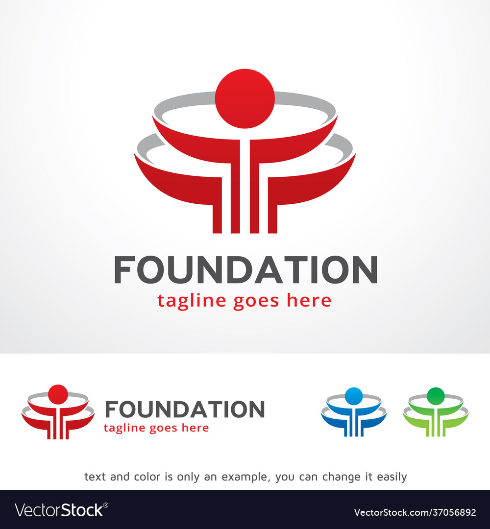
In the world of logo design, simplicity is key. A simple and clean logo is more memorable and versatile across various platforms. Avoid overcrowding your logo with unnecessary elements or details. Remember, less is often more when it comes to creating a strong foundation logo.
5. Consider Negative Space
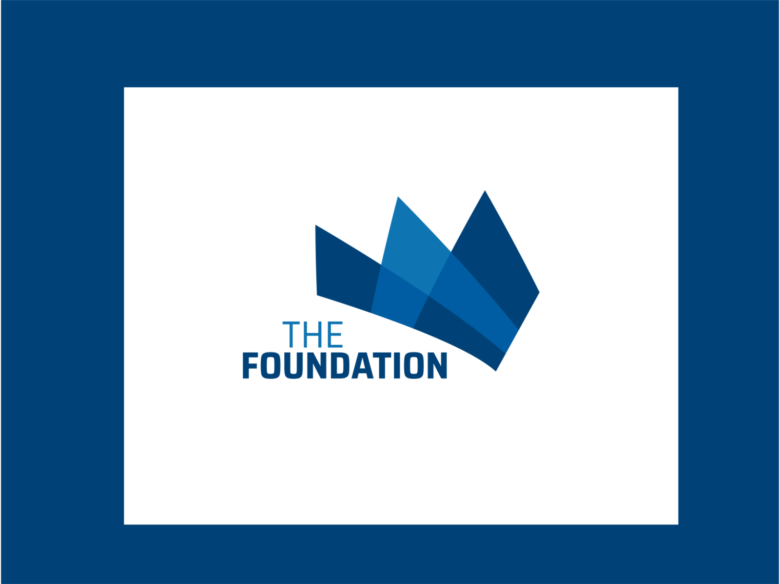
Negative space refers to the empty space around and between elements in a design. Utilizing negative space cleverly can create hidden meanings and add depth to your logo. It not only makes your logo visually appealing but also allows your audience to discover hidden messages within the design.
6. Seek Inspiration from Successful Foundations

Researching successful foundations in your industry can provide valuable inspiration for your logo design. Analyze their logos and identify the elements that make them successful. While you should never copy someone else’s logo, gaining insights from successful designs can help you understand what works well in your industry.
7. Test Your Logo Design
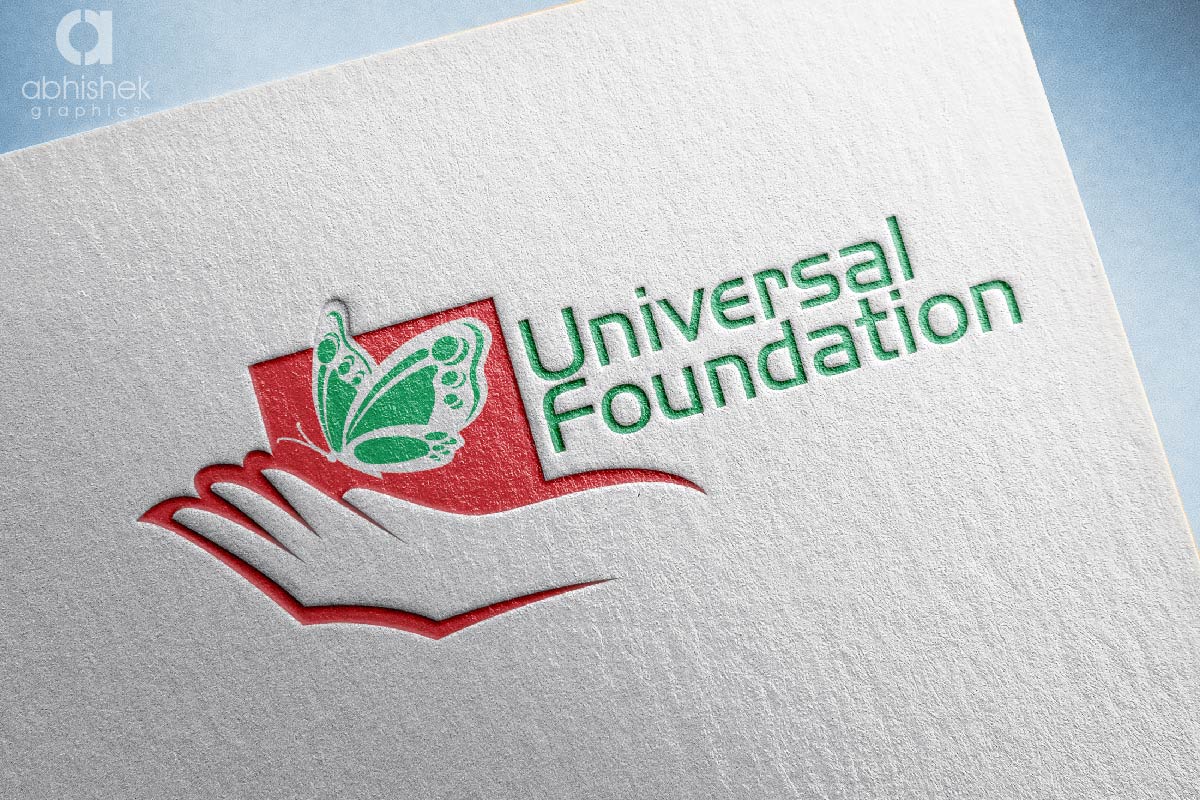
Once you have a few logo ideas, it’s essential to test them before finalizing your design. Share your designs with a focus group or gather feedback from your target audience. This will help you understand how well your logo resonates with your intended audience and if any improvements or adjustments are needed.
8. Hire a Professional Designer

If you’re not confident in your design skills or want to ensure a polished and professional result, consider hiring a professional logo designer. They have the expertise and experience to create a logo that aligns with your foundation’s vision and effectively communicates your brand identity.
9. Ensure Scalability

Your foundation logo will be used across various platforms and mediums, from websites to promotional materials. It’s crucial to ensure that your logo is scalable and looks good at different sizes. A logo that is too intricate may lose its impact when scaled down, so it’s important to test its readability and clarity at different sizes.
10. Stay Consistent

Consistency is key when it comes to brand identity. Once you have your foundation logo, ensure that it is consistently used across all your communication channels. This includes your website, social media profiles, email signatures, and any other platforms where your foundation is represented. Consistency helps build brand recognition and reinforces your foundation’s identity.
Conclusion

Designing a foundation logo requires careful thought and consideration. It should effectively represent your organization’s mission, values, and goals while resonating with your target audience. By incorporating symbolism, utilizing typography, playing with colors, emphasizing simplicity, and considering negative space, you can create a memorable and impactful logo for your foundation. Remember to test your design, seek inspiration, and stay consistent to establish a strong brand identity that will leave a lasting impression.
Barry Edwards is a digital marketing expert with a deep understanding of content strategy, logo, and branding principles. Holding a Bachelor’s degree in Marketing from Beaconhill College, he offers valuable insights on digital marketing trends and strategies through his writing. Follow Barry’s work to stay updated on the latest in online marketing and branding.

