Are you curious about the iconic Google logo? It’s hard to imagine a world without Google, but have you ever stopped to think about the history and evolution of their logo? The Google logo has become one of the most recognizable logos in the world, and it has undergone a number of changes since its inception in 1998.
The Google logo has come a long way since its original design, which was created by Google co-founder Sergey Brin using GIMP. Over the years, the logo has been updated and refined to better reflect the company’s values and mission. In 2015, Google unveiled its latest logo, which features a simpler, more modern design. The new logo was designed to be more versatile and work better across a variety of platforms and devices.
Whether you’re a long-time user of Google or a newcomer to the search engine, learning about the history and evolution of the Google logo is a fascinating journey. From its humble beginnings to its current status as a global brand, the Google logo has become an integral part of our daily lives. So sit back, relax, and prepare to take a trip down memory lane as we explore the history of the Google logo.
Creation of Google Logo
If you’ve ever used Google, you’re familiar with the colorful logo that appears on the search engine’s homepage. But did you know that the logo has undergone several changes over the years? Let’s take a look at the creation of the Google logo, from its initial design to its evolutions over the years.
Initial Design
The first Google logo was created in 1998 by co-founder Sergey Brin using GIMP, a free image editor. The design was simple and unpolished, featuring the word “Google” in blue letters with a yellow exclamation point. The exclamation point was later removed, and the font was changed to a more modern, sans-serif style.
Evolutions Over the Years
Since its creation, the Google logo has undergone several evolutions. Here are some of the most significant changes:
- In 1999, the logo was updated to feature a more colorful design with a shadow effect.
- In 2010, the logo was given a 3D effect with shading and highlights.
- In 2013, the logo was flattened and simplified, featuring a more modern, sans-serif font.
- In 2015, the logo was updated with a new, flatter design and brighter colors.
Today, the Google logo is one of the most recognizable global brands ever created. Its clever refinements over the last two decades have made it an iconic symbol of the internet age.
Significance of Google Logo
The Google logo is one of the most recognizable logos in the world. It has undergone several changes over the years, but its significance has remained the same. In this section, we will discuss the symbolism, recognition, and impact of the Google logo.
Symbolism
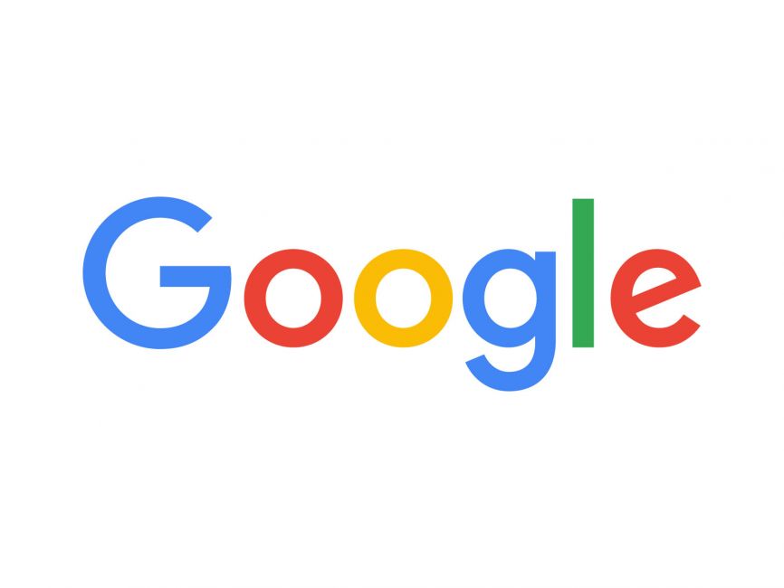
The Google logo is a combination of primary colors: blue, red, yellow, and green. The colors are arranged in a way that creates a sense of balance and harmony. The logo’s simplicity and clarity make it easy to recognize and remember.
Each color in the logo has a specific meaning. Blue represents stability and trustworthiness, red represents passion and energy, yellow represents happiness and optimism, and green represents growth and harmony. The combination of these colors creates a sense of excitement and positivity.
Recognition and Impact
The Google logo has become an iconic symbol of the brand. It is instantly recognizable and has helped to establish Google as a leading search engine. The logo’s simplicity and clarity make it easy to remember and identify.
The impact of the Google logo goes beyond brand recognition. The logo has become a symbol of innovation and creativity. It has inspired other companies to create logos that are simple, memorable, and meaningful.
The Google logo has also had an impact on the design industry. It has set a new standard for logo design, one that emphasizes simplicity, clarity, and meaning. The logo has become a benchmark for other designers to strive for.
In conclusion, the Google logo is more than just a symbol of a brand. It is a symbol of innovation, creativity, and simplicity. Its significance lies in its ability to inspire and influence the design industry, as well as its impact on brand recognition and identity.
Google Doodles
https://www.youtube.com/watch?v=xg8pkiaY2NM&embed=true
Google Doodles are special versions of the Google logo that are created to celebrate holidays, events, achievements, and people. They are a fun and creative way for Google to showcase its playful side and engage with its users.
Concept
The concept of Google Doodles originated in 1998 when Google founders Larry Page and Sergey Brin decided to add a stick figure drawing to the Google logo to indicate that they were attending the Burning Man festival. Since then, Google Doodles have evolved into a global phenomenon, with over 4,000 Doodles created to date.
Google Doodles are created by a team of talented artists and engineers who work together to come up with unique and compelling designs. The process of creating a Google Doodle involves brainstorming ideas, sketching designs, and testing prototypes. Once a design is selected, it is animated and integrated into the Google homepage.
Notable Doodles
Over the years, Google has created many memorable Doodles that have captured the attention and imagination of people around the world. Here are a few notable examples:
- Pac-Man Doodle (2010): This interactive Doodle allowed users to play a game of Pac-Man on the Google homepage.
- Les Paul Doodle (2011): This Doodle celebrated the 96th birthday of legendary musician Les Paul by allowing users to play a virtual guitar.
- Google Doodle for International Women’s Day (2021): This Doodle celebrated the achievements of women around the world and featured illustrations of trailblazing women from history.
- Google Doodle for the 2020 US Presidential Election: This Doodle encouraged users to vote in the US Presidential Election and provided information on how to do so.
Google Doodles are a creative and engaging way for Google to celebrate holidays, events, and people, and they have become an integral part of the Google brand.
Google Logo and Brand Identity
As one of the most recognizable logos in the world, the Google logo has undergone several changes since its inception in 1998. The current logo features four colors – blue, red, yellow, and green – arranged in a distinctive order. The logo is simple yet playful, and it reflects the company’s values of innovation, creativity, and accessibility.
Google’s brand identity is more than just its logo. It encompasses the company’s mission, values, and personality. The brand identity is designed to appeal to a wide range of users, from tech-savvy professionals to casual internet users. Google’s brand identity is built on a foundation of simplicity, reliability, and trust.
The Google brand is instantly recognizable, thanks in part to its distinctive logo. The logo is used across all of Google’s products and services, from search to email to cloud storage. The logo is also used in marketing and advertising campaigns, as well as on merchandise such as t-shirts and hats.
Google’s brand identity is reinforced by its use of consistent colors, fonts, and design elements across all of its products and services. The company’s brand guidelines provide detailed instructions on how to use the logo, colors, and other design elements correctly. This ensures that the Google brand is always presented in a consistent and professional manner, regardless of where it appears.
In conclusion, the Google logo and brand identity are essential components of the company’s success. The logo is instantly recognizable and reflects the company’s values of innovation, creativity, and accessibility. The brand identity is designed to appeal to a wide range of users and is reinforced by consistent use of colors, fonts, and design elements.
Future of Google Logo
As technology continues to evolve, so does the Google logo. With the increasing use of voice search and virtual assistants, the logo will need to be easily recognizable in a variety of formats and sizes.
One possibility is that the Google logo will become more minimalistic, with a focus on bold colors and simple shapes. This will make it easier to recognize on smaller screens, such as smartwatches and other wearables.
Another trend that we may see in the future is the use of animated logos. This will allow the Google logo to be more dynamic and engaging, making it stand out even more in a crowded digital landscape.
As Google continues to expand its reach into new areas, such as virtual reality and artificial intelligence, the logo will need to be adaptable to these new technologies. This could mean incorporating 3D elements or using more abstract shapes and designs.
Ultimately, the future of the Google logo is exciting and full of possibilities. With its iconic design and strong brand recognition, it will continue to evolve and adapt to the changing technological landscape.
Barry Edwards is a digital marketing expert with a deep understanding of content strategy, logo, and branding principles. Holding a Bachelor’s degree in Marketing from Beaconhill College, he offers valuable insights on digital marketing trends and strategies through his writing. Follow Barry’s work to stay updated on the latest in online marketing and branding.


