As one of the most recognizable brands in the world, Google has become synonymous with innovation, creativity, and user-friendly technology. One of the key elements that has contributed to the company’s success is its iconic logo. Over the years, Google has experimented with various logo designs, each representing the company’s values and evolving brand identity. In this article, we will delve into the realm of Google logo ideas, exploring creative concepts that have shaped the company’s visual branding.
Evolution of the Google Logo
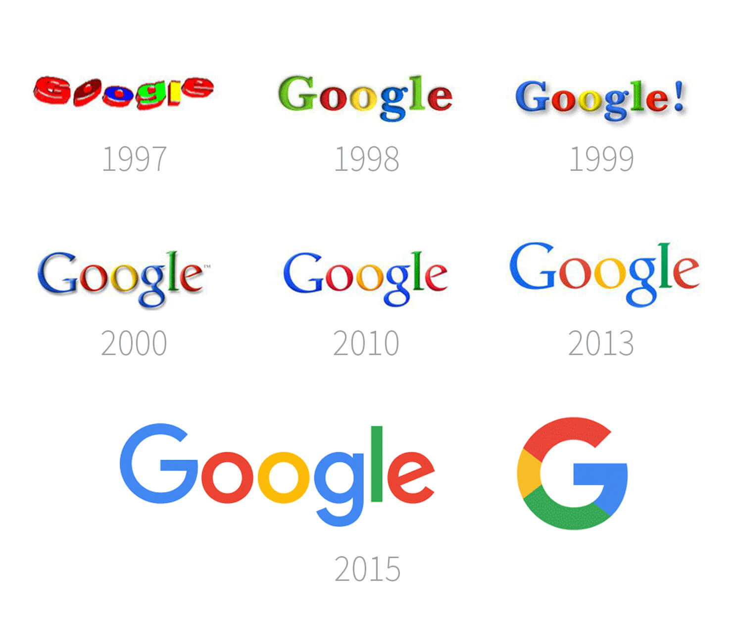
Google’s logo has undergone several transformations since the company’s inception in 1998. The early versions of the logo featured a playful, multicolored font, reflecting the company’s youthful spirit and commitment to thinking outside the box.
The Classic Google Logo
In 1999, Google introduced its first official logo, which featured a simple, lowercase font with a playful twist—a tilted “e.” This logo became the face of Google for more than a decade, representing the brand’s friendly and approachable image.
The First Major Update
In 2010, Google decided to give its logo a facelift. The new design retained the playful font but introduced a more polished, three-dimensional effect. The colors were slightly adjusted, resulting in a brighter and more vibrant logo.
A Bolder and More Modern Look
In 2013, Google unveiled another significant update to its logo. This time, the design became even simpler, with a flatter look and a more refined font. The colors were slightly softened, giving the logo a more modern and sophisticated appearance.
The Material Design Era
In 2015, Google embraced its Material Design philosophy—a design language focused on simplicity, depth, and realism. This approach influenced the logo as well, resulting in a cleaner and more streamlined design. The font was further simplified, and the colors became brighter and more saturated.
The Current Google Logo
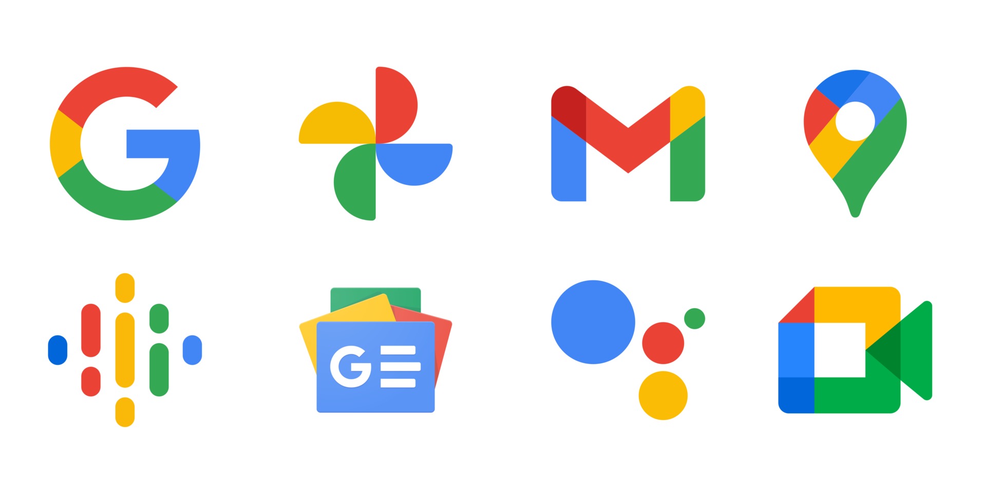
In 2015, Google introduced its most recent logo, which features a completely revamped design. The new logo is more geometric and uses a custom typeface called “Product Sans.” The playful colors remain, but the logo now appears more professional and contemporary.
Creative Concepts for Google Logo Redesign
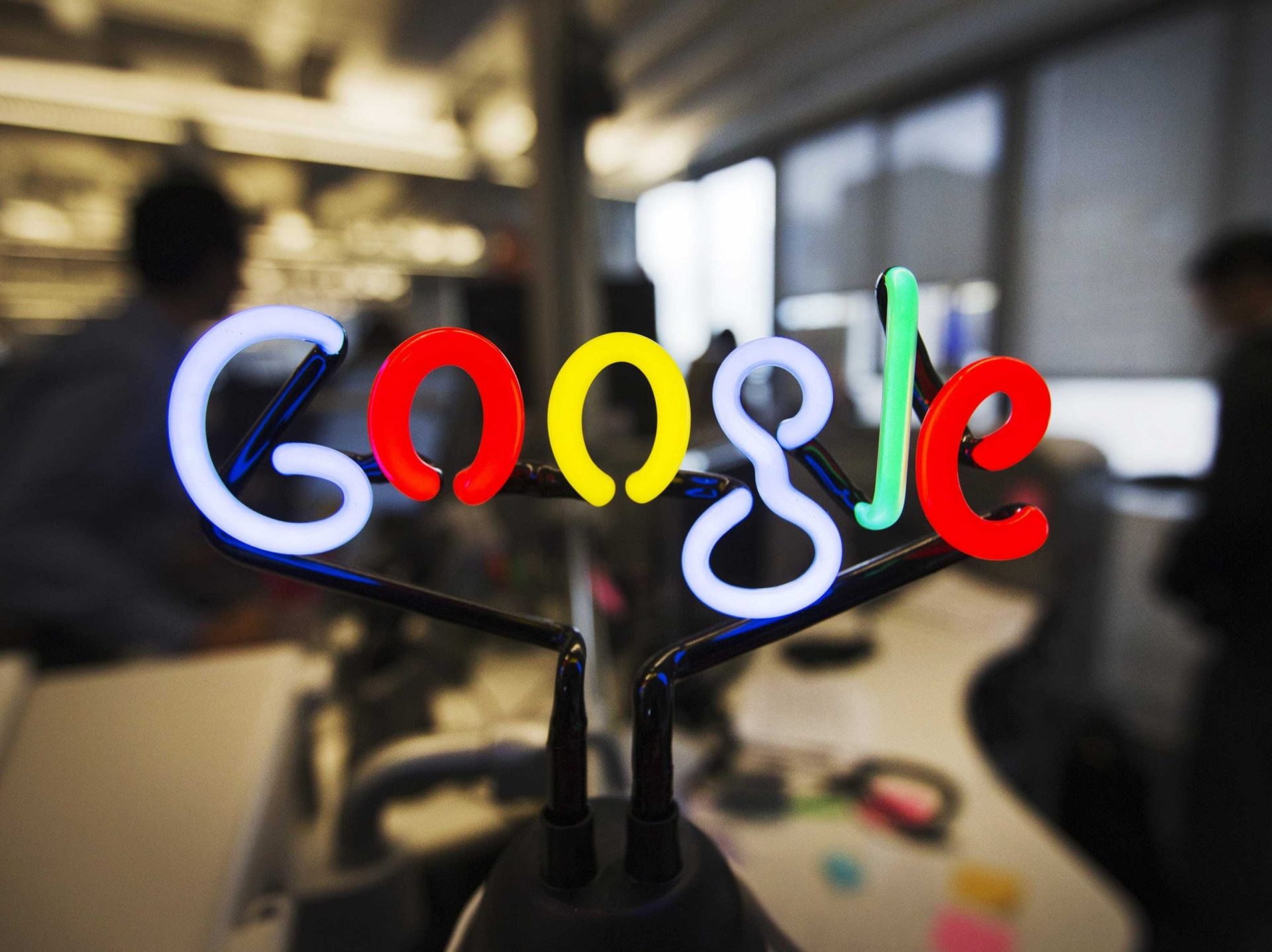
While the current Google logo is widely recognized and loved, exploring new logo ideas can be an exciting exercise for designers and enthusiasts alike. Let’s dive into some creative concepts that could inspire future iterations of the Google logo.
Minimalistic Approach
Minimalism has been a popular design trend in recent years, and applying this style to the Google logo could result in a fresh and timeless look. A minimalist Google logo could feature clean lines, simplified shapes, and a reduced color palette. This approach would align with Google’s commitment to simplicity and user-centric design.
Dynamic and Interactive Logos
In the age of interactivity, dynamic and animated logos have gained popularity. A Google logo that incorporates movement or responds to user actions could add an extra layer of engagement to the brand. For example, the logo could morph into different shapes when the user hovers over it or interact with the search bar in real-time.
Retro-Inspired Design
Incorporating elements of nostalgia into the Google logo could evoke a sense of familiarity and warmth. A retro-inspired logo could pay homage to Google’s early days and evoke a sense of nostalgia for long-time users. This design concept could include vintage typography, colors inspired by the past, or even a pixelated graphic style reminiscent of early computer interfaces.
Geometric Abstraction
Exploring abstract geometric shapes could result in a visually striking and unique Google logo. By deconstructing the letters of the word “Google” into their basic shapes, designers could create an abstract logo that represents the company’s innovative and forward-thinking nature. This logo concept would be visually distinctive and could serve as a memorable representation of the brand.
Cultural Influences
Google’s global presence and diverse user base provide an opportunity to incorporate cultural influences into its logo design. By incorporating elements from different cultures, such as patterns, symbols, or calligraphy, Google could create a series of localized logos that reflect its commitment to inclusivity and celebrate the diversity of its users.
The Importance of a Memorable Logo
A logo serves as the visual representation of a brand and plays a crucial role in establishing brand identity and recognition. A memorable logo can evoke positive emotions, create a strong first impression, and differentiate a brand from its competitors. For Google, a company that values innovation and creativity, a logo that stands out and captures the essence of its brand is vital.
When designing or updating a logo, it is important to consider various factors, including simplicity, versatility, and adaptability. A logo should be easily recognizable and scalable, allowing it to be used across different platforms and mediums. Additionally, it should be able to withstand the test of time, remaining relevant and impactful as trends and design preferences evolve.
Conclusion
The Google logo has evolved over the years, reflecting the company’s growth, innovation, and commitment to simplicity. While the current logo is widely recognized and loved, exploring new logo ideas can be an exciting endeavor. Concepts such as minimalism, dynamic design, retro-inspired aesthetics, geometric abstraction, and cultural influences can serve as inspiration for future Google logo redesigns.
When designing a logo, it is essential to consider the brand’s values, target audience, and the desired emotional response. A memorable logo has the power to leave a lasting impression, reinforce brand identity, and connect with users on a deeper level. By continuously evolving its visual branding, Google ensures that its logo remains a timeless symbol of its commitment to innovation and user-centric design.
Barry Edwards is a digital marketing expert with a deep understanding of content strategy, logo, and branding principles. Holding a Bachelor’s degree in Marketing from Beaconhill College, he offers valuable insights on digital marketing trends and strategies through his writing. Follow Barry’s work to stay updated on the latest in online marketing and branding.
