Are you looking to create a stunning landscape logo that represents your business and captivates your audience? A well-designed logo is a powerful tool that can leave a lasting impression, convey your brand’s values, and differentiate you from your competitors. In this article, we will explore landscape logo ideas and provide you with valuable tips and inspiration to help you design a logo that truly stands out.
Why Your Landscape Logo Matters
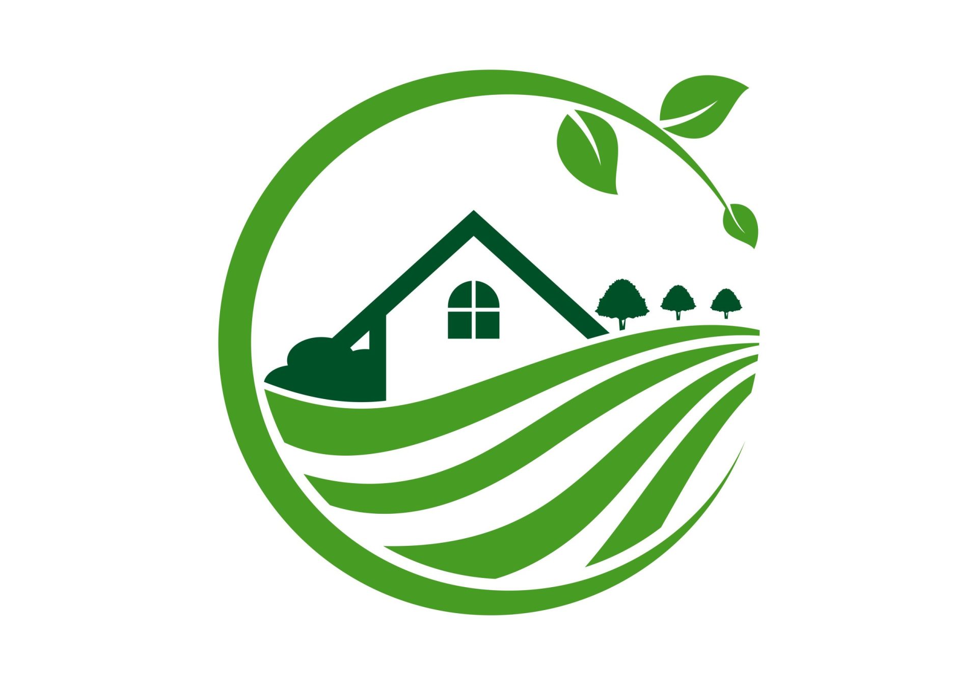
A logo serves as the visual representation of your brand and is often the first thing that potential customers notice. It plays a crucial role in establishing your brand identity and showcasing what your business stands for. A well-crafted landscape logo can communicate the essence of your business and create an emotional connection with your target audience.
Understanding Your Brand and Target Audience
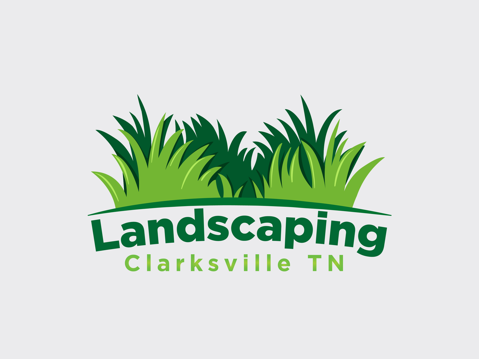
Before diving into designing your landscape logo, it is essential to understand your brand and identify your target audience. A thorough understanding of your brand’s values, mission, and unique selling propositions will guide you in creating a logo that accurately reflects your business.
Additionally, knowing your target audience’s preferences, interests, and demographics will help you design a logo that resonates with them. Consider the style, colors, and imagery that will appeal to your audience and align with their expectations.
Choosing the Right Style for Your Landscape Logo
When it comes to landscape logo design, there are several styles you can choose from. Each style conveys a different message and creates a distinct visual impact. Let’s explore some popular landscape logo styles:
1. Minimalist and Modern
The minimalist and modern style focuses on simplicity and clean lines. It utilizes minimal colors and shapes to create a sleek and contemporary look. This style works well for businesses that want to convey a sense of professionalism, innovation, and simplicity.
2. Illustrative and Playful
An illustrative and playful style incorporates detailed illustrations and vibrant colors to create a lively and engaging logo. This style is suitable for businesses targeting a younger audience or those in creative industries like landscaping, gardening, or eco-tourism.
3. Elegant and Classic
The elegant and classic style exudes sophistication, timelessness, and refinement. It often incorporates intricate details, elegant typography, and a subdued color palette. This style is perfect for businesses that want to establish a sense of tradition and elegance, such as luxury resorts, high-end landscaping services, or heritage gardens.
4. Geometric and Abstract
The geometric and abstract style utilizes geometric shapes and abstract forms to create a visually striking logo. This style is ideal for businesses that want to convey a sense of creativity, innovation, and uniqueness. It works well for modern landscape architecture firms, outdoor adventure companies, or eco-conscious brands.
Colors and Typography for Your Landscape Logo
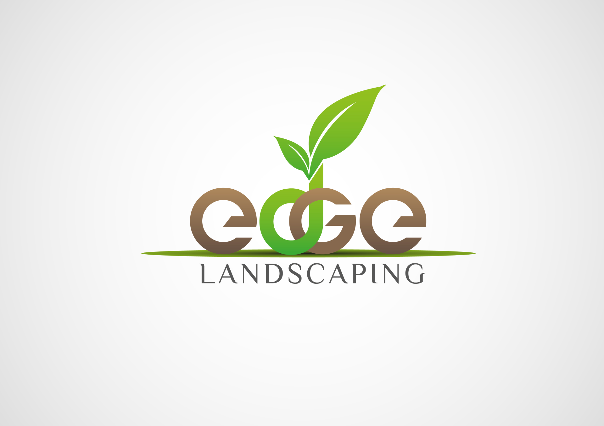
Choosing the right colors and typography is crucial in creating a visually appealing landscape logo. Here are some tips to help you make the right choices:
Colors
- Green: Green is a popular color choice for landscape logos as it represents nature, growth, and harmony. It evokes feelings of freshness, tranquility, and environmental consciousness.
- Blue: Blue is associated with trust, reliability, and professionalism. It is often used in landscape logos to convey a sense of reliability, serenity, and water elements.
- Earthy Tones: Earthy tones such as browns, beiges, and oranges can evoke a warm and natural feel. They are suitable for logos that want to convey a connection to the earth, such as organic gardens or sustainable landscaping services.
- Contrasting Colors: Using contrasting colors can create visual interest and make your logo stand out. Consider using complementary colors like orange and blue or yellow and purple to create a dynamic and eye-catching logo.
Typography
- Sans Serif Fonts: Sans-serif fonts are clean, modern, and easy to read. They work well for minimalist and modern landscape logos.
- Script Fonts: Script fonts can add elegance and sophistication to your logo. However, use them sparingly and make sure they are legible even at smaller sizes.
- Custom Lettering: If you want to create a unique and memorable logo, consider using custom lettering. Custom lettering adds a personal touch and can reflect the character of your brand.
Incorporating Landscape Elements in Your Logo
To create a landscape logo that truly represents your business, consider incorporating elements that reflect your industry. Here are some landscape elements you can incorporate:
1. Mountains and Hills
Mountains and hills symbolize strength, stability, and grandeur. They are perfect for logos that want to convey a sense of adventure, outdoor exploration, or a connection with nature.
2. Trees and Plants
Trees and plants represent growth, balance, and renewal. They are commonly used in landscape logos to convey a sense of sustainability, environmental consciousness, and natural beauty.
3. Water Elements
Water elements such as rivers, lakes, and waves can add a sense of serenity, tranquility, and fluidity to your logo. They are suitable for businesses that offer water-related services or want to evoke a sense of calmness and relaxation.
4. Sun and Sky
The sun and sky represent warmth, energy, and openness. They can be used in landscape logos to create a positive and uplifting impression. Incorporating sunbursts, rays of light, or clouds can add visual interest to your logo.
Sketching and Refining Your Landscape Logo
Once you have a clear vision of your landscape logo, start by sketching out your ideas on paper. Don’t worry about perfection at this stage; focus on capturing the essence of your concept. Experiment with different compositions, layouts, and elements.
After sketching, digitize your logo using design software like Adobe Illustrator or Canva. Refine your design by adjusting the proportions, balancing the elements, and fine-tuning the colors and typography. Seek feedback from colleagues, friends, or even your target audience to get different perspectives and make necessary improvements.
Conclusion

Designing a landscape logo that represents your brand and resonates with your audience requires careful consideration of your brand’s values, target audience, and design elements. By choosing the right style, colors, and typography, and incorporating landscape elements that reflect your industry, you can create a striking logo that captivates and leaves a lasting impression.
Remember, a well-designed landscape logo is not only visually appealing but also communicates the essence of your business. Invest time and effort in creating a logo that truly represents your brand, and watch as it becomes the cornerstone of your brand identity.
Marietta Arnold is a branding and design enthusiast who draws inspiration from hobbies like hiking, photography, and art exploration. With a background in graphic design, she shares insights on branding strategies and logo design trends. Stay updated with Marietta’s work for the latest in branding and design.
