As a landscaping business owner, you understand the importance of creating a strong brand identity. An integral part of this identity is a professionally designed logo that captures the essence of your business and resonates with your target audience. A well-crafted landscaping logo can convey trust, professionalism, and creativity, setting you apart from your competitors.
In this article, we will explore various landscaping logo ideas that can help you create a memorable brand identity for your business. From color schemes and typography to symbols and imagery, we will cover all the essential elements that make a landscaping logo stand out. So, let’s dive in and discover the perfect logo design for your landscaping business.
1. Understanding Your Brand

Before delving into specific landscaping logo ideas, it’s crucial to have a clear understanding of your brand. Take some time to reflect on your business’s values, mission, and unique selling points. Consider the emotions and messages you want your logo to convey. By defining your brand personality, you can create a logo that truly represents your business.
2. Choosing a Color Scheme
Color plays a vital role in logo design as it evokes emotions and communicates messages. When selecting a color scheme for your landscaping logo, it’s essential to consider the feelings you want to evoke in your audience. Here are a few color options and their associated meanings:
a. Earthy Tones
Using earthy tones such as greens, browns, and blues can evoke a sense of nature, calmness, and reliability. These colors work well for landscaping logos as they symbolize growth, harmony, and the great outdoors.
b. Vibrant Colors
If you want your logo to stand out and have a bold presence, consider using vibrant colors like oranges, yellows, or reds. These colors can convey energy, enthusiasm, and creativity. However, be cautious not to use too many vibrant colors, as it may overwhelm the overall design.
c. Neutral Colors
Neutral colors like grays, whites, or blacks can create a sophisticated and timeless look. These colors are often associated with professionalism, elegance, and simplicity. Using neutral colors can lend a modern and clean aesthetic to your logo.
3. Typography Selection
Typography is another critical element to consider when designing your landscaping logo. The right font can enhance the overall message and visual appeal of your logo. Here are a few typography styles to consider:
a. Serif Fonts
Serif fonts, characterized by small decorative lines at the end of letter strokes, can convey a sense of tradition and reliability. These fonts work well for businesses that want to establish a sense of trust and professionalism.
b. Sans Serif Fonts
Sans serif fonts, without the decorative lines, offer a more modern and clean look. They are often associated with simplicity, clarity, and approachability. Sans serif fonts can be an excellent choice for landscaping businesses aiming for a contemporary and friendly image.
c. Script Fonts
Script fonts, with their elegant and flowing characters, can add a touch of sophistication and creativity to your landscaping logo. This style is ideal for businesses that want to emphasize their artistic approach or cater to high-end clientele.
4. Incorporating Symbols and Imagery

Including symbols or imagery in your landscaping logo can help reinforce your brand’s message and make it more memorable. Here are a few ideas to consider:
a. Trees and Leaves
As a landscaping business, incorporating trees or leaves in your logo can be a great way to symbolize growth, nature, and environmental consciousness. It instantly communicates your industry and connects with your target audience.
b. Landscaping Tools
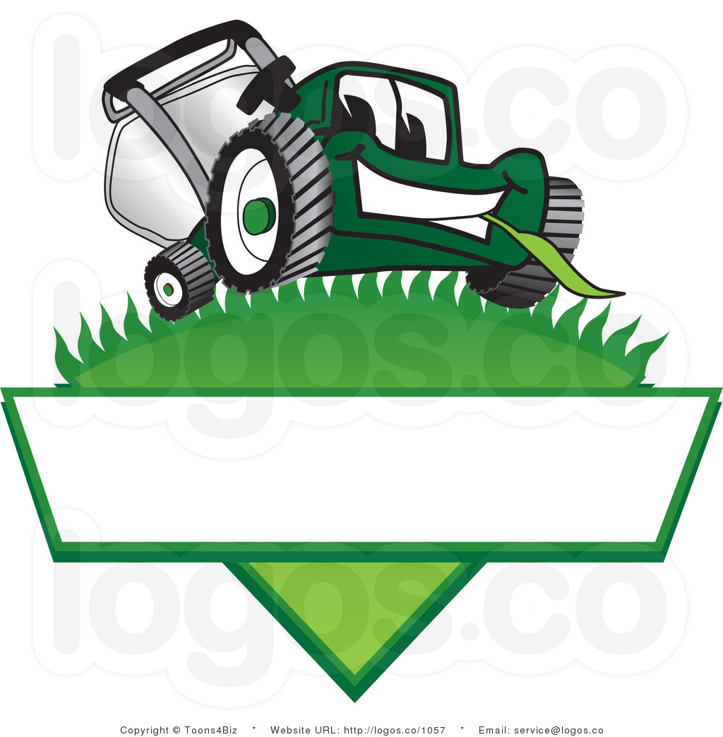
Integrating landscaping tools like shovels, rakes, or lawnmowers can showcase your expertise and specialization. Such symbols convey professionalism and competence, giving potential customers a clear idea of your services.
c. Abstract Shapes
Using abstract shapes or patterns can create a unique and eye-catching logo. These designs can be open to interpretation, allowing your audience to associate them with various aspects of your business. Abstract shapes can evoke curiosity and intrigue, making your logo memorable.
5. Balancing Simplicity and Uniqueness

When designing a landscaping logo, it’s essential to strike a balance between simplicity and uniqueness. A logo that is too complicated may be difficult to remember, while one that is too generic may fail to stand out. Aim for a design that is both visually appealing and easily recognizable.
6. Seeking Professional Help
Designing a logo that encapsulates your brand’s identity can be challenging, especially if you don’t have a background in graphic design. In such cases, it is worth considering hiring a professional designer or a design agency. They have the expertise and experience to create a logo that aligns with your vision and effectively represents your business.
7. Testing and Iterating
Once you have a design concept for your landscaping logo, it’s crucial to test it before finalizing it. Seek feedback from your target audience, friends, or colleagues to ensure that your logo resonates with them. Take their suggestions into account and iterate on your design if necessary. Remember, a well-designed logo is a result of continuous improvement and refinement.
Conclusion

Creating a memorable landscaping logo is essential for establishing a strong brand identity and attracting customers. By understanding your brand, selecting an appropriate color scheme and typography, incorporating relevant symbols or imagery, and balancing simplicity and uniqueness, you can design a logo that effectively represents your business. Whether you choose to design it yourself or seek professional assistance, investing time and effort into creating a captivating logo will undoubtedly pay off in the long run.
Marietta Arnold is a branding and design enthusiast who draws inspiration from hobbies like hiking, photography, and art exploration. With a background in graphic design, she shares insights on branding strategies and logo design trends. Stay updated with Marietta’s work for the latest in branding and design.
