Are you looking to create a unique and memorable logo for your business or organization? Incorporating letters into your logo design can be a creative and effective way to convey your brand’s identity. In this article, we will explore various letters logo design ideas that will inspire you to create a visually appealing and impactful logo. Whether you are a startup, an established company, or a non-profit organization, these ideas will help you stand out from the crowd and leave a lasting impression on your audience.
1. Initials as a Focal Point
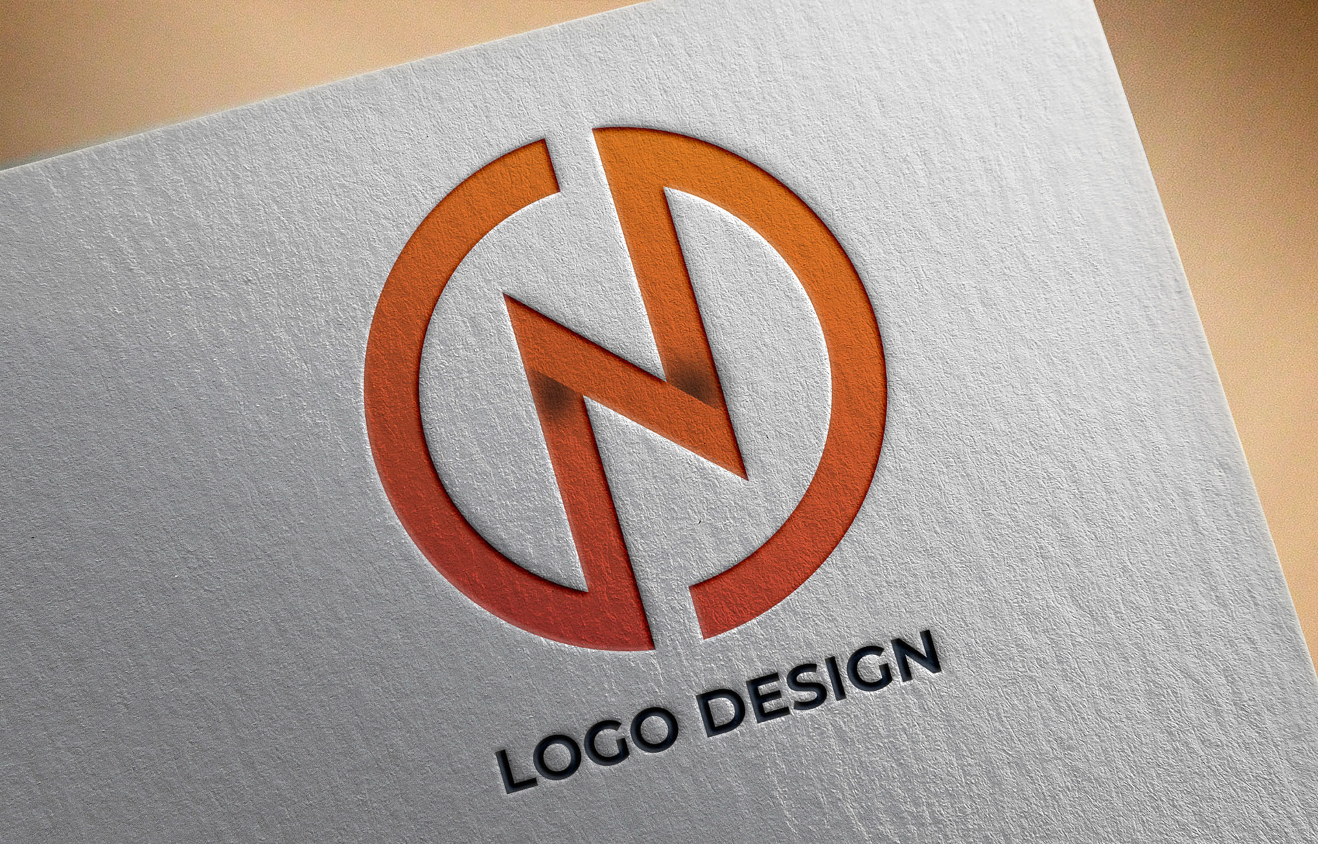
One popular approach to letters logo design is to use the initials of your business or organization as the focal point. This technique not only simplifies the design but also creates a strong visual representation of your brand. By using the initials, you can convey the essence of your business in a concise and elegant manner.
Example: Nike
The Nike logo is a perfect example of using initials as a focal point. The iconic “swoosh” represents the letter “N,” which is the first letter of the brand name. This simple yet powerful design has become synonymous with Nike and is instantly recognizable worldwide.
2. Typography Exploration

Another intriguing way to incorporate letters into your logo design is through typography exploration. By experimenting with different fonts, sizes, and arrangements, you can create a visually striking logo that captures attention and communicates your brand’s personality.
Example: Coca-Cola
The Coca-Cola logo is a testament to the power of typography. The unique and recognizable font used in the logo has remained largely unchanged since its inception. The flowing script evokes feelings of nostalgia and is instantly associated with the brand.
3. Letter Combination
Combining multiple letters in a logo design can create a visually appealing and dynamic composition. By carefully arranging the letters, you can create a harmonious and balanced design that represents the unity and interconnectedness of your brand.
Example: FedEx
The FedEx logo is a brilliant example of letter combination. By cleverly incorporating an arrow between the letters “E” and “x,” the logo communicates the company’s core values of speed, precision, and efficiency. This hidden element in the design adds depth and intrigue to an otherwise simple logo.
4. Negative Space Utilization
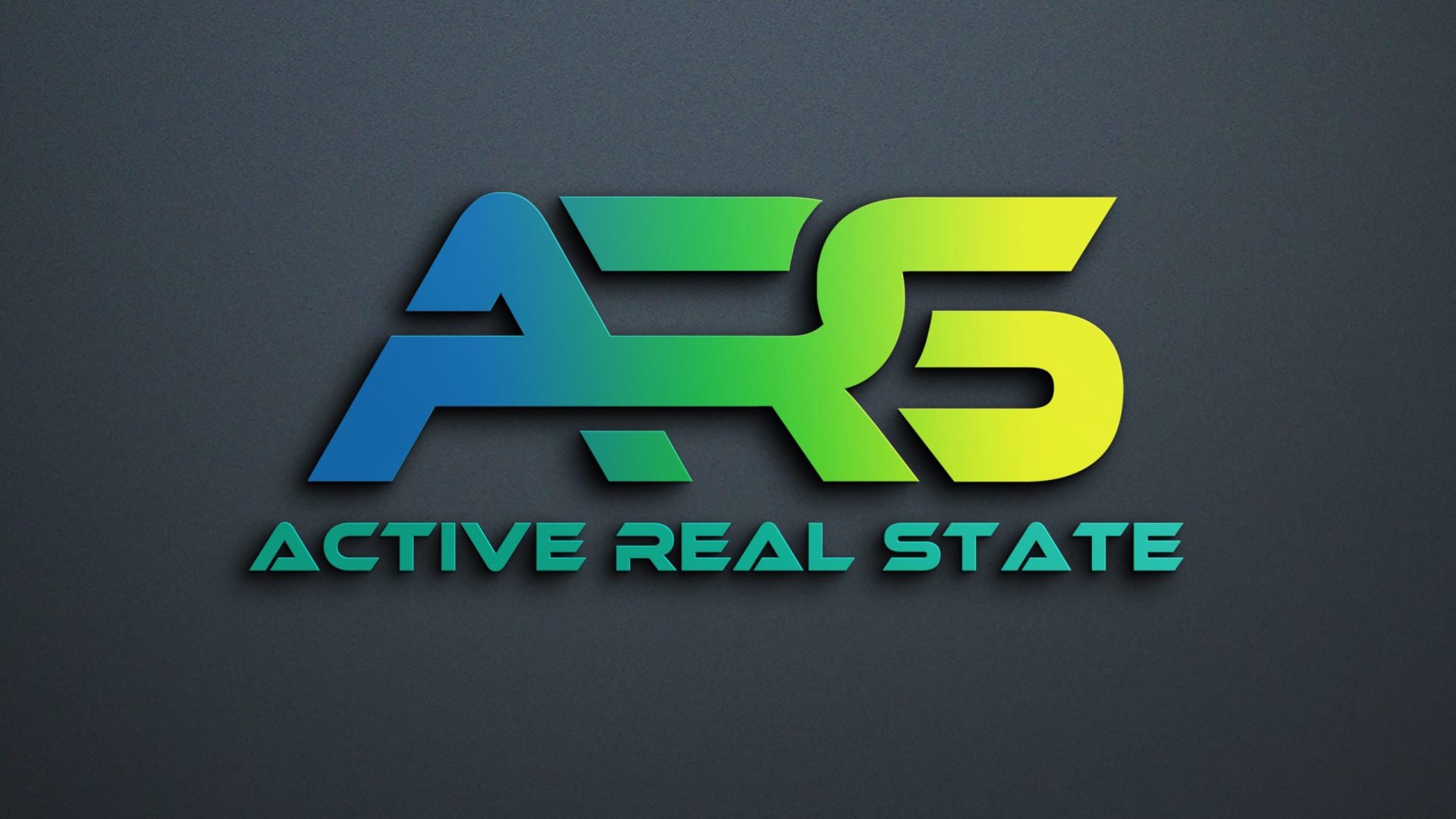
Negative space, also known as white space, refers to the empty space surrounding an object or text. Utilizing negative space in your letters logo design can create an optical illusion that adds depth and complexity to the overall composition.
Example: Amazon
The Amazon logo is a brilliant demonstration of negative space utilization. If you look closely, you will notice that the arrow connecting the letters “A” and “z” also forms a smile, symbolizing the company’s commitment to customer satisfaction. This clever use of negative space adds a subtle and playful element to the design.
5. Customized Letterforms
Customizing letterforms involves modifying the shape or structure of letters to create a unique and distinctive logo. By adding creative twists to the letters, you can create a logo that stands out and captures the essence of your brand.
Example: Airbnb
The Airbnb logo is a prime example of customized letterforms. The letters “A,” “i,” and “r” are cleverly merged to form a symbol that represents both a location pin and a heart. This innovative design perfectly encapsulates the brand’s mission of connecting people and fostering a sense of belonging.
6. Minimalistic Approach
Simplicity can often be the most powerful design choice. Adopting a minimalistic approach to your letters logo design can create a clean and timeless logo that exudes sophistication and elegance.
Example: IBM
The IBM logo is a testament to the effectiveness of minimalism. The simple and bold letterforms in blue represent reliability, trust, and integrity. This classic design has stood the test of time and remains a symbol of excellence in the tech industry.
7. Playful Letter Stacking

If you want to inject a sense of playfulness and creativity into your logo, consider stacking the letters in an unconventional way. This technique can create a visually interesting composition that captures attention and leaves a memorable impression.
Example: LEGO
The LEGO logo is a perfect example of playful letter stacking. The bold and colorful letters are stacked on top of each other, creating a vibrant and dynamic logo that perfectly aligns with the brand’s fun and creative nature.
8. Integration with Iconography

Integrating letters with iconography can add depth and symbolism to your logo design. By combining letters with relevant symbols or images, you can create a logo that tells a story and resonates with your target audience.
Example: Adobe
The Adobe logo seamlessly integrates the letter “A” with a stylized pencil to represent creativity and design. This combination of letter and iconography creates a cohesive and visually appealing logo that embodies the essence of the brand.
Conclusion
Designing a letters logo that effectively represents your brand requires careful thought and consideration. By exploring different design ideas such as using initials as a focal point, typography exploration, letter combination, negative space utilization, customized letterforms, minimalistic approach, playful letter stacking, and integration with iconography, you can create a logo that not only captures attention but also communicates the values and personality of your brand. Experiment, be creative, and let your logo become the visual representation of your brand’s identity.
Angela Irwin is a branding and design enthusiast with a Bachelor of Fine Arts in Graphic Design from Meadowbrook College. As a writer at Logocreator.io, she shares her expertise on logo design, graphic trends, and effective branding strategies, helping businesses create impactful visual identities.
