One of the most important things you will create when designing your brand is your logo. These symbols are important because they are in charge of grabbing viewers’ attention and giving them enough information about your company for them to form a first impression.
When designing your logo, there will be many choices that you will have to make to create your ideal logo. One of those choices is what kind of shapes would you like to have in your design.
Shapes, like everything else, hold psychological meanings that we subconsciously pick up on. Knowing what power each shape holds can be very helpful in order to craft a powerful logo.
In this article, we will review nine different shapes and how they can be integrated into your logo so that your company is represented accurately.
Psychology of Squares and Rectangles
Squares and rectangles are very popular in the world of logo design. A lot of social media apps have adopted the habit of putting a square or rectangle around the central part of their logo.
These two types of shapes can be found frequently in our daily lives. While they are not seen very often in nature, we have built them everywhere from windows to doors to phones to boxes and more.
They are a strong shape that we can rely on to hold weight. Here are some of their best features:
Characteristics of Squares and Rectangles
- Discipline
- Security
- Strength
- Reliability
Why are squares and rectangles so effective in design? They provide a box for the design, helping to keep a smooth transition. They provide order and professionalism to any design.
Applying Squares and Rectangles to Your Design
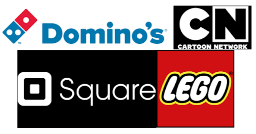
Examples of companies that utilize squares and rectangles are Lego, Square, Domino’s, and Cartoon Network.
Square makes their logo directly off their name and they also use a rectangle as a container box. Lego uses a square as a container box. Cartoon Network uses a square to distinguish the letter “N” from their “C” as well as to contain the logo. Last, Domino’s uses squares or a rectangle to literally represent a domino.
For your own logo, you can use squares or rectangles to physically design or show something about your logo, such as how Square and Domino’s does. You could also use these shapes as containers for the rest of your logo such as Cartoon Network and Lego.
Wherever you place them, these shapes are guaranteed to bring about some order to your logo.
Psychology of Circles and Ovals
Circles and ovals are popular shapes in logos. They are the only shapes that don’t have any angles or corners that are sharp and defining which allows them to create an eternal loop.
These shapes can be found around us such as in containers like cups or bowls, in items we grab like doorknobs or steering wheels, and in rolling items like wheels or tires. In nature, circles and ovals are mostly found in the planets and sun or in spherical items that are cut to make a circle or oval such as tree limbs and rocks.
They are friendly shapes that encourage movement and motion. Here are some of their characteristics:
Characteristics of Circles and Ovals
- Eternity
- Stability
- Femininity
- Mystery
Why are circles and ovals so effective for design? They can provide a container for the logo and encourage your eyes to move around the image, taking it all in.
Applying Circles and Ovals to Your Design
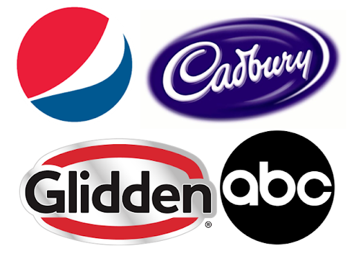
Examples of companies that utilize circles and ovals are Pepsi, Cadbury, Glidden, and ABC.
Pepsi’s logo is a circle with colors inside. On the other hand, Cadbury, Glidden, and ABC all use circles and ovals as containers for their logos.
For your logo, you can use a circle or oval to contain the rest of your logo and provide a natural ending point. You can also use circles within your design to help with the flow of your logo.
However you use them, circles and ovals bring about good motion and stability to any logo design.
Psychology of Triangles
Triangles are very strong shapes that can widely range based upon what type of triangle is used and how it is placed in the design. Their balanced angles make them unique from the other types of shapes.
These shapes can be found more often in man-made items like food, bridges, boat sails, signs, roofs, stairs, and more. They are not as often found in nature due to their unusual shape.
Triangles are a shape that calls the viewer to action. They also make viewers feel differently based upon how they are placed and what direction the point is going. Here are some of their traits:
Characteristics of Triangles
- Energetic
- Movement
- Stability
- Strength
Why are triangles so effective? They encourage your eyes to move around the design longer as you follow the direction that the triangle angles are pointing.
Applying Triangles to Your Design
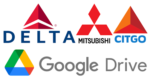
Examples of groups that use triangles in their logos are Delta, Mitsubishi, Citgo, and Google Drive.
All of these companies put multiple triangles into their design. Google Drive and Mitsubishi, and Delta even play with negative shapes to create more triangles.
For your own logo, you can incorporate triangles into the design just like these groups did, or you can use a triangle as a container. Your triangle does not have to be large or the main design in order for it to be effective.
Whatever way you decide to implement them, they can create a lot of energy for your design.
Psychology of Vertical Lines
Vertical lines create movement and push with their strength. In this way, they have many similar features to squares and rectangles due to the vertical lines featured in both shapes.
These lines can be found in trees, buildings, doorways, mountains, and more within natural and man-made designs.
Vertical lines can come off as a little pushy because they invoke so much movement. Here are some of their characteristics:
Characteristics of Vertical Lines
- Stability
- Aggressiveness
- Versatility
- Strength
Why are vertical lines so effective? The designs invoke feelings in the viewer which encourage them to act. This can help these logos get noticed more.
Applying Vertical Lines to Your Design
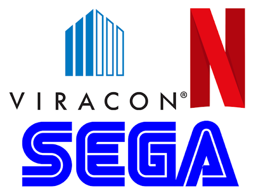
A few companies that use vertical lines in their designs are Viracon, Netflix, and Sega.
Viracon creates architectural glass. This is displayed easily in their logo with the lovely thick vertical lines.
Netflix has vertical lines featured in their letterform logo in order to form the “N” shape. Sega utilizes both vertical and horizontal lines to trace out the letters that spell the company’s name.
In your own logo, you can use vertical lines to emphasize forward or vertical motion or you can use them to help form the name of your company.
If you decide to utilize these lines in your logo, make sure that they create the type of energy that you are looking for from your design.
Psychology of Horizontal Lines
Horizontal lines create the horizon of your design. They provide a sense of growth but in a more peaceful manner than their vertical counterparts.
These lines can be found in stairs, fences, the horizon, signs, floors, and more.
Horizontal lines can be helpful to create borders and boundaries within designs while also increasing motion. Here are some of their traits:
Characteristics of Horizontal Lines
- Calm
- Stability
- Movement
- Femininity
Why are horizontal lines so effective? They create a stretching sensation that also brings about a stillness to the viewer.
Applying Horizontal Lines to Your Design
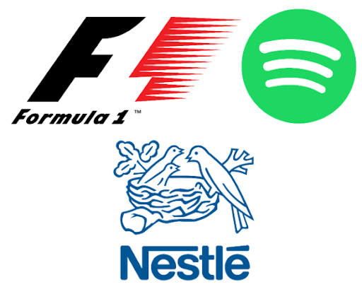
Examples of companies that utilize horizontal shapes are Formula 1, Spotify, and Nestle.
Formula 1 uses the lines within its design to help create the negative shape 1 image. Spotify uses a few small horizontal lines to give the impression of sound waves in its design. Nestle uses horizontal lines over their company name to create unity within it.
For your logo, you can use horizontal lines within your logo to create shapes or designs as Formula 1 and Spotify did. You can also use them to create a barrier within your design as Nestle did.
Whatever way you decide to utilize horizontal lines within your design, they can be very impactful.
Psychology of Abstract Shapes
Abstract shapes are shapes that are more or less undefinable. They are a combination of other shapes that come together to create something new.
These shapes can be found in nature such as in foliage, rocks, puddles, and more.
These unique shapes are one of a kind in the design world. Here are some of their characteristics:
Characteristics of Abstract Shapes
- Stylized
- Unique
- Representative
- Powerful
Why are abstract shapes so effective? They are unique to their company and brand, making it easier for viewers to identify what they are representing.
Applying Abstract Shapes to Your Design
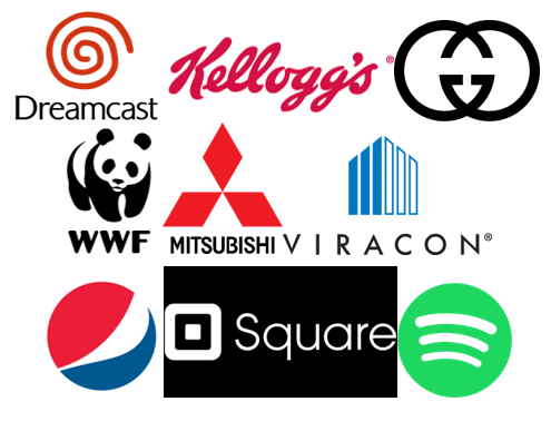
Examples of companies that use abstract shapes as their logos are BP, Chanel, Gucci, and TikTok.
They all use abstract shapes for their entire design. The companies take shapes and mash them together to create something new and unique to them.
For your logo, you can create your own abstract shape to represent your company. All it takes is some creativity to come up with a few ideas for you to try out as your unique logo.
Psychology of Organic Shapes
Organic or natural shapes are shapes that are created to be more natural with less harsh angles. These shapes can be just as unique as abstract shapes, though organic shapes tend to draw more on nature.
These shapes can be found all throughout nature, from plants to animals to insects to clouds, to water.
The natural, organic shapes are designed to create a softer image that is still very unique. Here are some of its features:
Characteristics of Organic Shapes
- Flexible
- Comforting
- Realistic
- Soft
Why are organic shapes so effective? They mimic real-world items that are not manmade. These items are already designed so well that when translated into a logo, these designs are often very successful.
Applying Organic Shapes to Your Design
Examples of companies that utilize organic shapes in their logos are NBC, WWF, Airbnb, and Red Bull.
NBC uses shapes to create the subtle image of a peacock. WWF uses shapes to create the image of a panda. Airbnb creates a lovely, organic ‘A’ shape. Red Bull uses their design to show two bulls running at each other.
All these companies portrayed different parts of nature through organic shapes. These designs become mascots for the company.
For your logo, you can also adopt an organic shape that you want to represent your company. There are plenty of plants, insects, and animals available for you to draw inspiration from.
However you decide to incorporate organic shapes into your logo, they will have a nice, comforting effect on the viewer.
Psychology of Curves
Curves are the lines that choose their own paths. They can be very versatile because of their ability the bend in any direction needed.
These bent lines are more frequently found than straight ones in nature. This can be seen in the way that rivers, plants, shells, human bodies, rocks, animals, and more curve.
Curves are the embodiment of happiness as they move around the design. Here are their main characteristics:
Characteristics of Curves
- Motion
- Happy
- Femininity
- Positive Emotions
Why are curves so effective? Viewers automatically follow the bouncing line throughout the design. This motion can help increase positive emotions.
Applying Curves to Your Design
Examples of companies that utilize curves in their design are McDonald’s, Burger King, Ford, and Kellogg’s.
The yellow arches of the McDonald’s “M” are curved. Burger King’s burger and font design curve throughout the logo. Ford and Kellogg’s use a curvy font to make their company name seem more fun and playful.
For your logo, you can have your company name in a curvy font to create that nice positive energy. Your other option is to incorporate curves within your design. These lines are extremely versatile which allows them to be placed nearly anywhere within a design.
Wherever you decide to place your curves, know that they will have a positive effect on your design.
Psychology of Spirals
Spirals are circular curving lines that often form patterns as they circle around themselves. They are very underused in the logo design world.
In nature, spirals can be found in shells, fingerprints, plants, waves, clouds, and space.
Spirals create a very moving form of creativity. Here are some of their main traits:
Characteristics of Spirals
- Creativity
- Growth
- Motion
- Calming
Why are spirals effective? Their movement inward causes the viewer’s eyes to follow along in a peaceful journey to the center of the design.
Applying Spirals to Your Design
Examples of companies that utilize spirals in their design are Dreamcast and Pro-Tech Pools Service and Repair.
Dreamcast’s entire design consists of a simple spiral that has a personal feeling to it. Pro-Tech Pools uses their spiral to create a water wave shape in order to represent what their company does.
For your logo, you can create your own spiral shape that best suits your company. The spiral needs to be unique enough to get off the correct impression of your company to viewers.
Spirals can be very helpful in creating a calming movement in your design.
Choosing Your Logo Shape
Now that you know all about the psychology behind each shape, you can choose the one that works best for you. It is very important that you consider your company and what type of vibe you want to give off.
Are you wanting viewers to see your company as more stable and secure or more fun and carefree? Your choice in logo shape directly influences this.
Once you have your options narrowed down to two or three, you can draw out some possible logos that you might want to use. Be sure to sketch down as many ideas as you can.
As soon as you have a few options, take a look at them. Which of them gives off the feelings you want your company to embody?
Logos are simply a representation of your company but having that representation be as accurate as possible can help you out in the long run.
If you are still having problems deciding, ask for other people’s opinions. If they know about your company, they can help you choose what works best. If they don’t, they can still tell you how each logo makes them feel so you know if you are on track or not.
As soon as you decide on your logo shape and all your other logo preferences, you are ready to start designing.
Creating Your Logo
Some people choose to hire an artist to create their logo. That can get expensive and time-consuming fast.
Creating your own logo is a great way to go. You just must be cautious about using expensive programs that require a lot of knowledge prior to starting. These programs can be difficult to use and have a lot of room for user error.
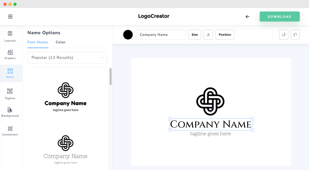
The best way around these predicaments is to use a logo creator. Our free platform allows you to create your very own logo in just a few easy steps.
As soon as it’s made, you can download and start using it to represent your company immediately.
Simply enter the name of your company, choose a category, decide on an icon, type in any tagline, and then you’re ready to start designing.
Our platform is easy-to-use and takes very little time to learn. You can have your logo finished in no time and ready to download.
Try out our LogoCreator today.
Barry Edwards is a digital marketing expert with a deep understanding of content strategy, logo, and branding principles. Holding a Bachelor’s degree in Marketing from Beaconhill College, he offers valuable insights on digital marketing trends and strategies through his writing. Follow Barry’s work to stay updated on the latest in online marketing and branding.
