Are you looking to create a logo that is both simple and memorable? One option to consider is a logo with words only. While many logos incorporate images or symbols, a text-only logo can be just as effective in conveying a brand’s message and identity. By focusing solely on typography and color, a wordmark logo can be versatile and timeless.
When creating a text-only logo, choosing the right font is crucial. The font you choose should be legible, reflect your brand’s personality, and be appropriate for your industry. Serif fonts are often associated with tradition and elegance, while sans-serif fonts are more modern and sleek. Script fonts can add a touch of whimsy or sophistication, depending on the style. Additionally, the color scheme you choose can also play a significant role in the effectiveness of your logo. A simple, monochromatic color palette can create a clean and sophisticated look, while bold, contrasting colors can make your logo stand out and be more memorable.
Despite their simplicity, text-only logos can be just as effective as more complex designs. In fact, some of the world’s most recognizable brands, such as Coca-Cola and Google, use wordmark logos. By focusing on typography and color, a text-only logo can be versatile, timeless, and memorable. Whether you’re a small business or a large corporation, a wordmark logo can be an excellent option to consider when creating your brand identity.
Understanding Logos with Words Only
Logos are an essential part of any brand’s identity. They help to create a visual representation of the brand and make it easier for customers to identify and remember it. Logos can be made up of various elements, including images, symbols, and typography. In this section, we will focus on logos with words only and explore their importance and types.
Importance
Logos with words only, also known as wordmarks or logotypes, are an effective way to convey a brand’s identity in a simple and straightforward manner. They rely solely on typography and font to create a visual representation of the brand. These logos are often used by companies that have a well-established brand identity and want to reinforce it through their logo.
One of the main advantages of logos with words only is that they are easy to read and recognize. They are also versatile and can be used in a variety of contexts, such as on business cards, letterheads, websites, and social media profiles. Additionally, wordmarks are often more affordable to design and produce than logos that include images or symbols.
Types
There are several types of logos with words only, each with its own unique style and purpose. Here are some of the most common types:
- Lettermarks: Lettermarks are logos that use the initials of a company’s name to create a unique design. Examples of companies that use lettermarks include IBM, CNN, and HBO.
- Wordmarks: Wordmarks are logos that use the full name of a company to create a unique design. Examples of companies that use wordmarks include Coca-Cola, Google, and Disney.
- Combination Marks: Combination marks are logos that combine both text and imagery to create a unique design. Examples of companies that use combination marks include Nike, Apple, and McDonald’s.
- Emblem Logos: Emblem logos are logos that use typography inside a symbol or icon. Examples of companies that use emblem logos include Harley Davidson, Starbucks, and the NFL.
In conclusion, logos with words only are an essential part of any brand’s identity. They are versatile, easy to read, and can be used in a variety of contexts. There are several types of logos with words only, each with its own unique style and purpose. By understanding the importance and types of logos with words only, you can create a logo that effectively represents your brand.
Designing Logos with Words Only
If you’re looking to create a logo that’s simple yet effective, a text-only logo might be the perfect solution for you. These logos are made up of words and letters, and they can be just as memorable and impactful as logos that include images or graphics. In this section, we’ll explore the key elements of designing logos with words only.
Conceptualization
When designing a text-only logo, it’s important to consider the message you want to convey. What does your brand stand for? What values do you want to communicate? Once you have a clear understanding of your brand’s identity, you can start brainstorming ideas for your logo.
One effective way to come up with ideas is to experiment with different font styles. Play around with different weights, sizes, and shapes to see what works best for your brand. You can also try incorporating symbols or icons that represent your brand’s values or mission.
Typography
Choosing the right font is crucial when designing a text-only logo. The font you choose will set the tone for your brand and can make a huge impact on how your logo is perceived.
When selecting a font, consider the personality of your brand. Are you a modern, edgy brand? A classic, sophisticated brand? A playful, fun brand? Each of these personalities would require a different font style.
It’s also important to consider legibility. Make sure the font you choose is easy to read and doesn’t require too much effort from the viewer.
Color Selection
Color is another important element of text-only logos. While you might be tempted to stick with black and white, adding color can help your logo stand out and make a lasting impression.
When selecting colors, consider your brand’s personality and values. Different colors can evoke different emotions and feelings, so choose colors that align with your brand’s message.
It’s also important to consider the practicality of your color choices. Make sure the colors you choose are easy to reproduce across different mediums and won’t cause issues with printing or scaling.
Overall, designing a text-only logo requires careful consideration of your brand’s identity, font selection, and color choices. By focusing on these key elements, you can create a logo that effectively communicates your brand’s message and resonates with your audience.
Famous Examples of Logos with Words Only
If you’re looking for inspiration for your next logo design, look no further than some of the most famous logos with words only. These logos have become iconic representations of their respective brands and have proven that sometimes, simplicity is key.
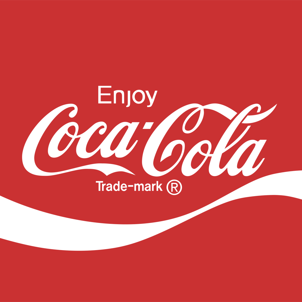
One of the most recognizable logos in the world is the Coca-Cola logo. The logo features the brand’s name in a classic cursive font, with a distinctive red and white color scheme. The logo has remained relatively unchanged since its creation in the late 19th century and has become a symbol of American culture.
Another famous example of a logo with words only is the Google logo. The logo features the company’s name in a playful and colorful font, with each letter in a different color. The logo has become synonymous with the internet and is instantly recognizable around the world.
In the fashion industry, Calvin Klein’s logo is a prime example of a successful wordmark logo. The logo features the designer’s name in a simple, bold font, with no additional imagery or design elements. The logo has become a symbol of minimalist fashion and has helped to establish Calvin Klein as a leading brand in the industry.
Other famous logos with words only include IBM, NASA, and Amazon. Each of these logos features the brand’s name in a distinctive font, with a unique color scheme that helps to set them apart from their competitors.
In conclusion, logos with words only can be just as effective as logos with images or symbols. By focusing on typography and color, these logos have become iconic representations of their respective brands. Whether you’re designing a logo for a new business or rebranding an existing one, taking inspiration from these famous logos can help you create a logo that is both memorable and effective.
How to Make Your Own Logos with Words Only
Creating a logo with words only can be a great way to represent your brand. It’s simple, yet effective. Here are some steps you can follow to make your own logos with words only.
Brainstorming
The first step is to brainstorm ideas for your logo. Think about what words best represent your brand. Consider your brand values, mission, and target audience. Write down a list of words that come to mind.
Next, think about the style of your logo. Do you want it to be modern or classic? Bold or elegant? This will help you choose the right font for your logo.
Sketching
Once you have your list of words and font style, it’s time to start sketching. Use a pencil and paper to sketch out different ideas for your logo. Try different combinations of words and font styles.
Don’t worry about making it perfect at this stage. The goal is to get a rough idea of what you want your logo to look like.
Finalizing
After you have a few sketches, choose the one that best represents your brand. Refine the design by adding color or adjusting the font size. Make sure the words are easy to read and the design is clean.
Once you’re happy with the design, create a digital version of your logo using graphic design software. There are many free options available online, such as Canva or Adobe Spark.
Remember to keep it simple and memorable. A logo with words only should be easy to read and recognize. It should also represent your brand values and personality.
In conclusion, creating a logo with words only can be a fun and creative process. By following these steps, you can make a logo that represents your brand and stands out from the competition.
Benefits and Challenges of Logos with Words Only
Logos with words only have become increasingly popular in recent years. They offer a simple and clean design that is easy to recognize and remember. However, there are both benefits and challenges to using logos with words only.
Benefits
Brand Recognition
One of the primary benefits of a logo with words only is that it can help with brand recognition. A well-designed logo can make your brand more memorable and recognizable. When people see your logo, they will associate it with your brand and the products or services you offer.
Versatility
Another benefit of logos with words only is their versatility. They can be used on a variety of marketing materials, including business cards, websites, and social media profiles. They are also easier to scale and reproduce than logos with complex graphics.
Timeless Design
Logos with words only tend to have a timeless design. They are not tied to any particular trend or style, which means they are less likely to become outdated over time. This can save you money in the long run, as you won’t need to update your logo as frequently.
Challenges
Lack of Visual Interest
One of the challenges of logos with words only is that they can lack visual interest. Without a graphic element, they may not be as eye-catching as other logos. This can make it more difficult to stand out from competitors.
Limited Brand Storytelling
Logos with words only can also limit your ability to tell your brand’s story. A graphic element can help communicate your brand’s personality and values. Without it, you may need to rely on other marketing materials to convey this information.
Difficulty in Design
Designing a logo with words only can be challenging. You need to carefully consider the font, spacing, and color scheme to ensure that the logo is visually appealing and easy to read. It’s important to work with a professional designer who has experience creating logos with words only.
Overall, logos with words only can be an effective way to build brand recognition and create a timeless design. However, they do come with some challenges that need to be carefully considered before making a final decision.
Conclusion
Congratulations! You have now learned about logos, one of the three modes of persuasion. Logos uses logical reasoning and evidence to support an argument, making it a powerful tool in persuasive communication.
Incorporating logos into your communication can help you build credibility and persuade your audience to take action. By presenting well-reasoned arguments supported by evidence, you can make a compelling case for your point of view.
Remember, when using logos, it’s important to consider your audience and tailor your arguments to their interests and values. You should also be sure to use reliable sources and accurate data to support your claims.
With practice, you can become a skilled user of logos and a more effective communicator overall. So go out there and start using logos to make your messages more persuasive and impactful!
Barry Edwards is a digital marketing expert with a deep understanding of content strategy, logo, and branding principles. Holding a Bachelor’s degree in Marketing from Beaconhill College, he offers valuable insights on digital marketing trends and strategies through his writing. Follow Barry’s work to stay updated on the latest in online marketing and branding.


