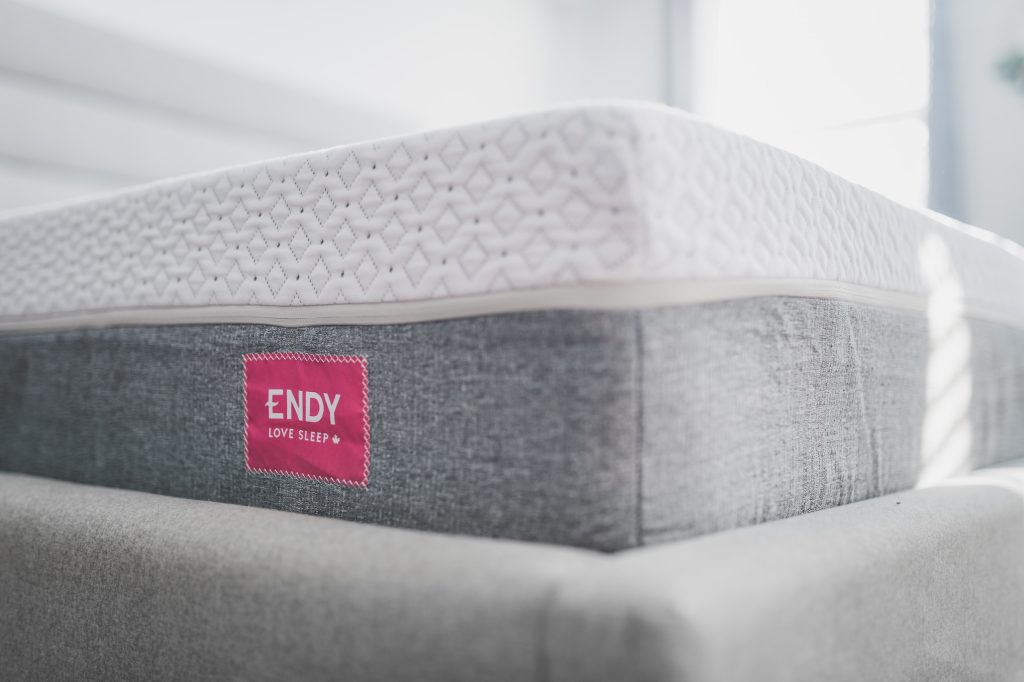
Looking for a new mattress can be a daunting task. With so many options available, it can be difficult to know where to start. However, one factor that can help narrow down your choices is the logo of the mattress brand. A well-designed mattress logo can give you an idea of the brand’s personality, quality, and style.
In this article, we will explore the world of mattress logos and showcase some of the best examples from around the globe. From simple and sleek designs to more intricate and playful ones, we will examine how mattress logos can communicate a brand’s values and mission. Whether you’re in the market for a new mattress or simply interested in design, this article will provide you with plenty of inspiration and insight. So, let’s dive into the world of mattress logos and see what they have to offer!
The Importance of Mattress Logos
If you’re in the mattress industry, you know how important it is to stand out from your competitors. One way to do this is through a well-designed logo. Your logo is the face of your brand, and it can make or break your success. Here are two reasons why mattress logos are so important.
Brand Recognition
Your logo is the most visible element of your brand, and it’s what people will remember when they think of your company. A good logo creates a strong brand identity and helps customers recognize your products. When people see your logo, they should immediately associate it with your company and the quality of your products.
To achieve this level of recognition, your logo needs to be consistent across all platforms. It should appear on your website, social media, packaging, and advertising. Consistency helps build trust with your customers and reinforces your brand identity.
Visual Appeal
A visually appealing logo can attract customers and set you apart from your competitors. Your logo should be eye-catching, memorable, and reflect your brand’s values. A well-designed logo can also communicate the quality and comfort of your products.
When designing your logo, consider the colors, fonts, and imagery that will best represent your brand. Use simple, clean lines and avoid clutter to ensure your logo is easy to read and understand. A good logo should be scalable, meaning it looks good at any size, from a small social media icon to a large billboard.
In summary, a well-designed logo is crucial for any mattress company looking to establish a strong brand identity and attract customers. By prioritizing brand recognition and visual appeal, you can create a logo that effectively communicates your brand’s values and sets you apart from your competitors.
Types of Mattress Logos
When it comes to creating a logo for your mattress company, there are several types of logos to choose from. Each type has its own strengths and weaknesses, so it’s important to choose the one that best represents your brand. Here are the three main types of mattress logos:
Text-Based Logos
Text-based logos use typography as the main design element. These logos often feature the company name in a unique font or style. Text-based logos are great for companies that want to emphasize their brand name. They are simple, elegant, and easy to read. Some examples of text-based logos in the mattress industry include Casper and Purple.
Image-Based Logos
Image-based logos use a graphic or symbol as the main design element. These logos often feature an image that represents the company’s brand or values. Image-based logos are great for companies that want to create a strong visual identity. They are eye-catching and memorable. Some examples of image-based logos in the mattress industry include Tempur-Pedic and Sealy.
Combination Logos
Combination logos combine text and images to create a unique design. These logos often feature the company name and a graphic or symbol that represents the brand. Combination logos are great for companies that want to create a strong visual identity while also emphasizing their brand name. They are versatile and can be used in a variety of marketing materials. Some examples of combination logos in the mattress industry include Serta and Simmons.
When choosing a logo for your mattress company, it’s important to consider your brand’s personality, values, and target audience. A well-designed logo can help your company stand out in a crowded market and create a strong visual identity.
Designing a Mattress Logo
Designing a mattress logo is an exciting process that requires careful consideration of various elements that will make your brand stand out. A well-designed mattress logo communicates your brand’s personality, values, and promise of comfort. Here are some sub-sections to guide you in designing a mattress logo.
Choosing Colors
Choosing the right colors for your mattress logo is essential as it sets the tone for your brand. Colors can evoke emotions, and you want to ensure that the colors you choose align with your brand’s personality. For example, blue is a calming color that evokes a sense of trust, while green represents growth and harmony.
Consider using a color wheel to help you choose complementary colors that work well together. You can also use color psychology to help you choose colors that align with your brand’s message.
Selecting Typography
The typography you choose for your mattress logo should be easy to read and align with your brand’s personality. Serif fonts are traditional and convey a sense of sophistication, while sans-serif fonts are modern and convey a sense of simplicity.
Consider using a font pairing tool to help you choose fonts that work well together. You can also create contrast by using different font weights or styles.
Incorporating Imagery
Incorporating imagery into your mattress logo can help communicate your brand’s message. Consider using imagery that aligns with your brand’s values and personality. For example, if your brand is focused on sustainability, you may want to incorporate imagery of nature or eco-friendly materials.
Keep in mind that the imagery you choose should be simple and easily recognizable. You don’t want your logo to be cluttered or confusing.
In conclusion, designing a mattress logo requires careful consideration of various elements that will make your brand stand out. By choosing the right colors, typography, and imagery, you can create a logo that communicates your brand’s personality, values, and promise of comfort.
Case Studies of Successful Mattress Logos
If you are looking to create a successful mattress logo, it can be helpful to look at some examples of brands that have already done it. The following case studies highlight three of the most successful mattress logos in recent years: Tempur-Pedic, Sealy, and Serta.
Tempur-Pedic
Tempur-Pedic is a brand that has been around for over 25 years and is known for its high-quality memory foam mattresses. Their logo is simple yet effective, featuring the brand name in bold, uppercase letters with a small, stylized “T” above it. The font is modern and clean, which reflects the brand’s commitment to innovation and quality.
One of the reasons why Tempur-Pedic’s logo is so successful is that it is instantly recognizable. The bold letters and unique “T” make it stand out from other mattress logos, and the modern font gives it a fresh, contemporary feel. Additionally, the logo is versatile and can be used on a variety of marketing materials, from billboards to social media posts.
Sealy
Sealy is another well-known mattress brand that has been around for over 130 years. Their logo features the brand name in a bold, sans-serif font with a small, stylized “S” above it. The “S” is designed to look like a wave, which represents the brand’s commitment to providing a comfortable, supportive sleep experience.
One of the strengths of Sealy’s logo is its simplicity. The bold font and subtle wave design make it easy to read and recognize, even from a distance. Additionally, the logo is versatile and can be used on a variety of marketing materials, from print ads to product packaging.
Serta
Serta is a popular mattress brand that has been around for over 80 years. Their logo features the brand name in a bold, uppercase font with a small, stylized “S” above it. The “S” is designed to look like a sheep, which represents the brand’s commitment to providing a comfortable, restful sleep experience.
One of the reasons why Serta’s logo is so successful is that it is playful and memorable. The sheep design is unique and instantly recognizable, and the bold font makes the brand name easy to read. Additionally, the logo is versatile and can be used on a variety of marketing materials, from TV commercials to product packaging.
In conclusion, these three case studies demonstrate that a successful mattress logo should be simple, memorable, and versatile. By incorporating unique design elements and modern typography, brands like Tempur-Pedic, Sealy, and Serta have created logos that are instantly recognizable and help to establish their brand identity.
Common Mistakes in Mattress Logo Design
When designing a logo for your mattress brand, it’s important to avoid common mistakes that can negatively impact your brand image. Here are some common mistakes to avoid:
Mistake #1: Lack of Originality
One of the biggest mistakes in mattress logo design is a lack of originality. Many mattress brands use similar design elements, such as clouds, stars, and moons, which can make it difficult for your brand to stand out. To avoid this mistake, try to come up with a unique concept that reflects your brand’s values and personality.
Mistake #2: Poor Font Choices
Choosing the wrong font can make your logo look unprofessional and difficult to read. Avoid using overly decorative or complex fonts, as they can be hard to read at smaller sizes. Instead, choose a simple and easy-to-read font that complements your brand’s style.
Mistake #3: Inappropriate Colors
Colors play a crucial role in logo design, as they can evoke emotions and convey meaning. However, using inappropriate colors can send the wrong message to your audience. For example, using bright and bold colors for a brand that focuses on relaxation and comfort can be off-putting. Instead, choose colors that complement your brand’s values and personality.
Mistake #4: Overcomplicating the Design
A common mistake in logo design is overcomplicating the design. A cluttered logo can be difficult to read and remember, which can negatively impact your brand’s image. To avoid this mistake, keep your design simple and clean. Use only essential design elements that reflect your brand’s values and personality.
Mistake #5: Ignoring Branding Guidelines
Finally, ignoring branding guidelines can be a costly mistake in logo design. Branding guidelines ensure consistency across all marketing materials, which helps build brand recognition and loyalty. Make sure to follow your branding guidelines when designing your logo to ensure consistency across all marketing materials.
The Future of Mattress Logos
As the mattress industry continues to grow and evolve, so too will the logos that represent these brands. Here are some potential trends and developments to watch out for in the future of mattress logos:
Minimalism and Simplicity
In recent years, many brands across various industries have shifted towards minimalist and simple logo designs. This trend is likely to continue in the mattress industry, as brands strive to create logos that are easy to recognize and memorable. Expect to see more logos with clean lines, bold typography, and simple shapes.
Customization and Personalization
As technology continues to advance, it’s becoming easier for brands to offer customizable products and experiences. This trend is likely to extend to mattress logos, with brands offering customers the ability to personalize their logo in some way. This could involve choosing a specific color scheme, adding a personalized message or symbol, or even designing their own logo from scratch.
Sustainability and Eco-Friendliness
As consumers become more environmentally conscious, brands are working to create more sustainable and eco-friendly products. This trend is likely to extend to mattress logos, with brands using earthy colors, natural textures, and eco-friendly symbols in their designs. Expect to see more logos that emphasize the brand’s commitment to sustainability and eco-friendliness.
Innovation and Technology
As the mattress industry continues to innovate and incorporate new technologies, brands will likely incorporate these advancements into their logos. This could involve using futuristic or tech-inspired designs, incorporating augmented reality elements into the logo, or even creating logos that change or adapt based on the user’s preferences or environment.
Overall, the future of mattress logos is exciting and full of potential. As brands continue to evolve and adapt to changing consumer preferences, we can expect to see more creative and innovative logo designs that capture the essence of the brand and resonate with customers on a deeper level.
Marietta Arnold is a branding and design enthusiast who draws inspiration from hobbies like hiking, photography, and art exploration. With a background in graphic design, she shares insights on branding strategies and logo design trends. Stay updated with Marietta’s work for the latest in branding and design.