Are you in the process of launching a new michelada brand or refreshing your existing one? One crucial element to consider is your logo. A well-designed logo can effectively communicate your brand’s personality, values, and story, while capturing the attention of your target audience. In this guide, we will explore some creative Michelada logo ideas that can help you establish a captivating brand identity. So grab a drink, get inspired, and let’s dive in!
Understanding the Essence of a Michelada
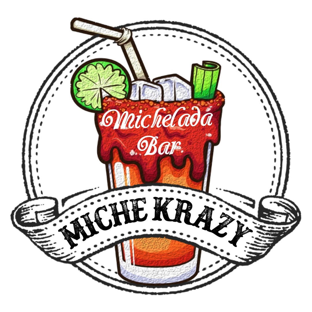


Before we delve into logo design ideas, it’s essential to understand the essence of a Michelada. This popular Mexican cocktail is a refreshing blend of beer, lime juice, hot sauce, Worcestershire sauce, and various spices. Known for its tangy and savory flavors, the Michelada embodies a vibrant and lively character that should be reflected in your logo design.
Reflecting Flavor and Tradition
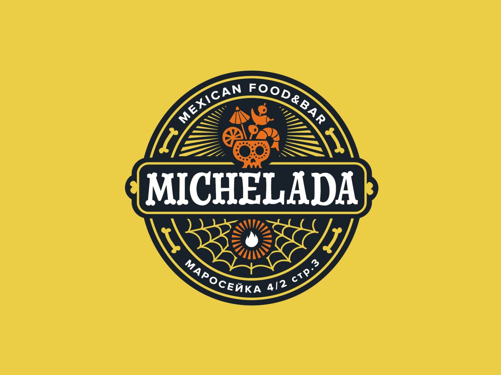


When brainstorming Michelada logo ideas, it’s crucial to consider the flavors and traditions associated with this beloved cocktail. Here are some key elements to keep in mind:
1. Citrus Accents
Citrus fruits, particularly limes, play a vital role in the Michelada’s flavor profile. Incorporating citrus accents into your logo can help evoke the zesty and refreshing nature of the cocktail. Consider using lime slices, zest, or even a stylized representation of a lime in your logo design.
2. Condiment Imagery
Micheladas often include condiments like hot sauce and Worcestershire sauce, which add depth and complexity to the taste. Including small visual cues, such as droplets or bottles, can subtly reference these key ingredients and enhance the authenticity of your logo.
3. Spices and Herbs
Spices like chili powder, Tajin, and celery salt are frequently used to rim the glass or add an extra kick to the Michelada. Incorporating visual representations of these spices or herbs can add a unique touch to your logo, emphasizing the cocktail’s flavor profile and cultural roots.
Typography: Capturing the Spirit of the Michelada
Typography plays a crucial role in logo design, as it sets the tone and personality of your brand. When selecting fonts for your Michelada logo, consider the following options:
1. Bold and Playful
To capture the lively essence of a Michelada, opt for bold and playful fonts. These fonts can convey a sense of fun, energy, and enthusiasm, reflecting the cocktail’s vibrant culture. Consider using rounded or handwritten typefaces to add a touch of warmth and approachability.
2. Retro and Vintage
Another typography option to explore is a retro or vintage-inspired style. This choice can evoke a sense of nostalgia and pay homage to the rich history of the Michelada. Fonts with distressed or worn textures can add an authentic touch, reminiscent of old-school signage or labels.
3. Modern and Minimalistic
If you prefer a more contemporary approach, consider using modern and minimalistic fonts. These clean and sleek typefaces convey sophistication and elegance, appealing to a more refined target audience. Pairing a modern font with bold colors or unique design elements can create a visually striking logo.
Colors: Setting the Right Mood
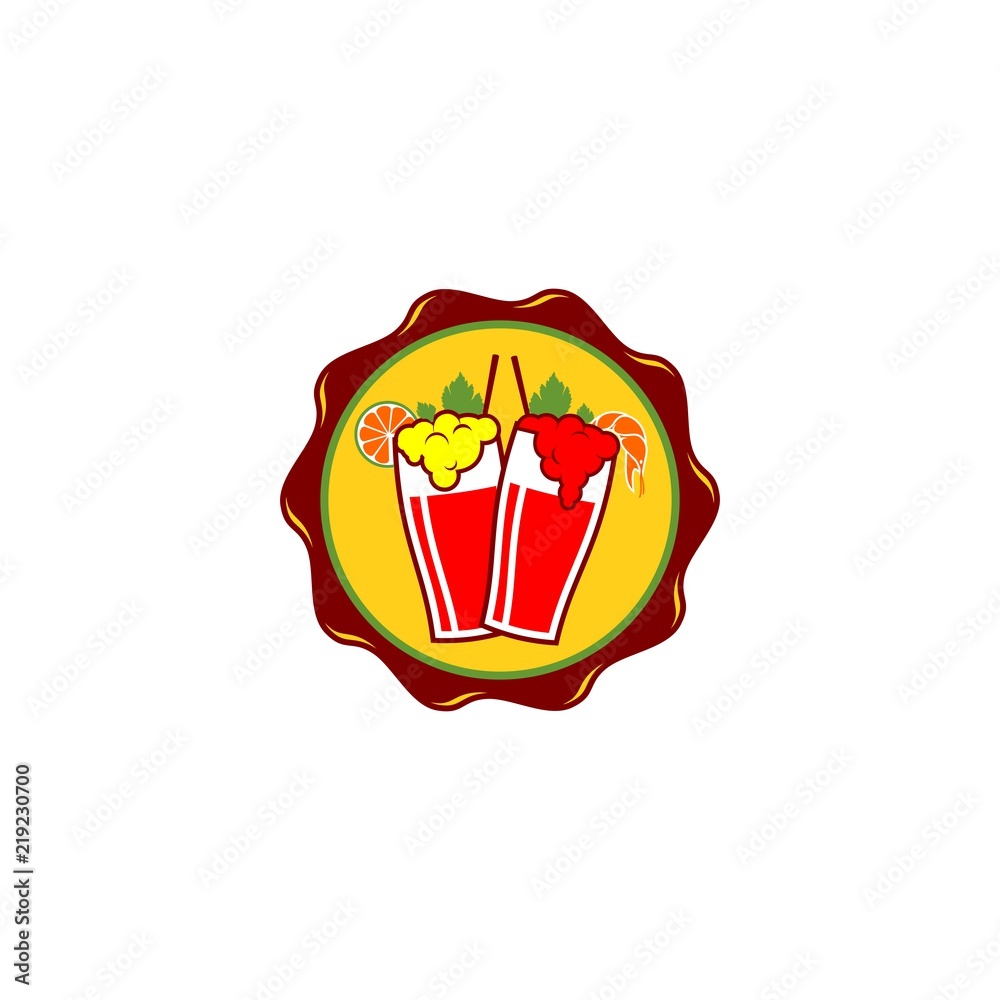


Choosing the right colors for your Michelada logo is crucial, as they can evoke specific emotions and perceptions. Here are some color palettes that can help you set the right mood for your brand:
1. Classic and Vibrant
Opt for a classic and vibrant color palette to reflect the energetic nature of a Michelada. Bold shades of red, orange, and yellow can stimulate appetite and excitement, making your logo visually appealing and memorable. Consider combining these colors with complementary tones to create a dynamic visual experience.
2. Earthy and Natural
If you want to emphasize the natural ingredients and traditional roots of a Michelada, consider an earthy and natural color palette. Shades of green, brown, and beige can evoke a sense of freshness, authenticity, and connection to nature. These colors can also work well with eco-friendly or organic Michelada brands.
3. Sophisticated and Refined
For those aiming to position their Michelada brand as a premium and upscale option, a sophisticated and refined color palette is ideal. Choose shades of deep red, gold, or black to convey elegance, exclusivity, and luxury. These colors can instantly elevate your brand’s visual identity, appealing to a more discerning audience.
Logo Design Styles: From Classic to Modern
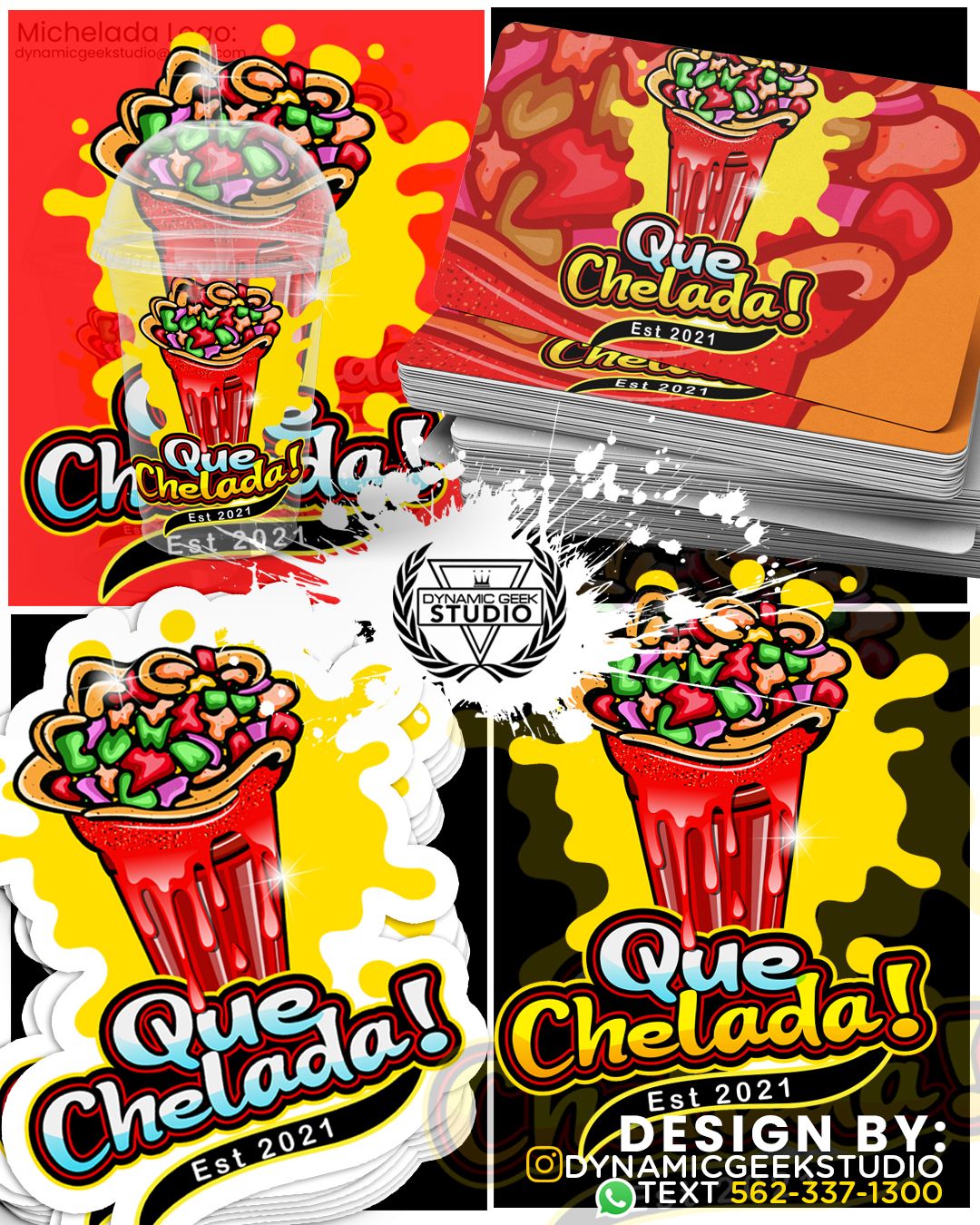


Now that we have explored typography and color choices, let’s dive into different logo design styles that can effectively represent your Michelada brand:
1. Iconic Logos
Iconic logos are simple, memorable, and instantly recognizable. They often feature a unique symbol or graphic element that represents the brand. For a Michelada logo, consider incorporating stylized representations of beer mugs, chili peppers, or citrus fruits. These icons can capture the essence of the cocktail and create a lasting visual impression.
2. Wordmarks and Lettermarks
Wordmarks and lettermarks are typographic logos that focus on the brand’s name or initials. They rely on creative typography to create a distinctive visual identity. Experiment with different font styles, sizes, and arrangements to create a visually engaging logo that stands out.
3. Combination Marks
Combination marks combine both symbols and typography to create a comprehensive logo. This versatile style allows you to incorporate both iconic elements and the brand name or initials. Consider pairing a stylized image of a Michelada glass with a unique font to create an eye-catching combination mark.
Final Thoughts
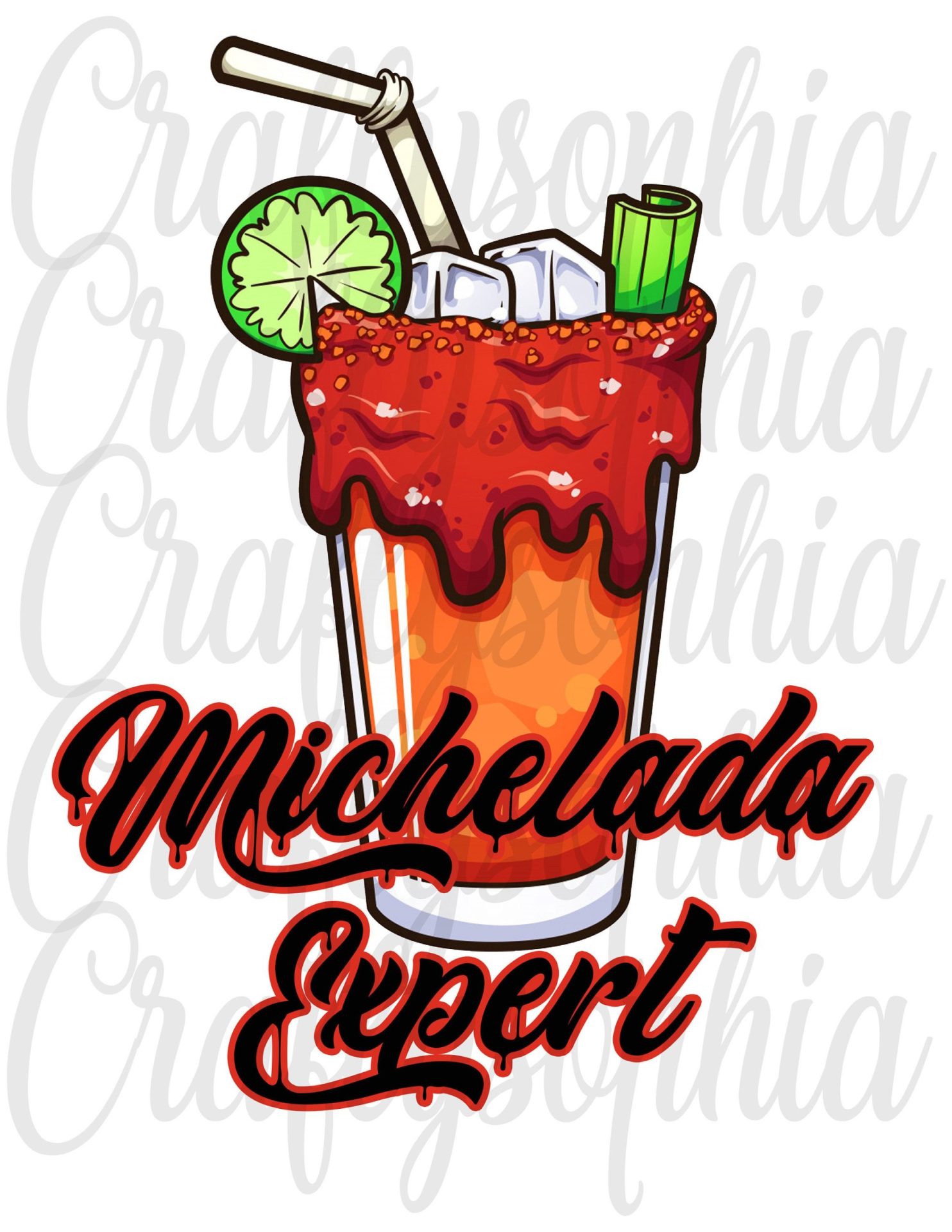


Crafting a captivating Michelada logo requires careful consideration of the cocktail’s essence, flavors, and traditions. By incorporating citrus accents, condiment imagery, and spice references, you can create a logo that authentically represents your brand. Typography, colors, and design styles further enhance your logo, allowing you to communicate your brand’s personality effectively. Remember, a well-designed logo not only attracts attention but also establishes a strong brand identity that resonates with your target audience. Cheers to creating a logo that perfectly captures the spirit of your Michelada brand!
Barry Edwards is a digital marketing expert with a deep understanding of content strategy, logo, and branding principles. Holding a Bachelor’s degree in Marketing from Beaconhill College, he offers valuable insights on digital marketing trends and strategies through his writing. Follow Barry’s work to stay updated on the latest in online marketing and branding.
