When it comes to creating a logo for your brand, simplicity is key. Minimalistic designs have become increasingly popular in recent years, as they convey a sense of elegance, sophistication, and modernity. In this article, we will explore the concept of minimal logo ideas and provide you with valuable insights and inspiration to help you create a logo that perfectly represents your brand.
Why Choose a Minimal Logo Design?

Minimalistic logos have gained popularity due to their timeless appeal and versatility. Here are a few reasons why you should consider a minimal logo design for your brand:
1. Memorable and Impactful
Simplicity in design allows for easy recognition and instant recall. Minimal logos typically contain fewer elements, making them easier for your audience to remember. By focusing on a core concept or symbol, you can create a logo that leaves a lasting impression.
2. Versatility Across Platforms
Minimal logos are highly adaptable and can be easily scaled down or up without losing their impact. Whether displayed on a billboard or a small mobile screen, a minimal logo will maintain its clarity and legibility, ensuring consistent branding across different platforms.
3. Timeless Design
Minimalistic logos often stand the test of time, as they are not tied to specific design trends. By avoiding intricate details and excessive ornamentation, your logo will remain relevant for years to come, saving you the effort and cost of rebranding.
4. Enhanced Brand Perception
A minimal logo design can convey a sense of professionalism, sophistication, and confidence. By utilizing clean lines, negative space, and thoughtful typography, you can elevate your brand perception and establish a strong visual identity in the market.
Key Elements of Minimal Logo Design
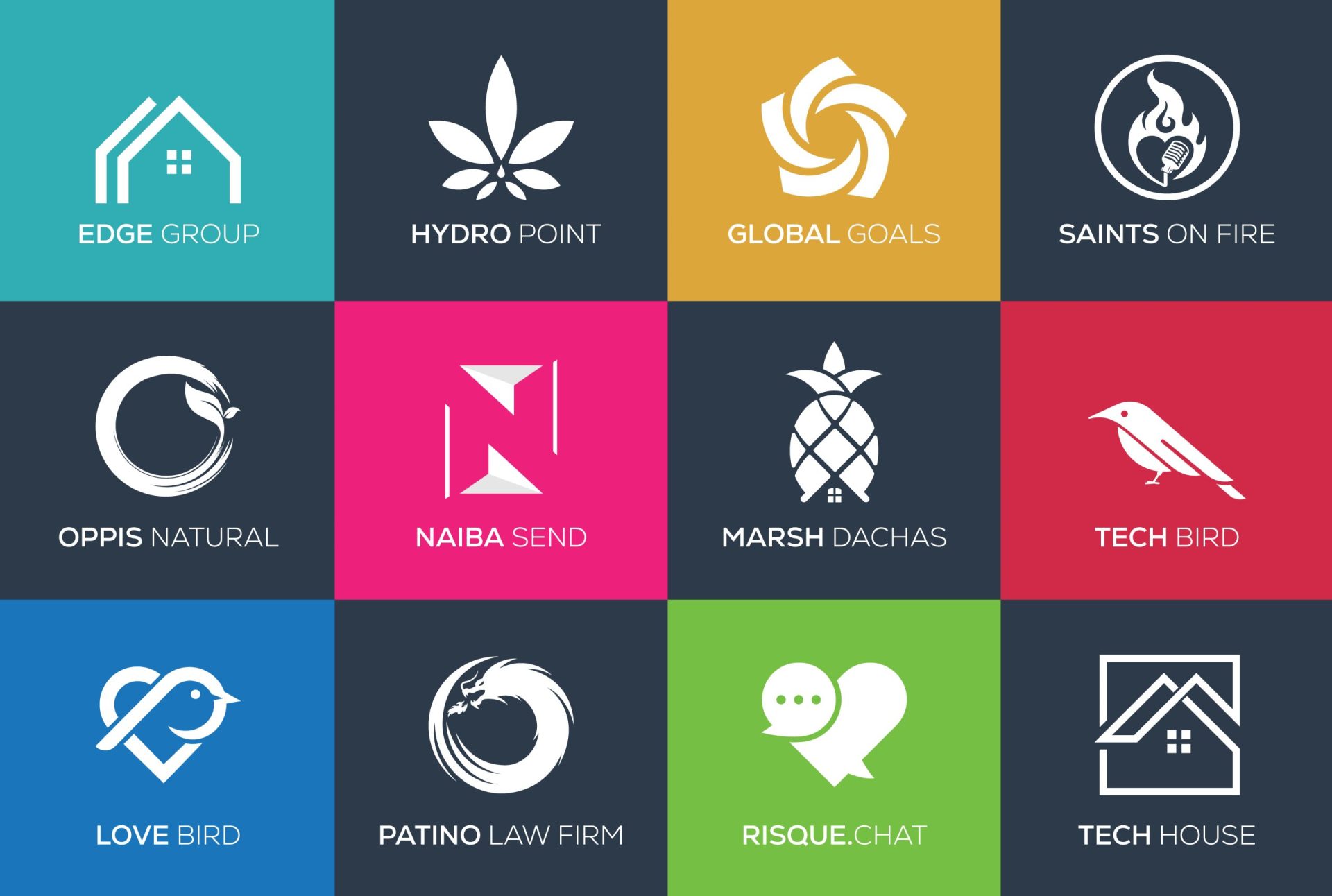
To achieve an effective minimal logo, certain design elements should be considered and utilized strategically. Here are key elements to keep in mind:
1. Simplified Shapes and Forms
Minimal logos typically consist of simplified shapes and forms that represent the essence of your brand. Geometric shapes, such as squares, circles, and triangles, are commonly used due to their clean and timeless appeal. These shapes can be combined or modified to create unique and memorable logo designs.
2. Negative Space
Negative space, also known as white space, refers to the empty areas around and within a logo. Utilizing negative space effectively can create clever and visually intriguing designs. By cleverly incorporating negative space into your minimal logo, you can add depth, enhance meaning, and create memorable visual illusions.
3. Typography
Selecting the right typography is crucial in minimal logo design. Clean, sans-serif fonts are often favored for their simplicity and legibility. However, you may also experiment with custom lettering or unique typefaces to create a logo that stands out while maintaining its minimalistic appeal.
4. Limited Color Palette
Minimal logos typically employ a limited color palette to maintain their simplicity. Monochromatic schemes, such as black and white, or the use of a single accent color, can create a strong visual impact. By reducing the number of colors, you can draw attention to the core elements of your logo and ensure consistency across different mediums.
Inspiring Minimal Logo Ideas
Now that we have discussed the benefits and key elements of minimal logo design, let’s explore some inspiring examples to spark your creativity:
1. Apple
The Apple logo is an iconic example of a minimalistic design. The silhouette of an apple with a bite taken out of it is instantly recognizable worldwide. Its sleek and simple design reflects the company’s commitment to innovation, elegance, and user-friendly technology.
2. Nike
Nike’s Swoosh logo is a prime example of how simplicity can create a powerful visual identity. The single curved line represents movement, energy, and the pursuit of excellence. Over the years, the Nike logo has become synonymous with athletic performance and motivation.
3. FedEx
The FedEx logo cleverly incorporates negative space to create an iconic and memorable design. The hidden arrow between the “E” and the “X” represents speed, precision, and reliability, aligning with the company’s core values in the logistics industry.
4. Airbnb
The Airbnb logo combines simplicity, friendliness, and global connectivity. The stylized “A” represents the roof of a house, symbolizing hospitality and travel. The minimalistic design ensures versatility across various applications and resonates with the company’s mission of creating a sense of belonging wherever you go.
Design Tips for Creating Minimal Logos
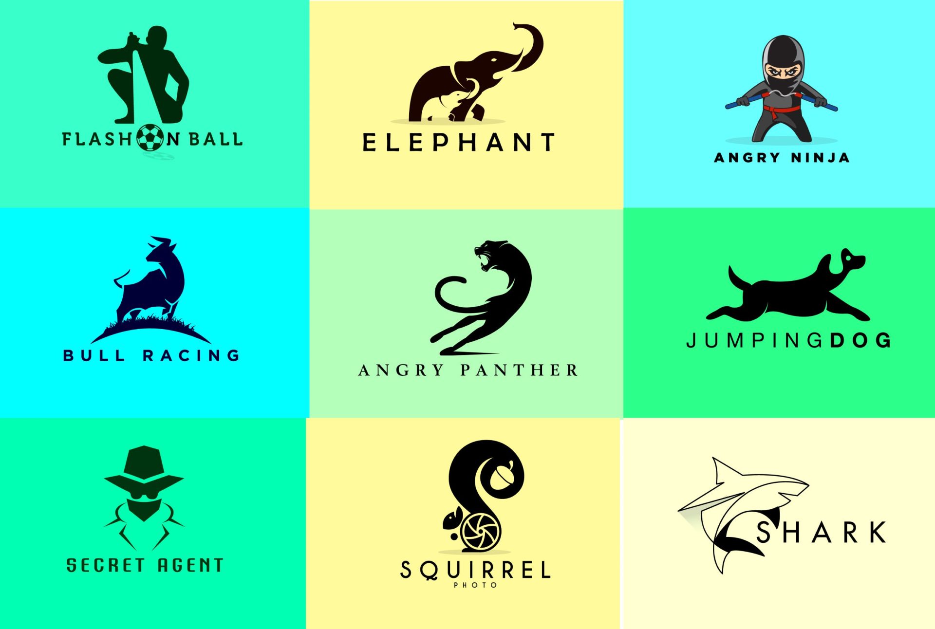
To help you in your logo design journey, here are some essential tips to consider:
1. Understand Your Brand Identity
Before diving into logo design, it is crucial to understand your brand’s identity, values, and target audience. A minimal logo should effectively communicate your brand’s essence, values, and unique selling points.
2. Sketch and Iterate
Start by sketching out rough ideas and concepts. This allows you to explore various possibilities and refine your design iteratively. Experiment with different shapes, forms, and typography to find the perfect balance for your minimal logo.
3. Focus on Simplicity
Remember, less is more when it comes to minimal logo design. Strive for simplicity and avoid unnecessary complexity or ornamentation. Ensure that every element in your logo serves a purpose and contributes to the overall message and aesthetic.
4. Test for Scalability
Test your logo designs at various sizes to ensure they remain clear and legible. A minimal logo should be easily recognizable, regardless of its size or application. Consider how your logo will appear on different platforms, from websites to social media profiles to merchandise.
5. Seek Professional Assistance
If you are not confident in your design skills, consider enlisting the help of a professional graphic designer or a design agency. They can provide expertise and guidance throughout the logo creation process, ensuring your minimal logo accurately represents your brand.
Conclusion
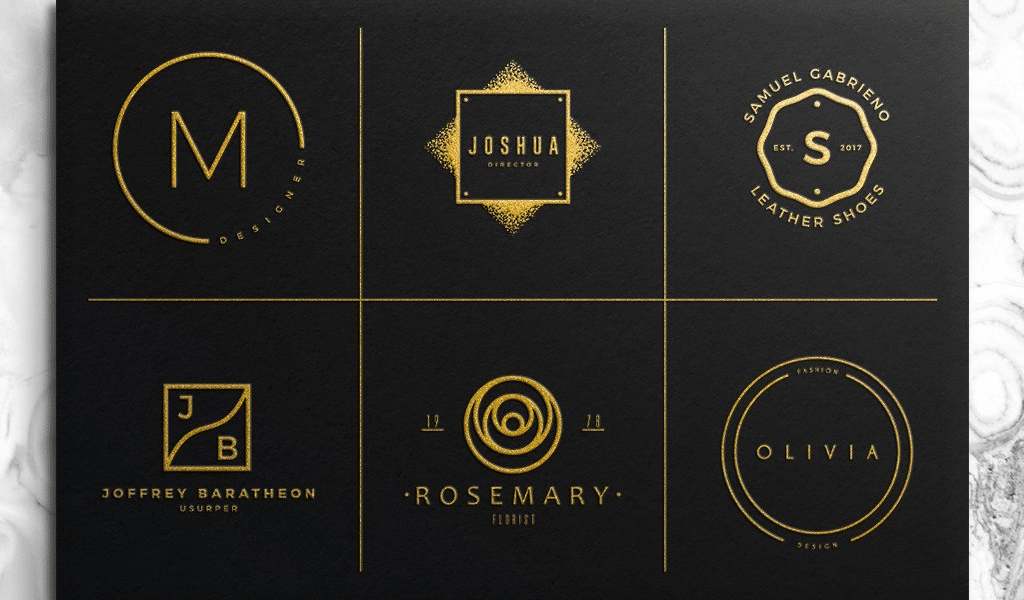
In a world where simplicity and clarity are valued, minimal logo designs have become a popular choice for brands across industries. By utilizing simplified shapes, negative space, thoughtful typography, and a limited color palette, you can create a logo that captures the essence of your brand while leaving a lasting impact on your audience. Remember to understand your brand identity, sketch and iterate, focus on simplicity, test for scalability, and seek professional assistance if needed. Embrace the power of minimalism and create a logo that stands the test of time, representing your brand with elegance and sophistication.
Barry Edwards is a digital marketing expert with a deep understanding of content strategy, logo, and branding principles. Holding a Bachelor’s degree in Marketing from Beaconhill College, he offers valuable insights on digital marketing trends and strategies through his writing. Follow Barry’s work to stay updated on the latest in online marketing and branding.
