Are you looking for a logo design that exudes simplicity and elegance? In today’s competitive business world, a minimalist logo can be a powerful tool to make a lasting impression on your target audience. By stripping away unnecessary elements and focusing on clean lines and simplicity, minimalist logos can effectively communicate your brand’s values and create a memorable visual identity. In this article, we will explore some minimalist logo ideas that can help you elevate your brand’s image and stand out from the crowd.
Why Choose a Minimalist Logo?
Before diving into the world of minimalist logo design, it’s essential to understand the benefits of this style and why it might be the perfect fit for your brand. Here are a few reasons to consider a minimalist logo:
1. Simplicity Speaks Volumes
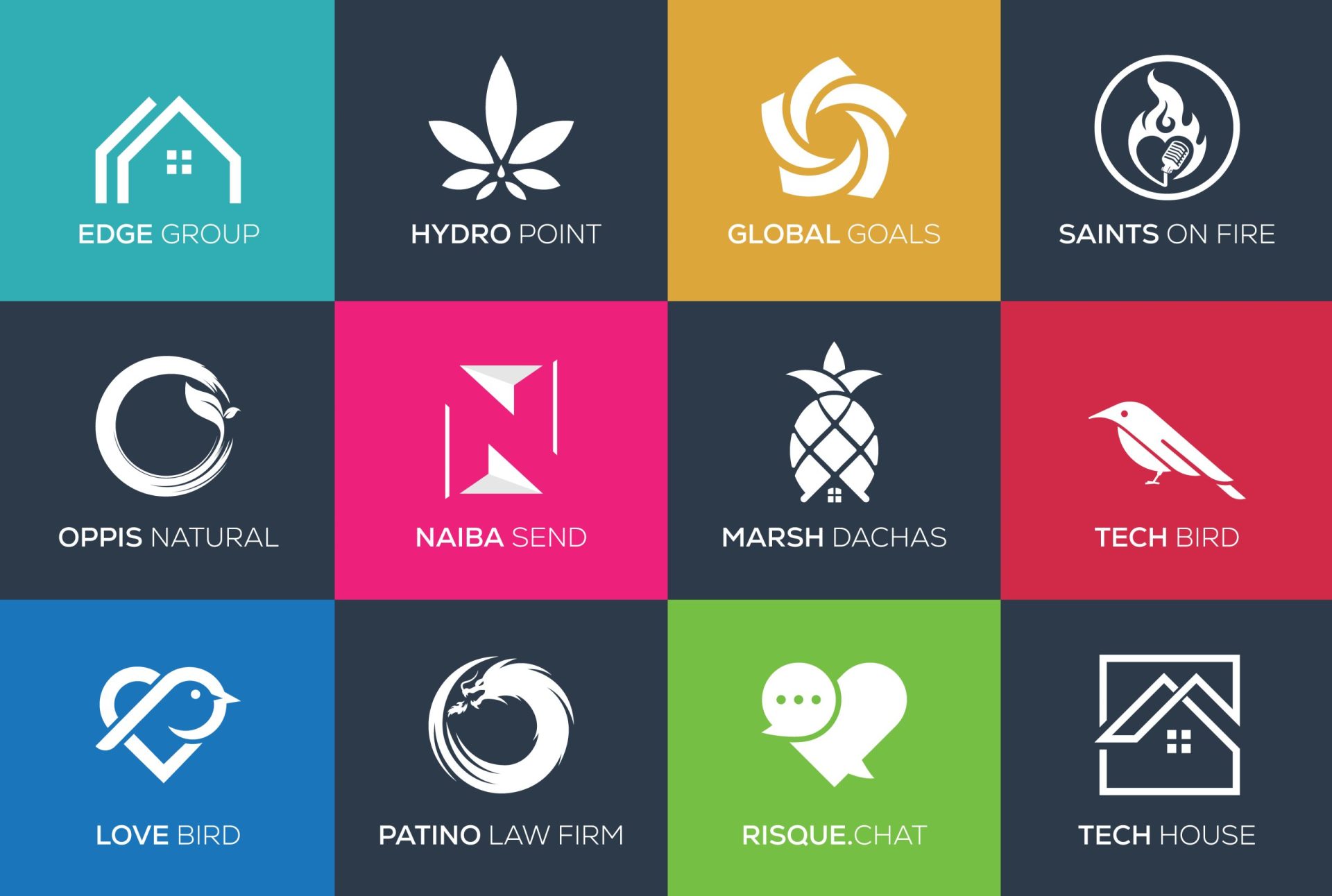
Minimalist logos have a unique ability to communicate a message with a few simple elements. By using clean lines, negative space, and limited color palettes, these logos can convey a sense of sophistication and elegance. A minimalist logo enables your brand to make a strong statement without overwhelming your audience with unnecessary details.
2. Memorable and Timeless
In a fast-paced world where trends come and go, minimalist logos have the advantage of being timeless. By focusing on the core essence of your brand, these logos can withstand the test of time and remain relevant for years to come. A minimalist logo is more likely to be memorable and easily recognizable, making it a valuable asset for your brand’s long-term success.
3. Versatile and Scalable
Minimalist logos are highly versatile and can be easily adapted across various mediums and platforms. Whether it’s a small social media avatar or a large billboard, a minimalist logo maintains its visual impact and legibility. This flexibility ensures that your brand’s identity remains consistent, regardless of the size or format of the logo.
Minimalist Logo Ideas
Now that you understand the value of a minimalist logo, let’s explore some inspiring ideas to help you create a logo that reflects your brand’s essence. Remember, each brand is unique, so these ideas are meant to spark your creativity and guide you in the right direction.
1. Monograms and Lettermarks
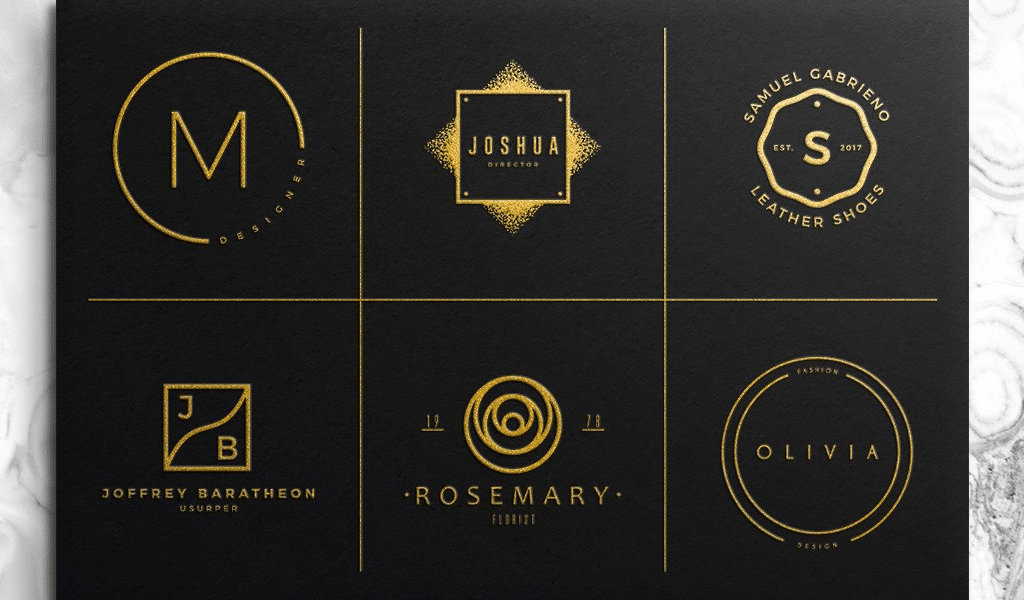
Monograms and lettermarks are minimalist logo designs that focus on the initials or acronyms of your brand name. By utilizing typography and negative space, these logos can create a visually appealing and memorable representation of your brand. Examples of successful monogram logos include IBM, HBO, and NASA.
2. Geometric Shapes
Geometric shapes are a popular choice in minimalist logo design due to their simplicity and versatility. By using circles, squares, triangles, or their combinations, you can create a logo that is both visually interesting and easily recognizable. The use of clean lines and simple shapes can convey a sense of precision and professionalism.
3. Symbolic Icons
Symbolic icons are minimalist logos that rely on a single, visually striking image. These icons can represent your brand’s values, products, or services in a subtle and elegant way. For example, Nike’s iconic swoosh or Apple’s bitten apple are instantly recognizable worldwide. When using symbolic icons, it’s essential to ensure that the image is unique and relevant to your brand.
4. Negative Space Magic
Negative space refers to the area surrounding the main elements of a logo. Cleverly utilizing negative space can create a visually captivating logo that communicates dual meanings or hidden messages. Famous examples include the FedEx logo’s hidden arrow and the Toblerone logo’s hidden bear. Incorporating negative space into your minimalist logo can add depth and intrigue.
5. Typography as Art
Typography can be a powerful tool in minimalist logo design. By focusing on the font, spacing, and arrangement of letters, you can create a logo that is both artistic and minimalist. Experiment with different fonts and unique letterforms to find a typographic logo that reflects your brand’s personality. Remember to keep it legible and engaging.
6. Line Art
Line art is a minimalist logo style that uses thin, continuous lines to create simple yet impactful designs. By reducing shapes and objects to their basic forms, line art logos achieve a sense of elegance and sophistication. This style is particularly effective for brands in creative industries, such as art, design, or architecture.
7. Black and White Excellence
Sometimes, simplicity is best achieved through a monochromatic color palette. A black and white logo can create a bold and striking impression, allowing your brand’s message to shine through without distractions. By eliminating color, you can focus on the design’s form, resulting in a minimalist logo that stands out.
Design Tips for Minimalist Logos
Creating a minimalist logo requires careful consideration of various design elements. Here are a few tips to help you along the way:
1. Less is More
The essence of a minimalist logo lies in its simplicity. Avoid cluttering your design with unnecessary elements. Focus on the core message and strip away any excess. Remember, your logo should be easily understood and visually appealing even at a glance.
2. Clever Use of Negative Space
As mentioned earlier, negative space can be a powerful tool in minimalist logo design. Experiment with negative space to create hidden symbols, dual meanings, or unique shapes within your logo. This technique adds an extra layer of intrigue and can make your logo more memorable.
3. Choose a Harmonious Color Palette
While minimalist logos often employ a limited color palette, selecting the right colors is crucial. Opt for colors that align with your brand’s personality and create a harmonious visual experience. Remember, even a monochromatic or black and white logo can evoke emotions and convey a specific tone.
4. Typography Matters
When using typography in your minimalist logo, pay attention to font selection and spacing. Choose fonts that reflect your brand’s image and are easily legible, even at smaller sizes. Ensure that the spacing between letters and elements is balanced and visually appealing.
5. Test for Scalability
A minimalist logo should be scalable without losing its visual impact. Test your logo design across different sizes, from large banners to tiny social media icons. Make sure it remains clear and legible, maintaining its visual appeal regardless of the size.
Conclusion

Minimalist logos have the power to simplify and strengthen your brand identity. By embracing simplicity, clean lines, and limited elements, these logos can make a lasting impression on your audience. From monograms and geometric shapes to symbolic icons and line art, there are numerous minimalist logo ideas to explore. Remember to consider the unique elements of your brand and create a logo that reflects your company’s values. With careful design choices and attention to detail, your minimalist logo will become a timeless symbol of your brand’s identity.
Marietta Arnold is a branding and design enthusiast who draws inspiration from hobbies like hiking, photography, and art exploration. With a background in graphic design, she shares insights on branding strategies and logo design trends. Stay updated with Marietta’s work for the latest in branding and design.
