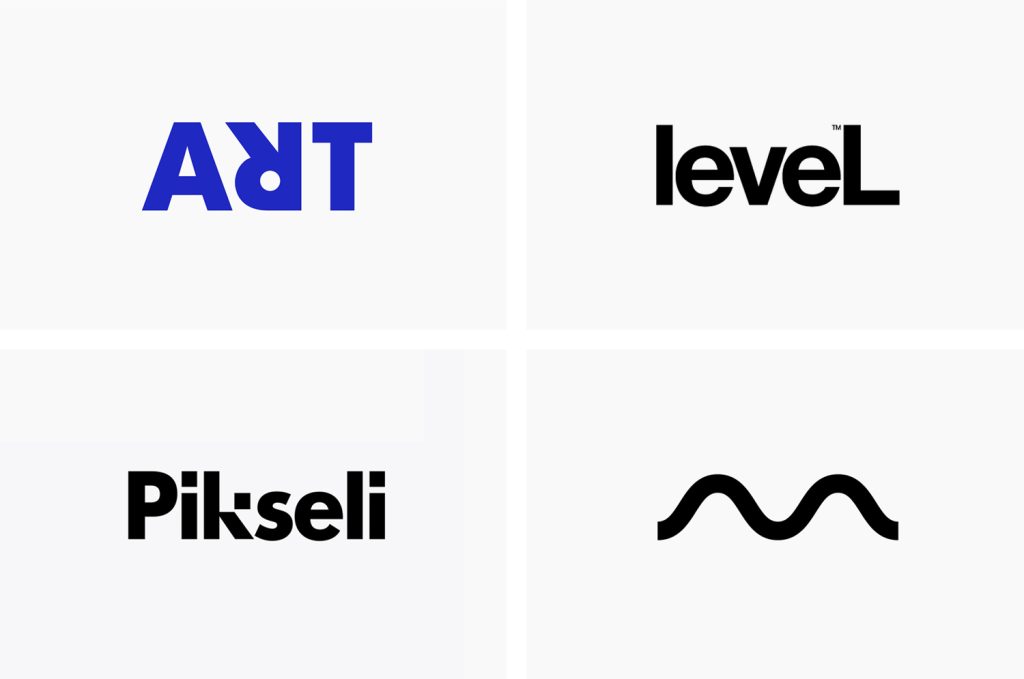
Are you looking for a way to make your brand stand out from the competition? Consider a minimalist logo. Minimalist logos are simple, yet impactful, designs that convey the essence of your brand in a clean and elegant way. Many famous brands, such as Apple, Google, and Starbucks, have switched to minimalist logos in recent years, proving that less is often more when it comes to branding.
A minimalist logo strips away unnecessary embellishments and colors to create a mark that is just as impactful as an intricate design, if not more so. By focusing on the bare essentials, a minimalist logo can make a bigger impact than a logo with too many colors and images. However, minimalist logos are not to be confused with plain or unfinished designs. They require careful consideration and attention to detail to ensure they convey the right message and capture the essence of your brand.
If you’re looking to create a minimalist logo for your brand, there are many resources available to help. Professional designers can work with you to create a custom minimalist logo that perfectly captures your brand’s personality. Alternatively, you can use customizable logo templates to create your own minimalist design. With the right approach, a minimalist logo can be a powerful tool for building brand recognition and creating a lasting impression on your customers.
The Essence of Minimalist Logos
Minimalist logos are all about simplicity and elegance. They focus on using clean lines, basic shapes, and thoughtful typography to create a lasting impression. The essence of minimalist logos is to convey a brand’s essence with impact while using fewer elements than traditional logos.
The power of minimalist logos lies in their ability to communicate a brand’s message in a clear and concise manner. They don’t clutter the mind or confuse viewers – they’re easy to remember and associate with a brand. This is why minimalist logos have become a popular choice for businesses seeking a clean and impactful brand identity.
Minimalist logos make for modern and chic branding that elevates your brand identity. They convey a sense of sophistication and professionalism that is hard to achieve with more complex designs. By stripping away unnecessary elements, minimalist logos allow the brand to shine through and speak for itself.
When creating a minimalist logo, it’s important to keep in mind that less is more. Every element in the design should have a purpose and contribute to the overall message of the brand. The typography should be carefully chosen to reflect the brand’s personality and values. The colors should be simple and complementary, and the shapes should be clean and easily recognizable.
In conclusion, the essence of minimalist logos is the art of simplicity. They are a powerful tool for communicating a brand’s message in a clear and concise manner. By focusing on clean lines, basic shapes, and thoughtful typography, minimalist logos allow the brand to shine through and speak for itself.
Characteristics of Minimalist Logos
Minimalist logos are simple yet impactful designs that convey a brand’s identity through the use of clean lines, negative space, and a limited color palette. Here are some of the key characteristics of minimalist logos:
Simplicity
The hallmark of minimalist logos is their simplicity. They use a minimal amount of design elements to create a powerful visual impact. This simplicity allows the logo to be easily recognizable and memorable. A minimalist logo is not cluttered with unnecessary details, making it easy to reproduce and versatile enough to be used across a variety of mediums.
Use of Negative Space
Minimalist logos often use negative space to create a secondary image or message within the logo. Negative space is the area around and between the design elements. By using negative space, a minimalist logo can convey a deeper meaning or message beyond the primary image. This technique is often used to create hidden images or to emphasize a particular aspect of the logo.
Limited Color Palette
Minimalist logos typically use a limited color palette, often black and white or a single color. This limited color palette helps to keep the design simple and uncluttered. It also makes the logo more versatile, as it can be easily reproduced in different colors or used on a variety of backgrounds.
Typography
The typography used in a minimalist logo is just as important as the design elements. The font should be simple and easy to read, complementing the design elements rather than competing with them. In some cases, the typography may be the primary design element, with the design elements being kept to a minimum.
In summary, minimalist logos are simple, impactful, and versatile designs that use clean lines, negative space, a limited color palette, and typography to convey a brand’s identity. By embracing simplicity, minimalist logos are able to create a lasting impression with their audience.
The Impact of Minimalist Logos
Minimalist logos have become increasingly popular in recent years due to their ability to convey a brand’s essence with elegance and impact while using fewer elements than traditional logos. In this section, we will explore the impact of minimalist logos on brand recognition and their versatility across platforms.
Brand Recognition
One of the primary benefits of minimalist logos is their ability to improve brand recognition. By simplifying the design, minimalist logos create a more memorable and distinctive brand identity. The simplicity of the design also makes it easier for customers to recognize and remember the brand, even when they are exposed to it for a short period.
For example, take a look at the Nike logo. The simple swoosh design is instantly recognizable and has become synonymous with the brand. The same can be said for Apple’s minimalist logo, which has become one of the most recognizable logos in the world.
Versatility Across Platforms
Another benefit of minimalist logos is their versatility across platforms. Minimalist logos are easy to use with smaller screens, such as on mobile phone devices, and they can be easily scaled up or down without losing their impact. This makes them ideal for use across a range of platforms, including social media, websites, and print media.
Moreover, minimalist logos are also easier to incorporate into other elements of a brand’s identity, such as packaging, business cards, and advertisements. This means that the brand’s identity can remain consistent across all platforms, which is essential for building a strong and recognizable brand.
In conclusion, minimalist logos have a significant impact on brand recognition and their versatility across platforms. By simplifying the design, minimalist logos create a more memorable and distinctive brand identity, making it easier for customers to recognize and remember the brand. Additionally, their versatility across platforms makes them an ideal choice for businesses looking to create a consistent and recognizable brand identity.
Famous Examples of Minimalist Logos
When it comes to minimalist logos, there are a few famous examples that immediately come to mind. These logos have become iconic and are instantly recognizable, despite their simplicity. Here are a few examples:
Nike
The Nike logo is one of the most famous examples of a minimalist logo. The logo features a simple swoosh, with no additional text or images. Despite its simplicity, the logo is instantly recognizable and has become synonymous with the Nike brand.
Apple
The Apple logo is another famous example of a minimalist logo. The logo features an apple with a bite taken out of it, with no additional text or images. The logo has become synonymous with the Apple brand and is instantly recognizable.
Adidas
The Adidas logo is another iconic example of a minimalist logo. The logo features three stripes, with no additional text or images. The logo has become synonymous with the Adidas brand and is instantly recognizable.
Coca-Cola
The Coca-Cola logo is a great example of how a minimalist logo can still be memorable and impactful. The logo features the brand name in a simple, yet distinctive font. Despite its simplicity, the logo is instantly recognizable and has become synonymous with the Coca-Cola brand.
FedEx
The FedEx logo is a great example of how a minimalist logo can convey a message. The logo features the brand name, with an arrow hidden in the negative space between the “E” and the “x. The arrow symbolizes speed and efficiency, which is a key message for the FedEx brand.
These are just a few examples of famous minimalist logos. Despite their simplicity, these logos are instantly recognizable and have become synonymous with their respective brands.
How to Create a Minimalist Logo
Minimalist logos are becoming increasingly popular due to their simplicity and versatility. A well-designed minimalist logo can effectively communicate your brand’s message and values. In this section, we will discuss the key steps to create a minimalist logo that represents your brand.
Define Your Brand
Before you start designing your minimalist logo, it’s important to define your brand. Ask yourself what your brand represents and what message you want to convey. Consider your target audience and what they expect from your brand. Once you have a clear understanding of your brand, you can start designing your minimalist logo.
Design Principles
When designing a minimalist logo, it’s important to follow certain design principles. Here are a few principles to consider:
- Stick to geometric shapes: Use clean, geometric shapes like rectangles, triangles, and ellipses. Avoid intricate designs or illustrations.
- Keep it proportional: Ensure that your logo is proportional and visually balanced.
- Use negative space: Utilize negative space to create interesting and unique designs.
- Choose a simple font: Use a simple font that is easy to read.
Choosing Colors and Typography
When it comes to minimalist logos, less is more. Stick to a limited color palette and choose colors that represent your brand’s values. Black and white are popular choices for minimalist logos, but you can also use other muted colors.
When choosing typography, keep it simple and legible. Sans-serif fonts are a popular choice for minimalist logos. Avoid using too many fonts or styles, as this can make your logo look cluttered.
In conclusion, creating a minimalist logo requires careful consideration of your brand’s values and design principles. By following these steps, you can create a minimalist logo that effectively communicates your brand’s message.
The Future of Minimalist Logos
Minimalist logos have been gaining popularity in recent years, and the trend is expected to continue in the future. With the rise of digital media, minimalist logos have become more important than ever. These logos are designed to be simple, memorable, and versatile, making them perfect for use across a wide range of platforms and devices.
One of the reasons minimalist logos are so popular is that they are timeless. Unlike more complex logos, minimalist logos are not tied to a particular era or design trend. This means that they can remain relevant and effective for years to come, even as design trends change.
Another benefit of minimalist logos is that they are easier to recognize and remember. With fewer elements to focus on, viewers can quickly and easily identify a brand’s logo, even if they only see it briefly. This makes minimalist logos ideal for use in advertising and marketing, where brands need to make a strong impression quickly.
In the future, we can expect to see even more minimalist logos as brands continue to prioritize simplicity and versatility in their branding. As technology continues to evolve, minimalist logos will become even more important, as they are better suited for use across a wide range of devices and platforms.
Overall, the future of minimalist logos looks bright. With their simplicity, versatility, and timeless design, minimalist logos are the perfect choice for brands looking to make a lasting impression in today’s fast-paced digital world.
Angela Irwin is a branding and design enthusiast with a Bachelor of Fine Arts in Graphic Design from Meadowbrook College. As a writer at Logocreator.io, she shares her expertise on logo design, graphic trends, and effective branding strategies, helping businesses create impactful visual identities.


