Are you looking to create a brand that represents strength, resilience, and a love for the outdoors? A mountain logo might be the perfect fit for your business. Mountain logos are a popular choice for companies in the outdoor and adventure industries, as well as for businesses that want to convey a sense of power and stability.
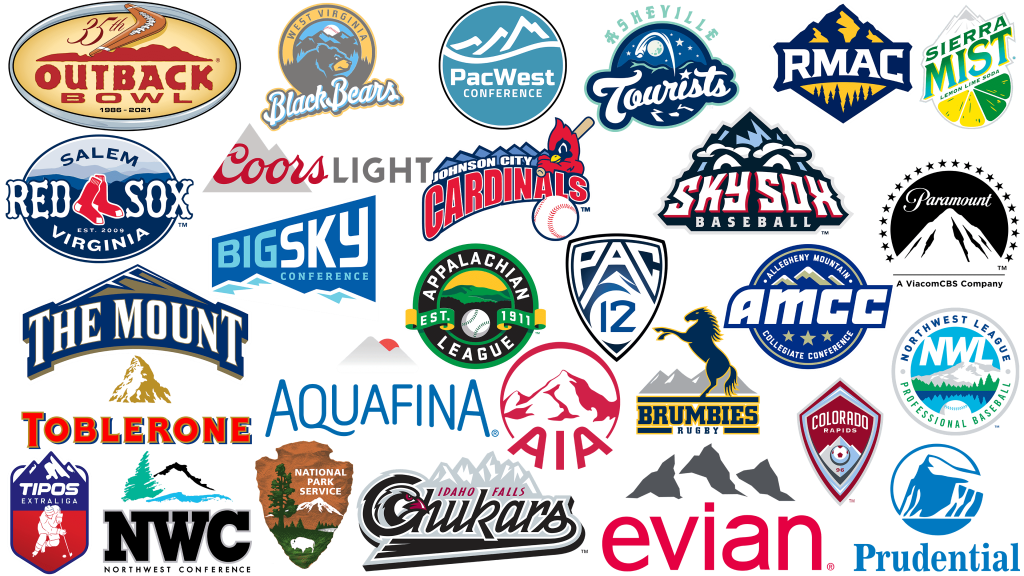
There are countless variations of mountain logos, from minimalist designs featuring simple silhouettes to more complex logos incorporating wildlife, trees, and other outdoor elements. Some of the most well-known companies with mountain logos include Patagonia, Paramount, Prudential, and Coors. A mountain logo can be a great way to showcase your brand’s personality and values, while also creating a memorable and recognizable image that customers will associate with your business.
The Power of a Mountain Logo
A mountain logo is a powerful symbol that can convey a wide range of meanings and emotions. Here are some reasons why a mountain logo can be so effective:
1. Mountains symbolize strength and stability
Mountains are massive, enduring structures that have stood the test of time. They represent strength, stability, and permanence. By incorporating a mountain into your logo, you can convey a sense of reliability and trustworthiness to your customers.
2. Mountains evoke a sense of adventure and exploration
Mountains are also associated with adventure and exploration. They represent the unknown and the unexplored. By using a mountain logo, you can tap into this sense of excitement and encourage your customers to take risks and try new things.
3. Mountains are a versatile symbol
Mountains can be used to represent a wide range of concepts and industries. They are commonly used by outdoor and adventure brands, but they can also be used by companies in other industries, such as finance or technology. A mountain logo can be adapted to fit any brand or message.
4. Mountains are memorable
A well-designed mountain logo can be memorable and instantly recognizable. By using a mountain in your logo, you can create a strong visual identity that will stick in your customers’ minds.
5. Mountains can be used in a variety of design styles
Mountains can be incorporated into a logo in a variety of ways, from simple and minimalist to detailed and intricate. This versatility allows you to create a logo that fits your brand’s style and personality.
Overall, a mountain logo can be a powerful tool for building a strong brand identity. Whether you’re starting a new business or rebranding an existing one, consider incorporating a mountain into your logo design to tap into the power of this timeless symbol.
Essential Elements of a Mountain Logo
If you’re looking to create a mountain logo for your brand, there are a few essential elements you should consider. A well-designed mountain logo can convey strength, stability, and natural beauty, making it an excellent choice for a wide range of businesses. Here are the key elements to keep in mind:
Shape and Symbolism
The shape of your mountain logo is perhaps the most critical element. Mountains are naturally strong and stable, so you’ll want to choose a shape that reflects these qualities. Some common shapes for mountain logos include:
- Triangles: A triangle shape can represent stability and strength, as well as the peak of a mountain.
- Peaks: A logo that features a stylized peak can be a powerful symbol of strength and endurance.
- Ridges: A logo that incorporates a ridgeline can represent the natural beauty of mountains and the idea of overcoming challenges.
When choosing a shape for your mountain logo, think about the message you want to convey and choose a shape that reflects those values.
Color Choices
Color is another critical element of a mountain logo. The right color palette can help evoke the natural beauty of mountains and convey a sense of strength and stability. Some popular color choices for mountain logos include:
- Blue: Blue is a common choice for mountain logos, as it can represent the sky and water, both of which are often associated with mountains.
- Green: Green can represent the natural beauty of mountains and the idea of growth and renewal.
- Brown: Brown is a popular choice for mountain logos, as it can represent the earthy tones of mountains and the idea of stability and strength.
When choosing colors for your mountain logo, consider the emotions you want to evoke and choose a palette that reflects those values.
Typography
Finally, typography is an essential element of any logo, including mountain logos. The right font can help convey the message and values of your brand. When choosing typography for your mountain logo, consider the following:
- Serif vs. sans-serif: Serif fonts can convey a sense of tradition and stability, while sans-serif fonts can be more modern and sleek.
- Bold vs. thin: A bold font can represent strength and stability, while a thin font can be more delicate and natural.
- Script vs. block: A script font can be elegant and sophisticated, while a block font can be more straightforward and bold.
When choosing typography for your mountain logo, consider the personality of your brand and choose a font that reflects those values.
By considering these essential elements, you can create a stunning and memorable mountain logo that represents your brand’s message and values.
Mountain Logo Design Process
Creating a mountain logo design can be an exciting and challenging process. To help you get started, we’ve broken down the process into three essential steps: research, sketching, and digital rendering.
Research
Before you begin designing your mountain logo, it’s crucial to do some research. Start by looking at other mountain logos to get a sense of what works and what doesn’t. Consider the following questions:
- What are the common elements of mountain logos?
- What colors are typically used in mountain logos?
- What fonts are commonly used in mountain logos?
Once you have a sense of what’s out there, think about your brand’s message and how you want to convey it through your logo. Consider the following:
- What emotions do you want your logo to evoke?
- What values does your brand represent?
- Who is your target audience?
Sketching
Once you’ve done your research, it’s time to start sketching. Grab a pencil and paper and start experimenting with different shapes and styles. Try to create a few different options, and don’t be afraid to get creative.
When sketching your mountain logo, keep the following in mind:
- Keep it simple: A simple logo is more memorable and easier to recognize.
- Use negative space: Negative space can be a powerful tool in logo design. Consider how you can use it to create a more interesting and dynamic logo.
- Think about color: Even if you’re sketching in black and white, consider how your logo will look in color. Color can have a significant impact on the emotional response to your logo.
Digital Rendering
Once you have a few sketches you’re happy with, it’s time to move on to digital rendering. Use your favorite design software to create digital versions of your sketches. Experiment with different colors, fonts, and layouts until you find a design that works.
When rendering your mountain logo, keep the following in mind:
- Keep it scalable: Your logo should look good no matter what size it is. Make sure it’s scalable without losing detail or clarity.
- Be consistent: Your logo should be consistent with your brand’s message and values. Make sure it reflects the tone and personality of your brand.
- Test it out: Once you have a final design, test it out in different contexts. Consider how it looks on different backgrounds and in different sizes. Make sure it’s versatile enough to work in a variety of settings.
By following these steps, you can create a mountain logo that’s both visually appealing and effective in conveying your brand’s message.
Successful Mountain Logo Examples
Mountain logos are a popular design choice for brands that want to convey strength, adventure, and a connection to nature. Here are a few examples of successful mountain logos that have made an impact in their respective industries:
Patagonia
Patagonia is a clothing brand that specializes in outdoor gear. Their logo features a mountain range with a river running through it. The logo is simple, yet effective, and it perfectly captures the brand’s connection to nature and the outdoors.
The North Face
The North Face is another outdoor clothing brand that uses a mountain logo. Their logo features a stylized image of the Half Dome peak in Yosemite National Park. The logo is bold and easily recognizable, and it has become synonymous with outdoor adventure.
REI
REI is a retail co-op that specializes in outdoor gear and clothing. Their logo features a stylized mountain peak with the letters “REI” next to it. The logo is simple and clean, and it effectively communicates the brand’s focus on outdoor exploration and adventure.
Columbia Sportswear
Columbia Sportswear is a clothing brand that specializes in outdoor gear. Their logo features a mountain peak with the brand name written underneath. The logo is simple and straightforward, and it effectively communicates the brand’s focus on outdoor adventure and exploration.
Mountain Dew
Mountain Dew is a popular soft drink that uses a mountain logo. Their logo features a stylized mountain peak with the brand name written underneath. The logo is bold and eye-catching, and it effectively communicates the brand’s energy and excitement.
In conclusion, these are just a few examples of successful mountain logos that have made an impact in their respective industries. If you’re looking to create a mountain logo for your brand, take inspiration from these logos and focus on creating a design that effectively communicates your brand’s connection to nature and the outdoors.
How to Choose a Mountain Logo Designer
Choosing the right designer for your mountain logo is crucial to ensure that your brand identity is accurately and effectively represented. Here are some tips to help you choose the best mountain logo designer for your needs:
Look for Experience
Experience is key when it comes to designing a logo that effectively captures the essence of your brand. Look for designers who have experience creating mountain logos or logos for outdoor brands. Check out their portfolio to see if their style aligns with your vision.
Check Reviews and Ratings
Read reviews and ratings from previous clients to get an idea of the designer’s work ethic, communication skills, and overall quality of work. This can help you avoid any potential issues and ensure that you’re working with a professional who can deliver what you need.
Consider Your Budget
Before hiring a designer, consider your budget and how much you’re willing to spend on your mountain logo. Keep in mind that a higher price doesn’t always guarantee better quality work. Look for designers who offer competitive pricing and value for money.
Communication is Key
Effective communication is crucial when working with a designer. Look for a designer who is responsive, easy to communicate with, and takes the time to understand your brand and vision. This can help ensure that you’re both on the same page throughout the design process.
Look for Additional Services
Some designers offer additional services such as branding packages, social media graphics, and website design. Consider whether these additional services align with your needs and can help you further establish your brand identity.
By following these tips, you can find the right mountain logo designer who can help you effectively represent your brand and stand out in a competitive market.
Maintaining Brand Consistency with Your Mountain Logo
Your mountain logo is a crucial component of your brand identity. It helps customers recognize your brand and differentiate it from competitors. To maintain brand consistency, it’s essential to ensure that your mountain logo is used correctly across all marketing materials and channels. Here are some tips to help you maintain brand consistency with your mountain logo:
Establish Brand Guidelines
Creating brand guidelines is an effective way to ensure that your mountain logo and other brand elements are used consistently. Your brand guidelines should include specifications for the use of your mountain logo, such as its size, placement, and color. It should also outline the appropriate use of your mountain logo on different marketing materials, such as business cards, websites, and social media platforms.
Use the Right Colors
Color is a critical component of your mountain logo and brand identity. To maintain brand consistency, it’s essential to use the correct colors across all marketing materials. Make sure that the colors used in your mountain logo are consistent with your brand’s color palette. Your brand guidelines should specify the correct color codes and variations to use.
Choose the Right Fonts
Fonts are another crucial element of your brand identity. To maintain brand consistency, it’s essential to use the same fonts across all marketing materials. Your brand guidelines should specify the correct fonts to use for your mountain logo and other brand elements. Make sure that the fonts used are consistent with your brand’s personality and tone.
Monitor Usage
To maintain brand consistency, it’s essential to monitor the usage of your mountain logo across all marketing materials and channels. Regularly check that your mountain logo is being used correctly and consistently. If you notice any inconsistencies, address them promptly to ensure that your brand identity remains strong and recognizable.
By following these tips, you can maintain brand consistency with your mountain logo and strengthen your brand identity. Remember that your mountain logo is a crucial component of your brand, and it’s essential to use it correctly and consistently to ensure that your brand is recognizable and memorable.
Conclusion
Congratulations! You have now learned about some of the most popular clothing brands with mountain logos and how to create your own mountain logo for your outdoor or adventure brand.
Remember, when designing your logo, it is important to convey strength, resilience, and the adventurous spirit of your audience. You want your logo to stand out and be recognizable to your target market.
In addition to the brands mentioned in the search results, there are many other companies that use mountain logos in their branding. It is important to do your research and make sure your logo is unique and not too similar to other logos in your industry.
When it comes to creating a successful mountain logo, simplicity is key. A simple yet effective logo can make a lasting impression on your audience. Consider using bold colors, clean lines, and minimalist designs to make your logo stand out.
Overall, creating a mountain logo for your brand can be a fun and exciting process. With the right design, your logo can become a symbol of strength, adventure, and the great outdoors. Good luck with your branding journey!
Barry Edwards is a digital marketing expert with a deep understanding of content strategy, logo, and branding principles. Holding a Bachelor’s degree in Marketing from Beaconhill College, he offers valuable insights on digital marketing trends and strategies through his writing. Follow Barry’s work to stay updated on the latest in online marketing and branding.


