Are you looking for a unique and eye-catching logo design? Incorporating numbers into your logo can be a creative and effective way to communicate your brand’s message and values. In this article, we will explore various number logo ideas to inspire you and help you create a memorable and impactful logo for your business.
Why Use Numbers in Logo Design?
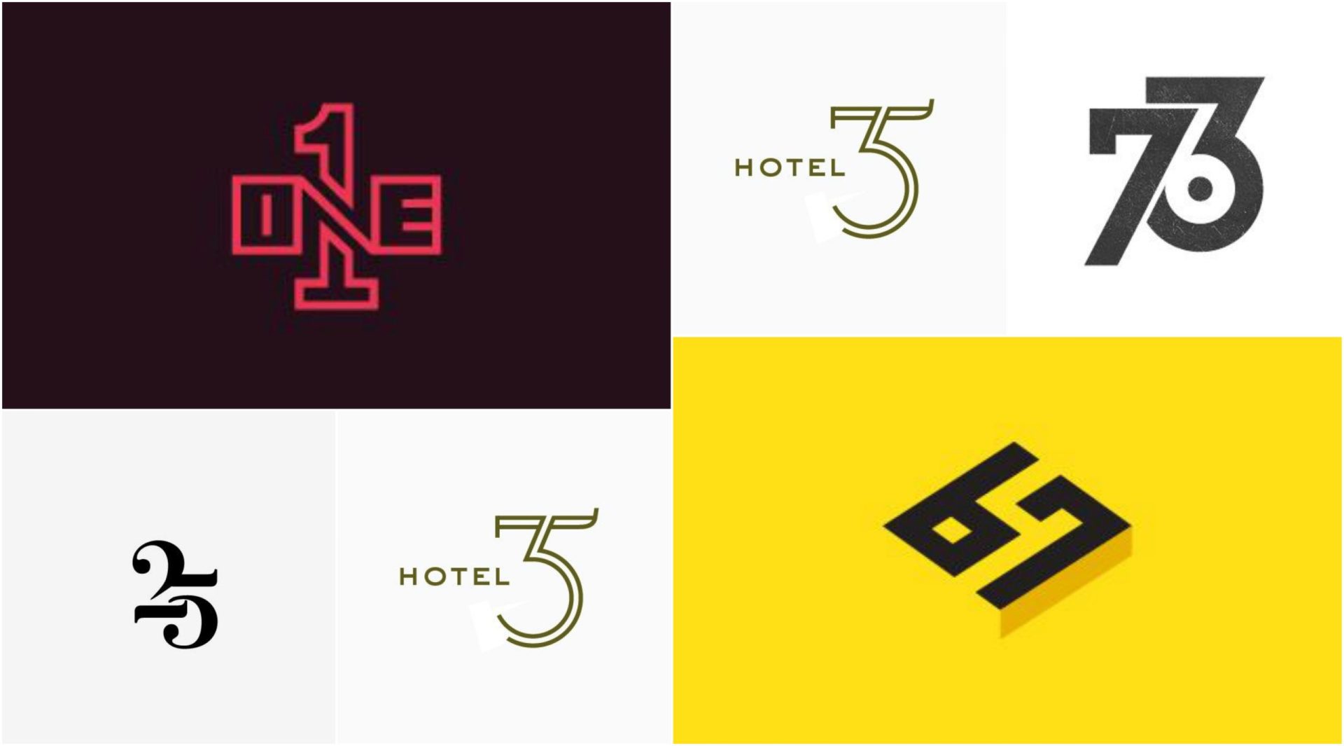
Numbers are powerful visual elements that can convey meaning and evoke emotions. They can represent various aspects of your business, such as the founding year, product features, or even your brand’s core values. By incorporating numbers into your logo, you can create a strong visual identity that resonates with your target audience.
Using numbers in your logo design can have several benefits:
- Memorability: Numbers are easily recognizable and can leave a lasting impression on your audience. A well-designed number logo can help your brand stand out from the competition.
- Symbolism: Numbers can symbolize specific meanings or concepts. For example, the number “7” is often associated with luck or perfection, while “1” can represent leadership or excellence. By choosing the right numbers, you can convey a deeper message about your brand.
- Versatility: Numbers can be combined with other design elements to create a unique and versatile logo. Depending on your brand’s personality and target audience, you can experiment with different fonts, colors, and styles to create a logo that reflects your brand’s identity.
Now that we understand the benefits of using numbers in logo design, let’s dive into some creative number logo ideas that can inspire your own logo creation process.
1. Incorporating Numerals as the Main Element
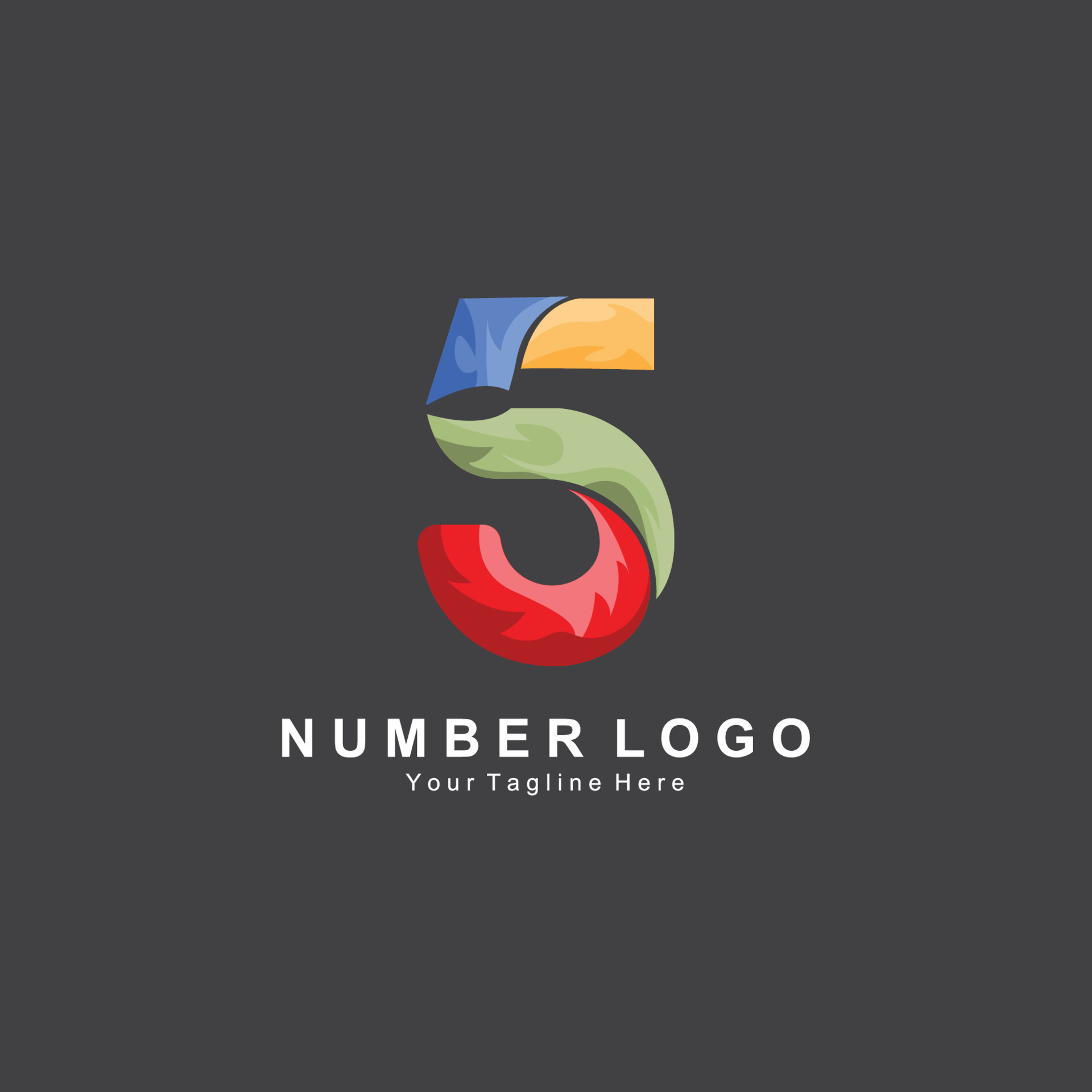
One of the simplest ways to use numbers in your logo design is to make them the main focal point. This approach works well when you want to emphasize a specific number that holds significance for your brand.
Example: “The 365 Café”
In this example, the number “365” represents the concept of everyday service. The logo could feature a bold and stylized “365” alongside the word “Café,” creating a visually appealing and memorable design. The font choice and style can be tailored to match the brand’s personality, whether it’s modern, classic, or playful.
2. Using Numbers to Depict Symbols or Objects
Numbers can be cleverly incorporated into your logo design to represent symbols or objects related to your business. This approach adds depth and creativity to your logo, as it combines both visual and numerical elements.
Example: “The Gearbox Tech”
If you own a technology company specializing in gears or mechanical components, you can integrate a gear shape into the numbers of your logo. For instance, the number “0” can be transformed into a gear, while other numbers can be designed to complement the overall logo concept. This creates a cohesive and visually appealing logo that clearly communicates your expertise.
3. Creating a Logo with Sequential Numbers
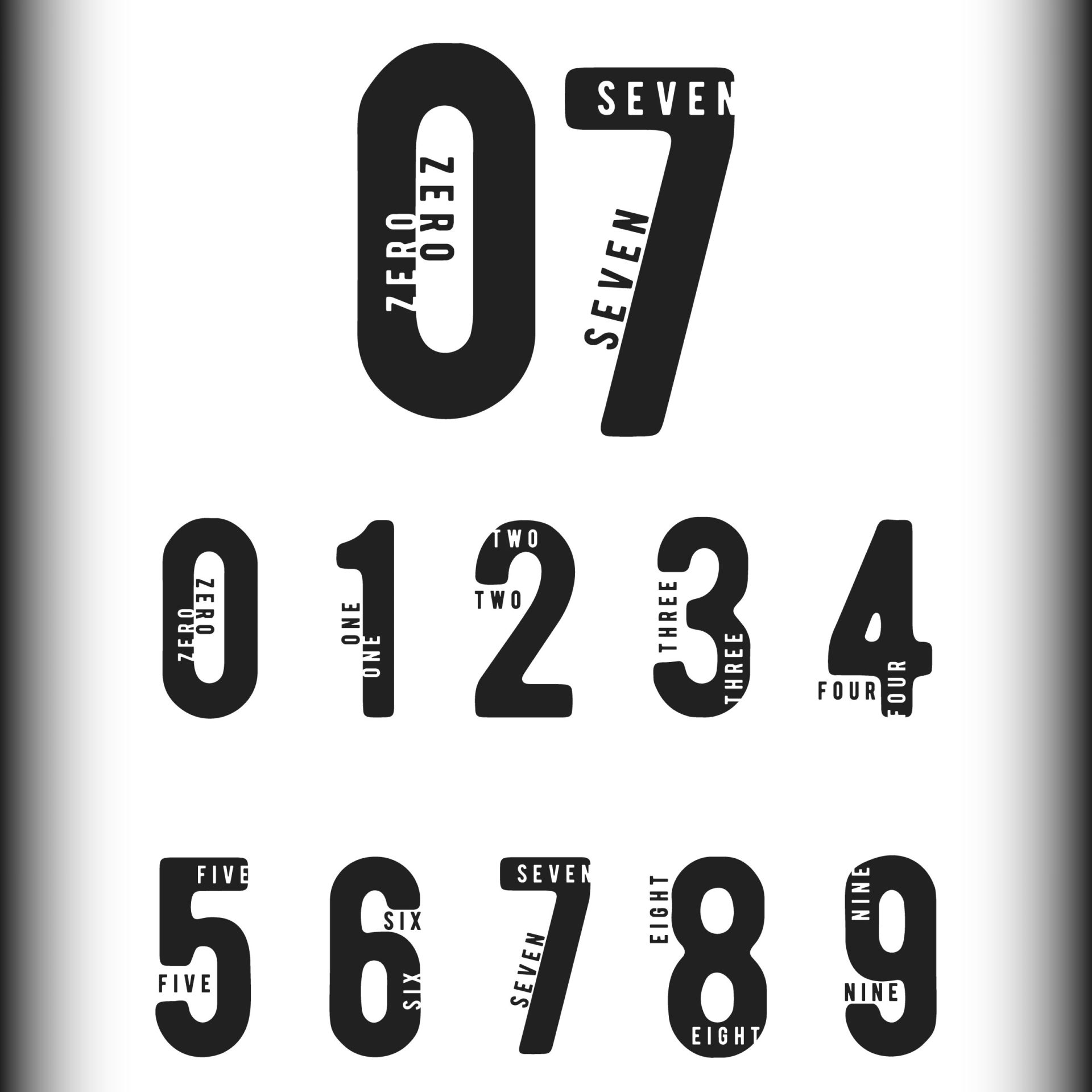
Sequential numbers can be used to convey growth, progress, or a series of products or services. This approach works well for businesses that offer a range of products or have a clear progression in their offerings.
Example: “The Steps Fitness Studio”
If you own a fitness studio that offers various levels of workouts or training programs, you can incorporate sequential numbers into your logo design. Using ascending numbers, such as “1,” “2,” and “3,” can represent the different levels of intensity or skills offered by your studio. This approach not only showcases your range of services but also creates a sense of progression and achievement for your clients.
4. Using Roman Numerals for a Classic Touch
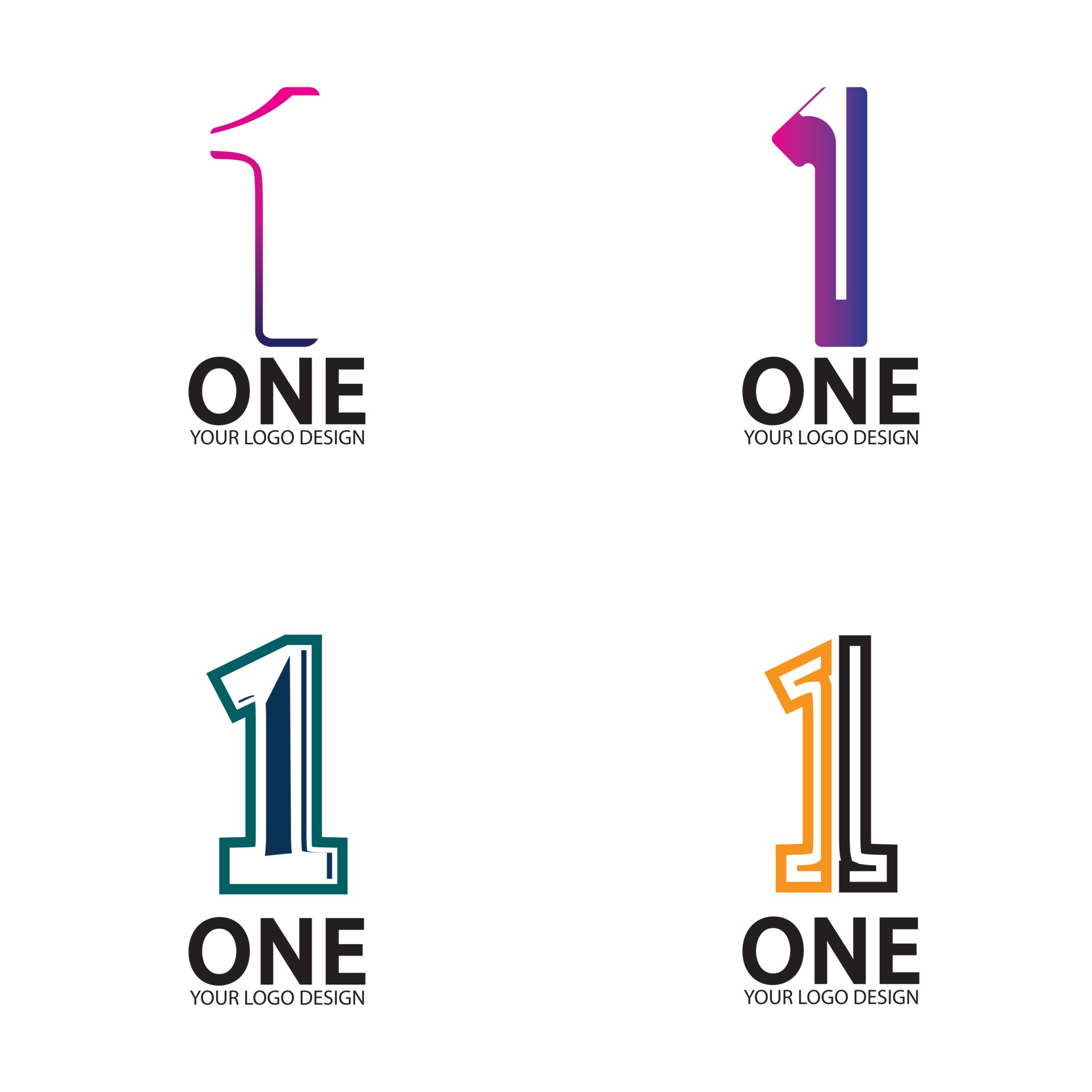
Roman numerals can add a touch of elegance and timelessness to your logo design. They are often associated with historical significance, making them suitable for brands that want to convey a sense of tradition or heritage.
Example: “The MMXIX Bakery”
In this example, the logo for a bakery can feature the Roman numeral representation of the year 2019 (MMXIX). This not only signifies the founding year of the bakery but also adds a classic and sophisticated touch to the brand’s identity. The typography and overall design should be carefully chosen to reflect the desired aesthetic.
5. Combining Numbers with Typography
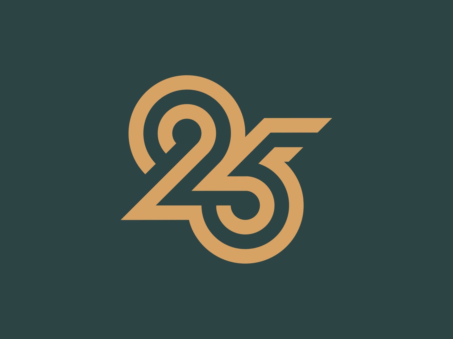
Combining numbers with creative typography can result in a visually striking logo design. This approach allows you to play with different font styles, sizes, and arrangements to create a unique and memorable logo.
Example: “The 24/7 Fitness Club”
For a fitness club that operates 24/7, the numbers “24/7” can be creatively integrated with typography to form an engaging logo. The numbers can be stylized using bold fonts, and the “2” and “7” can be emphasized to highlight the club’s round-the-clock availability. Combining this with a dynamic and energetic typography style can effectively communicate the club’s brand identity.
Conclusion
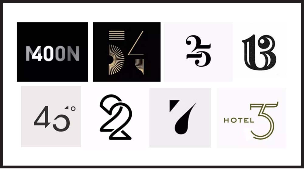
Incorporating numbers into your logo design can add depth, meaning, and visual appeal to your brand’s identity. Whether you choose to make numbers the main element, use them to represent symbols or objects, create a logo with sequential numbers, opt for Roman numerals, or combine numbers with typography, there are countless creative possibilities to explore.
Remember, when designing your logo, it’s essential to consider your brand’s personality, values, and target audience. By carefully selecting the right numbers and combining them with creative design elements, you can create a logo that effectively communicates your brand’s message and leaves a lasting impression on your audience. So, go ahead, unleash your creativity, and create a number logo that truly represents your brand!
Angela Irwin is a branding and design enthusiast with a Bachelor of Fine Arts in Graphic Design from Meadowbrook College. As a writer at Logocreator.io, she shares her expertise on logo design, graphic trends, and effective branding strategies, helping businesses create impactful visual identities.

