Creating a unique and memorable photography logo is crucial for establishing a strong brand identity in the highly competitive photography industry. Your logo is often the first point of contact with potential clients, and it should convey your style, professionalism, and creativity. In this comprehensive guide, we will explore various photography logo ideas, including design principles, typography, color palettes, and emblem options, helping you craft a logo that truly reflects your creative vision.
Understanding the Importance of a Photography Logo
A photography logo serves as the visual representation of your brand. It can have a significant impact on how potential clients perceive your work and the overall impression they have of your business. A well-designed logo can help you stand out from the crowd, create a sense of professionalism, and foster trust with your audience.
Establishing Your Brand Identity
Before diving into logo design, it’s essential to define your brand identity. Consider your target audience, your style of photography, and the emotions you want to evoke with your work. Are you a wedding photographer aiming for elegance and romance, or are you a nature photographer focusing on capturing the beauty of the natural world? Understanding your brand personality will guide your logo design choices.
Design Principles for Photography Logos
When crafting your photography logo, it’s important to adhere to certain design principles to ensure a visually appealing and cohesive final result.
Simplicity
Simplicity is key when it comes to logo design. A cluttered or complicated logo can be overwhelming and fail to make a lasting impression. Aim for a clean, minimalist design that is easily recognizable and scalable across various platforms.
Balance
Achieving balance in your logo design helps create a visually pleasing composition. Consider the distribution of elements within your logo – both in terms of size and placement – to ensure a harmonious visual balance.
Proportion and Scale
Maintaining proper proportion and scale is crucial for a professional-looking logo. Elements that are too large or too small can create visual imbalance and affect the overall aesthetic appeal.
Typography
Typography plays a significant role in logo design, as it can convey personality and set the tone for your brand. When choosing fonts for your photography logo, opt for those that are legible, timeless, and complement your brand identity.
Color Palette
The color palette you choose for your photography logo can influence the emotions and perceptions associated with your brand. Consider the psychology of colors and select hues that align with your brand personality. Experiment with different combinations to find the perfect balance between creativity and professionalism.
Photography Logo Ideas
Now that you understand the design principles behind creating a visually appealing logo, let’s explore some specific photography logo ideas that can inspire your own unique design.
1. Signature Logo
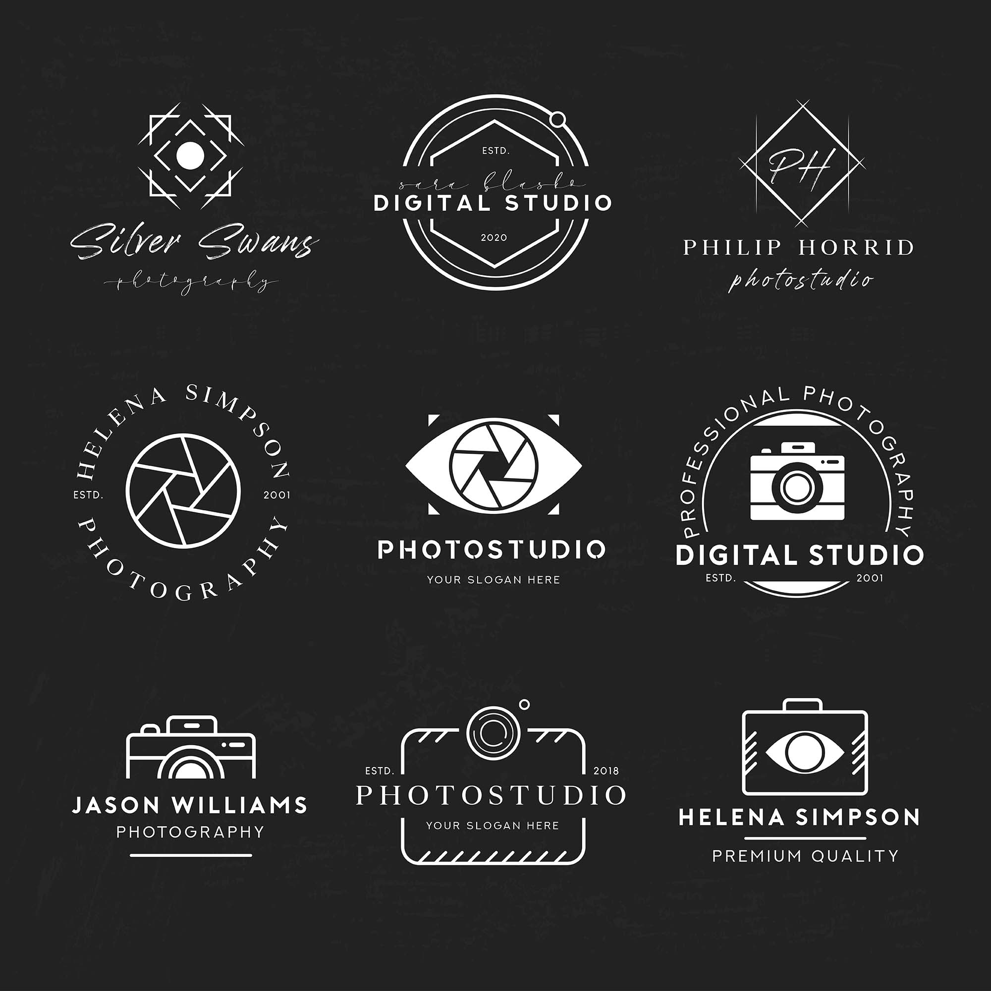
A signature logo is a popular choice among photographers, as it adds a personal touch and a sense of authenticity to your brand. Consider creating a custom signature using your own handwriting or a script font that reflects your style. This type of logo works particularly well for portrait photographers or those who want to convey a sense of individuality.
2. Camera Icon
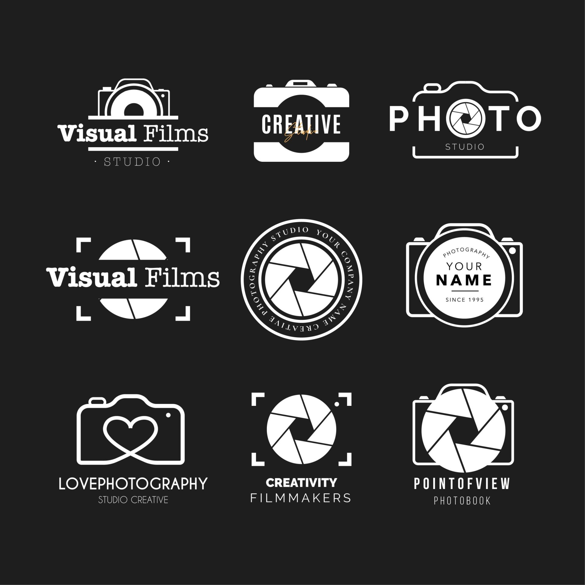
Incorporating a camera icon into your logo design is a straightforward way to instantly convey your profession. Experiment with different camera styles, such as vintage film cameras or modern digital cameras, to find one that aligns with your brand personality. This type of logo is ideal for photographers who want to emphasize their expertise and passion for the craft.
3. Abstract Shapes
Using abstract shapes in your logo design can create a unique and artistic look. These shapes can represent elements related to your photography niche, such as landscapes, cityscapes, or light rays. Abstract logos allow for more creative freedom and can be an excellent choice for photographers with a more artistic or experimental approach.
4. Monogram
A monogram logo involves combining two or more initials to create a distinctive symbol. This type of logo adds a touch of elegance and sophistication to your brand. Experiment with different typographic treatments and embellishments to create a monogram that truly represents your style and professionalism.
5. Negative Space
Utilizing negative space in your logo design can create a clever and visually appealing effect. By strategically incorporating hidden symbols or shapes within the negative space, you can add depth and intrigue to your logo. This type of logo is particularly effective in conveying a sense of creativity and attention to detail.
Choosing the Right Typography for Your Photography Logo

The typography you choose for your photography logo plays a crucial role in conveying your brand personality and setting the tone for your business. Here are some key considerations when selecting typography:
1. Serif Fonts
Serif fonts, with their elegant and timeless appeal, are often associated with tradition, sophistication, and professionalism. They can be an excellent choice for wedding photographers or those aiming for a classic and refined brand identity.
2. Sans-Serif Fonts
Sans-serif fonts have a clean and modern aesthetic, making them popular among photographers with a contemporary style. They can convey a sense of simplicity, minimalism, and innovation.
3. Script Fonts
Script fonts add a personal and handcrafted touch to your logo. They can evoke a sense of elegance, creativity, and individuality. However, it’s important to ensure that script fonts remain legible and don’t compromise the overall readability of your logo.
4. Custom Lettering
Consider creating custom lettering for your photography logo. This can involve modifying existing fonts or designing entirely unique letterforms. Custom lettering allows you to create a logo that is truly one-of-a-kind and tailored to your brand identity.
Color Psychology in Photography Logos
Colors have the power to evoke emotions and convey specific messages. Understanding color psychology can help you select a color palette that aligns with your brand identity. Here are some common colors used in photography logos and their associated emotions:
1. Blue
Blue is often associated with trust, reliability, and professionalism. It can be an excellent choice for photographers who aim to create a sense of calmness, dependability, and authenticity.
2. Black
Black is synonymous with sophistication, elegance, and timelessness. It can add a touch of luxury and professionalism to your photography logo. However, be cautious not to overuse black, as it can sometimes appear heavy or overpowering.
3. White
White is often associated with purity, simplicity, and cleanliness. It can create a sense of openness and can be an excellent choice for photographers who want to convey a minimalist and modern brand identity.
4. Warm Tones (e.g., Red, Orange, Yellow)
Warm tones evoke feelings of energy, passion, and enthusiasm. They can add vibrancy and excitement to your logo. These colors work particularly well for photographers who want to convey a sense of creativity, warmth, and joy.
5. Earth Tones (e.g., Green, Brown)
Earth tones are often associated with nature, growth, and stability. They can be an excellent choice for nature or landscape photographers, as well as those who want to convey a sense of authenticity and connection with the natural world.
Final Thoughts
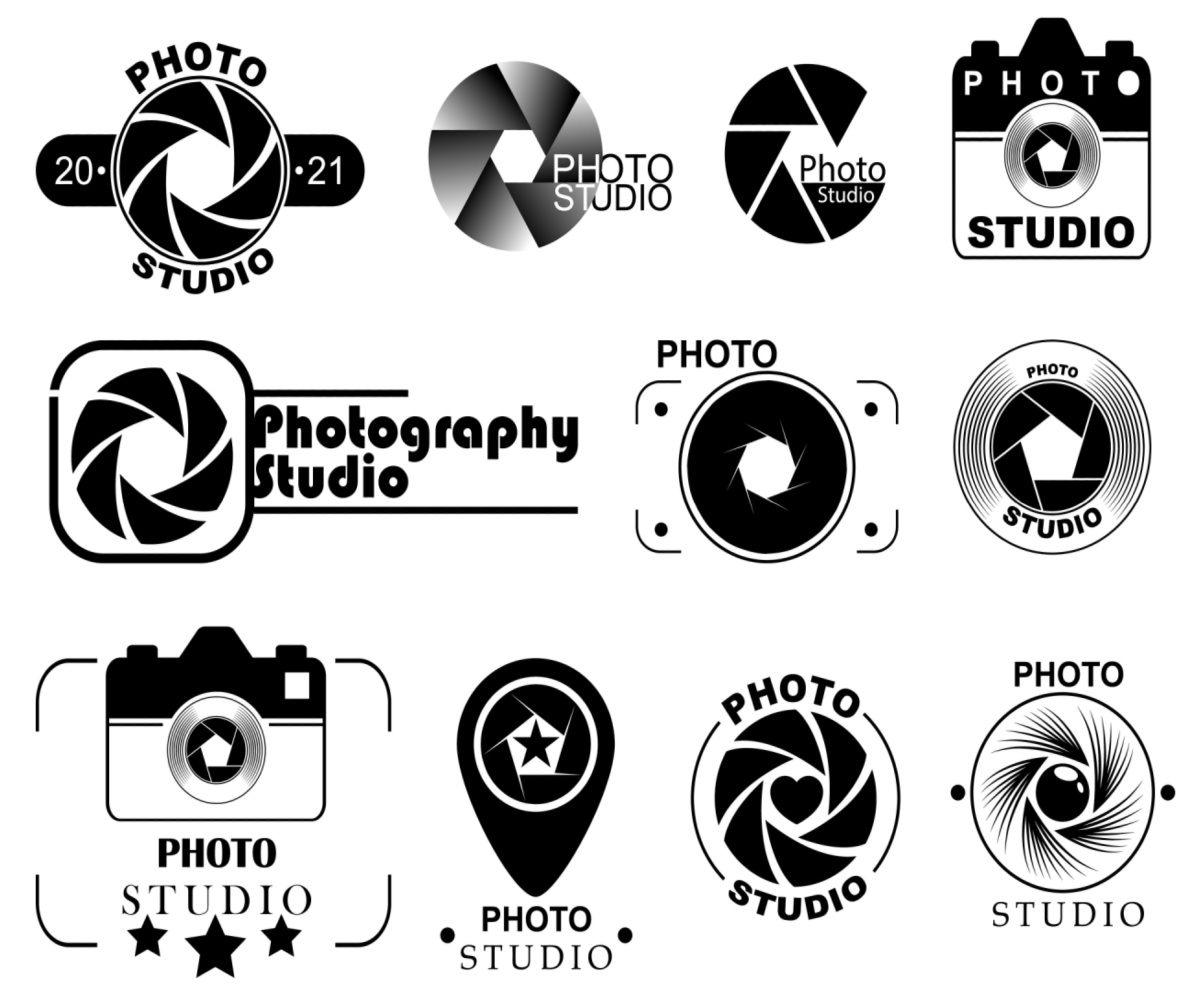
Designing a photography logo that accurately represents your brand identity is an important step in establishing a strong visual presence in the industry. By considering design principles, typography, color psychology, and various logo ideas, you can create a logo that is not only visually appealing but also memorable and reflective of your unique style. Remember, your logo should evolve with your brand, so don’t be afraid to refine and update it as your photography business grows and evolves.
Barry Edwards is a digital marketing expert with a deep understanding of content strategy, logo, and branding principles. Holding a Bachelor’s degree in Marketing from Beaconhill College, he offers valuable insights on digital marketing trends and strategies through his writing. Follow Barry’s work to stay updated on the latest in online marketing and branding.
