Are you looking to start a smoothie business or revamp your existing brand? One of the key elements of a successful business is a memorable and visually appealing logo. A well-designed logo can attract customers, convey your brand’s values, and create a lasting impression. In this article, we will explore some smoothie logo ideas that will help you craft a refreshing brand identity.
Importance of a Well-Designed Logo
Before delving into smoothie logo ideas, let’s first understand why a well-designed logo is crucial for your smoothie business:
1. Brand Recognition
A logo serves as the face of your business. It is the visual representation of your brand that customers can easily recognize and associate with your products. A unique and memorable logo can help your smoothie business stand out in a crowded market.
2. Conveys Brand Identity
Your logo is an opportunity to showcase the values, personality, and essence of your smoothie business. It should communicate the freshness, healthiness, and deliciousness of your products. A well-designed logo can create an emotional connection with your target audience.
3. Builds Trust and Credibility
A professional and visually appealing logo instills trust in your customers. It conveys that you are a reputable and reliable brand. Customers are more likely to choose a smoothie business with a well-designed logo over a generic or poorly executed one.
Now that we understand the importance of a well-designed logo, let’s explore some smoothie logo ideas to inspire your brand identity.
Nature-Inspired Logos

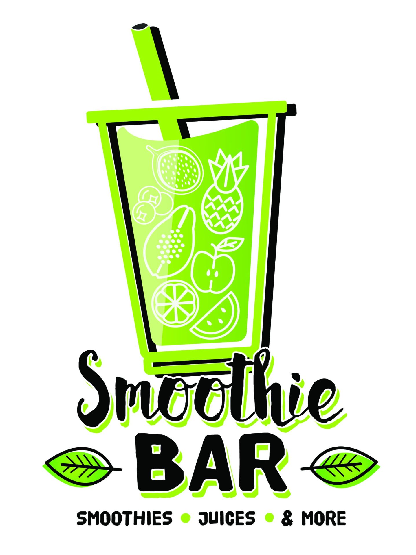
When it comes to smoothie logo ideas, drawing inspiration from nature is a popular choice. Nature evokes feelings of freshness, health, and vitality – qualities that align perfectly with the smoothie industry. Here are a few nature-inspired logo ideas to consider:
1. Fruit Silhouettes
Incorporate simple silhouettes of fruits such as strawberries, oranges, or pineapples into your logo design. This approach highlights the natural ingredients used in your smoothies and creates an instant connection with your target audience.
2. Leafy Accents
Integrate leafy elements into your logo design to evoke a sense of freshness and healthiness. Whether it’s a single leaf or a cluster of leaves, this design element adds a touch of nature while symbolizing the nutritious aspect of your smoothies.
3. Organic Shapes
Embrace organic shapes in your logo design, mimicking the curves and contours found in nature. Smoothie businesses often opt for rounded or flowing shapes to convey a sense of fluidity and movement. This design choice can also represent the vibrant energy and dynamic nature of your brand.
Vibrant Color Palette
Choosing the right color palette is essential in creating a visually appealing smoothie logo. Bright and vibrant colors are often preferred, as they reflect the energy and freshness associated with smoothies. Consider the following color ideas for your logo:
1. Citrus-inspired Colors
Citrus fruits like oranges, lemons, and limes are commonly used in smoothies. Incorporating colors inspired by these fruits, such as vibrant oranges, refreshing yellows, and zesty greens, can create a logo that is visually appealing and instantly recognizable within the smoothie industry.
2. Cool Blues and Greens
Cool blues and greens can evoke a sense of calmness and tranquility, while still maintaining a fresh and natural feel. These colors work particularly well if your smoothie business focuses on promoting relaxation or a sense of well-being.
3. Colorful Burst
Consider incorporating a burst of multiple colors in your logo design. This approach can represent the variety of fruits and flavors offered in your smoothies. It also adds a playful and eye-catching element that can attract attention in a competitive market.
Typography Choices
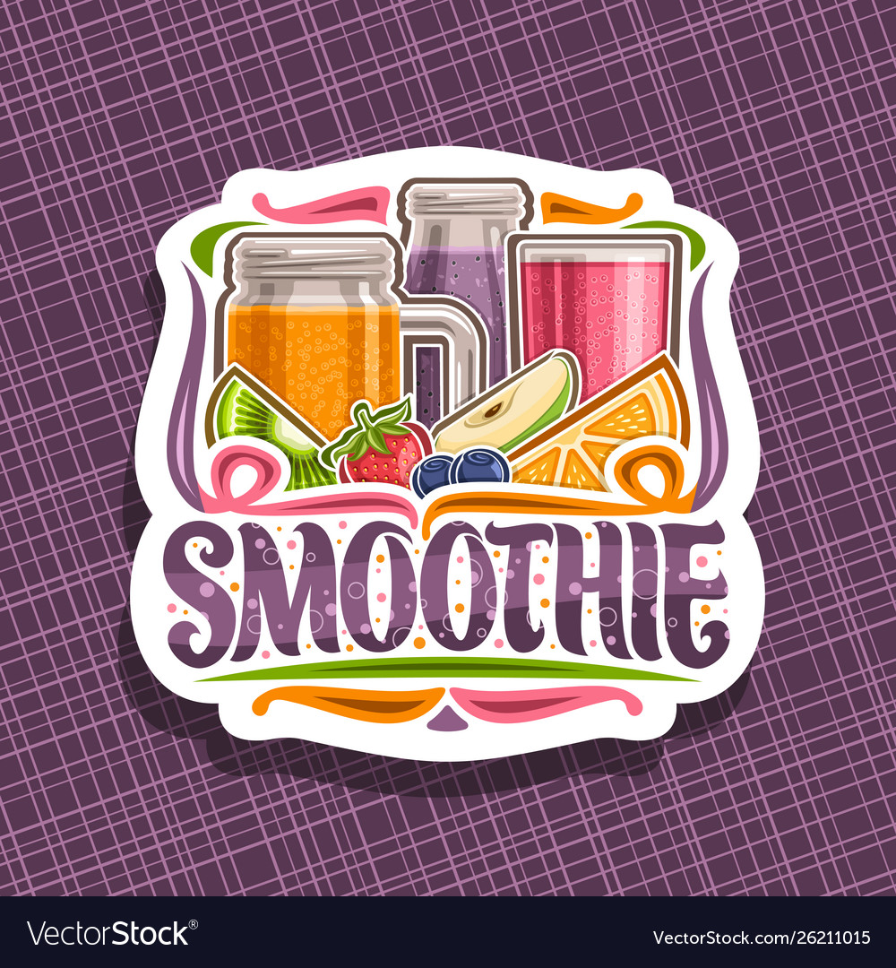
Choosing the right typography is crucial in creating a cohesive and visually appealing smoothie logo. The typography should complement the overall design and reflect your brand’s personality. Here are a few typography ideas to consider:
1. Handwritten Fonts
Handwritten or script fonts can add a personal and organic touch to your smoothie logo. This choice of typography can convey a sense of homemade, artisanal, or craft-like qualities, which may resonate well with health-conscious consumers.
2. Bold and Playful Fonts
If your smoothie business targets a younger audience or aims to create a fun and energetic brand identity, consider using bold and playful fonts. These fonts can convey a sense of excitement and enthusiasm, aligning with the vibrant nature of your products.
3. Minimalistic Sans-Serif Fonts
For a clean and modern look, opt for minimalistic sans-serif fonts. These fonts are simple, straightforward, and highly readable. This choice of typography can convey a sense of professionalism and sophistication, making your brand appear sleek and trustworthy.
Logo Variation and Adaptability
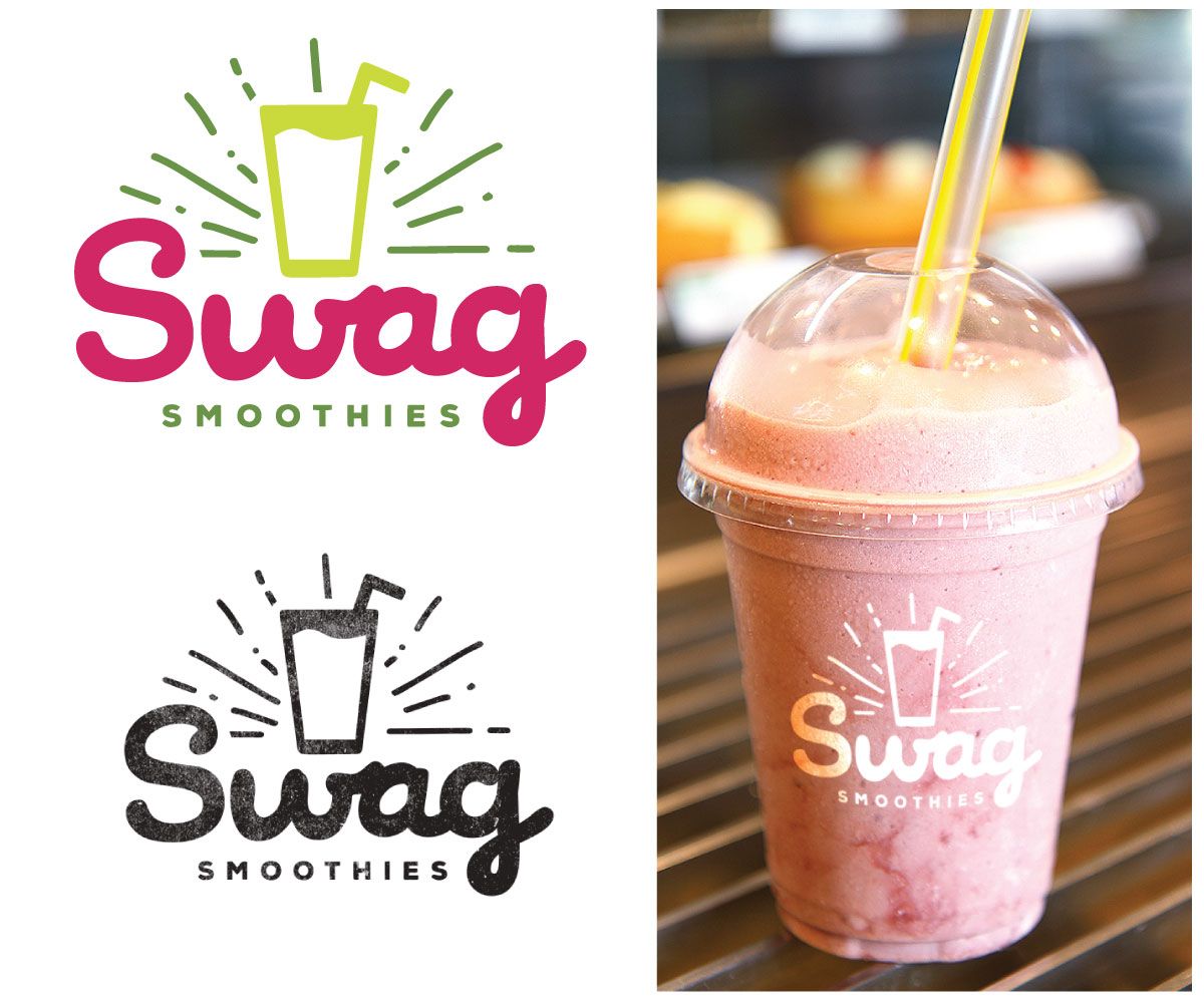
When designing your smoothie logo, keep in mind its versatility and adaptability across various mediums. Your logo should work well across different platforms, including your website, social media profiles, packaging, and marketing materials. Consider the following aspects:
1. Scalability
Ensure that your logo is scalable without losing its clarity or legibility. It should look equally appealing whether displayed on a small social media profile picture or on a large billboard.
2. Monochrome Variation
Create a monochrome variation of your logo to ensure it remains recognizable even when color is absent. This variation can be useful for printing purposes or when your logo needs to be displayed in black and white.
3. Simplified Version
Having a simplified version of your logo can be handy when space is limited or when you need to create a small favicon. This simplified version should retain the core elements of your logo, ensuring instant recognition.
Final Thoughts
Designing a smoothie logo that captures the essence of your brand requires careful consideration of various elements. By drawing inspiration from nature, choosing a vibrant color palette, selecting appropriate typography, and ensuring adaptability, you can create a refreshing and memorable brand identity for your smoothie business. Remember, a well-designed logo is an investment that can help your business thrive and leave a lasting impression on your customers. Cheers to a successful smoothie logo design journey!
Barry Edwards is a digital marketing expert with a deep understanding of content strategy, logo, and branding principles. Holding a Bachelor’s degree in Marketing from Beaconhill College, he offers valuable insights on digital marketing trends and strategies through his writing. Follow Barry’s work to stay updated on the latest in online marketing and branding.
