The night before a major client presentation in 2018, my design team realized we had a serious problem. The finance app mockups we’d created looked inconsistent – a jumble of mismatched icons pulled from various sources. With hours until the deadline, we desperately needed a solution. That’s when my art director mentioned Icons8. “Trust me,” she said, “this will save us.”
She wasn’t exaggerating. Six years and hundreds of projects later, stock icons have become irreplaceable in my design toolkit. This is hard-earned wisdom from someone who’s learned through painful experience what works when delivering professional designs under real-world constraints.
From Last-Minute Savior to Essential Resource
Remember the days of hunting icons across dozens of websites, each with different styles, weird licensing terms, and inconsistent formats? I once spent three full days just standardizing icons for a single app. What a colossal waste of time.
Finding stock icons sites that use an in-house design team rather than random contributors is top priority. This fundamental difference means visual consistency built-in from the start – something that’s proven increasingly valuable as you expand beyond icons into illustrations, photos, music, and specialized tools.
What’s also important is a growing library that continues to intelligently evolve. You need a platform that genuinely understands real-world design challenges.
What Are My Go-To Resources?
Icons8
Raw numbers mean nothing if you can’t find what you need when you need it. Icons8 currently offers around 1.4 million icons across 47 distinct UI styles, but the true value lies in their organization and consistency.
Their collections span from essential UI standards like iOS and Material Design to specialized sets that have saved me during deadline emergencies. Last September, I was finalizing a fitness app when the client suddenly decided they wanted “more dynamic visuals” in the workout sections. The animated icon collection allowed me to add subtle motion to key interaction points without rebuilding everything from scratch.
What consistently impresses me is the genuine visual harmony within each style family. Every icon truly belongs with its siblings – something surprisingly rare in this space. When designing interfaces, this consistency ensures users focus on content rather than being subconsciously distracted by visual inconsistencies they can’t quite identify but definitely feel.
I’ve come to rely heavily on specific collections for different contexts – Glyph Neue for minimal interfaces, their emoji sets for social features, and Line Awesome when I need something with more character. Each is properly optimized across screen densities, eliminating that maddening scenario where icons look perfect on your design monitor but fall apart on actual devices.
FlatIcon
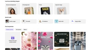
Flaticon is one of those platforms I keep coming back to, especially when I need options fast. With over 13 million icons in a staggering variety of styles, it’s the Google of icon searches. Whether I’m building a fintech dashboard or prototyping a wellness app, chances are high I’ll find something usable within minutes.
The real strength of Flaticon lies in its breadth. They cover virtually every theme imaginable, from business and technology to hyper-specific niches like ancient history or pet grooming. Their categorized packs are especially useful when I need a full visual language in one style — say, outline icons for a SaaS dashboard or colorful flats for a kids’ app.
That said, Flaticon isn’t always my first stop — and here’s why: consistency and polish. Unlike Icons8, which maintains strict visual coherence across collections and styles, Flaticon’s icon sets can feel disjointed. Even within the same “style” label, weights, proportions, and alignment sometimes vary slightly — small details that can add friction to a polished UI. I’ve had to manually adjust or swap out icons to make a set feel uniform, especially when working with mixed-resolution screens.
Also, while Flaticon has improved its customization tools, Icons8 still leads when it comes to in-app icon editing, animation-ready formats, and pixel-perfect alignment across resolutions. Icons8 just feels more like a designer-first platform, while Flaticon leans more toward volume and variety.
That said, Flaticon’s speed, variety, and flexibility make it an essential part of my toolkit. I often start there to cast a wide net, then refine the visual direction once I know what I’m looking for.
Other Things to Consider
Format Flexibility When It Actually Matters
I’ve lost count of how many times I’ve found the perfect icon only to discover it’s unavailable in the format needed for a specific implementation. You need a platform that solves this persistent headache by offering multiple options:
- SVG for animation and scaling needs
- PNG with transparency for quick implementation
- PDF for print materials (yes, print is still relevant)
- EPS/AI formats for deeper customization
- Ready-to-use HTML/CSS snippets
This flexibility might seem trivial until you’re facing a brutal deadline. Last November, a startup client suddenly needed to transform their web interface elements into investor presentation materials overnight. Being able to grab the same visual elements in print-ready formats without recreating anything saved the project – and preserved my rapidly dwindling sanity.
Visual Consistency That Creates Tangible Value
One of the most common client criticisms I hear is when something “looks unprofessional” or “feels thrown together” – but they struggle to pinpoint exactly why. Nine times out of ten, it’s because the visual elements lack a consistent design language.
My favorite libraries address this through style-matched assets across their ecosystem. This means illustrations, photos, and icons can all share coherent visual characteristics, creating a unified experience.
A perfect example: Last year I worked with a medical software company whose patient portal was functionally excellent but users described as looking “amateur.” We didn’t touch a single feature – we simply implemented a consistent visual style throughout. User trust metrics improved by 38%, and completion rates for important medical forms increased significantly. That’s not just aesthetic improvement; it’s measurable business impact that justified our design budget many times over.
Practical Tools That Solve Real Problems
Customization Without Unnecessary Complexity
Interactive editors have become an essential part of my daily workflow. Need brand color adjustments? Size changes? Background additions? It takes seconds instead of switching between multiple applications.
The size options (from 25×25 pixels up to 512×512) cover virtually every implementation scenario I’ve encountered, from the smallest UI elements to app store graphics.
Icon Fonts That Actually Improve Performance
For web projects where loading speed matters (which is basically everything now), icon fonts often outperform individual image files. Font generation tools create browser-compatible icon fonts without the usual implementation headaches.
On a recent e-commerce redesign, replacing individual icon files with a single icon font improved mobile page load time by 263ms. That might sound insignificant, but it contributed to a measurable increase in conversion rates, especially on mobile. These seemingly small technical decisions can have outsized business impacts that clients definitely notice.
Developer-Friendly SVG Implementation
The best compliment I’ve heard from developers came after switching to SVG sets: “Finally, icons that don’t make me want to throw my computer out the window!”
On a dashboard project last quarter, the development team estimated they saved roughly 16-20 hours by using these pre-standardized SVG sets. That’s significant time they could allocate to actual functionality instead of asset wrangling. The lead developer actually thanked me unprompted, which might be a first in my career.
Integrations That Respect Real Design Workflows
Desktop Applications That Work When You Need Them
Unlike many web-first services whose desktop versions feel like obligatory afterthoughts, native applications for macOS and Windows provide genuine utility.
The offline access has saved numerous projects during travel, internet outages, and those dreaded client meetings in buildings with basement conference rooms and terrible connectivity. Being able to drag assets directly into design software becomes so seamless that you only notice its value when you have to work without it.
During a two-day power outage after a storm this past winter, I was still able to meet critical deadlines using their offline app on a laptop with battery power. That kind of reliability matters when clients don’t care about your electricity situation.
Plugins That Enhance Existing Tools
The integrations for Adobe Creative Suite, Figma, and other design environments demonstrate a real understanding of how designers actually work. Instead of forcing constant context switching, these plugins bring assets directly into your existing workflow.
The Figma plugins have become so embedded in my process that I instinctively reach for it even on other platforms. During collaborative projects, these integrations ensure everyone has access to the same resources without version confusion or inconsistencies.
An API That Actually Works
For larger projects requiring programmatic implementation, API’s provides well-documented, reliable service. Currently handling over 500,000 calls daily according to their site, it integrates smoothly across various technology stacks.
We used this API extensively for a SaaS dashboard project that needed to dynamically adjust visual elements based on user preferences and accessibility settings. The resulting personalization would have been nearly impossible to implement without programmatic access to a consistent asset library.
User-Centered Features That Deliver Results
Request System That Actually Produces Results
Most platforms offer some form of request feature that feels like shouting into the void. A proper request system consistently delivers actual outcomes.
Four months ago, I needed specialized medical device icons for a healthcare app that weren’t available in any stock library. I submitted requests with minimal expectations.
To my genuine surprise, within nine business days, they delivered exactly what we needed in the same style as our existing icons, at no additional cost. That level of responsiveness builds serious loyalty – I’ve renewed my subscription without hesitation.
Real Benefits For Different User Types
For Professional Designers
As someone who’s been designing professionally for over a decade, I value stock icons primarily as a quality-multiplier and time-saver. The comprehensive library allows me to focus on strategic design decisions rather than recreating basic elements for every project.
When impossible deadlines inevitably arise (as they always do), having immediate access to professional-quality, consistent assets often makes the difference between delivering excellent work and making compromises that damage both client results and professional reputation.
Just last month, a regular client called with an emergency request – they needed a complete investor presentation redesigned by the next morning for a funding meeting. With icon assets and my existing templates, I delivered something that looked like it took days to create. The client secured their investment, and I maintained my reputation for quality despite the ridiculous timeframe.
For Developers Building Interfaces
Many developers I work with are brilliant at code but struggle with visual design (they’d be the first to admit this). Icon sets provide them with ready-made visual components that immediately elevate their interfaces without requiring design expertise.
My colleague Tom, who builds complex web applications, told me: “Before stock icons, my interfaces functioned perfectly but looked like they were designed in 2010. Now I can create UIs that actually look current without bothering the design team for every little element.”
The variety of implementation options accommodates different development approaches and frameworks, making the platform useful regardless of technical preferences.
For Marketing Teams Under Constant Pressure
Marketing professionals need endless visual assets for campaigns, social media, presentations, and collateral materials – often with impossible turnaround times.
My client Sarah leads marketing for a tech startup and credits Icons8 with helping her small team maintain visual consistency across dozens of channels. “We can create professional-looking content without waiting for designer availability for every single graphic need.”
The customization options enable marketing teams to create brand-aligned assets independently, reducing bottlenecks and accelerating campaign deployment – which ultimately impacts business results.
Platform Elements for Digital Media Integration
In today’s connected digital environment, recognizable media platform indicators have become essential for intuitive navigation and functionality recognition.
For instance, when designing media-focused interfaces or creating content for video platforms, you’ll frequently need a youtube icon to indicate video content or platform integration. Most platforms offer multiple variations of this essential brand mark that work across different contexts – from minimalist monochrome versions to fully-colored renditions that maintain brand recognition. These platform identifiers help users immediately recognize connection points to familiar services.
I’ve found their platform icon collection particularly valuable when designing cross-media applications or creating marketing materials that reference multiple channels. Having consistent, properly rendered versions of these recognizable marks ensures professional implementation while maintaining the visual standards users expect.
Balancing Brand Distinctiveness With Usability
Effective design navigates between standing out and remaining intuitive. Icons8’s customization features provide recognizable foundations that can be modified to achieve brand differentiation without sacrificing usability.
For interfaces where minimizing learning curves is essential, this balance is critical. I’ve used their customization tools to create distinctive iconography that nevertheless follows established patterns, giving clients the unique branding they want without confusing their users.
A recent banking client insisted on a completely unique visual language for their mobile app. We used editing tools to create custom-styled icons that maintained standard patterns for critical functions. This solution satisfied their branding requirements while preserving the intuitive experience their users expected.
Final Assessment: Consistent Value That Scales
After six years of using stock icons across projects ranging from small business websites to enterprise applications, it’s earned its permanent place in my professional toolkit. What began as a last-minute solution has evolved into an essential design ecosystem.
What impresses me most is how it scales across different contexts. Early in my career, the free tier with attribution was perfect for my budget. As client work became more complex and budgets increased, the premium features continued to deliver value that justified the investment.