Creating a memorable brand identity is crucial for any theme park. A well-designed logo can speak volumes about the park’s unique offerings, capture the attention of potential visitors, and convey the overall experience they can expect. In this article, we will explore some creative theme park logo ideas and provide tips on how to design a logo that stands out from the crowd.
Importance of a Theme Park Logo
Before diving into logo design ideas, let’s first understand why a theme park logo is so important. A logo serves as the face of the park, representing its core values, attractions, and the overall experience it offers. A well-crafted logo can:
- Create a Strong First Impression: A visually appealing logo can instantly capture the attention of potential visitors and make a lasting first impression.
- Differentiate from Competitors: A unique logo design helps differentiate the theme park from its competitors in a crowded market, setting it apart and attracting a specific target audience.
- Build Brand Recognition: A well-designed logo creates a visual identity that visitors can easily recognize and associate with the park. This recognition helps build trust and loyalty over time.
- Convey the Park’s Theme: A theme park logo should encapsulate the essence of the park’s theme or concept, giving potential visitors a glimpse into the experience they can expect.
Now that we understand the importance of a theme park logo, let’s explore some creative ideas to inspire your own logo design.
1. Incorporate Iconic Park Attractions
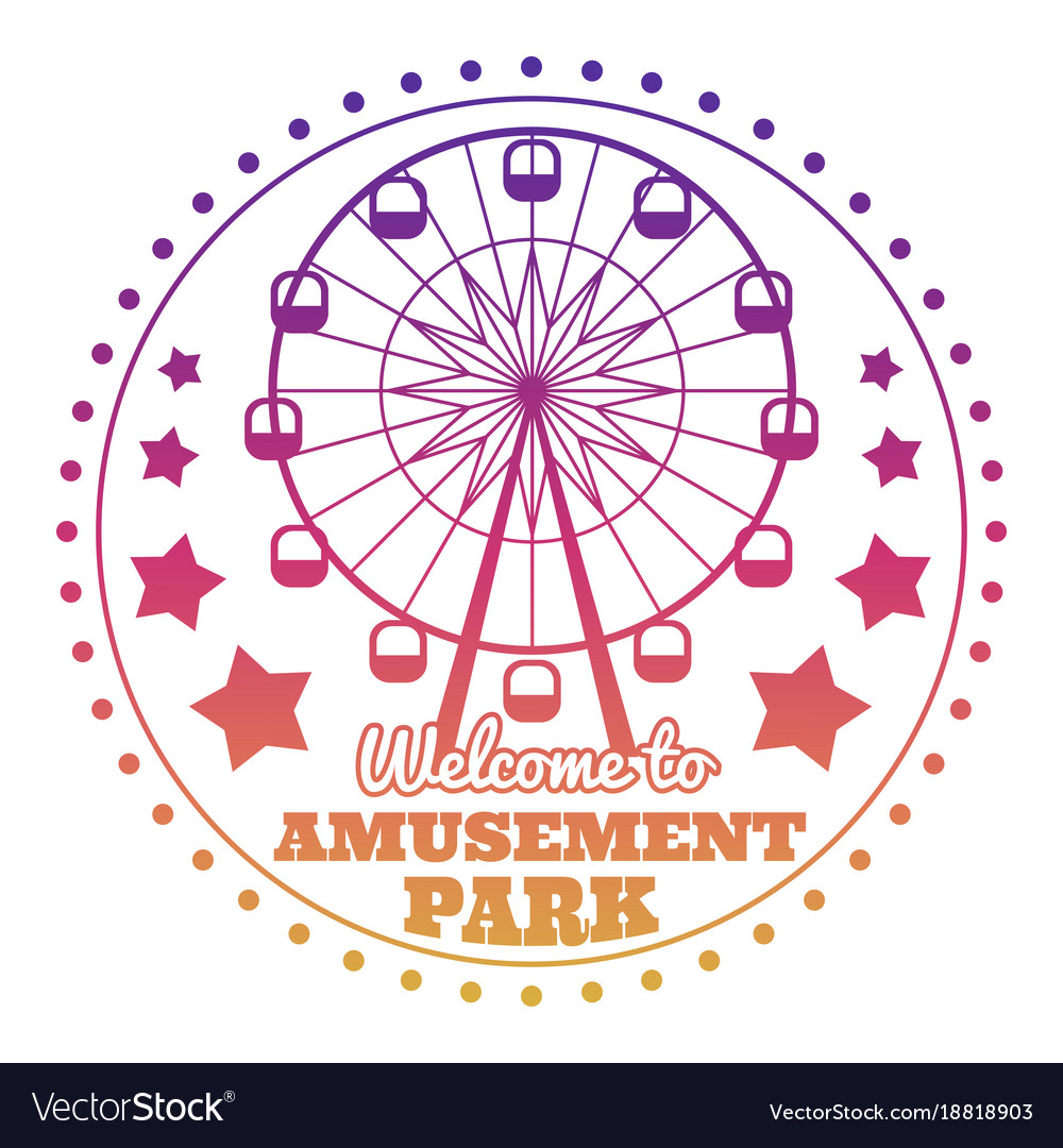
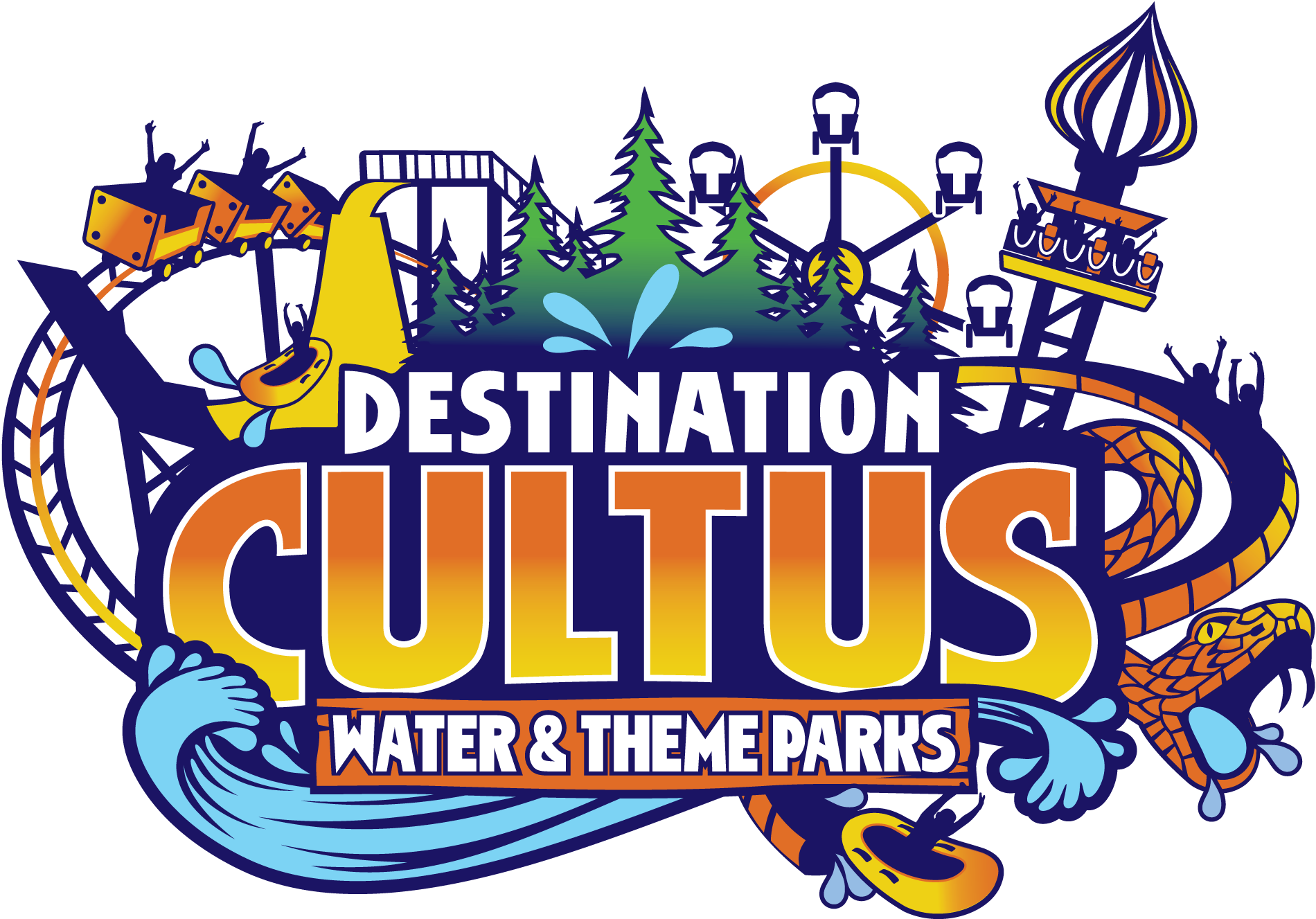
One effective way to create a memorable theme park logo is by incorporating iconic attractions within the design. Think about the park’s most recognizable rides, landmarks, or characters, and find creative ways to integrate them into the logo. For example, if your park has a famous roller coaster, consider using its silhouette or incorporating elements that symbolize the thrill it offers.
2. Reflect the Park’s Theme
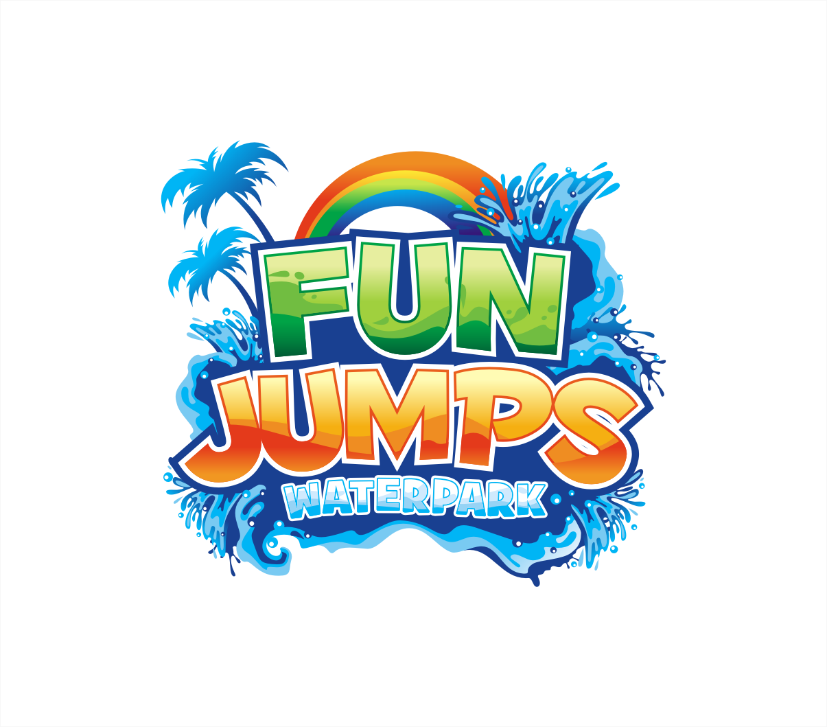
When designing a theme park logo, it’s essential to capture the park’s theme or concept. Whether it’s a fantasy world, a tropical paradise, or a futuristic adventure, the logo should reflect the essence of the park. Consider using colors, fonts, and visual elements that evoke the desired atmosphere. For instance, a logo for a water park could feature vibrant blue hues and wave-like shapes to convey a refreshing and playful ambiance.
3. Emphasize Fun and Excitement
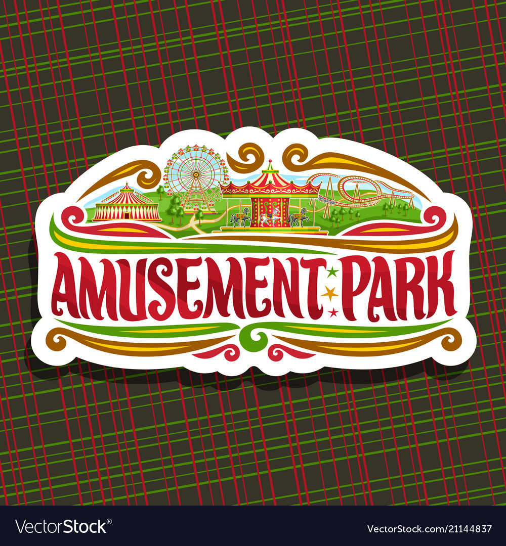
A theme park is all about fun and excitement, and your logo should reflect this energy. Use bold and dynamic typography to convey a sense of enthusiasm. Incorporate vibrant colors that evoke a feeling of joy and thrill. Consider using playful illustrations or symbols that represent the park’s offerings, such as roller coasters, Ferris wheels, or fireworks.
4. Keep It Simple and Versatile
While it’s important to create a visually striking logo, it’s equally crucial to keep it simple and versatile. A cluttered or overly complex design can be difficult to reproduce across various platforms and promotional materials. Opt for clean lines, minimalistic shapes, and easy-to-read typography. A simple logo is also more memorable and easier to recognize at a glance.
5. Typography Matters
Typography plays a significant role in logo design. The right font choice can convey the park’s personality and set the tone for the overall brand. Consider using bold and eye-catching fonts for the park’s name, ensuring it can be read clearly from a distance. Experiment with different font styles to find one that aligns with the park’s theme and evokes the desired emotions.
6. Color Psychology: Choosing the Right Palette
Colors evoke emotions and have a significant impact on how people perceive a brand. When designing a theme park logo, it’s essential to select colors that align with the park’s theme and evoke the desired emotions in potential visitors. Here are a few color ideas and their associated meanings:
- Blue represents trust, reliability, and serenity. It is often associated with water parks or parks with a calming atmosphere.
- Red conveys energy, excitement, and passion. It is commonly used in logos for parks with thrilling rides and adrenaline-pumping experiences.
- Green symbolizes nature, harmony, and relaxation. It is suitable for parks with a focus on outdoor activities or eco-friendly attractions.
- Yellow represents happiness, joy, and optimism. It can be used to evoke a sense of fun and playfulness in the logo design.
Remember, the color palette should be cohesive and visually appealing. Consider using no more than three colors to maintain simplicity and avoid overwhelming the logo.
7. Seek Professional Help
Creating a logo that effectively represents your theme park can be a challenging task. If you lack design expertise or want to ensure a polished result, it’s worth considering professional help. Hiring a graphic designer or a design agency that specializes in logo creation can save you time and ensure a high-quality outcome that aligns with your vision.
Conclusion
Designing a memorable theme park logo requires careful consideration of the park’s theme, target audience, and desired emotions. By incorporating iconic attractions, reflecting the park’s theme, and emphasizing fun and excitement, you can create a logo that captures the essence of your park. Remember to keep the design simple, choose appropriate typography, and use colors that evoke the right emotions. Seek professional assistance if needed, and enjoy the process of creating a logo that will become the face of your theme park.
Angela Irwin is a branding and design enthusiast with a Bachelor of Fine Arts in Graphic Design from Meadowbrook College. As a writer at Logocreator.io, she shares her expertise on logo design, graphic trends, and effective branding strategies, helping businesses create impactful visual identities.
