Are you looking to create a logo that will captivate and mesmerize your audience? Trippy logo designs offer a unique and visually stimulating way to showcase your brand’s personality and set it apart from the competition. In this article, we will explore different trippy logo ideas that will help you unleash your creative vision. Let’s dive in!
What Makes a Logo Trippy?
Before we delve into the various trippy logo ideas, it’s important to understand what makes a logo trippy in the first place. Trippy logos are characterized by their vibrant colors, surreal elements, and mind-bending designs. These logos often incorporate optical illusions, psychedelic patterns, and abstract shapes to create an otherworldly visual experience.
Trippy logos are not only visually appealing but also evoke emotions and capture attention. They can convey a sense of adventure, mystery, and unconventionality, making them an excellent choice for brands that want to stand out and leave a lasting impression on their audience.
Incorporating Psychedelic Patterns
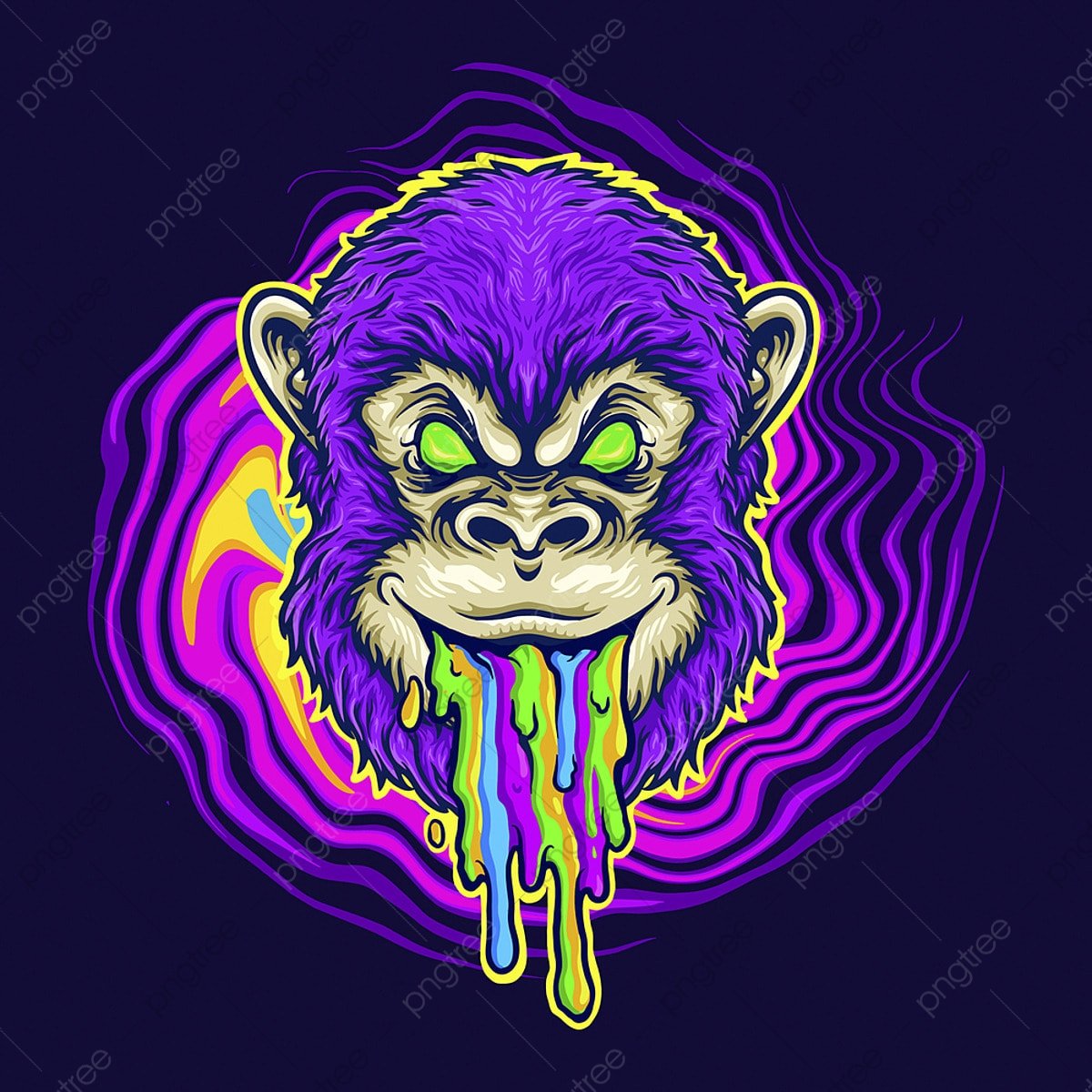
One of the key elements in creating a trippy logo is incorporating psychedelic patterns. These patterns often feature intricate and repetitive designs that create a sense of movement and depth. By using vibrant colors and abstract shapes, you can create a visually stunning logo that mesmerizes your audience.
Example: Kaleidoscopic Delight
Imagine a logo where a kaleidoscope of colors swirls and morphs into various shapes and forms. This logo could be perfect for a music festival or an art gallery looking to convey a sense of creativity and endless possibilities.
Optical Illusions: Playing with Perception
Optical illusions are another powerful tool in creating trippy logos. These illusions manipulate perception and challenge the viewer’s visual understanding. By incorporating optical illusions into your logo design, you can create a sense of intrigue and captivate your audience.
Example: Mind-Bending Twist
Imagine a logo that appears to be a simple spiral at first glance but upon closer inspection, reveals hidden elements or messages. This logo would engage viewers as they try to decipher its hidden meaning, making it an ideal choice for a brand that wants to evoke curiosity and keep their audience captivated.
Abstract Shapes: Breaking the Mold
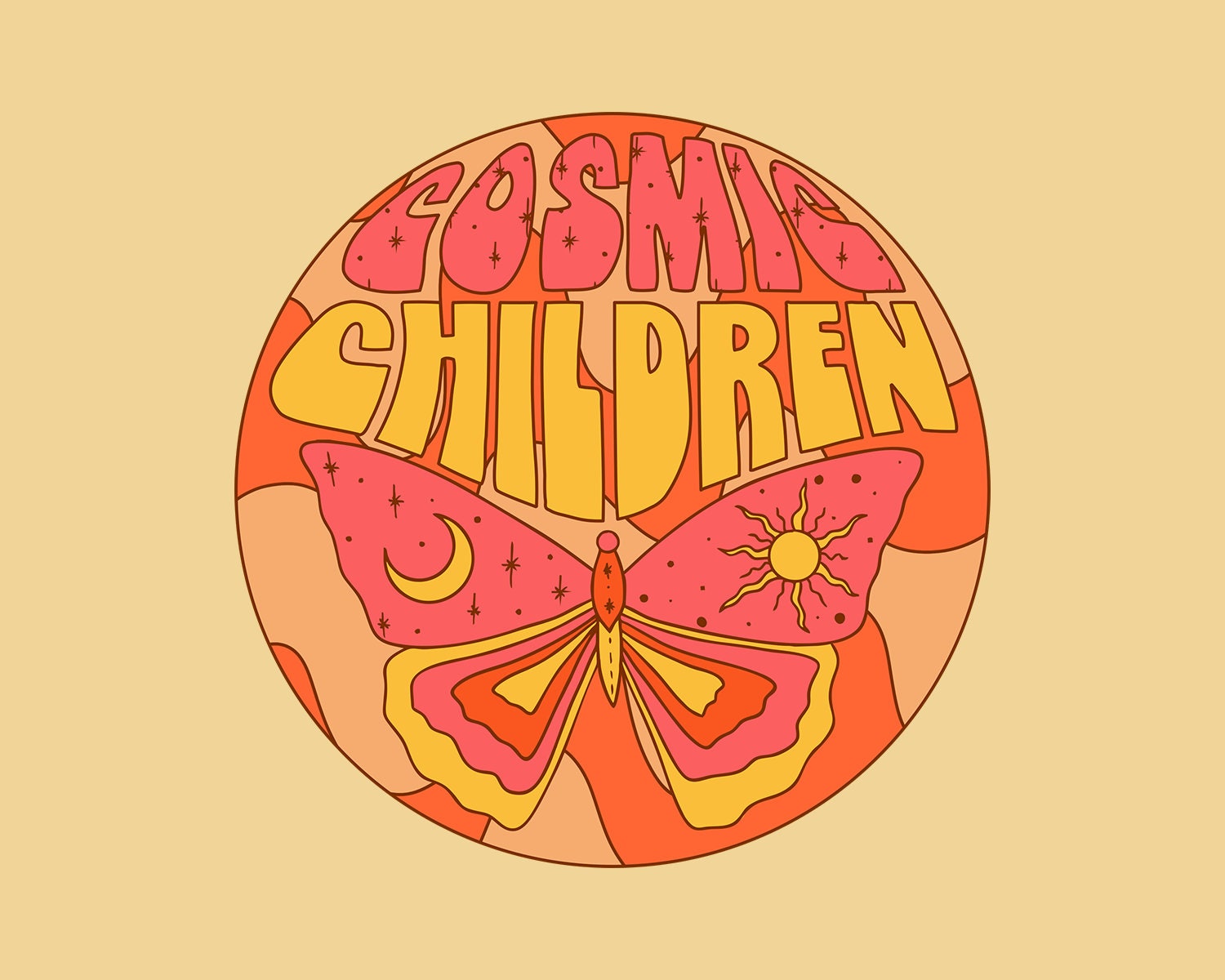
Trippy logos often break away from conventional forms and embrace abstract shapes. These shapes allow for a more fluid and unconventional design, helping your logo stand out from the crowd.
Example: Cosmic Chaos
Imagine a logo composed of interconnected abstract shapes resembling celestial bodies, nebulae, and cosmic phenomena. This logo could be perfect for a science fiction-themed brand or a forward-thinking technology company aiming to convey innovation and a futuristic vision.
Vibrant Color Palettes: Painting a Psychedelic Canvas
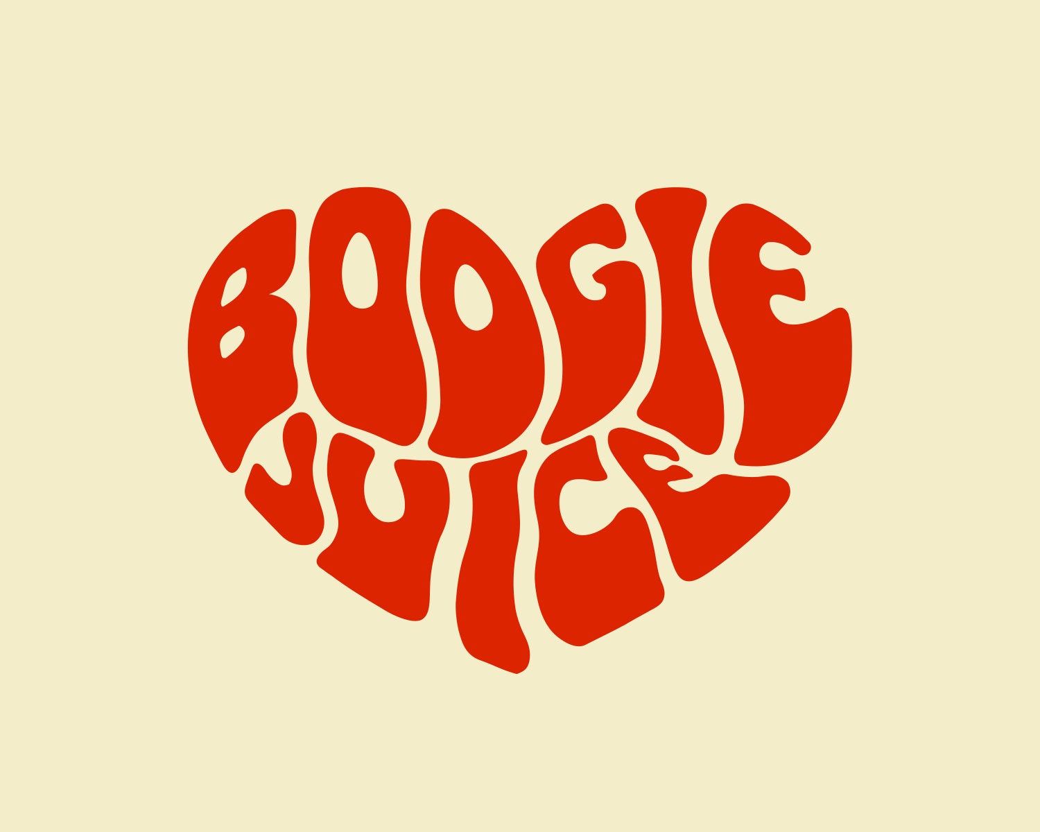
Color plays a crucial role in trippy logo designs. Vibrant and saturated color palettes are commonly used to create an intense visual experience and evoke emotions. By carefully selecting your color scheme, you can amplify the trippy effect of your logo.
Example: Neon Dreams
Imagine a logo that combines neon pinks, electric blues, and vivid yellows. These colors would create a logo that pulsates with energy and stands out in any setting. This type of logo design could be perfect for a nightclub or an entertainment company aiming to create an unforgettable brand presence.
Typography: Beyond the Ordinary
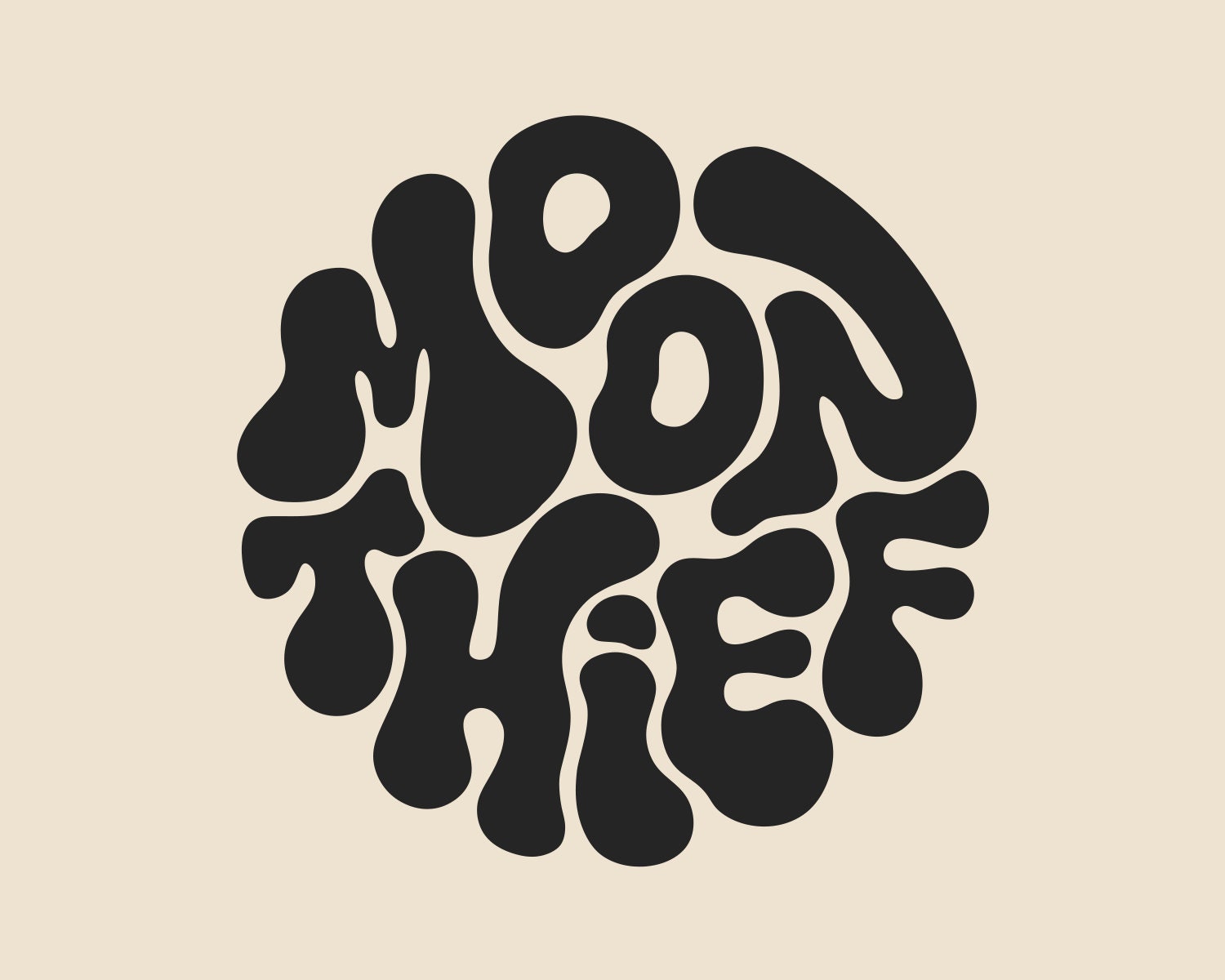
When it comes to trippy logo designs, typography offers an opportunity to push the boundaries of conventional letterforms. By experimenting with distorted, warped, or unconventional typography, you can enhance the trippy effect of your logo.
Example: Psychedelic Typefaces
Imagine a logo where the letters appear to be melting or morphing into each other. This logo would create a hallucinatory experience, perfect for a brand in the creative industry or a psychedelic music band looking to convey their unique style.
Balancing Simplicity and Complexity
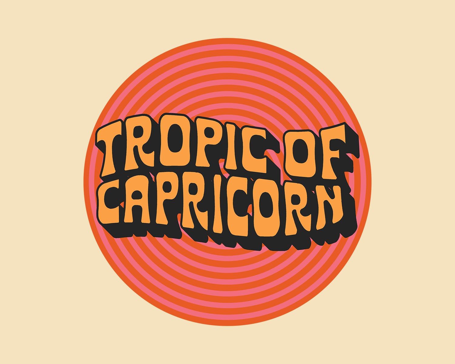
While trippy logos often feature intricate designs and vibrant colors, it’s important to strike a balance between simplicity and complexity. A logo that is too busy or overwhelming may fail to convey your message effectively. Finding the right balance ensures that your logo remains visually engaging without sacrificing clarity.
Example: Harmonious Fusion
Imagine a logo that combines a minimalist symbol with trippy elements seamlessly integrated into the design. This logo would strike a balance between simplicity and complexity, making it suitable for a brand that wants to convey a sense of harmony and innovation.
Final Thoughts
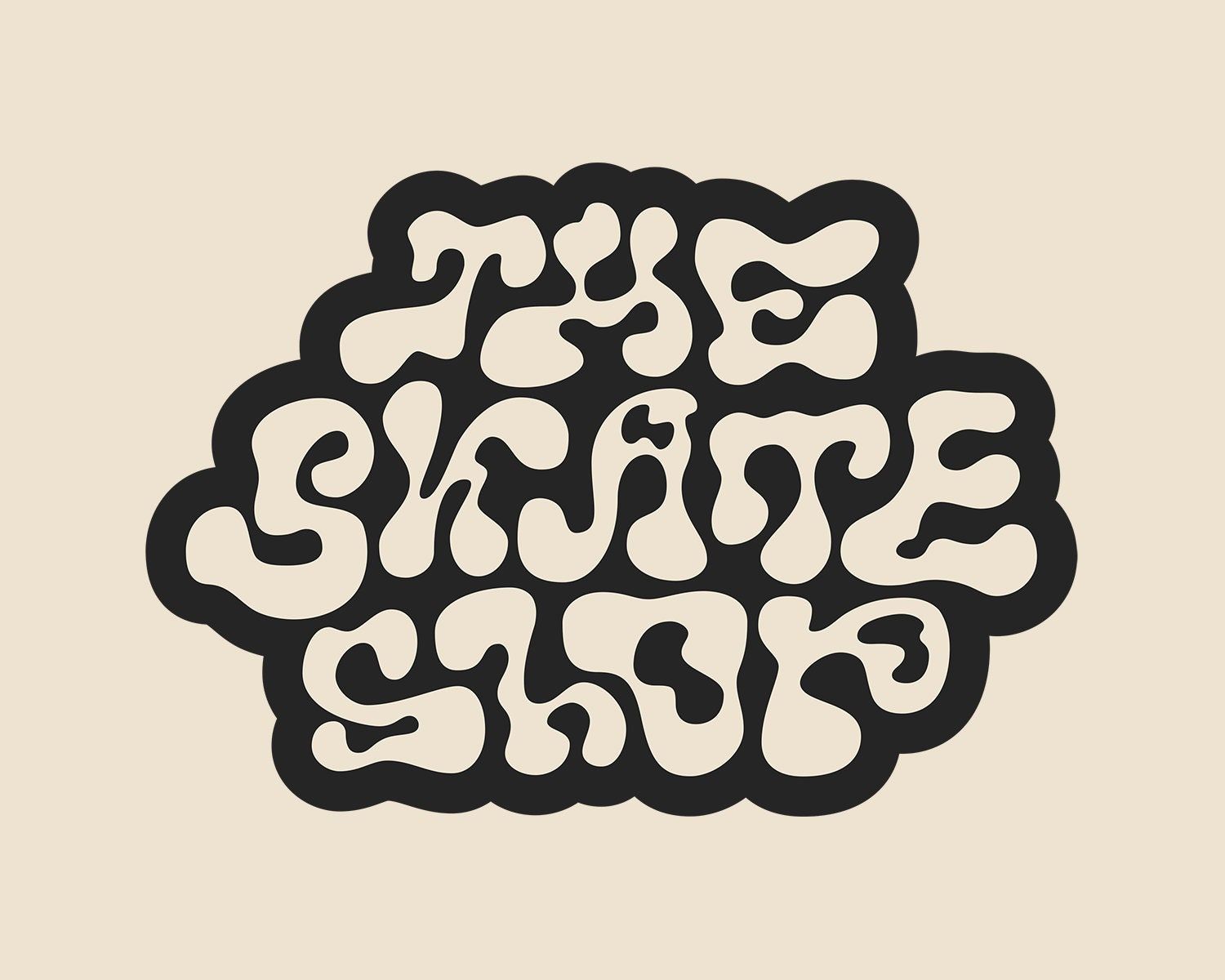
Creating a trippy logo can be an exciting journey that allows you to unleash your creative vision. By incorporating psychedelic patterns, optical illusions, abstract shapes, vibrant color palettes, and unique typography, you can create a logo that captures attention and leaves a lasting impression on your audience.
Remember, a trippy logo should not only be visually appealing but also align with your brand’s personality and values. Take the time to understand your target audience and the message you want to convey, and let your imagination run wild. With the right trippy logo, you can set your brand apart and create a memorable visual identity that resonates with your audience.
Angela Irwin is a branding and design enthusiast with a Bachelor of Fine Arts in Graphic Design from Meadowbrook College. As a writer at Logocreator.io, she shares her expertise on logo design, graphic trends, and effective branding strategies, helping businesses create impactful visual identities.
