Are you looking to create a logo that stands out from the crowd? Are you tired of conventional and predictable designs? If so, then you’ve come to the right place. In this article, we will explore the world of twisted logo ideas, where creativity knows no bounds. Whether you’re a business owner, a designer, or simply someone looking for inspiration, this guide will provide you with valuable insights into creating unique and memorable logos. So, let’s dive in and explore the exciting possibilities of twisted logo designs!
What are Twisted Logos and Why are They Trending?
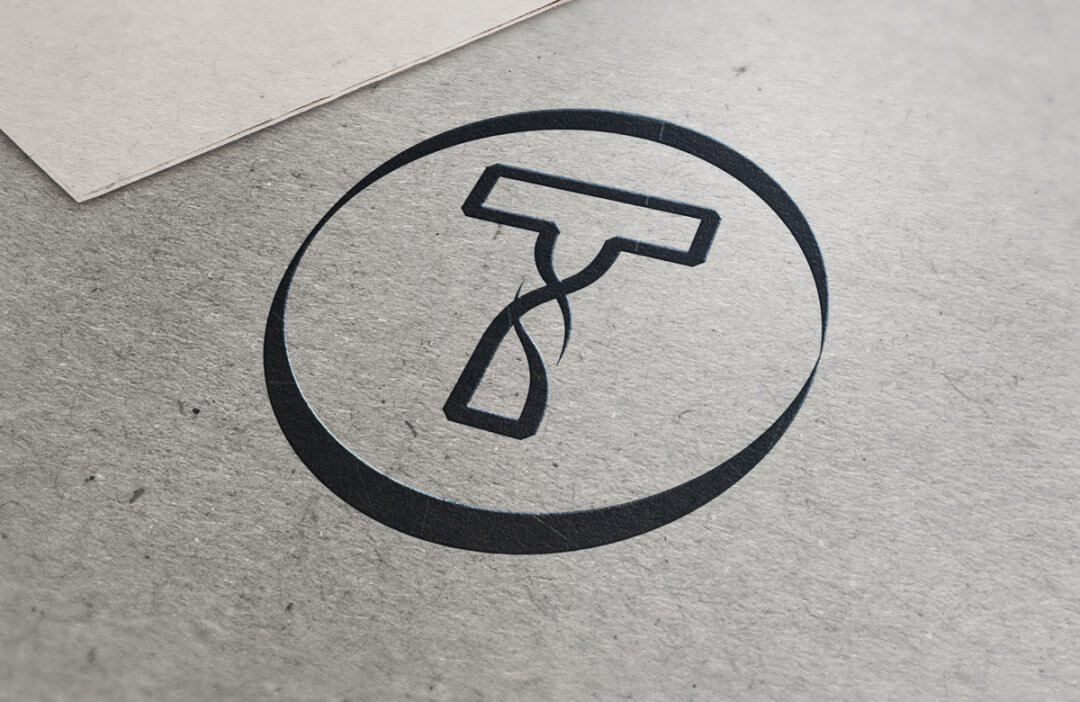
Twisted logos are a form of logo design that deviates from the traditional and expected visual representations. These logos often incorporate unusual shapes, unexpected angles, and unconventional elements to create a sense of intrigue and captivate the viewer’s attention. By breaking away from the norm, twisted logos have become increasingly popular among businesses and organizations looking for a fresh and distinctive identity.
Benefits of Twisted Logo Designs
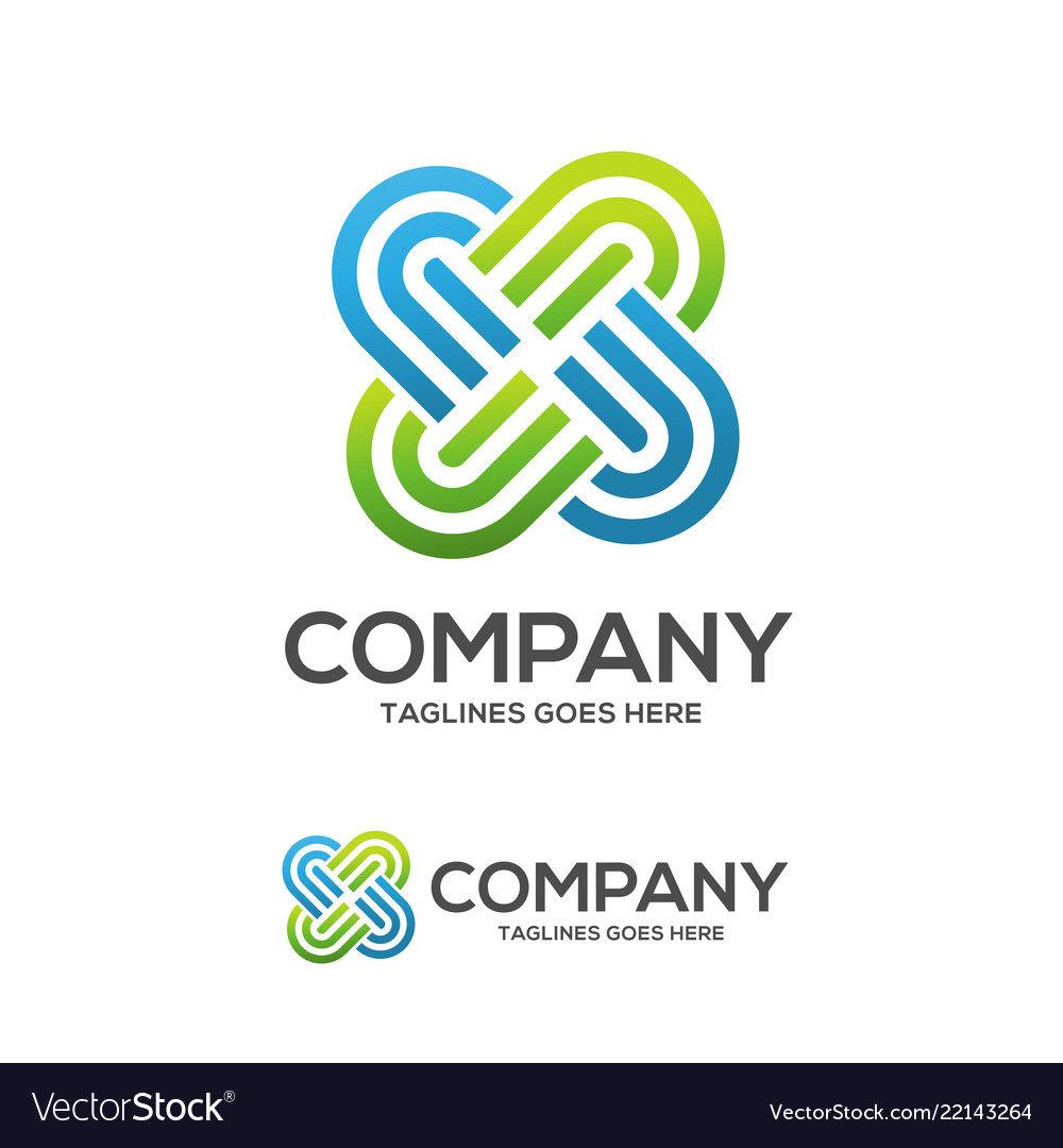
1. Uniqueness and Memorability
One of the key advantages of twisted logo designs is their ability to stand out in a crowded marketplace. By defying expectations and embracing unconventional elements, these logos have the power to leave a lasting impression on customers and clients. In a world where brand recognition is crucial, a twisted logo can help your business differentiate itself from competitors and make a memorable impact.
2. Creativity and Innovation
Twisted logo ideas are an excellent way to demonstrate your brand’s creativity and innovation. By pushing the boundaries of traditional design, you can showcase your brand’s willingness to take risks and think outside the box. This can resonate with customers who value originality and forward-thinking approaches.
3. Versatility and Adaptability
Twisted logos offer a high degree of versatility and adaptability. They can be scaled, modified, and integrated into various marketing materials without losing their impact. Whether you need a logo for your website, social media profiles, or print materials, a twisted logo design can seamlessly adapt to different mediums and formats.
Tips for Creating Twisted Logo Designs
To help you get started on your journey to creating a twisted logo design, here are some valuable tips to keep in mind:
1. Embrace Unconventional Shapes
Think beyond the traditional shapes commonly used in logo design. Experiment with asymmetrical shapes, geometric patterns, or even organic forms. By embracing unconventional shapes, you can immediately capture attention and create a sense of intrigue.
2. Play with Negative Space
Negative space refers to the empty space between and around the elements in a design. By cleverly utilizing negative space, you can create optical illusions and hidden imagery within your logo. This not only adds depth to your design but also engages the viewer’s curiosity.
3. Incorporate Unexpected Elements
Consider incorporating unexpected elements into your logo design. This could be a hidden symbol, a distorted letter, or an unconventional color scheme. By adding these unexpected elements, you can create a sense of surprise and intrigue, making your logo memorable and unique.
4. Experiment with Typography
Typography plays a vital role in logo design. Consider using custom lettering or modifying existing fonts to create a twisted effect. By manipulating the shape, size, or spacing of the letters, you can add a unique twist to your logo design.
5. Maintain Simplicity and Clarity
While it’s important to be creative and innovative, it’s equally important to maintain simplicity and clarity in your logo design. Avoid overcrowding your design with too many elements, as this can make it difficult for viewers to understand and remember. Strive for a balance between creativity and simplicity.
Real-World Examples of Twisted Logo Designs

To help inspire your twisted logo design journey, let’s explore some real-world examples of companies that have successfully embraced this creative approach:
1. FedEx
The FedEx logo is a classic example of a twisted logo design. At first glance, it appears to be a simple arrangement of the letters “F” and “E.” However, upon closer inspection, an arrow pointing to the right between the “E” and “X” is revealed. This hidden arrow symbolizes speed, efficiency, and forward motion, aligning perfectly with FedEx’s core values.
2. Toblerone
The Toblerone logo is another iconic twisted logo design. Nestled within the mountain shape, which represents the Swiss Alps, is a hidden image of a bear. This clever incorporation of a local symbol adds depth and creates a memorable connection between the brand and its origin.
3. Amazon
The Amazon logo is a prime example of using negative space to create a hidden message. The arrow connecting the letters “A” and “Z” not only represents the wide range of products available on the platform but also subtly signifies the smile of a satisfied customer. This clever use of negative space adds an element of surprise and delight to the logo.
Final Thoughts
When it comes to logo design, embracing twisted logo ideas can set your brand apart from the competition. By breaking away from conventional design norms, you can create a logo that captivates attention, sparks curiosity, and leaves a lasting impression. Remember to experiment with unconventional shapes, negative space, unexpected elements, and typography while maintaining simplicity and clarity. Draw inspiration from real-world examples, but don’t be afraid to let your creativity shine through. So go ahead, unleash your imagination, and create a twisted logo design that represents the uniqueness and innovation of your brand!
Angela Irwin is a branding and design enthusiast with a Bachelor of Fine Arts in Graphic Design from Meadowbrook College. As a writer at Logocreator.io, she shares her expertise on logo design, graphic trends, and effective branding strategies, helping businesses create impactful visual identities.
