Are you looking to create a unique and impactful logo for your brand? One approach to consider is designing a two-letter logo. While it may seem challenging to convey your brand’s essence using just two letters, it can actually result in a visually striking and memorable design. In this article, we will explore the world of two-letter logo ideas and provide you with inspiration and tips to create a logo that effectively represents your brand.
Why Choose a Two Letter Logo?
Simplicity with Impact
Two letter logos offer simplicity and minimalism, which can make a strong impact on your audience. By distilling your brand’s name into two letters, you can convey a sense of focus and clarity. This simplicity allows for easy recognition and recall, making your logo stand out in a crowded marketplace.
Versatility and Adaptability
Another advantage of two letter logos is their versatility. They can be easily adapted across various marketing channels, from digital platforms to print materials. The compact nature of these logos allows for seamless integration into different formats without losing their visual impact. Whether it’s on a website, business card, or social media profile, your two letter logo will always look sharp and professional.
Memorable and Unique
Creating a memorable logo is crucial for brand recognition. Two letter logos, when designed effectively, can become powerful visual cues for your brand. By combining unique typography, colors, and design elements, you can create a logo that stands out and makes a lasting impression on your target audience.
Key Considerations for Designing a Two Letter Logo
1. Understand Your Brand Identity
Before diving into the design process, it’s important to have a clear understanding of your brand identity. Consider the values, personality, and target audience of your brand. This knowledge will guide your design choices and help you create a logo that resonates with your intended audience.
2. Typography Selection
Typography plays a crucial role in two letter logos. The right choice of fonts can evoke different emotions and convey the desired message. Experiment with various typefaces—whether it’s bold, elegant, playful, or minimalistic—and find the one that aligns with your brand identity. Remember to prioritize legibility and readability to ensure your logo is easily recognizable across different platforms and sizes.
3. Synergy between Letters
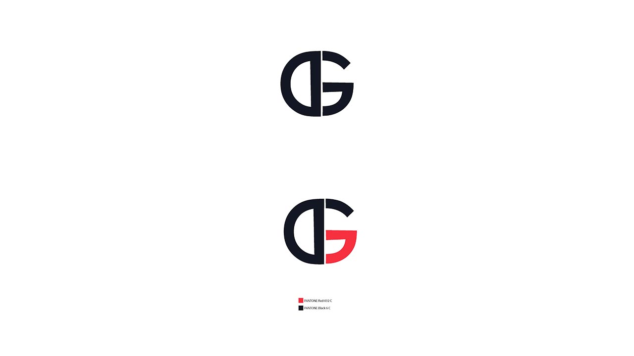
When working with two letters, strive for a design that creates harmony and synergy between them. Explore different layouts, alignments, and visual connections to find the most visually pleasing arrangement. Consider the negative space between the letters and how it can be utilized to create a unique and memorable logo.
4. Color Palette
Colors have a significant impact on how a logo is perceived. Selecting the right color palette can help evoke specific emotions and create a strong association with your brand. Consider the psychology of colors and how they align with your brand’s personality and target audience. Experiment with different combinations to find a color scheme that enhances your logo’s visual appeal.
5. Keep it Timeless
While it’s tempting to follow current design trends, it’s important to create a logo that stands the test of time. Avoid overly trendy elements that may quickly become outdated. Instead, strive for a timeless design that can adapt to changes in the industry and remain relevant for years to come.
Two Letter Logo Ideas for Inspiration
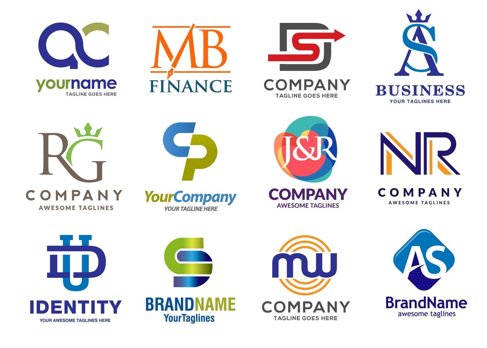
Now that you have a better understanding of the key considerations, let’s explore some two letter logo ideas to spark your creativity. Remember, these examples are intended to inspire you and provide a starting point for your own unique logo design.
1. Nike (Nike, Inc.)
The Nike logo is a prime example of a powerful and memorable two-letter logo. The simple yet dynamic combination of the letters “N” and “K” creates a sense of movement and energy, aligning with Nike’s athletic brand identity. The bold typography and iconic swoosh further enhance the logo’s impact and recognition.
2. IBM (International Business Machines)
IBM’s logo showcases the timeless elegance of a two-letter design. The overlapping letters “I,” “B,” and “M” create a sense of unity and integration. The clean and simple typography adds a touch of sophistication, reflecting IBM’s reputation as a leading technology company.
3. HP (Hewlett-Packard)
HP’s logo exemplifies the creative use of negative space in a two-letter design. The letters “H” and “P” are cleverly interwoven, creating an abstract symbol that represents the brand’s innovation and versatility. The vibrant blue color adds a modern and trustworthy touch to the logo.
4. EA (Electronic Arts)
Electronic Arts’ logo showcases how a bold and striking typography choice can make a two-letter logo stand out. The two letters “E” and “A” are designed with sharp edges and a futuristic feel, reflecting the brand’s presence in the gaming industry. The gradient color scheme adds depth and visual interest to the logo.
5. LG (Lucky Goldstar)
LG’s logo demonstrates the power of simplicity. The clean and minimalistic design of the two letters “L” and “G” gives a modern and sleek impression. The bold red color provides a vibrant contrast, making the logo easily recognizable and memorable.
Designing Your Two Letter Logo
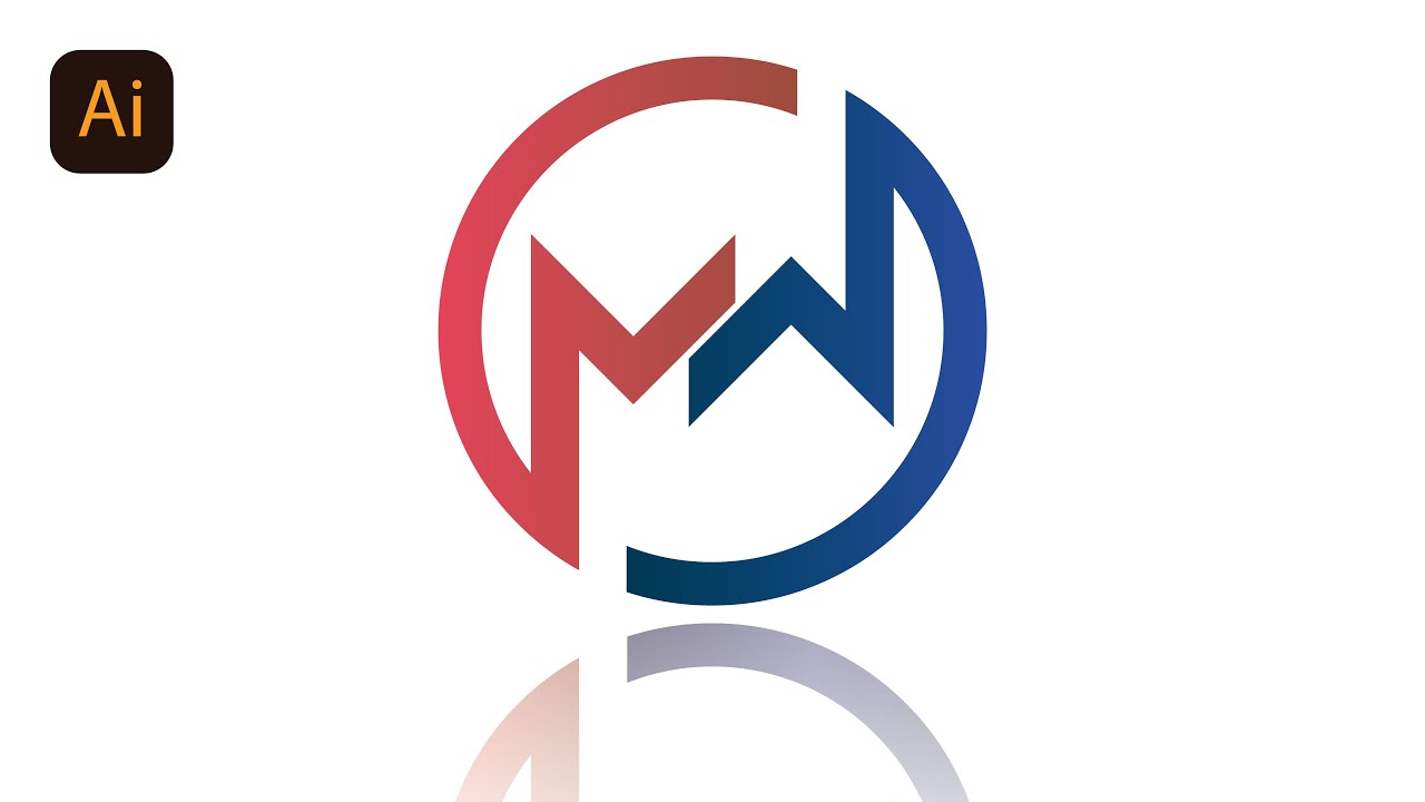
Now that you have gathered inspiration from existing two letter logos, it’s time to embark on the design process for your own logo. Remember the key considerations we discussed earlier and follow these steps to create a compelling two letter logo:
Step 1: Research and Sketch
Start by researching your competitors and related industries to get a sense of the existing two letter logos. Take note of what works and what doesn’t. Then, begin sketching your ideas on paper to explore different layouts, typography, and visual connections. Don’t be afraid to experiment and iterate on your designs.
Step 2: Digitalize Your Sketches
Once you have a few promising sketches, digitize them using design software such as Adobe Illustrator or Sketch. This will allow you to refine and fine-tune your designs with precision.
Step 3: Typography and Color Exploration
Experiment with various fonts and color palettes to find the perfect combination for your logo. Remember to consider your brand identity and target audience during this process. Test different typography styles and color schemes to see how they impact the overall impression of your logo.
Step 4: Seek Feedback and Iterate
Don’t hesitate to share your designs with others and gather feedback. This can provide valuable insights and help you refine your logo further. Iterate on your designs based on the feedback received, striving for a final version that effectively represents your brand.
Step 5: Finalize and Implement
Once you are satisfied with your two letter logo design, finalize it by ensuring all elements are aligned, proportions are balanced, and colors are consistent. Save your logo in various file formats and sizes to ensure its versatility across different platforms and marketing materials.
Conclusion
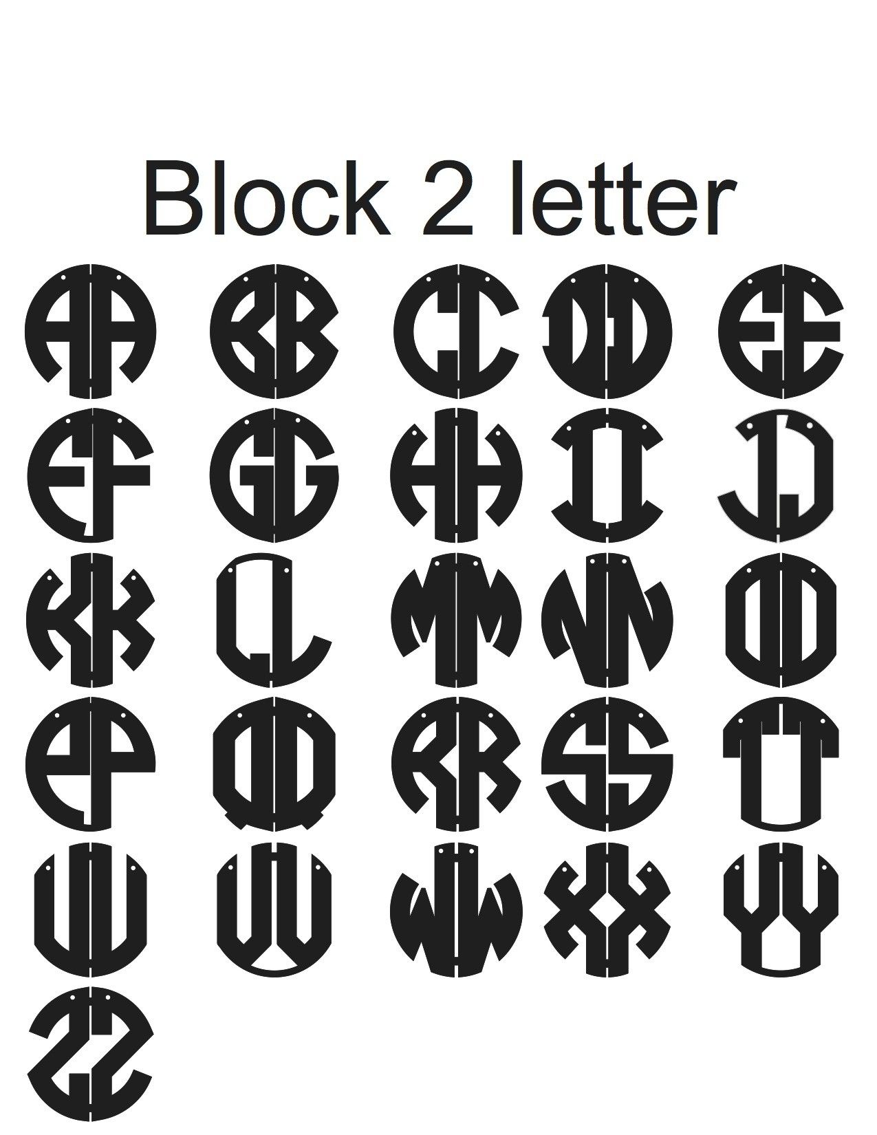
Two letter logos offer a unique opportunity to create a simple, memorable, and impactful visual representation of your brand. By considering key design principles, understanding your brand identity, and gathering inspiration from existing two letter logos, you can create a logo that effectively communicates your brand’s essence. Remember to be creative, experiment with different typography and color options, and strive for a design that stands the test of time. With dedication and attention to detail, your two letter logo will become a powerful symbol that helps your brand stand out and leave a lasting impression on your audience.
Barry Edwards is a digital marketing expert with a deep understanding of content strategy, logo, and branding principles. Holding a Bachelor’s degree in Marketing from Beaconhill College, he offers valuable insights on digital marketing trends and strategies through his writing. Follow Barry’s work to stay updated on the latest in online marketing and branding.
