Are you looking to establish a strong brand identity for your weight loss business? One important aspect of building a brand is creating a logo that effectively communicates your message and captures the essence of your business. In this article, we will explore some weight loss logo ideas that can help you create a visually appealing and memorable logo for your business.
Importance of a Well-Designed Logo

A logo serves as the visual representation of your brand. It plays a crucial role in creating a strong first impression and attracting potential customers. A well-designed logo can convey the unique value proposition of your weight loss business and differentiate you from your competitors. It helps build trust, establishes credibility, and fosters brand recognition.
Understanding Your Target Audience

Before diving into logo design ideas, it’s essential to have a clear understanding of your target audience. Identifying your ideal customers and understanding their preferences, aspirations, and motivations will help you create a logo that resonates with them. Consider factors such as age, gender, lifestyle, and the specific weight loss goals your target audience may have.
Logo Design Elements
When creating a logo for your weight loss business, it’s important to consider various design elements that contribute to its overall effectiveness. Let’s explore these elements:
1. Colors
Colors play a vital role in logo design as they evoke emotions and convey different meanings. For weight loss logos, it’s recommended to use colors that create a sense of trust, calmness, and positivity. Shades of blue, green, and purple are often associated with health, wellness, and tranquility. Additionally, incorporating contrasting colors can create visual interest and make your logo stand out.
2. Typography
Choosing the right typography is crucial for creating a visually appealing and legible logo. Consider using clean and modern typefaces that communicate professionalism and simplicity. Avoid overly decorative fonts that may be difficult to read. Experiment with different font pairings to find the perfect combination that aligns with your brand image.
3. Symbols and Icons
Including symbols or icons in your logo can add depth and meaning to your brand identity. When it comes to weight loss logos, incorporating imagery that represents health, fitness, or balance can be effective. Consider using icons such as scales, measuring tapes, or abstract shapes that symbolize progress and transformation. Ensure that the chosen symbols are relevant to your brand and resonate with your target audience.
4. Shapes and Layout
The shape and layout of your logo can greatly impact its visual appeal and message. Rounded shapes often convey a sense of friendliness and approachability, while sharp edges and angles can represent strength and determination. Experiment with different layouts to find a design that effectively balances the various elements of your logo.
Weight Loss Logo Ideas

Now that we have explored the essential design elements, let’s dive into some weight loss logo ideas to inspire your own logo creation:
1. Minimalist Approach
A minimalist logo design can create a clean and modern look that appeals to a wide audience. Consider using simple geometric shapes, such as circles or squares, along with a sleek typography treatment. This approach emphasizes simplicity and can convey a sense of professionalism and efficiency.
2. Nature-Inspired Elements
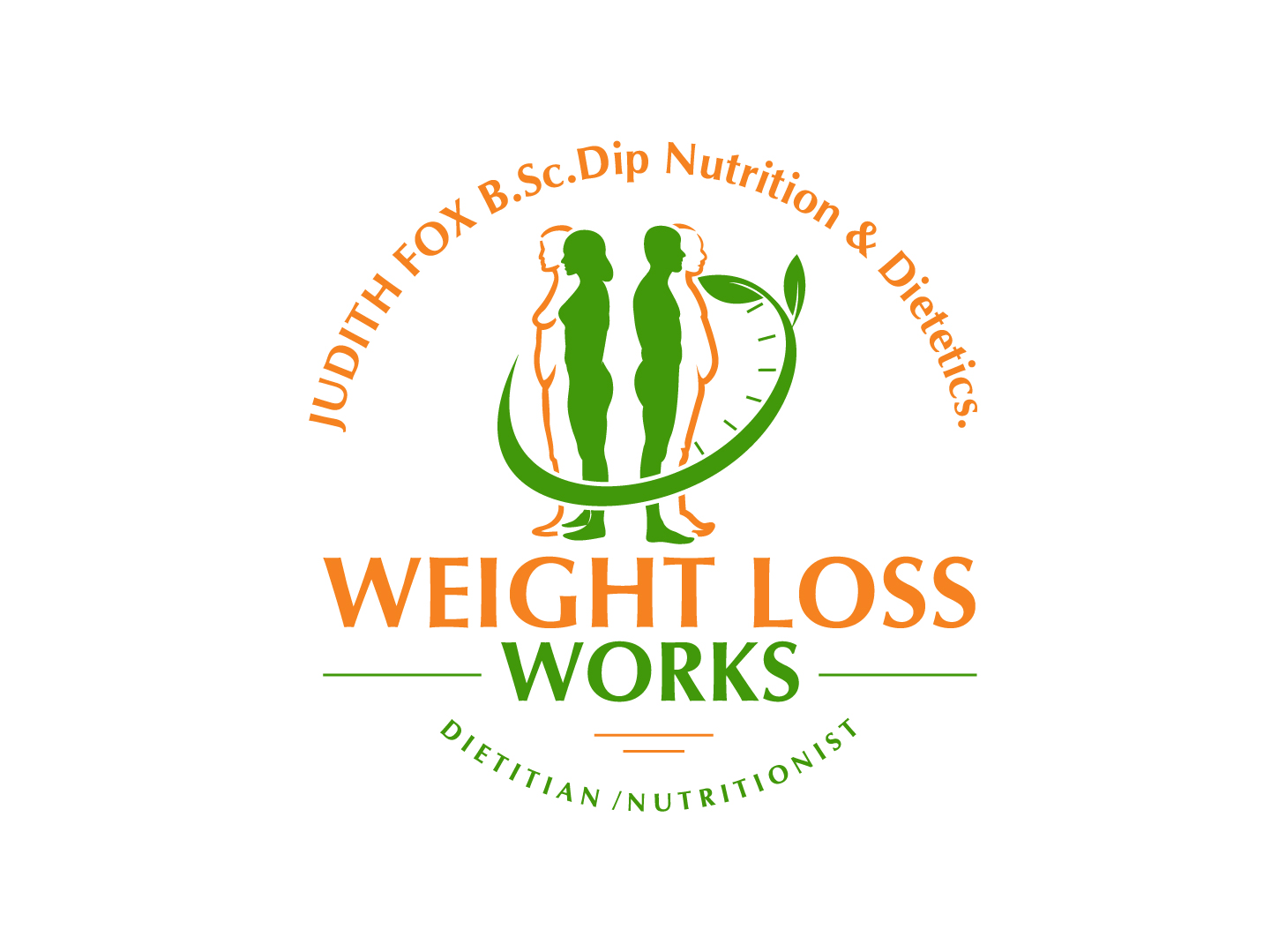
Incorporating nature-inspired elements in your weight loss logo can evoke a sense of vitality and well-being. Consider using leaf motifs, organic shapes, or vibrant colors associated with nature to create a visually appealing logo. This approach can resonate well with individuals seeking a holistic and natural approach to weight loss.
3. Abstract Representations
Using abstract representations in your logo design can create a sense of intrigue and make your brand memorable. Consider using geometric shapes or patterns that symbolize transformation, progress, or balance. This approach allows for creativity and flexibility, enabling you to create a unique logo that captures the essence of your weight loss business.
4. Fitness-Related Imagery
Incorporating fitness-related imagery can effectively communicate the core values of your weight loss business. Consider using icons or symbols that represent movement, strength, or endurance. This approach can resonate well with individuals who are seeking an active and energetic approach to weight loss.
5. Positive and Inspirational Messages
Including positive and inspirational messages in your logo design can create a strong emotional connection with your audience. Consider incorporating short and impactful phrases that encourage and motivate individuals on their weight loss journey. This approach can help position your brand as a source of support and inspiration.
Final Thoughts

Designing a logo for your weight loss business is an exciting opportunity to create a strong brand identity. By considering the design elements discussed in this article and exploring various weight loss logo ideas, you can develop a visually appealing and memorable logo that effectively represents your business. Remember to keep your target audience in mind and aim to create a logo that resonates with their needs and aspirations. With a well-designed logo, you can establish a strong brand presence and attract customers to your weight loss business.
Angela Irwin is a branding and design enthusiast with a Bachelor of Fine Arts in Graphic Design from Meadowbrook College. As a writer at Logocreator.io, she shares her expertise on logo design, graphic trends, and effective branding strategies, helping businesses create impactful visual identities.


