When you decide to design and create your logo, one of the things you will have to decide is what kind of logo you want to make.
The main parts that make up a logo are the icons and typography. You do not need both, however.
Typography is the text that is designed in a specific font. Logos that only have typography focus heavily on the design of their words so that it is unique and represents their company well.
One main thing to always keep in mind when dealing with typography is to make sure that it remains legible so that consumers will know what your name is.
Icons are the images or symbols that are chosen or designed to represent a company. Logos that only have icons will normally represent well-established companies that can get away without having any words to identify them.
When you put an icon and typography together in a logo, it becomes a combination logo. Combination logos are some of the more popular ones. This is because they communicate the most information out of all logos. They not only have their name designed in nice typography but they also have an icon that is working as a symbol for them.
The only downfall of combination logos is that they can get a little large due to having multiple elements. It is important when creating a combination logo that it balances itself out well and isn’t too overwhelming.
Horizontal
Horizontal combination logos seem to be one of the more popular choices. In this, the icon is located horizontal to the typography, either to the left or right.
This type of logo works best if you have an icon that isn’t too complex or tall. It has to be able to balance well with the typography in order for the design to be received as aesthetically pleasing.
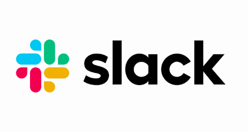
Slack is a good example of a horizontal combination logo. They have their colorful logo placed to the left of their words. The shape is a similar height to the words helping to balance the design.

Airbnb also provides a good example of this. Their script ‘A’ is located to the left of their name. The ‘A’ shape is larger than the typography but it is offset to the side enough to balance out.
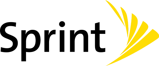
Sprint shows how to have a horizontal combination logo where you put the icon to the right of the typography. Their yellow triangular arrow shape helps to show the movement and energy that their company will provide.

One last good example of a horizontal combination logo is Macy’s. They have their simple star shape to the left of their name.
Staked
Stacked combination logos are those where the typography and icon are located vertically to each other. These are fairly common logos.
These types of logos work best with typography that is on the shorter side. You want the logo to merge together well and that doesn’t happen as well when the typography is super long.

Mailchimp is a great example of a stacked combination logo. The chimp icon is placed on top of the words. They are sized to go well together.

A more unique example of a stacked combination logo is the Pumba logo. Typically the icons are located in the center of the typography but with this logo, they decided to have the puma seem to jump off or over the words and towards the other side. This is a very clever design and works really well.
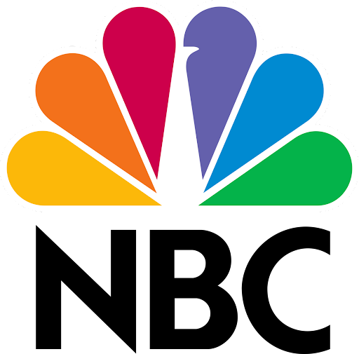
Another good example of a stacked combination logo is the logo for NBC. Above the initials is their peacock icon. Although it is an abstract design, it can still be easily understood.
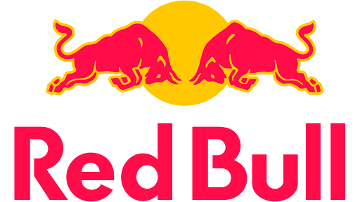
Red Bull provides another classic stacked combination logo. They have their name on top of their two bulls that are going head to head. While the words are large, they are helped balanced out by the image below.
Integrated
Integrated combination logos have their typography within their icon. These are the most creative and unique of all combination logos.
The main downside to these logos is that the icon and typography can’t be featured without one another. They have to stay together whereas other combination logos can be separated.
The main upside of these logos is that they stand out in a crowd. Their unique designs help draw attention towards them and also help hold the attention of consumers longer than other logos.
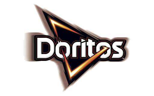
Doritos is a good example of integrated combination logos. They have their company name located in the center part of the logo with their triangle ‘Dorito’ shape going around and through the word.
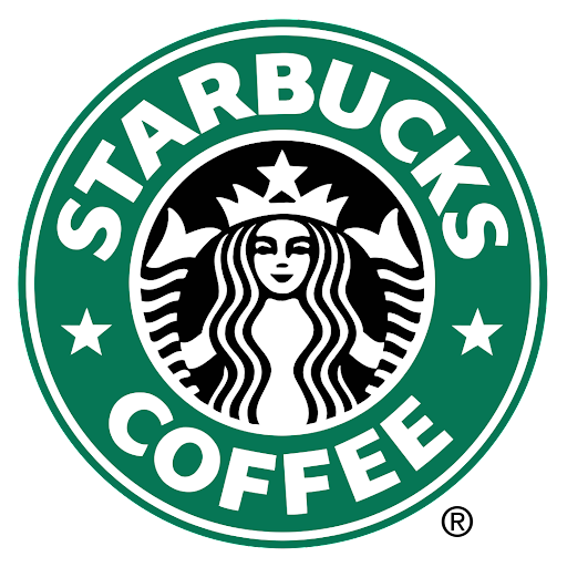
Another example of an integrated combination logo is the Starbucks logo. While their logo is also an emblem it still represents a good combination logo as the world circle around the female character within the colored circles.
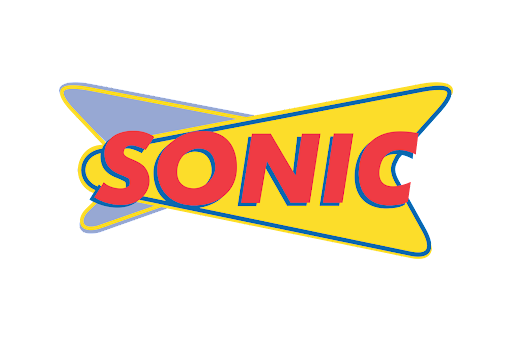
Sonic also shows how integrated combination logos can work well. Its icon is created out of some triangular arrow shapes with the typography located right in the center of the design.
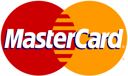
MasterCard is another great example of an integrated combination logo. They featured the typography above the two circle icons that are mashing together.
Utilizing Multiple Combination Options
Just because you picked one option to present your combination logo doesn’t mean that you have to stick with it. There are benefits to each type of logo and it can be useful to have options.
Some companies end up creating multiple different types of logo styles and using the different styles. Sometimes these different styles are used at the same time for different things depending on how well they worked. Other times, the company will go from one style to the next as they update their logo.
Adidas is a good example of this. They have tried out many different types of logos and they have multiple combination logos currently in use. One of their logos is horizontal while the other is a stacked combination logo.
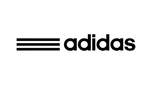

Because they have multiple logo versions in use, they are able to use them where they fit best, allowing their marketing and other materials to appear very professional with an appropriate logo in each spot.
There are no rules that say you must choose one type of logo and stick with it forever. It is up to you to decide how many logos you want to create and how often you want to change or update them.
Ultimately, there are no true rules for logos, only what has already been done and what has yet to be seen. Feel free to push the boundaries on what your combination logo can be.
Create Your Own Combination Logo
Now that you understand the different styles of combination logos, you can apply this knowledge to your own branding. Your choice should be based upon what you think will look best with your combination of name and your symbol.
You can apply this information to our logo creator in order to get a logo that is fast and cost-effective. Our platform is completely free to use with no hidden costs or fees.
In just a few easy steps, you can have your very own logo. Simply enter your company name, choose a category and an icon and then start creating.
Our program allows you to try out different layouts for your logo and all of them are combination-based. Play around with your design to see what you like best. You can also add different shapes and other elements as needed.
With LogoCreator.io, the amount of time it takes to have a new logo is only how long it takes for you to finish editing it. This means that you can have your own, professional logo that is ready to use within a few minutes of starting the creation process. Check out our logo creator today!
Angela Irwin is a branding and design enthusiast with a Bachelor of Fine Arts in Graphic Design from Meadowbrook College. As a writer at Logocreator.io, she shares her expertise on logo design, graphic trends, and effective branding strategies, helping businesses create impactful visual identities.

