Color theory is the study of how colors interact with one another, and how they can be used to create certain emotional responses. It is a fundamental concept in art, design, and marketing, and plays a crucial role in creating a brand identity that resonates with your target audience.
In the context of branding, color theory is particularly important because colors can influence the way people perceive your brand and can even impact their purchasing decisions. Different colors have different meanings and associations, and understanding these can help you choose the right colors to represent your brand and communicate your message effectively.
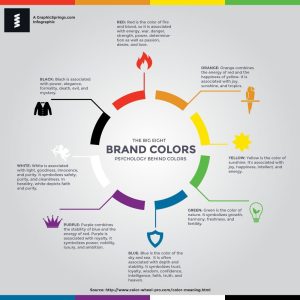
For example, blue is often associated with trust, reliability, and professionalism, making it a popular choice for finance and technology companies. Green, on the other hand, is associated with nature, growth, and health, and is often used by companies in the environmental or wellness industries. Red is associated with passion, excitement, and energy, making it a popular choice for brands in the entertainment or food industries.
Understanding color theory can also help you create a cohesive brand identity that is recognizable and memorable. By selecting a consistent color palette for your logo, website, marketing materials, and packaging, you can create a visual identity that is unique to your brand and helps you stand out in a crowded market.
In addition, color theory can help you create effective marketing materials that your audience will respond to. By using colors that align with the emotions and values of your target market, you can create messaging that is more likely to resonate with them and encourage them to take action.
It’s important to note that color theory is not an exact science, and the meanings and associations of different colors can vary depending on cultural and personal factors. However, by understanding the basics of color theory and how it can influence the way people perceive your brand, you can make more informed decisions about the colors you choose to represent your business.

Here are 8 famous examples of color theory in branding:
- Coca-Cola: The Coca-Cola logo is known for its iconic red and white color scheme. Red is a bold and energetic color that is associated with passion and excitement, while white represents purity and simplicity. Together, these colors create a sense of fun and excitement that aligns with the brand’s values.
- McDonald’s: The McDonald’s logo features bright red and yellow colors that are associated with happiness, energy, and excitement. These colors are used throughout the brand’s marketing materials to create a sense of fun and playfulness that appeals to its target audience of children and families.
- Apple: Apple is known for its minimalist and elegant design aesthetic, which is reflected in its use of a simple monochromatic color scheme. The brand’s iconic apple logo is a shade of gray, which represents sophistication, professionalism, and innovation.
- Nike: Nike’s logo features a bold black swoosh on a white background. Black is associated with strength and power, while white represents simplicity and purity. Together, these colors create a sense of confidence and professionalism that aligns with the brand’s values.
- Starbucks: The Starbucks logo features a green mermaid on a white background. Green is associated with growth, nature, and health, which aligns with the brand’s focus on sustainable and ethically sourced coffee. The white background creates a sense of simplicity and purity, which is important for a brand that emphasizes quality and authenticity.
- Pepsi: The Pepsi logo features blue and red colors that create a sense of fun and excitement. Blue is associated with trust and reliability, while red represents passion and energy. Together, these colors create a sense of excitement and playfulness that appeals to the brand’s target audience of young people.
- FedEx: The FedEx logo features a combination of purple and orange colors. Purple represents luxury, sophistication, and creativity, while orange is associated with energy, excitement, and enthusiasm. Together, these colors create a sense of innovation and creativity that aligns with the brand’s values.
- Whole Foods: The Whole Foods logo features a green leaf on a white background. Green represents growth, health, and sustainability, which aligns with the brand’s focus on organic and natural foods. The white background creates a sense of simplicity and purity, which is important for a brand that emphasizes quality and authenticity.
In conclusion, color theory plays a crucial role in branding by helping you choose colors that align with your brand’s personality and values, and communicate your message effectively to your target audience. By understanding the meanings and associations of different colors, you can create a visual identity that is unique, memorable, and effective in building a strong brand.
Angela Irwin is a branding and design enthusiast with a Bachelor of Fine Arts in Graphic Design from Meadowbrook College. As a writer at Logocreator.io, she shares her expertise on logo design, graphic trends, and effective branding strategies, helping businesses create impactful visual identities.


