Are you looking to create a strong and impactful wrestling logo? Look no further! In this article, we will guide you through the process of generating wrestling logo ideas that capture the essence of your brand and resonate with your target audience. Whether you are a professional wrestling organization, a wrestling team, or an individual wrestler, a well-designed logo can help you establish a memorable and recognizable brand identity. So, let’s dive right in!
Understanding the Importance of a Wrestling Logo
![]()
![]()
A wrestling logo serves as the visual representation of your brand. It is an essential component of your overall brand identity and plays a significant role in shaping the perception of your organization or team. A well-designed wrestling logo can convey the spirit, energy, and values of your brand, while also distinguishing you from competitors. Moreover, a strong logo can help build trust and loyalty among fans and supporters.
Researching Wrestling Logos for Inspiration
![]()
![]()
Before you start designing your wrestling logo, it’s crucial to gather inspiration from existing logos in the wrestling industry. Take some time to research and analyze the logos of successful wrestling promotions, teams, and individual wrestlers. Look for common elements, themes, and styles that resonate with the wrestling community. While you should never copy or imitate another logo, this research will help you understand the visual language of wrestling logos and identify unique design elements to incorporate into your own.
Choosing the Right Design Style
When it comes to wrestling logos, there are several design styles that you can consider. Each style has its own unique characteristics and can convey different emotions and messages. Here are a few popular design styles to inspire your wrestling logo ideas:
1. Bold and Aggressive
Bold and aggressive logos are often associated with power, strength, and intensity. They typically feature strong typography, sharp angles, and fierce animal imagery. This design style is commonly found in logos of wrestling promotions and teams that aim to convey a sense of dominance and competitiveness.
2. Retro and Vintage
Retro and vintage logos evoke a sense of nostalgia and tradition. They often use classic typography, distressed textures, and retro color palettes to create a timeless appeal. This design style can be a great choice for wrestling promotions or teams that want to pay homage to the rich history of wrestling and appeal to fans who appreciate the sport’s roots.
3. Modern and Sleek
Modern and sleek logos are characterized by clean lines, minimalistic elements, and a contemporary aesthetic. This design style is often associated with professionalism, sophistication, and innovation. If you want to position your wrestling brand as progressive and forward-thinking, a modern and sleek logo could be the perfect fit.
Incorporating Wrestling Elements into Your Logo
![]()
![]()
To create a wrestling logo that truly stands out, it’s important to incorporate elements that are specific to wrestling. These elements will help your logo resonate with fans and instantly communicate your affiliation with the sport. Here are a few wrestling-related elements you can consider integrating into your logo:
1. Wrestler Silhouettes
Silhouettes of wrestlers in action can be a powerful visual element in your logo. They instantly convey the sport of wrestling and capture the dynamic and energetic nature of the sport. Experiment with different wrestling moves and positions to find a silhouette that best represents your brand.
2. Wrestling Gear
Another way to incorporate wrestling elements into your logo is by featuring wrestling gear such as wrestling boots, singlets, or championship belts. These iconic elements are instantly recognizable within the wrestling community and can evoke a sense of authenticity and credibility.
3. Typography
Choosing the right typography is crucial in creating a strong wrestling logo. Bold, strong, and impactful fonts can help convey the power and intensity associated with the sport. Experiment with different font styles and consider customizing or modifying existing fonts to create a unique look for your logo.
Selecting the Perfect Color Palette
![]()
![]()
Colors play a significant role in logo design, as they can evoke specific emotions and create a lasting impression. When choosing a color palette for your wrestling logo, consider the following factors:
1. Passion and Energy
Wrestling is a high-energy and passionate sport, and your logo should reflect that. Colors like red, orange, and yellow can evoke feelings of excitement, intensity, and determination.
2. Trust and Strength
If you want to convey trust and strength, consider incorporating colors like blue or black into your logo. These colors are often associated with stability, reliability, and power.
3. Contrast and Impact
To ensure your logo stands out and catches attention, opt for high-contrast color combinations. Bold contrasts, such as black and white, or vibrant combinations like red and white, can create a visually striking logo that is easily recognizable.
Remember, it’s important to strike a balance between bold and eye-catching colors while ensuring readability and versatility across different applications.
Typography Tips for Wrestling Logos
![]()
![]()
When it comes to typography in wrestling logos, it’s essential to choose fonts that are legible, bold, and capture the essence of the sport. Here are a few typography tips to keep in mind:
1. Avoid Overly Ornate Fonts
While decorative fonts may seem appealing, they can often be difficult to read, especially at smaller sizes. Stick to fonts that are clean, bold, and have a strong presence.
2. Experiment with Custom Typography
Consider customizing existing fonts or creating entirely new ones to give your logo a unique and distinctive look. Custom typography can help your logo stand out and add a touch of professionalism and originality.
3. Test Legibility at Different Sizes
Ensure that your chosen typography remains legible and clear when scaled down or reproduced at smaller sizes. Your logo should be easily recognizable on various promotional materials, merchandise, and digital platforms.
Bringing Your Wrestling Logo to Life
![]()
![]()
Once you have finalized your wrestling logo design, it’s essential to ensure its versatility and adaptability. Your logo should look great across different mediums, including digital platforms, print materials, merchandise, and even on-screen during wrestling events. Here are a few considerations to keep in mind:
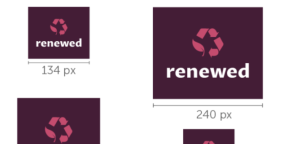
1. Scalability
Ensure that your logo is scalable without losing its visual impact. It should remain legible and recognizable whether it’s displayed as a small thumbnail on social media or blown up on a billboard.
2. Simplify for Versatility
Consider creating simplified versions or variations of your logo that can be used in limited spaces or different contexts. These simplified versions should retain the core elements of your logo and maintain brand consistency.
3. Test in Multiple Formats
Test your logo in different formats, such as full color, grayscale, and black and white, to ensure it retains its impact and legibility across various applications.
Conclusion
![]()
![]()
Designing a wrestling logo that captures the spirit of the sport and resonates with your target audience requires careful consideration and creativity. By researching existing wrestling logos, choosing the right design style, incorporating wrestling elements, selecting an appropriate color palette, and paying attention to typography, you can create a powerful and memorable wrestling logo that represents your brand effectively. Remember, a well-designed wrestling logo not only helps you establish a strong brand identity but also forms a connection with fans and supporters that can last a lifetime. Now it’s time to unleash your creativity and create a wrestling logo that truly stands out in the ring!
Marietta Arnold is a branding and design enthusiast who draws inspiration from hobbies like hiking, photography, and art exploration. With a background in graphic design, she shares insights on branding strategies and logo design trends. Stay updated with Marietta’s work for the latest in branding and design.