When taking a look at the logos of the biggest corporations out there, you’ll start to see some recurring color combinations. These are the tried and true colors that people know work together well.
Thankfully, logo color combinations can’t be patented, so you are welcome to try them out for yourself. With each set, there are reasons they work and look so nice together.
The reasons that these combinations work are due to color psychology. These colors not only look nice together but they help make you feel things or think in a specific type of way.
Here are thirteen of these famous color combinations and why they work so well together. If none of these combinations catch your eye, keep reading to learn how to make your own.
Yellow and Red Logos
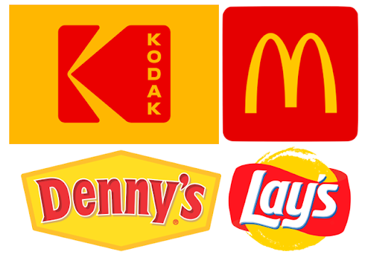
Yellow and red logos are very popular. Even though both colors are bright and strong, these warm colors work really well together.
Red is an intense warm color that can create feelings of anger, passion, confidence, excitement, and much more.
Yellow is also a warm color, but much less intense. It can create feelings of happiness, warning, energy, and positivity.
When red and yellow are paired together, they have been proven to make you feel more hungry. Because of that, this color combination is used by a lot of food companies.
The examples we choose are from Lay’s, Denny’s, Kodak, and McDonald’s. They all heavily use red and yellow in their decisions but Lay’s and Denny’s decided to use some white as well to help with contrast.
For your own logo, your whole logo doesn’t have to be filled with red and yellow. Just a little bit of one color to contrast the other is a great way to make a logo stand out.
Choose the color combination of red and yellow for your next logo if you want to have a logo that is full of energy, positivity, excitement, and more. They are also great for making viewers hungry.
Purple and White Logos
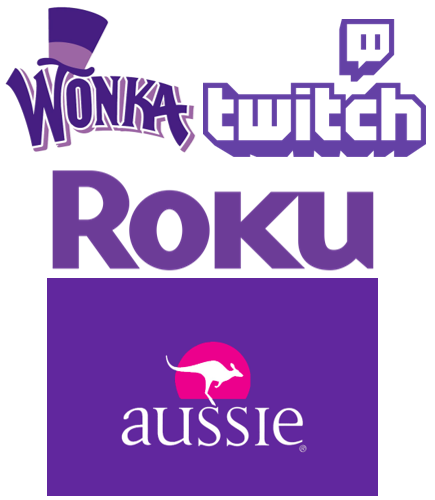
The combination of purple and white is very pleasing to the eye. While it is not as widely used as the yellow and red combination, it is very effective when companies choose this combo.
White is a very clean, pure, and elegant color that works well with almost any other color. Purple is a royal color that is very wise and emotional.
The examples that we choose are Aussi, Roku, Wonka, and Twitch. While there is a mixture of which color is featured as the primary, both colors are used effectively in each design.
For your own logo, consider what type of vibe you are wanting to give off and if a purple and white combination will do this for you. These colors, together, are very elegant, clean, and royal and make a great combination for a logo.
Black and Yellow Logos
Black and yellow is a very bold color logo combination. Most commonly seen on the bee, this color combination is eyecatching, bold, and sends a message.
As previously reviewed, yellow is a positive, energetic, happy, warm color. Black is a very powerful color that gives off feelings of mystery, elegance, authority, and strength.
Our examples for this combination consist of Sprint, Star Wars, Caterpillar, and DeWalt. All of these logos are very different in how they handle what they do with their color choices but every logo remains bold and powerful.
For your own logo, if yellow and black is the combination that works best for you, make sure that your colors balance each other out well in your design. You don’t want one of them to be heavier than the other, especially since they are both such strong colors.
Blue and White Logos
The color combination of blue and white is a popular one. White works with nearly every shade possible, making it one of the more simple combinations. Just because it’s simple, doesn’t mean that it isn’t powerful.
White, as previously stated is a very pure, elegant, clean, and simple color. It works really well with nearly any color that it is paired with.
Blue is a very predictable color on the cooler side of the spectrum. It gives off feelings of security, peace, trust, and predictability.
Some examples of companies that use this color combination are AT&T, Facebook, Skye, and Oreo. There are plenty of other companies that also use this combination.
Most companies use white as the color for their font and blue as the background or shape color. However, these colors can be used in a multitude of ways in order to achieve many stunning looks.
For your own logo, if you want to give off a very trustworthy and dependable vibe, this color combination could be the way to go. It is a tried and true set of colors that many companies rely upon.
Pink and Blue Logos
Although it creates some great results, the pink and blue color logo combination is not as used as some of its counterparts. Despite this, this color combination is slowly increasing and becoming the color choice for new companies.
Blue, as previously mentioned is a very calming and trustworthy color. It gives off feelings of security, reliability, peace, and predictability.
Pink is often used for gender-specific audiences because of its feminity. It produces vibes of playfulness, love, nurturing, and kindness.
Some companies that use this color combination are TikTok, PinkBlue, Flickr, and Baskin Robbins. While each company uses a different shade of the colors, they make their combinations work really well.
For your logo, consider who your target audience is and what type of message you want to send with your colors. Pink and blue is a great combination for giving viewers an impression that your company values playfulness, reliability, kindness, and security.
Red and White Logos
Red and white is an incredibly popular logo color combination. This pairing of colors works so well because of the contrast the colors give one another including how white provides a perfect softness to red’s boldness.
As previously mentioned, red is a very bold and strong color. It is associated with feelings of passion, confidence, action, and energy.
White, on the other hand, is a very simple color. It emphasizes elegance, calmness, and simplicity.
Some examples of a few companies that use this color combination are Adobe, Reddit, Beats, and Marvel. All of these companies chose to use white as the color for their font and red as the color for their background container.
For your logo, you can’t go wrong with this color combination. As long as you are wanting to bring a lot of energy and passion to your logo with this red-strong combination, you are good to go.
Blue and Yellow Logos
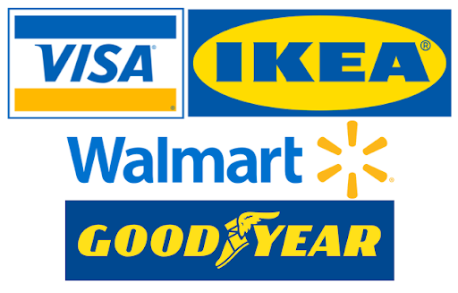
The color combination of blue and yellow is a good one to rely upon. These colors work well to balance each other out and provide a well-rounded amount of traits.
As previously mentioned, blue is a calm and cool color. It has characteristics of being predicable, trustworthy, peaceful, and more.
Also previously mentioned, yellow is a very positive and happy color. It provides feelings of warmth, energy, and inspiration.
Some companies that use this color combination are Goodyear, Walmart, Visa, and Ikea. These groups employ a variety of strategies in how they present their colors in their logos.
For your own logo, this is a solid color combination to use. As long as it presents the values that you are looking for with the combination of trustworthiness and positivity, it is a great combo to use.
Black and White Logos
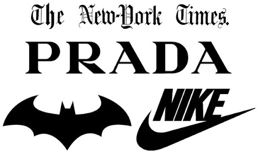
The color combination of black and white is a very elegant, powerful, and simple choice. Being opposites, black and white will always work really well together.
As previously stated, white is a color that represents purity. It is clean, simple, and elegant.
Black, as also previously stated, is a color that is very mysterious. It holds strength, authority, and elegance.
Some companies and groups that use this color combination are Nike, Batman, Prada, and The New–York Times. All of these groups use black as the primary color against white backgrounds.
For your own logo, try to utilize the strengths of each color within your logo. You want to make sure that there is not too much of either color in your design.
Green and Yellow Logos
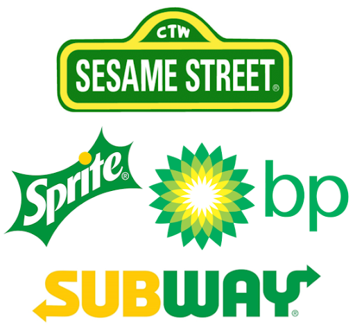
Green and yellow create very pleasing logo color combinations. These two colors work well together and complement each other’s strengths.
As previously mentioned, yellow is a very happy color. It brings positivity, energy, warmth, and inspiration to any design.
Green, however,, is a very natural color. It has ties, not only to nature but, also to health and money. It has traits of growth, fertility, hope, and prosperity.
Some companies that use this color combo in their logos are Subway, BP, Sprite, and Sesame Street. Each of the logos is very unique in how they utilize its colors.
For your own logo, green provides a large number of characteristics that can be connected to your values. Yellow adds positivity to the overall design. This can be a winning combination to represent your company.
Brown and White Logos
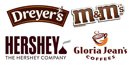
Brown and white are an underutilized set of colors for logo combinations. They provide a very grounding feeling to viewers.
White, as previously mentioned, is a very pure color. It values innocence, elegance, and simplicity.
On the other hand, brown is a color that has ties to the Earth. Its main characteristics are that it is grounding, predictable, honest, and natural.
Some companies that use the brown and white color combination in their logos are The Hershey Company, Gloria Jean’s Coffees, M&M’s, and Dreyer’s. Almost all of these groups use brown as the primary color with Dreyer’s being the exception. Most of these companies likely chose brown because it is the same color as their main product.
For your own logo, you can base your color choice on your product, or off of the attributes that the colors present. The white and brown combination provides a nice about of elegance, naturalness, simplicity, and groundedness.
Purple and Yellow Logos
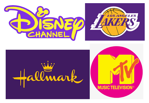
The purple and yellow color combination for logos provide a striking look. As opposites on the color spectrum, they work very well together and are a great choice.
As previously stated, purple is a very regal color. It represents wisdom, royalty, emotions, and inspiration.
Also as previously stated, yellow is a very happy color. It is full of positivity, energy, inspiration, and warmth.
Some companies that have used this color combination in the past are Hallmark, Music Television, Disney Chanel, and the Los Angeles Lakers. Only the Lakers’ team chose to use Purple as their primary font color rather than yellow like the rest of the example companies.
While this color combination is not as popular as others, anything designed with these colors has an advantage due to how the colors respond to each other.
For your own logo, make sure that these colors fit what you want your company to represent. They are very inspiring colors that are emotional, warm, and full of wisdom.
Orange and White Logos
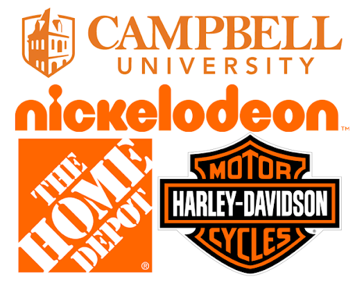
Orange and white are a good combination of colors for a logo. This combo brings together both a feeling of simplicity and spontaneity.
As previously stated, white is a pure color that is focused on innocence, cleanliness, and elegance.
Orange, on the other hand, is a very emotional color. It has characteristics of enthusiasm, creativity, success, and optimism.
Some companies that use this color combination are The Home Depot, Harley-Davidson Motor Cycles, Nickelodeon, and Campbell University. There is a mixture between who uses the orange color for the font and who uses it for container shapes.
For your own logo, these colors can work well if you want to show off your company’s characteristics in a bold way. Being associated with optimism, elegance, creativity, and simplicity are all good things.
Blue and Orange Logos
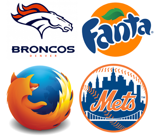
Blue and orange are a great combination for logos because of how the colors interact together. These colors are on opposite sides of the color spectrum which brings out the best in both of them.
As previously stated, orange is a vibrant color that can be associated with optimism, success, creativity, spontaneity, and encouragement.
Also previously stated, blue is a very calm color. It can be associated with trust, security, predictability, and reliability.
Some examples of companies that use this color combination are Mozilla Firefox, the New York Mets, Fanta, and the Denver Broncos. All of these companies utilize their colors in a unique way that makes them different from the others.
For your own logo, however you use it, this color combination can be really great because of how the colors interact with each other.
Create Your Own Logo Color Combinations

One of the best parts about colors combinations is that they are nearly endless. While yes, there are only so many colors, each color has countless shades. With the internet, you can access all those colors and shades.
All of the color combinations listed in this article are tried and true with proof that they work. Those are all good options to consider for your logo. But those are not the only options.
Understanding what a color means and how it makes people feel is a great place to start when picking out colors that you like. This is a great way to decide on colors also so that they fit your company’s image.
If you don’t like any of the color combinations listed in this article, you can create your own. If the combination that you create looks pleasant to your eyes, then there is a good chance that it is a good combination.
A benefit of creating your own combination is that it is less likely to already be in use by many other companies and groups.
Once you have decided on a color combination, the next step is to make your logo with those colors. Our logo creator provides a great platform to create your next logo.
Logo Creator is easy to use, quick, doesn’t require any extra programs, and best of all, it is completely free. Simply add your name, choose a category, add a tagline, choose an icon, and finish editing your new logo.
Within a short time, you can have your very own logo featuring the color combination that you picked out. Try out our logo creator today.
Barry Edwards is a digital marketing expert with a deep understanding of content strategy, logo, and branding principles. Holding a Bachelor’s degree in Marketing from Beaconhill College, he offers valuable insights on digital marketing trends and strategies through his writing. Follow Barry’s work to stay updated on the latest in online marketing and branding.
