Audience
When it comes to designing a logo for your alarm clock brand, it’s important to consider your target audience. Whom are you trying to reach with your brand? Are you targeting busy professionals who need a reliable alarm to wake up on time? Or perhaps you’re catering to students who need a gentle wake-up call to start their day? Understanding your audience will help you create a logo that resonates with them and communicates the value your alarm clock offers.
Icons
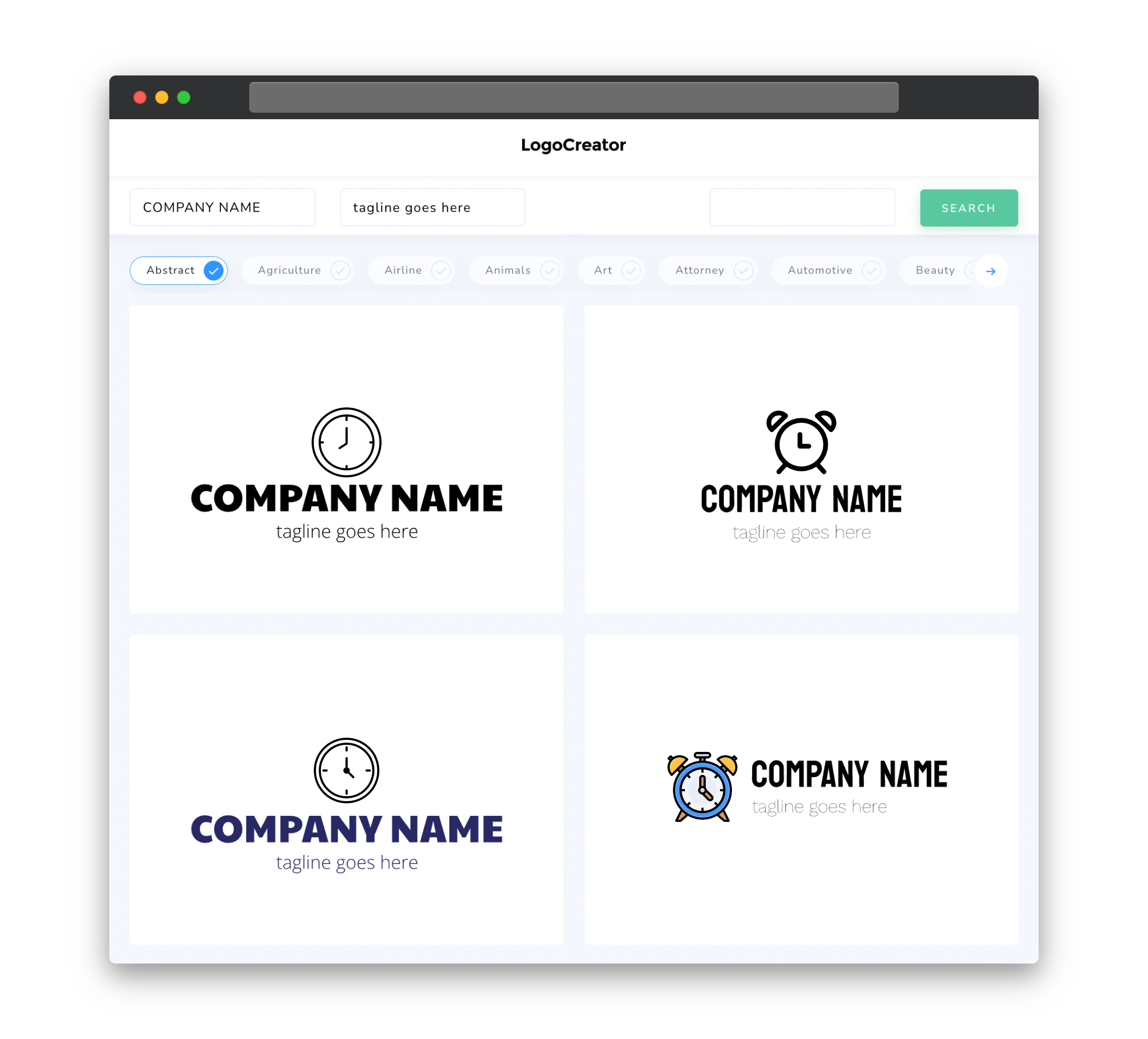
Icons play a crucial role in alarm clock logos, as they instantly convey the purpose of your brand. Incorporating a simple and recognizable icon into your logo design will make it easier for customers to identify your alarm clock brand at a glance. Consider using classic alarm clock symbols such as a clock face with hands, a ringing bell, or even a snooze button. Icons that represent time, wakefulness, or relaxation can also be used to complement your brand identity.
Color
Color selection is essential when designing a logo for an alarm clock brand. The colors you choose should align with your brand’s personality and the emotions you want to evoke in your customers. Bright and energetic colors like orange and yellow can convey a sense of awakening and enthusiasm, while calm and soothing colors like blue and green can evoke relaxation and peacefulness. It’s important to choose color combinations that are visually appealing and create a harmonious balance in your logo design.
Fonts
The choice of fonts in your alarm clock logo will contribute to the overall aesthetic and message of your brand. Consider selecting fonts that are easy to read and have a modern or classic feel, depending on your brand’s positioning. Sans-serif fonts are a popular choice for alarm clock logos as they convey a clean and contemporary look. However, serif fonts can also be used to add a touch of elegance and sophistication to your logo design. Experiment with different font options to find the one that best represents your brand personality.
Layout
The layout of your alarm clock logo should be simple, yet eye-catching. It’s important to strike a balance between creativity and clarity. A minimalist approach can often work well, with the main focus being on the icon or imagery representing your alarm clock. Consider placement and size, ensuring that the logo is easily visible and identifiable when scaled down or used in different applications. The overall layout of your logo should be cohesive and visually appealing, capturing the essence of your alarm clock brand.
Usage
Thinking about the different ways your logo will be used is crucial in the design process. Logos need to be versatile and adaptable to various applications such as digital platforms, print materials, and promotional items. Ensure that your logo works well in different sizes and maintains its clarity and legibility. It should also be scalable without losing any details or becoming distorted. Keeping these usage considerations in mind will result in a logo that can effectively represent your alarm clock brand across different mediums.


