Audience
When designing a logo for an ambulance service, it’s important to understand your audience. Your target audience includes both the patients who need emergency medical care and the professionals who work in the healthcare industry. Patients are usually in a state of distress and may be seeking immediate help, so your logo should evoke a sense of trust, reliability, and urgency. Healthcare professionals, on the other hand, value professionalism, expertise, and efficiency. Therefore, your logo should also appeal to their expectations and reflect the high standard of care provided by the ambulance service.
Icons
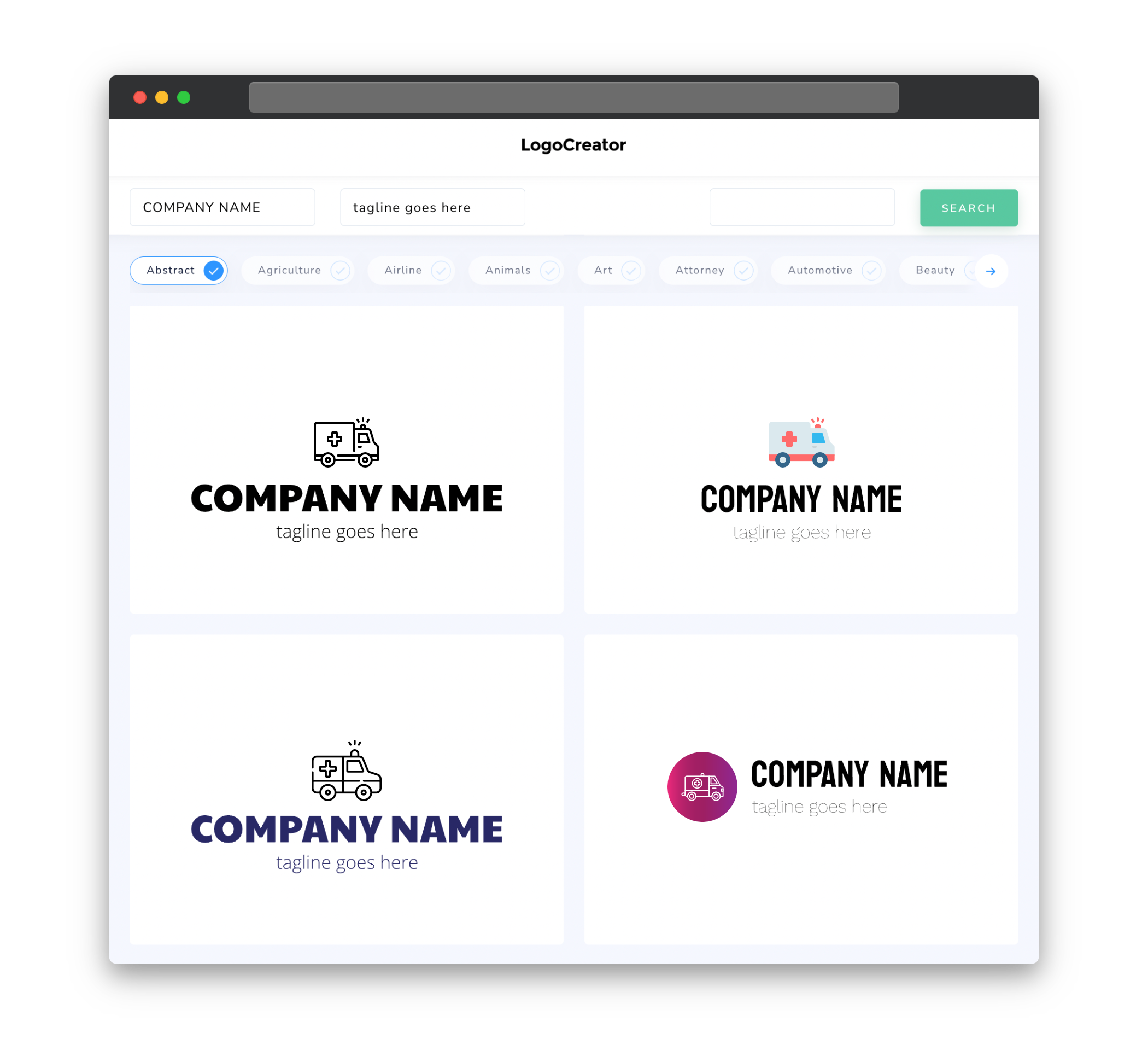
Icons are essential when designing an ambulance logo as they can instantly convey the purpose of your business. Consider incorporating recognizable symbols such as a medical cross, a stylized ambulance or paramedic symbol, or a heart rate monitor to symbolize life-saving interventions. These icons not only inform people about the nature of your service but also make your logo visually appealing and memorable. It’s important to strike the right balance between simplicity and uniqueness when choosing iconography for your ambulance logo.
Color
Choosing the right colors for your ambulance logo can significantly impact its effectiveness. Colors such as red, which symbolizes urgency and emergency, are commonly used in ambulance logos to evoke a sense of alertness and immediate assistance. Blue, often associated with trust, reliability, and professionalism, is another popular choice. Combining these colors can create a compelling logo that balances the urgent nature of the ambulance service with the professionalism of healthcare. Remember to use a maximum of two to three colors to maintain clarity and visual cohesion.
Fonts
The choice of fonts for your ambulance logo is crucial as they help convey the message and tone of your brand. When it comes to ambulance logos, it’s best to opt for clean, modern, and easily readable fonts. Sans-serif fonts are particularly suitable as they exude professionalism and are easily legible even in small sizes. Fonts with bold variations can add a sense of strength and urgency to your logo, while still maintaining a level of professionalism. Remember to keep the fonts consistent across different elements of your logo to maintain a cohesive and unified visual identity.
Layout
The layout of your ambulance logo should be well-balanced and visually appealing. Consider placing the icon at the forefront, either above or to the left of the text, to grab attention and instantly communicate the purpose of your service. Keep the layout simple and avoid cluttering the logo with excessive elements. By allowing ample negative space, you can create a logo that appears clean, professional, and is easily recognizable even at small sizes. Experiment with different proportions and alignments to find the right composition that conveys your brand identity effectively.
Usage
Your ambulance logo should be versatile and adaptable to various marketing materials and platforms. It should seamlessly integrate and look clear and legible whether displayed on a website, printed on stationery or uniforms, or even on the side of an ambulance. Opt for vector-based designs to ensure that your logo remains sharp and scalable across different sizes and resolutions. Remember to consider how your logo will appear in both color and grayscale, ensuring it remains recognizable even without color differentiation. By creating a versatile logo, you can effectively amplify your brand presence and ensure consistent representation across different mediums.


