Audience
When it comes to designing an amusement park logo, it is important to consider your target audience. Your logo should appeal to both children and adults, as amusement parks are a place for people of all ages to have fun and create lasting memories. With this in mind, it’s essential to create a logo that is playful, vibrant, and captures the essence of excitement and adventure.
Icons
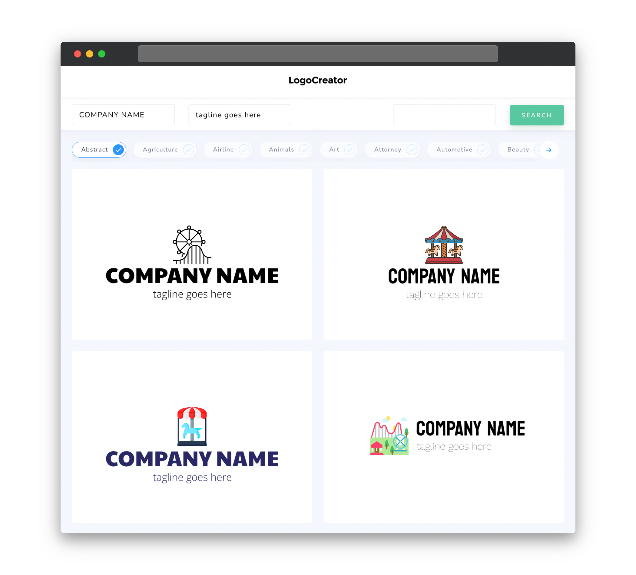
Incorporating icons in your amusement park logo can be a great way to communicate the different attractions and experiences your park offers. Consider using icons of roller coasters, Ferris wheels, carousels, or any other iconic elements that represent the unique features of your amusement park. These icons will not only make your logo visually appealing but will also give potential visitors a glimpse of the thrilling experiences they can expect.
Color
Choosing the right colors for your amusement park logo is crucial in conveying the right emotions and capturing the attention of your target audience. Bright, bold, and lively colors are often associated with fun and excitement, and are therefore perfect for an amusement park. Consider incorporating shades of red, yellow, blue, or green to create a vibrant and captivating logo that reflects the spirit of your park.
Fonts
The choice of fonts in your amusement park logo can greatly influence the overall look and feel of the design. Opt for playful, bold, and easy-to-read fonts that convey the fun and energetic atmosphere of your park. Avoid overly fancy or intricate fonts, as they may make your logo appear cluttered and difficult to comprehend at a glance. Remember, simplicity is key when it comes to creating an effective amusement park logo.
Layout
The layout of your amusement park logo should be well-balanced and visually appealing. Consider incorporating both text and icons in a way that compliments each other and creates a cohesive design. Experiment with different arrangements, such as placing the icon above or to the side of the text, to find the best layout that communicates your park’s unique brand identity effectively.
Usage
Your amusement park logo will be used across different platforms and mediums, so it’s important to design a logo that is versatile and can be easily adapted to various sizes and formats. Make sure your logo looks great both on large-scale signage as well as on small promotional materials, such as brochures or websites. Additionally, consider creating variations of your logo for different applications, such as simplified versions for use in small print or as social media avatars, ensuring your logo remains recognizable in any context.


