Audience
If you want to make a statement and communicate your brand’s edginess and attitude, an Angry Logo is the perfect choice for you. This logo style is ideal for businesses seeking to convey power, strength, defiance, or even rebellion. Whether you’re in the gaming industry, sports, or any other field where boldness is key, an Angry Logo will instantly grab attention and leave a lasting impact on your target audience. It appeals to those who are seeking authenticity, uniqueness, and a touch of aggressiveness in their brand identity.
Icons
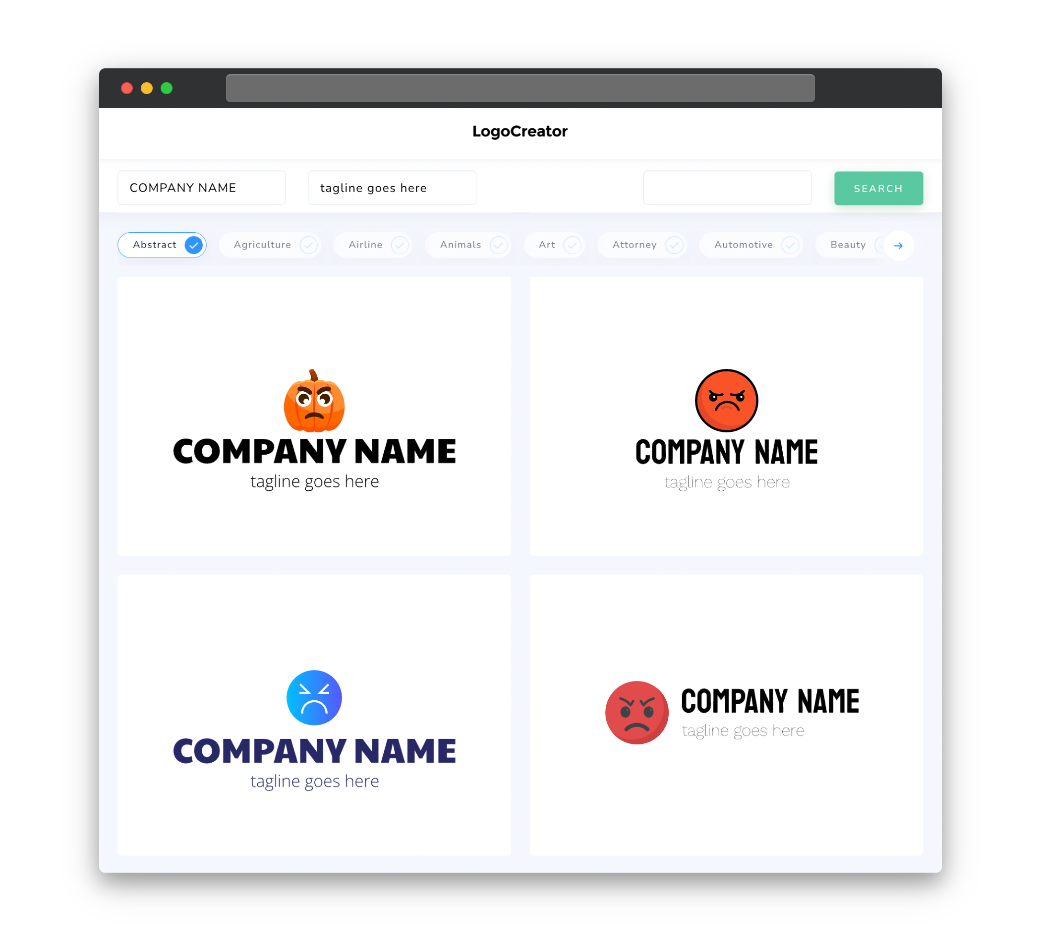
Angry Logos feature powerful and unmistakable icons that reflect intense emotions and strength. From fierce animal motifs, such as lions, wolves, or eagles, to clenched fists, thunderbolts, or intense facial expressions, these icons are designed to showcase power and determination. Using visually striking and bold icons in your Angry Logo will help you establish a strong visual identity that resonates with your target audience. They will immediately recognize and associate your brand with strength, determination, and a fearless attitude.
Color
When it comes to choosing colors for your Angry Logo, you’ll want to go for hues that evoke strong emotions and intensity. Red, for example, is a classic choice as it symbolizes power, passion, and energy. Black is another popular color, often associated with authority, mystery, and strength. Incorporating metallic tones like gold or silver can add a touch of luxury and exclusivity to your logo. However, keep in mind that ultimately the choice of color should align with your brand’s personality and values to create a cohesive and impactful visual representation of your business.
Fonts
To match the powerful and aggressive nature of an Angry Logo, it’s crucial to select fonts that exude strength and impact. Bold, sans-serif fonts convey a sense of authority, while sharp-edged or angular typefaces can add an edgy and aggressive touch. Avoid overly delicate or intricate fonts, as they may dilute the impact of your logo. Experiment with different font styles to find the perfect one that captures the essence of your brand and enhances the overall intensity of your Angry Logo.
Layout
When it comes to the layout of an Angry Logo, simplicity and clarity are key. A minimalistic approach allows the powerful icon and the bold typography to take center stage. Consider positioning the icon prominently, ensuring that it stands out and instantly catches the eye. Placing the text below or to the side of the icon allows for a balanced and visually appealing composition. Remember to test different variations and layouts, keeping in mind that the ultimate goal is to create a visually compelling logo that conveys strength and aggression effectively.
Usage
An Angry Logo can be utilized across various brand touchpoints, establishing a consistent and impactful brand presence. From digital platforms, such as websites, social media profiles, and apps, to traditional marketing materials like business cards, packaging, and merchandise, the Angry Logo will make a bold statement wherever it is used. Consider adapting the logo for different sizes and formats to ensure optimal visibility and legibility. This versatile logo style allows you to maintain a cohesive brand image across different contexts, reinforcing the strong and powerful identity you want to project to your audience.


