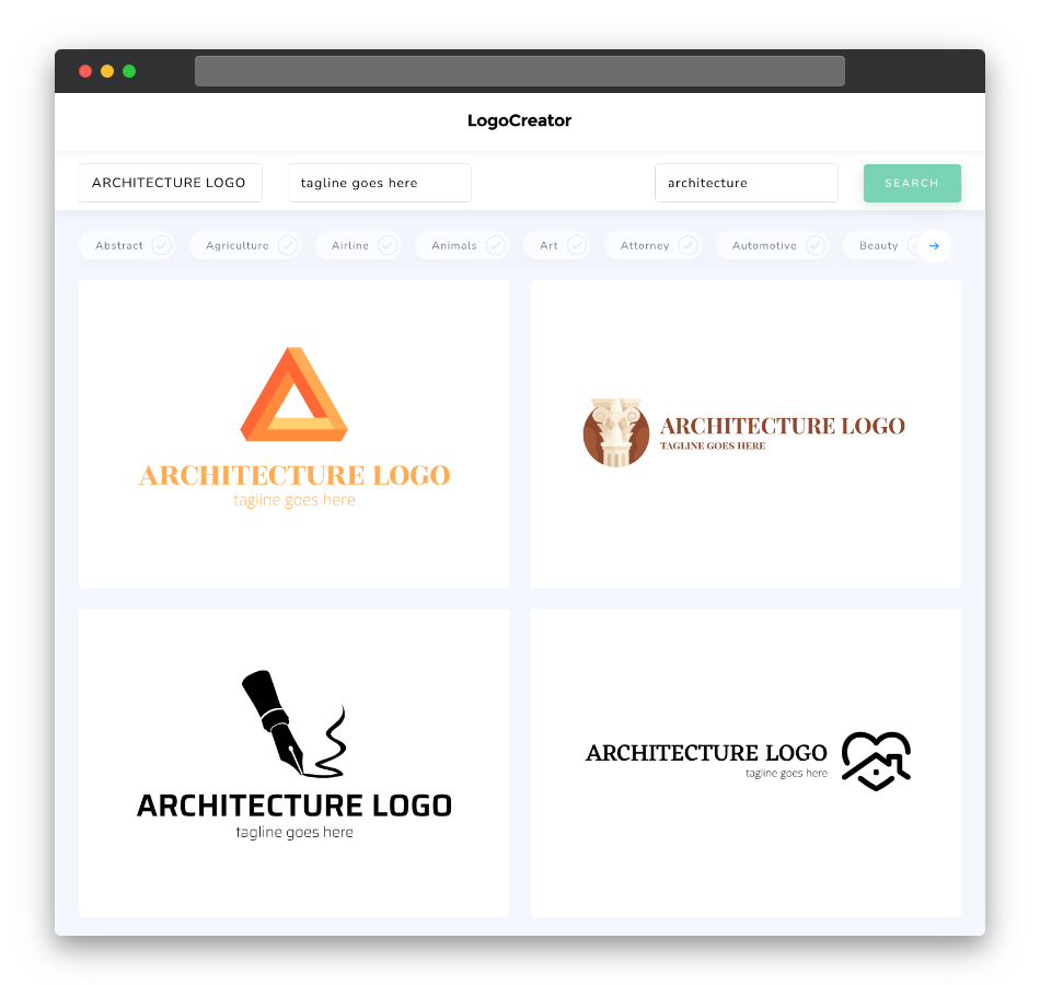
Is an architecture logo the right choice for me?
An architecture logo is an excellent choice if you want to establish a strong visual identity for your architectural practice or firm. It serves as the face of your brand, reflecting your design style, vision, and commitment to excellence. A well-designed architecture logo can help you stand out in a competitive field, create a lasting impression on clients, and convey the essence of your architectural philosophy.
What makes a good architecture logo?
A good architecture logo should be simple, memorable, and reflective of your design principles. It should encapsulate the core values of your architectural practice, whether it’s innovation, sustainability, or timeless aesthetics. Consider incorporating design elements such as architectural shapes (e.g., buildings, arches, columns), drafting tools (e.g., rulers, compasses), or abstract representations of architectural concepts. Choose a clean and balanced design that conveys professionalism and creativity.
What are the best icons for architecture logos?
The best icons for architecture logos often include architectural elements, tools, or abstract representations of buildings and spaces. Icons like stylized buildings, blueprints, or structural elements like columns or beams can be effective choices. Abstract symbols that evoke ideas of structure, balance, or design innovation can also work well. The key is to choose icons that resonate with your architectural philosophy and convey the essence of your work.
What colors are best for architecture logos?
When selecting colors for your architecture logo, consider those that evoke trust, creativity, and professionalism. Neutral tones like blues, grays, and blacks are commonly used in the architectural industry to convey reliability and sophistication. Earthy colors like browns and greens can symbolize a connection to nature and sustainable design. Additionally, bold accent colors like red or orange can represent creativity and innovation. Choose a color palette that aligns with your brand’s identity while ensuring readability and versatility in various applications.
Which fonts go best with architecture logos?
Font selection plays a crucial role in conveying the right tone for your architecture logo. Opt for clean, modern, and legible fonts that complement your design style. Sans-serif fonts often work well, offering a contemporary and professional aesthetic that aligns with architectural principles of simplicity and clarity. Consider the scale and readability of your chosen font, especially when used in various applications, from business cards to digital media.
In conclusion, a well-designed architecture logo is a vital component of your architectural brand. Our logo maker is here to help you create a logo that embodies your architectural vision and professionalism. Don’t miss the opportunity to leave a lasting impression on your clients and peers—try it now and take the first step toward building a remarkable architectural brand.


