Audience
When it comes to creating your auto shop logo, it’s essential to understand your target audience. Your logo should resonate with car enthusiasts and appeal to both new and existing customers. It should convey reliability, expertise, and a sense of trust. By understanding your audience, you can tailor your logo design to speak directly to their needs and preferences. Whether youâre targeting individuals looking for a reliable car repair service or car dealerships searching for a professional logo for their business, knowing your audience will help you create a logo that makes a lasting impression.
Icons
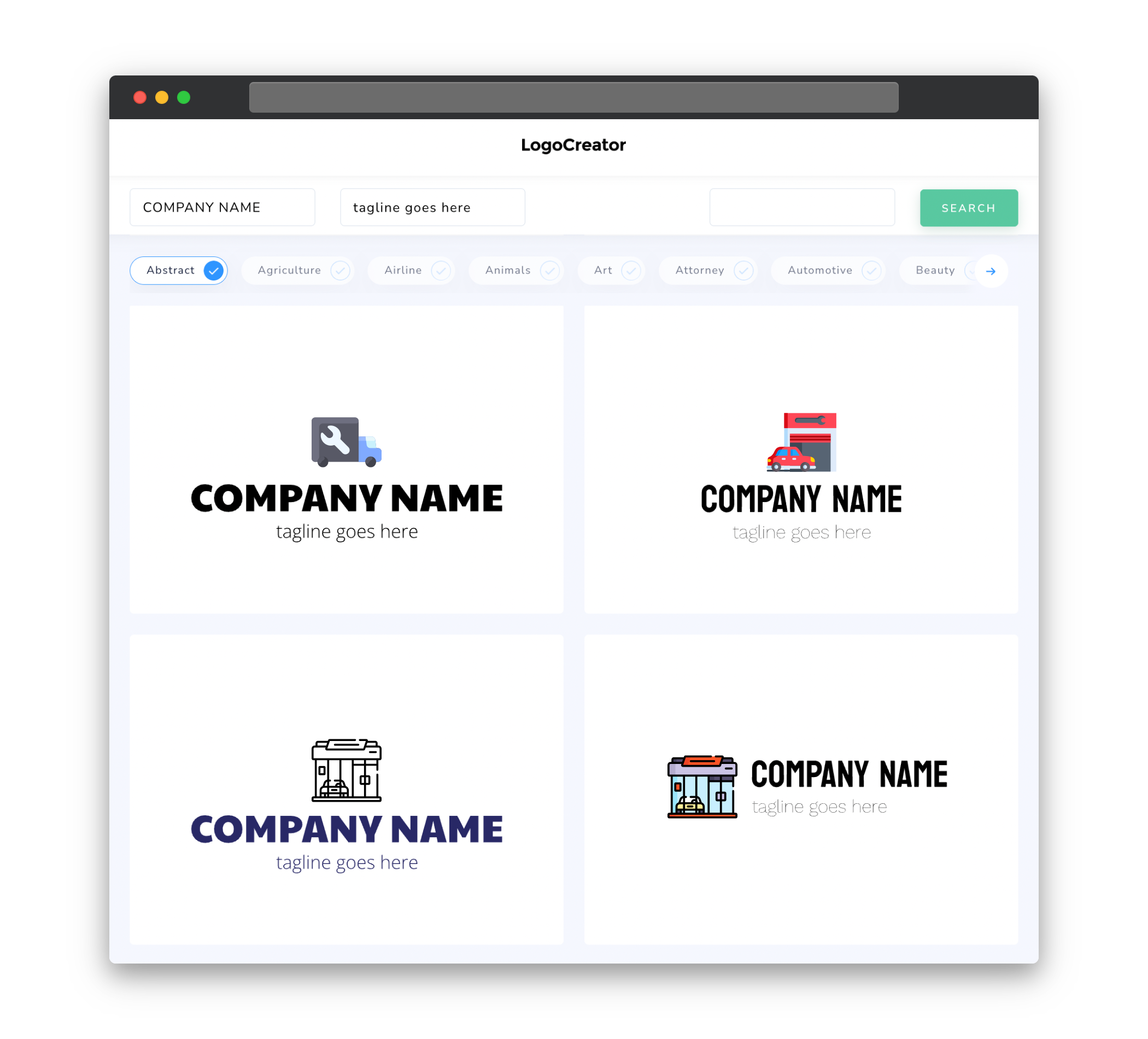
Icons play a crucial role in the design of your auto shop logo. The icon you choose should be simple, memorable, and easily identifiable. Common icons used in auto shop logos include vehicle outlines, car parts, or wrenches, alluding to the services you offer. Using a recognizable icon in your logo can help customers associate your brand with automotive expertise and make it easier for them to recognize your auto shop from a distance. The right icon can convey professionalism, reliability, and a sense of automotive knowledge, strengthening your brand identity.
Color
Colors play a significant role in the perception of your auto shop logo. It’s important to choose colors that align with your brand personality and resonate with your target audience. Bold and vibrant colors like red, blue, and yellow can convey energy and enthusiasm, while more subdued colors like black, silver, or gray can evoke a sense of professionalism and trust. Consider using color combinations that complement each other and are visually appealing. Just remember to keep the overall color scheme clean and avoid using too many colors, as it can make your logo look cluttered and confusing.
Fonts
Choosing the right fonts for your auto shop logo is crucial for conveying the desired message. Clean and modern fonts can reflect professionalism and make it easier for customers to read your logo, even from a distance. Consider using bold and uppercase fonts to give your logo a strong and commanding presence. It’s also important to ensure that the font pairs well with the icon and overall design of your logo, creating a harmonious and visually appealing composition.
Layout
The layout of your auto shop logo should be balanced and visually appealing. Consider different placement options for the icon and text elements, such as placing the icon above or to the left of the text. Experiment with different arrangements to find the one that best represents your brand and allows for easy recognition. Remember to keep the overall design clean and uncluttered, avoiding excessive details or overcrowding of elements. A balanced and well-structured layout will give your logo a professional and polished look, making it memorable and easy to identify.
Usage
Once you have created an impressive auto shop logo, it’s important to use it consistently across all your marketing materials. Consistency builds brand recognition and trust in your business. Ensure that your logo is scalable and can be used effectively on various platforms, such as websites, social media profiles, business cards, and signage. Consider creating different versions of your logo to accommodate different sizes and formats. By using your logo consistently, you’ll establish a strong brand presence and make it easier for customers to associate your logo with your auto shop.


