Audience
When it comes to creating a board game logo, it’s important to consider your target audience. Whether you’re designing a logo for a family-friendly game, a strategy game for hardcore gamers, or a party game for social gatherings, understanding your audience will help you create a logo that resonates with the players. For example, if your game is geared towards children, you may want to use bright, vibrant colors and playful icons to appeal to their sense of fun and imagination. On the other hand, if you’re targeting serious gamers, a more sleek and sophisticated logo design with bold fonts and strong colors might be more appropriate.
Icons
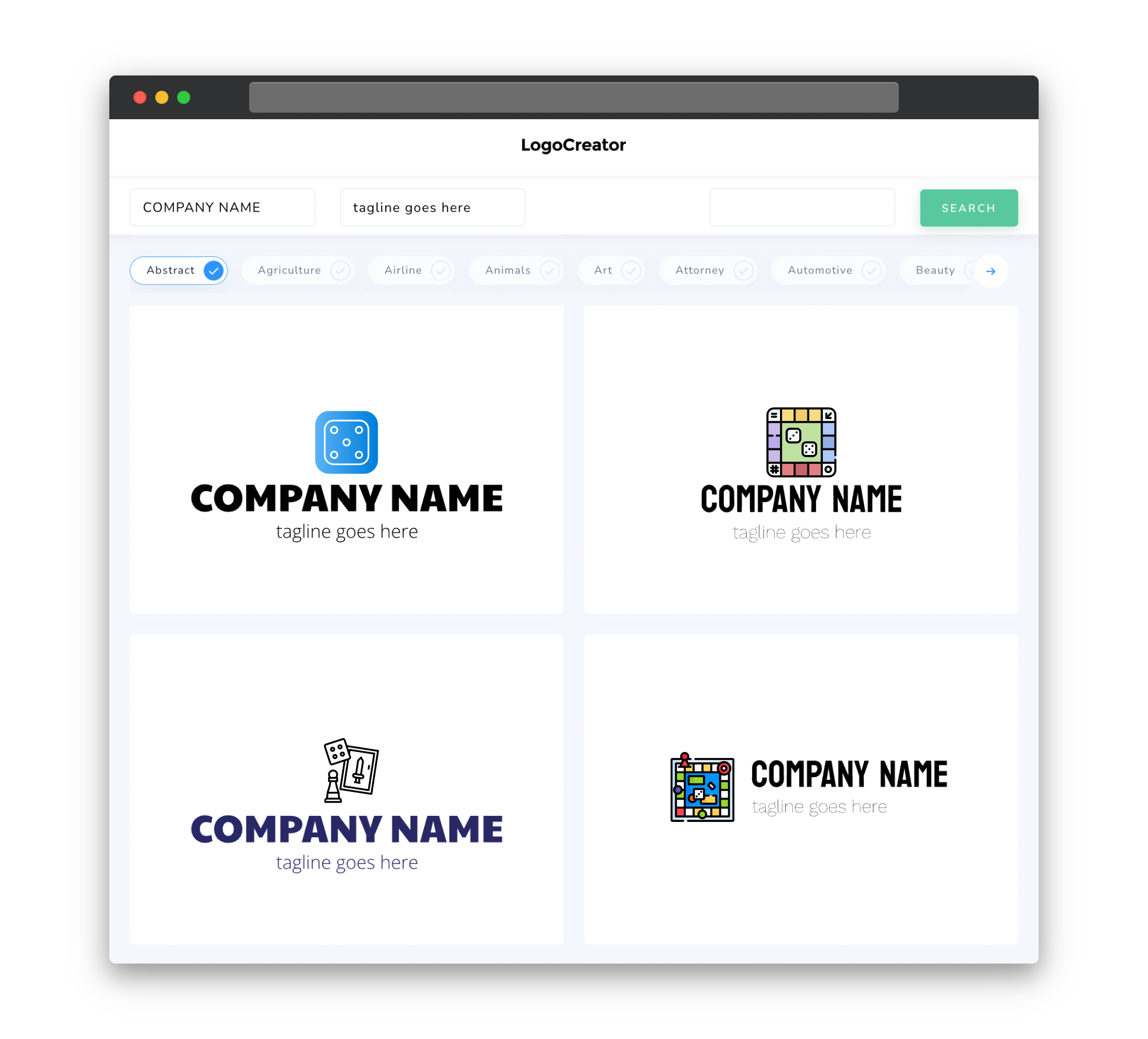
The icons you choose for your board game logo can play a crucial role in communicating the theme and gameplay experience of your game. Whether you opt for classic board game elements like dice, playing cards, or game pieces, or more abstract symbols that represent the themes and mechanics of your game, the icons should be both visually appealing and relevant to your game’s concept. Additionally, consider the style of your icons. Are they more cartoony and whimsical, or do they have a more realistic and detailed look? The choice of icon style can greatly impact the overall tone and aesthetic of your logo.
Color
Color plays a significant role in logo design, as it evokes emotions and helps establish brand identity. When selecting colors for your board game logo, consider the genre and theme of your game. For example, a fantasy-themed game might benefit from using rich and vibrant colors like deep blues and purples, while a sci-fi game might use sleek and metallic colors like silver and electric blue. Additionally, think about the overall tone you want your logo to convey â is it light-hearted and fun, or serious and intense? Choosing a color palette that aligns with the intended mood of your game will help reinforce its message to potential players.
Fonts
The choice of fonts in your board game logo can greatly impact its overall look and feel. It’s important to select fonts that are legible and convey the right message about your game. For instance, if your game is a medieval-themed adventure, you might want to use bold and ornate fonts that evoke a sense of antiquity and grandeur. On the other hand, if your game has a more modern and futuristic setting, sleek and clean fonts with a high-tech aesthetic might be more suitable. It’s also worth considering the readability of your chosen fonts â make sure they are easily legible, even when scaled down to smaller sizes.
Layout
The layout of your board game logo should be visually balanced and harmonious. Consider the placement and arrangement of the various logo elements, such as icons, text, and any additional design elements. Experiment with different compositions to find the one that best represents your game and is visually appealing. Remember to ensure that the key elements of your logo are clear and distinguishable, even when scaled down to smaller sizes or viewed from a distance. A well-designed layout will ensure that your logo stands out and makes a memorable impression on potential players.
Usage
Once you have designed your board game logo, it’s important to consider how it will be used across various materials and platforms. Your logo should be scalable, allowing it to be easily resized without losing its visual impact. It should also work well in both color and black and white, ensuring that it can be reproduced across different mediums. Additionally, consider how your logo will be used in promotional materials, packaging, and online platforms. Ensuring that your logo is versatile and adaptable will allow it to effectively represent your game across different touchpoints and effectively communicate its identity.


