Audience
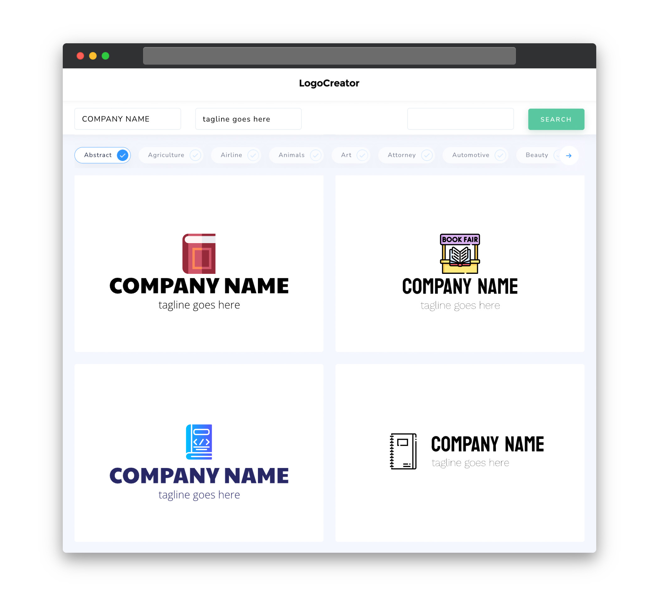
When designing a logo for a book fair, it’s important to consider the target audience of the event. Typically, a book fair attracts book lovers, avid readers, authors, publishers, and educators. Your logo should appeal to this diverse group while still capturing the essence of a book fair. Consider using imagery that represents books, such as open books, bookshelves, or book stacks. Additionally, incorporating elements that symbolize community, creativity, and a love for literature can help resonate with the target audience.
Icons
Using icons in your book fair logo can be a great way to visually communicate the purpose and theme of the event. Icons can represent various book-related elements, such as books, bookmarks, quills, or reading glasses. These symbols not only add visual interest to the logo but also help viewers instantly recognize that the event is related to books. Make sure to choose icons that are clear, simple, and easily identifiable even at smaller sizes.
Color
Color selection plays a significant role in creating an impactful book fair logo. Considering the nature of a book fair, it’s best to choose colors that are vibrant, warm, and inviting. While there is no specific color palette for a book fair logo, you can opt for colors commonly associated with books, like deep blues, rich browns, or earthy greens. These colors evoke a sense of tradition, knowledge, and creativity. You may also incorporate bright and playful colors to add a touch of excitement and energy to the logo, reflecting the lively atmosphere of a book fair.
Fonts
Font selection is crucial to maintaining the overall theme and aesthetics of your book fair logo. Depending on the desired tone, you can choose from a variety of fonts. Serif fonts, such as Times New Roman or Baskerville, can give a classic and traditional feel, which is well-suited for book fairs with a more formal setting. On the other hand, sans-serif fonts like Helvetica or Futura can convey a modern and contemporary vibe, ideal for book fairs with a focus on innovation and cutting-edge literature. Whichever font you choose, ensure its readability and scalability for various promotional materials.
Layout
The layout of your book fair logo should be clean, balanced, and easily recognizable. Consider using a simple and straightforward design that can be easily integrated into different marketing materials, such as banners, posters, flyers, and social media profiles. A rectangular or square shape tends to work well for book fair logos, as they provide a balanced canvas for incorporating icons, text, or both. Remember to leave enough white space around the logo to ensure clarity and avoid visual clutter.
Usage
Once you have created a compelling book fair logo, it’s important to consider its usage across different platforms and materials. Ensure that your logo is scalable, so it remains visually appealing when resized for both small and large formats. Whether it’s for print or digital purposes, the logo should be easily recognizable and legible. Additionally, consider creating variations of the logo, such as a simplified version or a version with a transparent background, to accommodate different design requirements. By having a versatile logo, you can effectively promote your book fair across various channels and capture the attention of your target audience.


