Audience
When creating a logo for your boxing gym, it’s important to consider your target audience. Think about who you are trying to attract and what message you want to convey. Are you targeting professional boxers or casual fitness enthusiasts? Understanding your audience will help you design a logo that resonates with them and captures their attention.
Icons
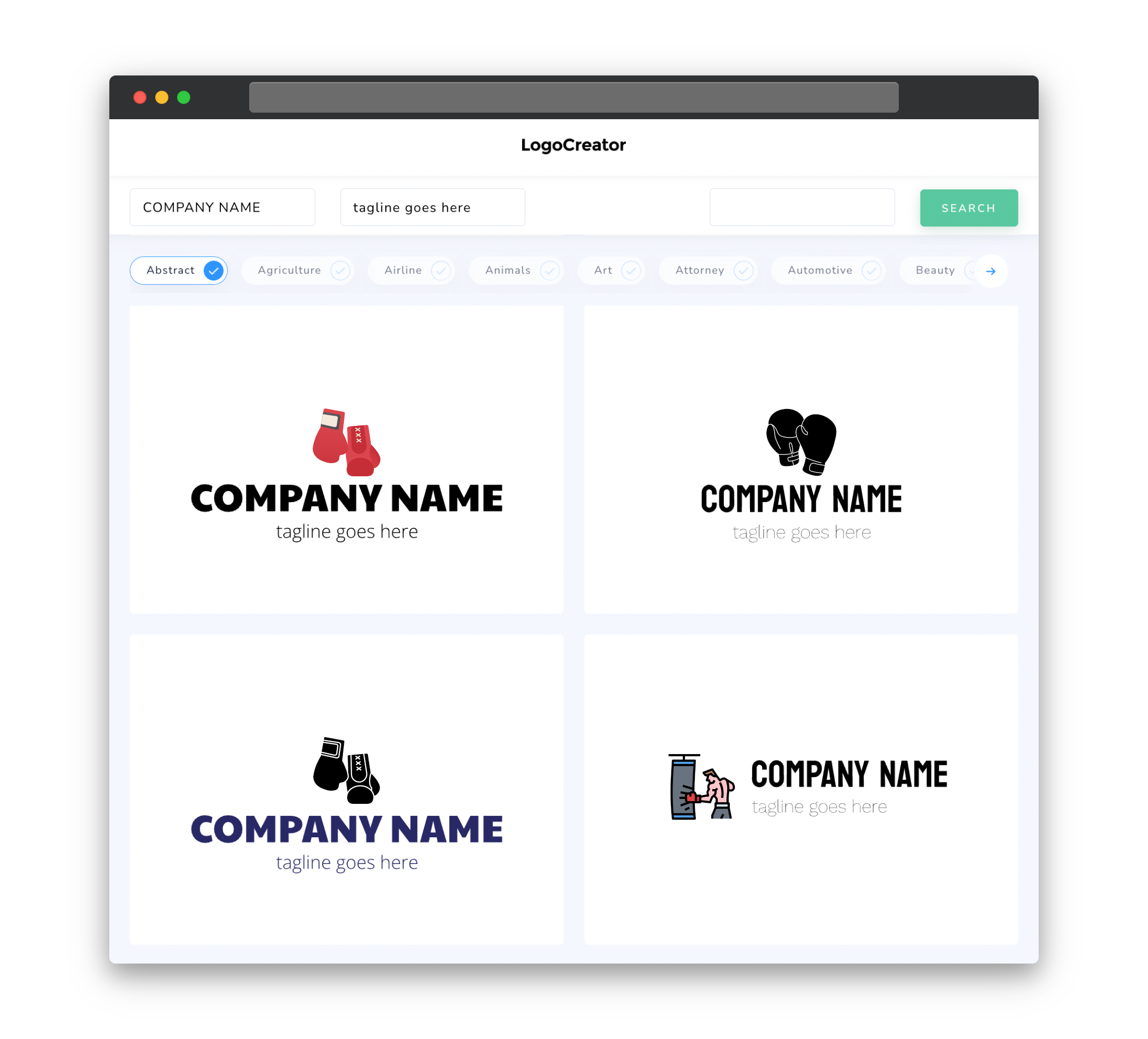
Icons are a powerful visual element that can instantly communicate the essence of your boxing gym. Incorporating boxing-related icons, such as gloves, punching bags, or boxing rings, can help establish an immediate connection with your audience. These icons not only convey the nature of your business but also add a touch of authenticity to your logo. Remember to keep the icons simple and easily recognizable so that they can be easily reproduced in different sizes and formats.
Color
Choosing the right color scheme for your boxing gym logo is crucial as it can greatly influence how your audience perceives your brand. Consider using bold and energetic colors that reflect the intensity and passion often associated with boxing. Colors like red, black, and white are commonly used in boxing logos and can evoke feelings of power, strength, and determination. However, you should also take into account your gym’s brand identity and align the color palette with your overall branding strategy.
Fonts
The choice of fonts for your boxing gym logo plays a significant role in establishing the tone and personality of your brand. Consider using bold and strong fonts that convey a sense of power and resilience. Fonts with sharp edges or italicized styles can add a touch of dynamism and movement to your logo, reflecting the speed and agility often associated with boxing. Make sure the font is easily readable, especially when scaled down to smaller sizes, to ensure its legibility on various marketing materials.
Layout
The layout of your boxing gym logo should be clean, balanced, and visually appealing. Try to maintain symmetry or create an organized alignment to give your logo a professional and cohesive look. Consider placing the icons or text elements in a way that enhances the overall appeal of the logo while maintaining readability. Experimenting with different arrangements and proportions during the design process can help you find the perfect layout that captures the spirit of your boxing gym.
Usage
A well-designed boxing gym logo should be versatile and adaptable for various uses. Consider the different platforms and mediums your logo will be displayed on â from websites and social media profiles to merchandise and signage. Make sure your logo can be easily scaled up or down without losing its impact or becoming indistinguishable. Additionally, designing your logo in vector format allows for easy editing and scaling while maintaining the highest quality, ensuring your logo retains its professional appearance across all applications.
Remember, a logo is the visual representation of your brand and serves as a powerful tool for creating brand recognition and identity. By considering your audience, incorporating meaningful icons, utilizing appropriate colors and fonts, creating a balanced layout, and designing for versatility, you can create a boxing gym logo that truly captures the essence of your brand and appeals to your target audience.


