Audience
When it comes to designing a butterfly logo, it is important to understand your target audience and their preferences. Butterfly logos are often associated with elegance, beauty, and transformation. They can be used for a variety of businesses, including fashion, beauty, wellness, and even environmental organizations. Consider who your target customers are and what message you want to convey through your logo design. Understanding your audience will help you create a butterfly logo that resonates with them and effectively represents your brand.
Icons
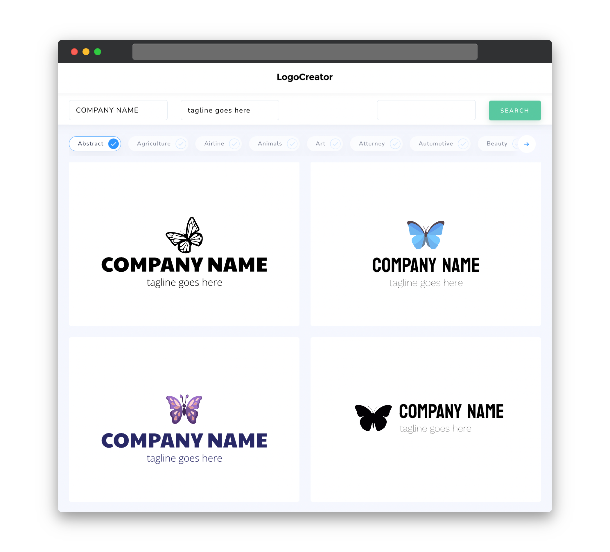
Icons play a crucial role in creating a memorable butterfly logo. You want to choose an icon that not only captures the essence of a butterfly but also aligns with your brand identity. There are various styles of butterfly icons to choose from â from realistic to abstract. Realistic butterfly icons are detailed and showcase the intricate patterns and colors of a butterfly. On the other hand, abstract butterfly icons focus more on the symbolic representation of a butterfly. Whichever style you choose, make sure the icon is visually appealing, easily recognizable, and reflects the unique qualities of your brand.
Color
Color is an essential element in logo design, and when it comes to a butterfly logo, it plays an even more significant role. Butterflies are known for their vibrant and diverse range of colors. When selecting colors for your butterfly logo, consider the emotions and associations you want to evoke. Bright, bold colors like blues, purples, and oranges can convey a sense of energy, creativity, and positivity. On the other hand, softer pastels like pinks, lavenders, and yellows can evoke a sense of elegance, femininity, and tranquility. Choose colors that not only appeal to your target audience but also align with your brand’s personality and message.
Fonts
The choice of fonts in your butterfly logo is another crucial decision to make. Fonts can communicate various emotions and attitudes. For a butterfly logo, it is recommended to use fonts that are graceful, elegant, and organic. Cursive or script fonts can convey a sense of sophistication and femininity, while sans-serif fonts can provide a more modern and clean look. Experiment with different font styles and combinations to find the perfect balance between legibility and aesthetics. Remember to choose fonts that are easy to read, especially when scaling down your logo for smaller applications.
Layout
The layout of your butterfly logo is the arrangement of its various elements â the icon, text, and any other design elements. The key is to find a balance between simplicity and creativity. The butterfly icon should be the main focus, so ensure it is placed prominently within the logo design. Consider placing the text either below or beside the icon, using complementary fonts and sizes to create hierarchy. Be mindful of the spacing and proportions, as a well-designed layout will enhance the overall impact of your butterfly logo.
Usage
A well-designed butterfly logo should be versatile and adaptable to different mediums and applications. Ensure your logo looks good both in color and in black and white, as it may need to be printed or used in various formats. It should be scalable, maintaining its clarity and legibility when sized up or down. Additionally, think about how your logo will appear on different surfaces and backgrounds. Consider creating variations of your logo to accommodate different scenarios, such as a simplified version for smaller sizes or a monochromatic version for single-color applications. This will ensure consistency and maximize the impact of your butterfly logo wherever it is used.


