Audience
When it comes to creating a logo for your cabinet business, it’s important to consider your target audience. Your logo should appeal to both residential and commercial clients who are looking for high-quality and stylish cabinets. Whether you specialize in kitchen cabinets, bathroom cabinets, or custom cabinetry for office spaces, your logo should convey professionalism, reliability, and craftsmanship.
To attract homeowners, your logo should evoke a sense of warmth and comfort, while also showcasing the functionality and durability of your cabinets. For commercial clients, your logo should exude sophistication, efficiency, and the ability to meet their specific storage needs. By understanding your target audience, you can design a logo that resonates with potential customers and sets the tone for your business.
Icons
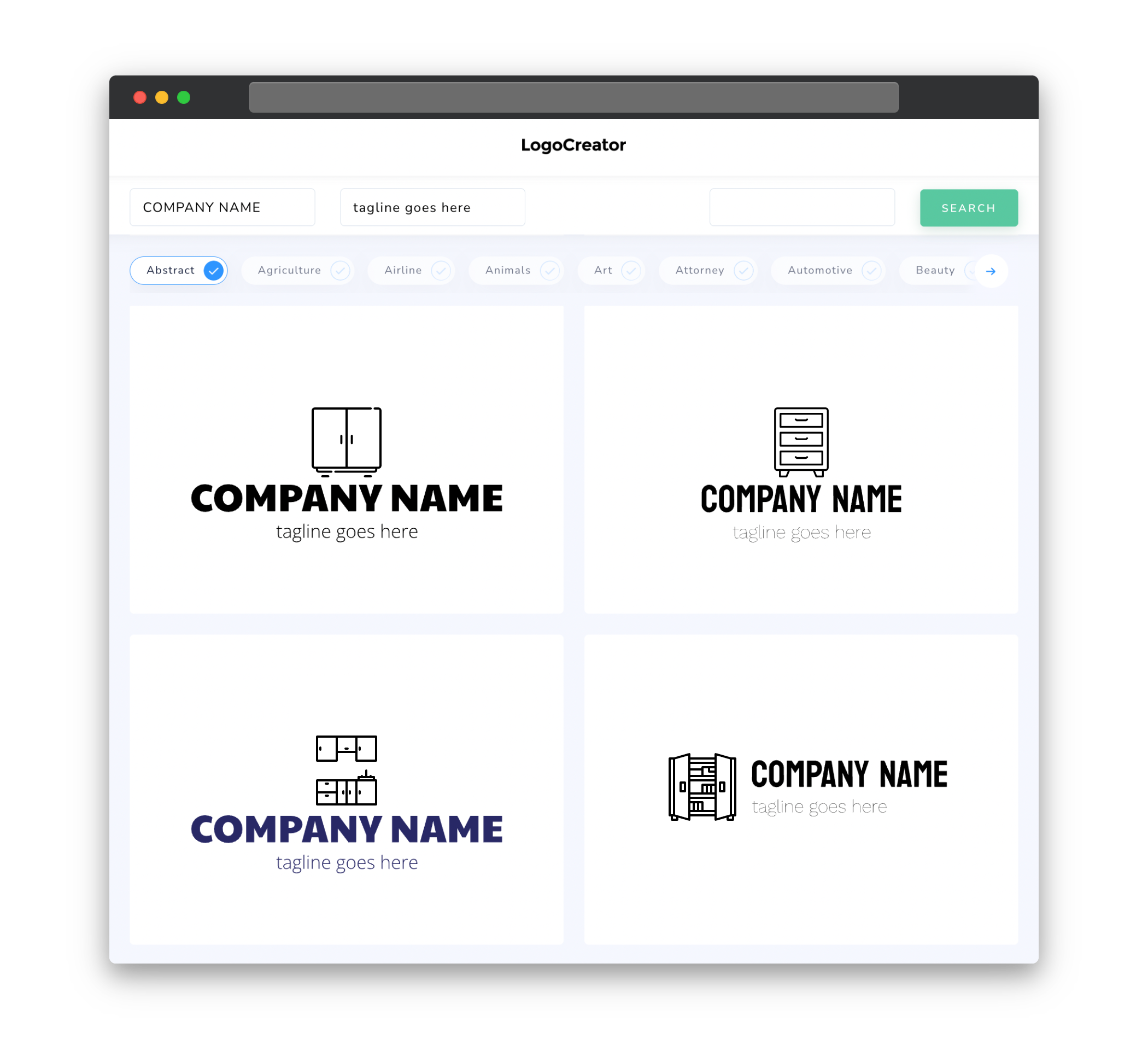
Icons are a powerful design element that can instantly communicate the nature of your cabinet business. When choosing icons for your logo, consider incorporating symbols that represent cabinets, such as a simple outline of a cabinet or drawer. This will visually convey what your business is about, making it easier for potential customers to recognize and remember your brand.
Additionally, you can incorporate other relevant icons, such as tools or design elements, to portray craftsmanship and attention to detail. Icons can be used alongside text or as standalone elements, depending on the style and aesthetic you want to achieve. Just remember to keep the icons clean, simple, and visually appealing to ensure they resonate with your target audience.
Color
Color plays a crucial role in logo design, as it can evoke certain emotions and create a memorable visual impact. For a cabinet logo, it’s best to stick with colors that reflect the qualities you want your business to convey. Natural wood tones, such as warm browns or rich mahogany, can create a sense of warmth and sophistication. These colors also lend themselves well to the notion of craftsmanship and quality.
In addition to wood tones, you can also consider incorporating other colors that complement or contrast with your chosen wood tone. For example, a pop of vibrant green or blue can add a modern and fresh touch to your logo, while still maintaining a connection to the natural elements associated with cabinets. Experiment with different color combinations to find the perfect balance that represents your brand identity.
Fonts
When it comes to fonts for your cabinet logo, it’s important to choose a typeface that is clear, legible, and reflects the personality of your business. For a cabinet business, fonts that exude professionalism and stability work well. Serif fonts, such as Times New Roman or Georgia, can communicate a sense of tradition and craftsmanship, while clean and modern sans-serif fonts, like Arial or Helvetica, create a more contemporary feel.
To add a touch of uniqueness to your logo, you can also consider customizing or modifying a font. This can be achieved through subtle changes, such as adjusting the letter spacing or adding subtle curves to the font. Just make sure that the font remains legible and easy to read, even when resized or viewed from a distance.
Layout
The layout of your cabinet logo should be visually clean, balanced, and organized. This helps to convey a sense of professionalism and attention to detail, which is crucial in the cabinetry industry. Consider using symmetry or a well-structured grid system to create a cohesive and harmonious design.
A common approach is to place the icon, if you have one, to the left or right of the text, creating a horizontal layout. Alternatively, you can stack the icon on top of the text for a vertical layout. Experiment with different arrangements to see which one best suits your business name and overall aesthetic. Just remember to strike a balance between the size of the icon and the text, ensuring that both elements are easily discernible and complement each other.
Usage
A well-designed cabinet logo should be versatile and scalable, allowing you to use it across various platforms and mediums. It’s important to consider how your logo will appear in different sizes, whether it’s on a business card, website, or signage.
To ensure readability and visual impact at different scales, avoid overly complex designs or intricate details that may get lost when scaled down. Keep your logo simple, focused, and easily recognizable. This will allow you to maintain a consistent and memorable brand image across different touchpoints, helping to establish credibility and trust with your customers.


