Audience
When it comes to creating a captivating cafeteria logo, it’s essential to consider your target audience. Think about who will be visiting your cafeteria and who you want to attract. Are you targeting students, working professionals, or families? Understanding your audience will help you design a logo that resonates with them and makes a lasting impression.
Your cafeteria logo should reflect the atmosphere and vibes you want to create in your space. If you have a trendy and modern cafeteria, consider using sleek and contemporary design elements. On the other hand, if you have a family-friendly ambiance, incorporating playful and welcoming icons could be a great idea. Understanding your audience will guide you in choosing the right style, colors, and overall design for your cafeteria logo.
Icons
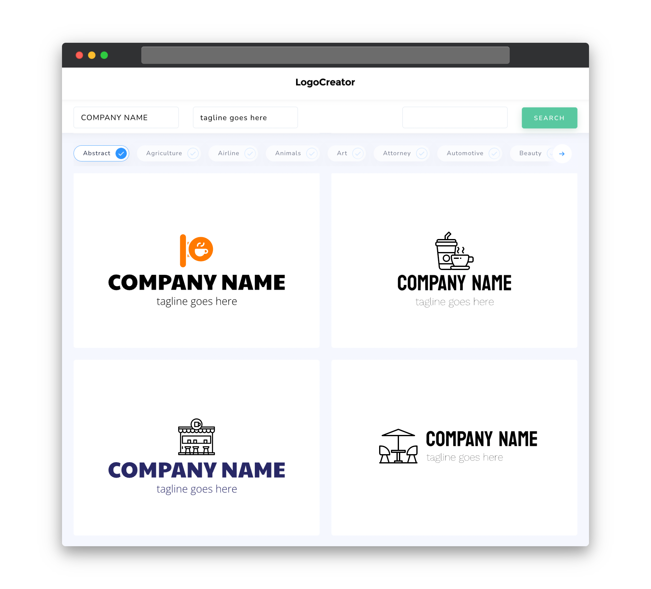
Icons are a powerful visual tool when it comes to creating a cafeteria logo. They help convey your brand’s message and add a touch of personality to your logo. Incorporating food-related icons can instantly communicate the nature of your business and create an immediate connection with your target audience.
Consider including icons such as coffee cups, plates, forks, or even a chef’s hat to symbolize your cafeteria. These icons can be either simple or intricate, depending on the style you’re aiming for. Whichever icons you choose, make sure they align with your brand identity and contribute to a visually appealing and memorable logo.
Color
The color palette you select for your cafeteria logo plays a vital role in grabbing attention and evoking emotions in your audience. Colors have the power to communicate feelings, express your brand’s personality, and create a sense of visual harmony.
When designing your cafeteria logo, think about the atmosphere you want to create. If you have a laid-back, casual cafeteria, consider using warm and inviting colors like earthy tones or soft pastels. On the other hand, if you want to portray a vibrant and energetic environment, bold and bright colors like oranges, yellows, and reds can be a great choice. Remember to use colors that complement each other and express the essence of your cafeteria to make your logo truly impactful.
Fonts
Choosing the right fonts for your cafeteria logo is crucial in creating a visual identity that represents your brand accurately. Fonts have their personalities and evoke specific emotions, so it’s essential to select ones that align with your cafeteria’s vibe.
Consider using clean and modern fonts for a contemporary cafeteria with a focus on simplicity and sophistication. On the other hand, if you have a more traditional or rustic cafeteria, consider incorporating handwritten or vintage-inspired fonts. Make sure the fonts you choose are legible, even when scaled down to smaller sizes, and maintain consistency across your branding materials.
Layout
The layout of your cafeteria logo determines its overall structure and visual appeal. It’s essential to strike a balance between creativity and clarity to ensure your logo catches the eye while effectively communicating your brand’s identity.
Experiment with different layouts, such as placing your cafeteria’s name next to an icon or incorporating both elements into a single cohesive design. The placement, size, and orientation of the elements should be carefully considered to create a harmonious and proportional logo. Keep in mind that a cluttered layout can make your logo confusing, so make sure to prioritize simplicity and clarity.
Usage
Your cafeteria logo will be used across various platforms, from signage to online menus, business cards, and social media. Ensuring your logo is versatile and scalable is important to maintain its integrity across different mediums.
Consider creating variations of your logo to accommodate various sizes and orientations. For instance, have a simplified version of your logo for small-scale applications, such as social media profiles or promotional merchandise. Furthermore, incorporating vector-based design elements ensures that your logo can be resized without losing quality, allowing for seamless scalability.
Remember, your cafeteria logo represents your brand and sets the tone for your entire cafeteria. By carefully considering your target audience, incorporating relevant icons, choosing suitable colors and fonts, creating a balanced layout, and ensuring versatile usage, you can create a logo that reflects your cafeteria’s unique character and leaves a lasting impression on your customers.


