Audience
When designing a calculator logo, it is important to consider your target audience. Your logo should instantly resonate with your users, conveying professionalism, dependability, and efficiency. Consider who will be using your calculator and what they will be using it for. Is it for students, professionals, or a specific industry? Understanding your audience will help you choose the right design elements to incorporate into your logo.
Icons
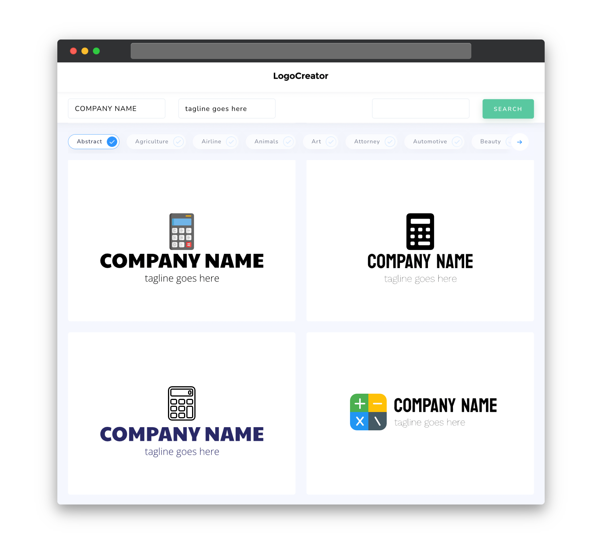
Icons play a crucial role in calculator logos. They are visual representations of your calculator’s functions and can help users quickly identify the features they need. When choosing icons for your logo, make sure they are clear, concise, and easily recognizable. Avoid using too many icons that may clutter your logo and create confusion. Select icons that represent the essential functions of a calculator, such as addition, subtraction, multiplication, and division.
Color
Color plays a significant role in setting the tone and evoking emotions in your calculator logo. When choosing colors, consider the psychological impact they have on your users. Opt for colors that convey trust, reliability, and efficiency, such as shades of blue or green. Avoid overly bright or neon colors that may distract users. It is also essential to consider the accessibility of your color choices, ensuring that they are easily distinguishable for users with visual impairments.
Fonts
The choice of fonts in your calculator logo can help communicate the intended message and establish your brand identity. Use clear, legible fonts that are easily readable in different sizes. Sans-serif fonts are often preferred for calculator logos as they offer a clean and modern look. However, depending on your target audience and brand personality, you may choose different font styles. Strike a balance between uniqueness and readability to ensure your logo stands out while remaining easily recognizable.
Layout
The layout of your calculator logo should be clean, simple, and well-balanced. Aim for a symmetrical design that creates a sense of order and precision. Arrange your icons and text in a way that is visually appealing and easy to understand. Consider the different sizes and orientations in which your logo may be used â on websites, mobile apps, or physical products. Maintaining consistency across these formats will enhance brand recognition and establish a sense of professionalism.
Usage
Your calculator logo should be versatile enough to be used in various contexts. Ensure that it looks equally impressive on different mediums, such as websites, mobile apps, business cards, or promotional materials. Create different versions of your logo for different backgrounds, ensuring it remains visually striking in both light and dark themes. Consider how it will appear when scaled down or displayed in monochrome. By designing a logo that is adaptable and scalable, you can ensure consistent branding across all channels.


