Audience
When it comes to creating a successful call center logo, it’s important to consider your audience. Your logo should resonate with your target demographic and reflect the values and professionalism of your call center. Keep in mind that your audience may include both potential customers and potential employees. Whether you are catering to a specific industry or offering general call center services, your logo should visually represent the quality, trustworthiness, and efficiency you bring to the table. By understanding your audience, you can design a logo that appeals to them and helps establish a strong brand identity for your call center.
Icons
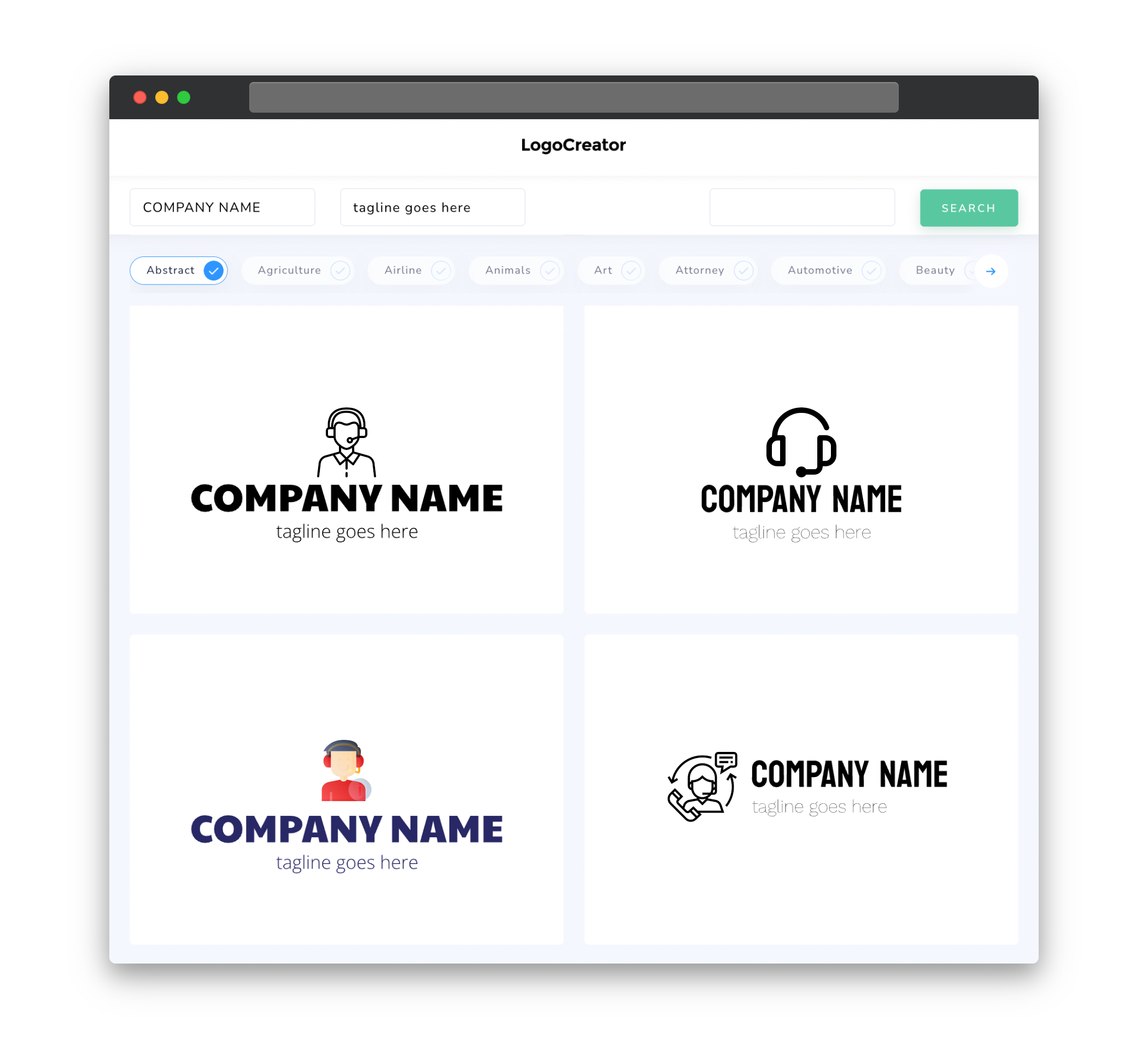
Icons play a crucial role in creating a visually appealing and memorable call center logo. They can represent various elements related to call center services, such as phones, headsets, speech bubbles, or even abstract representations of communication. Icons add a touch of visual interest to your logo and can help convey the core message of your call center. Choose icons that are simple yet distinctive, as overly complex or cluttered icons may make your logo difficult to identify and remember.
Color
Color is an essential element in logo design, as it evokes emotions and helps create brand recognition. When selecting colors for your call center logo, consider the tone and personality you want to convey. Blue, for example, is often associated with trust, reliability, and professionalism – making it a popular choice for call center logos. Green can represent growth, freshness, and empathy. Yellow evokes feelings of energy and optimism. However, it’s important to choose colors that not only appeal to your audience but also align with your overall branding strategy. You want your logo to stand out while remaining visually harmonious.
Fonts
Fonts are another critical element in creating an effective call center logo. Choose fonts that are clear, readable, and professional. Sans-serif fonts, such as Arial or Helvetica, are often used in call center logos as they convey a sense of modernity and simplicity. Serif fonts, on the other hand, can add a touch of elegance or professionalism. Experiment with different font combinations to find the perfect balance between readability and aesthetics. Also, consider how the fonts you choose will look across different sizes and mediums to ensure your logo remains legible and impactful.
Layout
The layout of your call center logo should be simple, balanced, and easily recognizable. Consider the various elements you want to include, such as icons, text, or a tagline, and find a layout that allows these elements to work together cohesively. Keep in mind that your logo will often be displayed in small sizes, so it’s important to ensure all the elements are clear and distinct even at a reduced scale. Additionally, consider how your logo will translate into different formats, such as print or digital, to ensure maximum versatility and usability.
Usage
Once you have created your call center logo, it’s essential to understand how and where to use it effectively. Your logo should have a scalable design that works well across different mediums, from websites and social media profiles to letterheads and business cards. It should be able to maintain its clarity and impact whether it’s displayed on a small favicon or a large billboard. Additionally, make sure to follow branding guidelines consistently to maintain a unified visual identity. By understanding how to utilize your logo effectively, you can enhance brand recognition and establish a strong presence in the call center industry.


