Audience
When it comes to camera rentals, photographers, videographers, and filmmakers are the primary audience that make use of such services. They often rely on renting high-quality cameras and equipment to ensure they have access to the latest technology without committing to the significant costs of purchasing them outright. Whether it’s a professional photographer preparing for a high-profile wedding shoot or a student filmmaker looking to explore their creative ideas, our camera rental service caters to all levels of expertise and ambition.
Icons
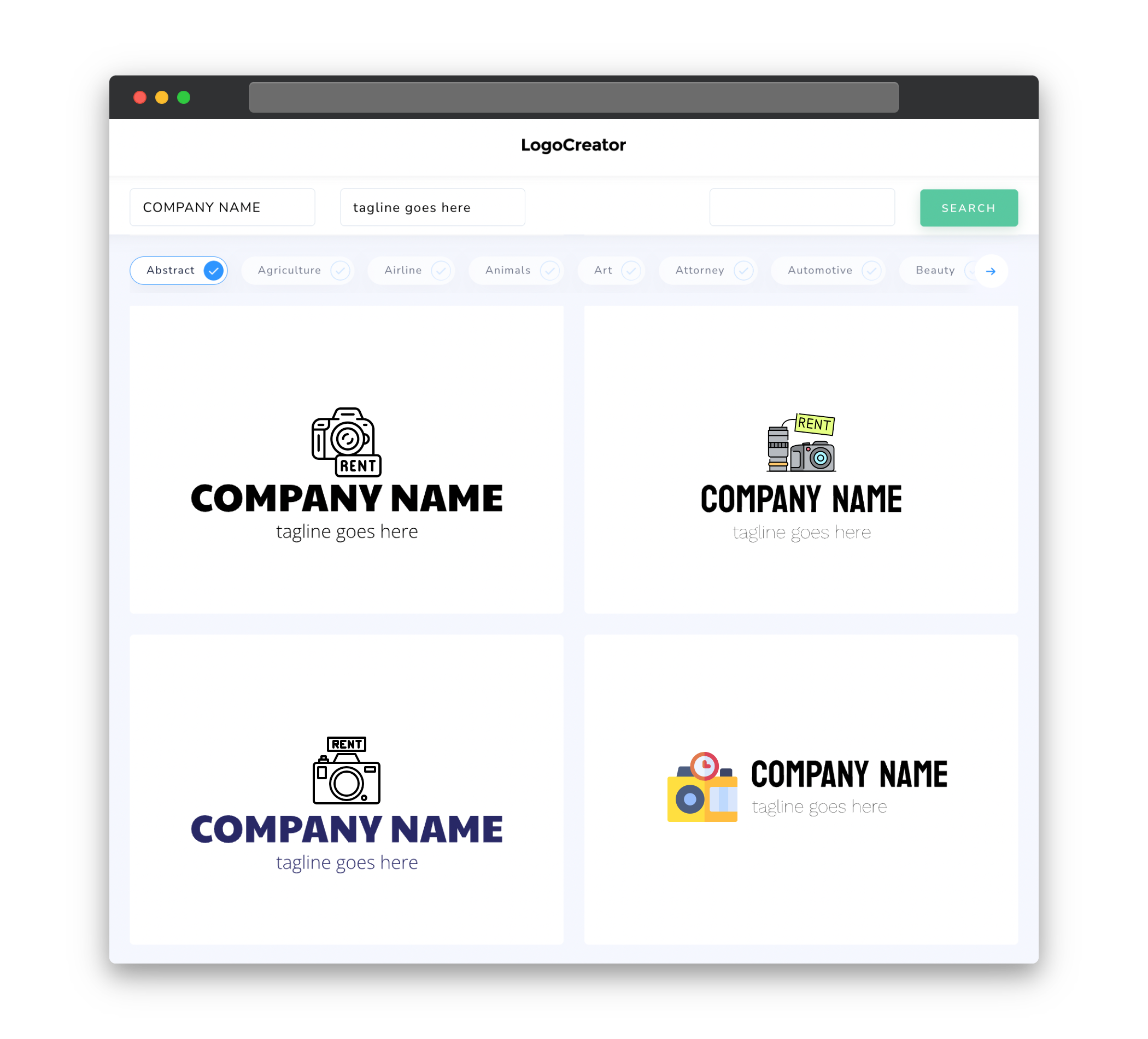
Using icons in our camera rental logo can help convey the essence of our services at a glance. Consider incorporating camera elements such as lenses, tripods, or film reels as icons within the logo. These icons can represent the versatility, quality, and professionalism of our camera rental service. By using icons, we create a visual representation of our products and services that can resonate with our target audience, making our logo memorable and instantly recognizable.
Color
Choosing the right color palette for our camera rental logo is essential to create the desired visual impact. Consider colors that evoke trust, reliability, and professionalism. Shades of blue or gray can typically convey these qualities effectively. Additionally, incorporating neutral colors can help emphasize the focus on the camera equipment itself, allowing our logo to be visually appealing while maintaining a sense of sophistication.
Fonts
The choice of fonts for our camera rental logo should strike a balance between uniqueness and readability. Opt for fonts that are clean, modern, and professional. Serif or sans-serif fonts with clean lines and a bold appearance can give our logo a contemporary and polished feel. It’s important to ensure that the chosen font is easy to read, as this will enhance the legibility of our logo on various marketing materials, including business cards, website banners, and social media posts.
Layout
The layout of our camera rental logo should prioritize simplicity and clarity. Avoid overcrowding the design with excessive elements that can create visual clutter. Consider a clean and balanced composition that showcases the core camera-related elements while incorporating the name of our rental service in a prominent position within the logo. A balanced and well-structured layout will enable our logo to make a strong visual impact, fostering brand recognition and credibility.
Usage
Our camera rental logo can be utilized across various platforms and materials to establish a consistent and recognizable brand presence. From our website and social media profiles to promotional materials such as brochures, business cards, and stickers, our logo should be easily adaptable to different sizes and formats without losing its visual appeal. By establishing clear guidelines for logo usage and providing high-quality variations, we ensure that our brand is represented consistently, building customer trust and reinforcing our position as a reliable camera rental service.


